
Ad hoc analysis
- Configuring ad hoc analysis
- Editing a chart
- Saving a view
- Find out more...
DigDash Enterprise provides an editing tool that allows users to modify their charts in real time: adding columns, totals, changing the sort order, etc.
This feature, also known as Self-service BI, gives users greater freedom. Changes to charts can be made easily without the need to reconfigure data flows within the information portfolio.
Ad-hoc analysis is available on all charts except: Flow Charts, Tree Views, Text, Keyword Clouds, HTML Reports and Gantt Charts.
Configuring ad hoc analysis
Users can edit their charts directly from the dashboard editor.
Enabling ad hoc analysis
The ad hoc analysis feature in the dashboard editor (whether viewing the dashboard or opening the flow in a browser) is enabled when editing the flow (chart) in Studio:
- Click the Ad-hoc Analysis button in the flow configuration toolbar.

Advanced options for ad hoc analysis
You can customise the ad-hoc analysis interface to restrict or specialise certain functions for users of the chart. Please refer to the documentation Advanced options for the ad hoc analysis interface.
Editing a chart
When you view a chart in a browser or dashboard, the chart is displayed on the right and the editing toolbar on the left.
The editing toolbar can be collapsed: click the  button to hide it.
The help icon ![]() allows you to access this documentation directly.
allows you to access this documentation directly.

This editing toolbar includes the list of dimensions and measures available in the data model, as well as a number of tools such as the option to save your chart view.
Dimension names followed by … indicate that the dimension includes a hierarchy or navigation path. Click on the dimension to display the list of available hierarchies.
If you are editing a chart other than a table, the list of axes is displayed on the chart so that you can modify their content:

Adding dimensions or measures
Objects can be added to or removed from the chart by dragging and dropping them or by using the context menu (right-click) on the chart.
In a table
If you wish to add a dimension or measure to a table or cross-tab, drag and drop that object onto the header of the table column before which you wish to insert it.
You can also add an object by right-clicking:
- Right-click on the column header before or after which you wish to insert the object and select ‘Insert a dimension (before or after) ’ or ‘Insert a measure (before or after)’.
In a table, you can reorder dimensions and measures freely by dragging and dropping the columns to the desired position. Measures can be placed at the top if you wish.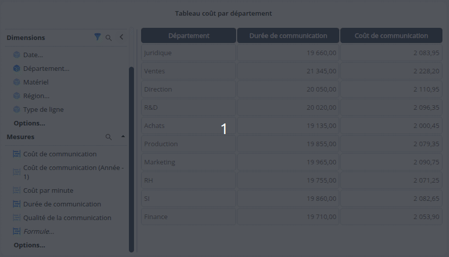
Replacing a dimension or measure
If you wish to replace a dimension or a measure:
- Right-click on the header of the relevant column, then select the Replace Axis ( or Replace Measure) menu command
- Then select the new dimension (or measure) to use.

Deleting a dimension or measure
If you want to delete a dimension or measure, right-click on the header of the relevant column and then select the ‘Delete Axis’ ( or ‘Delete Measure’) menu command.
In a chart
If you wish to add a dimension or measure to a chart (columns, bars, etc.), drag and drop the item directly onto the desired axis:

To add a hierarchy level for a dimension, first click on the dimension to display the list of hierarchies, then select the level to add.
You can also add an object by right-clicking:
- Right-click on the axis and choose ‘Add a dimension to the axis’ or ‘Add a measure to the axis’.

- Then select the dimension/measure.

Replacing a dimension or measure
To replace the existing dimension or measure:
- Right-click on that object and select ‘Replace Dimension’ or ‘Replace Measure’.

- Then select the measure or dimension you wish to use.
If the dimension has hierarchies, the root level is automatically selected. To select a different hierarchical level, use drag-and-drop from the list of dimensions on the left.
Deleting a dimension or measure
If you wish to delete a dimension or measure, drag and drop the object you wish to delete from the chart onto the toolbar.
You can also delete objects from the context menu that appears when you right-click on the object or axis: click on ‘Remove dimension’ or ‘Remove measure’.
Add a formula
To add a formula:
- Drag and drop the ‘Formula…’ item at the end of the list of measures onto the measures axis.

➡ A dialog box will appear prompting you to enter the name and content of the formula - Enter the name of the formula and its content.

You can insert a measure by clicking the ‘Insert measure into formula’ button, or a dimension (e.g. count of distinct members) by clicking the ‘Insert dimension into formula’ button.
The aggregation function shown in brackets is, by default, that of the data model. You can change this by clicking on the measure/dimension and then selecting the desired aggregation. See the section Available aggregation functions for dimensions and measures below for further details.
💡 You can also type the beginning of the name of the measure or dimension you wish to add directly into the formula editor. You will then be shown a list of matching measures and dimensions with the various possible aggregations.
- Select an output number format from the Format drop-down list.
- Click OK.
➡ The formula is used in the chart.
The formula is also visible in the list of available measures. You can edit it by clicking on or delete it by clicking on
  .
.
Aggregation functions available for dimensions and measures
You can change the aggregation function shown in brackets for dimensions and measures included in a formula.
For dimensions, the dcount aggregation function is used by default. It calculates the distinct count of members in the dimension.
You can replace dcount with dmember, which returns the value of the dimension.
For measures, the‘sum’ aggregation function is used by default. It calculates the sum of the measure’s values. You can replace it with one of the available aggregation functions:
- Average (avg)
- Min(min): minimum value
- Max ( max): maximum value
- Cumulative along the axis (arsum)
- Or ( or): logical ‘or’ (‘|’ in programming or ‘+’ in Boolean arithmetic) between the (integer) values of the measure. Example: 2+2=4 (arithmetic sum) but 2|2 =2, 2|1=3, 1|0=1… (logical OR).
- Median (med)
Changing a measure’s aggregation
You can change a measure’s aggregation function: click the Options… button, then Aggregation below the list of measures, then drag and drop the desired aggregation type onto the relevant measure.
It is also possible to change the aggregation directly from the measure on the axis: see the section Changing a measure’s aggregation for further details.
Adding a transformer
Transformers are applied to measures and allow you to display values for the previous year, the previous month, the previous week or the previous day.
To add a column transformer:
- Click Options... then Transformers and drag and drop the selected transformer onto the desired measure.

- Edit the name of the measure using the transformer as required, then click OK.

➡ This is displayed after the transformed measure and added to the list of measures.
Example: drag and drop the Year -1 transformer onto the Communication Cost measure. A ‘Communication Cost (Year -1) ’ column is added after the ‘Communication Cost’ measure, and a‘Communication Cost (Year -1) ’ measure is added to the list of measures.

Adding a smoothing function or a predictive function
To add a smoothing function or a predictive function:
- Click on Options... then Smoothing Functions and drag and drop the selected function onto the desired measure.
- Enter the required parameters.
- Rename the measure as required, then click OK.
➡ This is displayed after the selected measure and added to the list of measures.
Example: drag and drop the Moving Average smoothing function onto the Communication Cost metric. A Communication Cost (Moving Average) column is added after the Communication Cost metric and to the list of metrics:

Managing and adding filters
Viewing and managing filters
To view all stream filters (dashboard filters and private flow filters), click the button  to the right of Dimensions.

➡ The Filters pane appears, showing the list of filters applied to the flow.
Private flow filters (defined in the ad hoc analysis or the Dashboard Editor) can be:
- edited: select the filter, click the button
 and modify the filter as required.
 - deleted: select the filter(s) and click the
 button.
Filters created in Studio (with a dimension defined as non-navigable) are greyed out and cannot be edited or deleted here.
Filters using an exclusion take the following form:

Adding a filter
You can add a filter from the Filters box above :
- Click the ‘Add a filter’ button.
- Select the dimension to filter by, for example Date.
- In the ‘Filter by Dimension’ box, set the filter as required and click OK.

You can also add a filter from the dimension:
- Right-click on the dimension you wish to filter by, then click Add filter.

- In the ‘Filter by Dimension’ box, set the filter as required and click OK.
Editing axis properties
Adding an overall
To add a total:
- Right-click on the axis (or column header, if it is a table) to which you wish to add a total, then select ‘Add Overall’.

- In the ‘Add Overall’ box that appears, select the position of the overall and the aggregation to use.
➡ The overall is displayed at the chosen position.
You can also add a total via the dimension options: click the Options… button below the list of dimensions, then drag and drop Total (end) or Total (beginning) onto the desired axis.

To modify the total (position and aggregation), right-click on the axis and select Change Overall.
To remove a total, right-click on the axis and select Remove Overall.

Adding a measure filter
To add a measure filter of the type ‘Best’, ‘Worst’ or ‘Interval’:
- Right-click on the axis and select Add a measure filter.

- In the Add Measure Filter box that appears, select the measure of your choice.
- Then select:
- the ‘Top’ or ‘Bottom’ type, then enter the number of values.

- or the ‘Interval’ type, then enter the Min and Max values.
- the ‘Top’ or ‘Bottom’ type, then enter the number of values.
- Click OK: the chart will update.

To remove the Top / Bottom / Interval filter, right-click on the axis and select Remove Measure Filter.
Adding a sort
To add a sort:
- Right-click on the axis of your choice, then select ‘Add sort’.

- In the ‘Add sort’ box that appears, select the sort type.

You can also add a sort from the dimension options: click the Options… button below the list of dimensions, then drag and drop Sort (asc.) or Sort (dsc.) onto the desired axis.
To edit a sort, right-click on the axis and select Change sort.
To remove a sort, right-click on the axis and select Remove sort.
Changing a measure’s aggregation
To change a measure’s aggregation, right-click on the measure’s name, then select Change aggregation and choose the function: Sum, Average, Min, Max,Cumulative or Median.
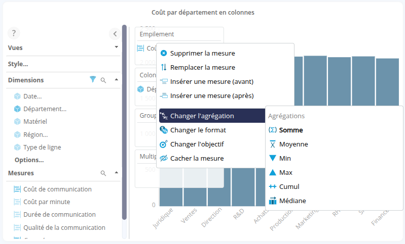
Aggregations can also be changed via the measure options: see the section Changing a measure’s aggregation for further details.
Changing a measure’s format
To change a measure’s format:
- Right-click on the measure or continuous dimension (e.g. time dimension), then select Change Format.
- In the Change Format box, select the desired format and click OK.

Setting / Changing a target
When a metric has one or more targets defined (see the page Creating a target for a measure for more details), you can set or change a target. To do this:
- Right-click on the relevant metric.
- In the context menu, select ‘Change objective’, then choose the objective of your choice or ‘None’ if you do not wish to use an objective.

➡ The objective applies to the chart or table.
Adding an interaction
To add an interaction:
- Right-click on the axis of your choice and select ‘Add interaction’.
➡ The interface displays a list of possible interactions for each chart. - Select the desired interaction.

Changing teh color distribution
The colour scheme can be changed. To do this, right-click on the axis and select Enable color distribution or Disable color distribution.
Example: on a column chart, colour distribution is enabled by default on the stacking axis (a different colour is assigned to each element on this axis):
If you want the colour scheme to apply to the column axis, right-click on the Stacking axis and select ‘Disable color distribution’. Then right-click on the column axis and choose ‘Enable color distribution’.

Editing a chart’s properties
Changing the colour palette used
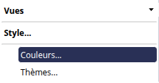
To change the colour palette:
- Click on Style… then Colours…
- Then select the desired palette from the drop-down list and click OK.
Additional colour palettes can be created in Studio: see the page Colour Palette Manager for further details.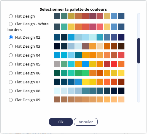
You can also choose a specific existing theme for your chart by clicking on Style... then Themes.... Additional themes can be defined via Studio. See the Style Manager page for further details.
Editing table styles
To edit the table’s styles:
- Click on Style...then on Context Menu: Styles to open the styles context menu (click this button again to close the menu).

- Right-click on the row, column or cell whose style you wish to edit to display the styles context menu.

Modify the styles as required: see the page Changing a table’s style for more details on the available options.
Saving a view
You can save different views of the same chart.
Save the view
To save the current view of your chart:
- Click on Views... then click the Save View button.

- Enter the Name of the view.
- You can assign a Category to the view by selecting an existing category or creating a new one.
Multiple levels of categories can be created. The categories will be displayed as a folder tree.
- Tick the ‘Do not save current filters in the view’ box to save the view without the currently defined filters.
- Tick the ‘Public view’ box if you wish to share the view with other users (who have access to the role).

- Click OK.
➡ The view is saved in the feed and added below‘Views’ in the specified category.
Viewing a saved view
To view a saved view, simply click on its name.
Filtering private/public views
Private and public views can be identified by their icon:


You can filter the views displayed using the Public and Private buttons to the right of ‘Views’. The filter is applied via the button shown in blue.
Below, the filter is set to show only private views.
Resetting a view
To return to the initial view:
- Click Reset the view.
➡ A message appears: Do you want to reset the view?
- Click OK.
Deleting a saved view
To delete a view, click the delete icon  next to the view’s name.
If it is the only view in the category, the category is also deleted.
Correcting an incorrect view
When a dimension, measure or hierarchy is deleted, or when its identifier is changed in the data model, saved views (both public and private) may be affected.
In this case, a message appears to inform you that the data model has changed, and lists the missing objects.

You can then remove the missing objects from the view by clicking the ‘Clean up view’ button.
Tick the ‘Also save the view after cleaning it up ’ box to automatically save the view after cleaning it up.
Click the Cancel button if you wish to ignore the message. In this case, you will not be able to display the view and will remain on the current view.
The types of missing objects may include the following:
- Dimension
- Filter: ‘Elements’ type filter
- FilterRule: Rule-type filter
- Dim Set Dimension: ‘Set’ type filter
- Measure: measure
- ValueFilter: filter using a measure (Best, Worst, etc.)
- Format