Tutorial
Table of contents:
- Installation
- Start-up
- Administration
- Creation of the “telecom” data model
- Chart creation: “Cost by Type of service”
- Synchronization
- Chart creation “Communication cost by area“
- Chart creation: “Cost reduction target”
- Chart creation: “Simulation Euro Dollar”
- Data model reation "retail"
- Chart creation: “Top 3 products”
- Dashboard configuration
- Access dashboard
Installation
Files extraction:
- Extract the content of digdash_enterprise_<numversion>_64.zip into the folder of your choice.
You can use the freeware 7zip.
DigDash Enterprise is now installed on your computer.
Please note that DigDash Enterprise is usually installed on a distant server which allows to share contents between users.
Start-up
- Open your installation directory, then double-click on the file StartDigDash.exe.
- Click on “Start”.

The first start can take several minutes. The green icon will keep blinking until the server is completely started. The message “The server is started” will appear
- When the DigDash Enterprise server is ready, click on “Execute”.
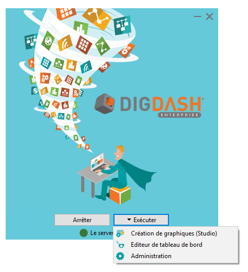
A menu appears with shortcuts to:
- Studio: a dedicated tool to create charts
- Dashboard editor: a web interface to create pages with your charts
- Administration: the home page to all administration pages
Administration
- Click “Administration” in the StartDigDash.exe application.
Your browser opens and displays DigDash Enterprise welcome page.
- Click Configuration then license management.
- In the connection dialog box, enter admin/admin Enter the license key then click Test.

- Accept the general terms and conditions of use and maintenance then click Apply.
If you need to change the lang of the administration interface, do the following:
- Go back to the configuration page then click User management.
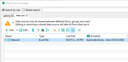
- Click the New role button and enter name “telecom”. Each user and role have their own wallet containing charts. When you assign a role to a user, the user will access all the charts of the role.
We will now create the user John Smith.
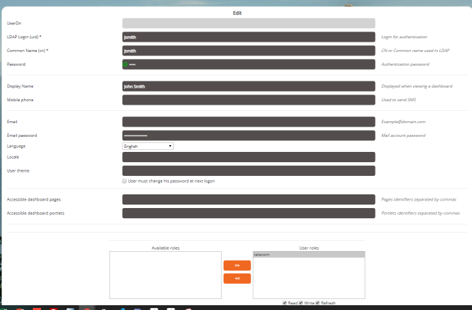
In the User management page again, click New user Fill up the following fields:
- LDAP login (uid) : jsmith
- Common Name (cn) : jsmith - Password: john
- Display Name : John Smith - Language : English
- Add telecom role to the user
- Assign all authorizations to the user
Creation of the “telecom” data model
Objective: Import into DigDash Enterprise the Excel file “telecomen.xls” (included) which represents the data of a (fictive) telecommunication company.
Enhance this source and build a data model to create relevant graphics. This data model will be used by several charts.
- Click on “Chart creation (Studio)” in the application StartDigDash.exe.
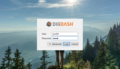
- In the login dialog, fill in the user and password fields with jsmith and john.
Step 1: Import a data source file
- Select the “telecom” role
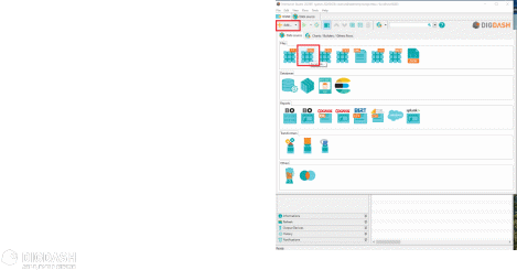
- In the toolbar located at the top of the window, click on Add… then click on Excel.
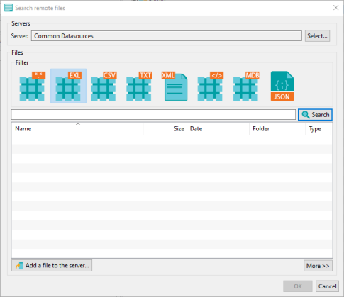
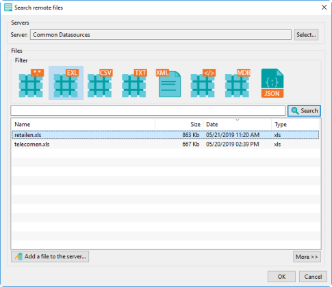
The window Search remote files appears:
- Click on Select at the top then choose the documents server “Common Datasources”.
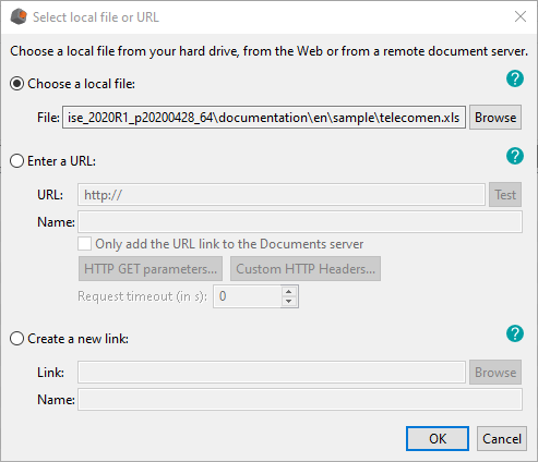
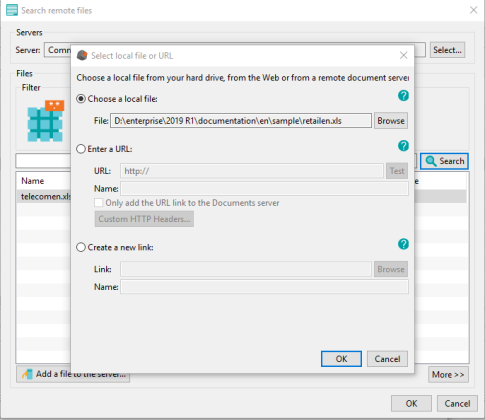
- Click “Add a file to the server...”. The window Select local file or URL appears.
- Select Choose a local file then click on Browse to select the file «telecomen.xls» which can be found in the folder documentation\en\sample of your installation folder.
- Click OK.
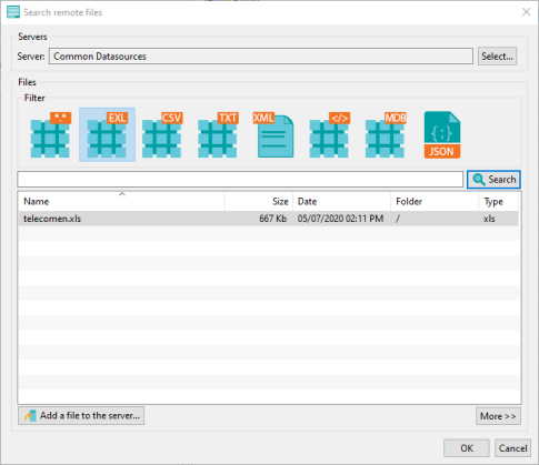
The file is now saved on the DigDash server and accessible to all users.
NB : if you use the documents server “UserDocs”, you will be the only one who can access the document.
- In the window Search remote files, select “telecomen.xls” then click OK.
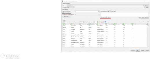
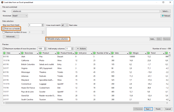
The window Load data from an Excel spreadsheet appears.
Check the boxes:
- First row as header
- Disable empty columns
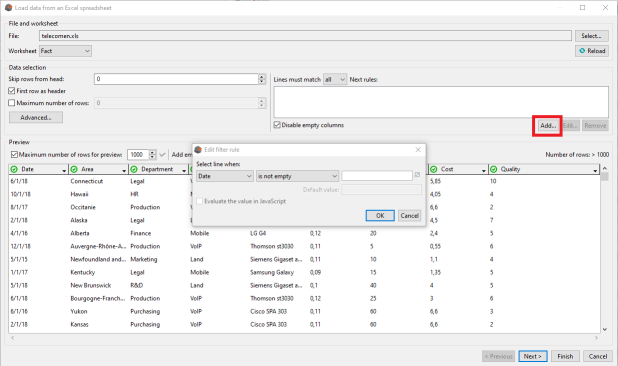
- Click Add ... to the right of Disable empty columns.
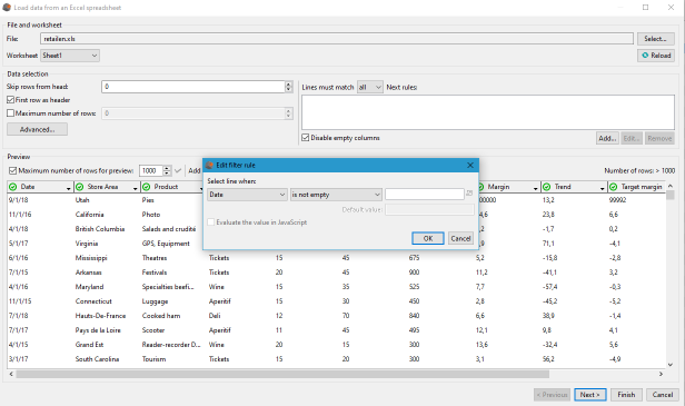
The window Edit filter rule is displayed.
- Leave the default values (Date in the first drop-down list and is not empty in the second drop-down list)
- Click OK then Next.
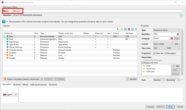
Step 2: Configure the data model
Name your data model “telecom”
Next objectives:
- Create a manual hierarchy of departments within the organization.
- Create an automatic hierarchy on phone hardware.
- Create a target on communication costs
- Create a calculated measure « Euro Dollar cost » which varies according to the € / $ exchange rate
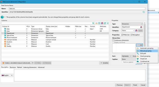
Creating a manual hierarchy
- Select Department, click Add in the hierarchies panel and select Manual grouping.
The window Group editor appears.
The default hierarchy name is Group 0.
- Rename it to Type of service.
The first level called Level 0 contains all the column values.
- Rename it to Function.
- To create groups in this level, click Add… on the bottom left corner
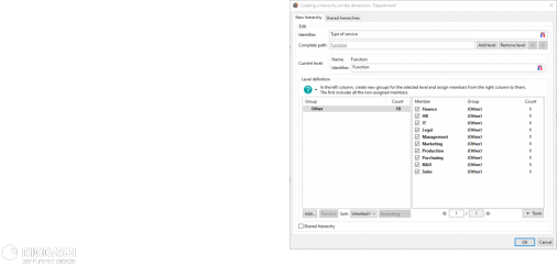
The window Group name appears.
- Type Sales and do the same with Management, Production and Administration.

Assign members to groups.
Select Administration then check the boxes IT, Legal et Purchasing in the right panel.
Do the same for :
- Management: Finance, HR and Management
- Production: Production and R&D
- Sales : Marketing and Sales
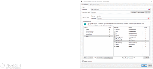
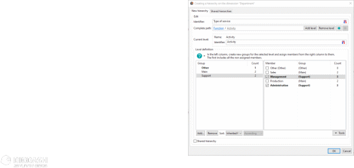
- Add a second level and name it Activity.
- Add two groups Main and Support with the following members:
- Main: Sales, Production
- Support: Management, Administration
- Click OK to save your hierarchy levels.
Objective: create an automatic hierarchy
- Select Phone Hardware then click Add in the Hierarchies panel and select Automatic grouping.
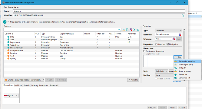
The window Group editor appears.
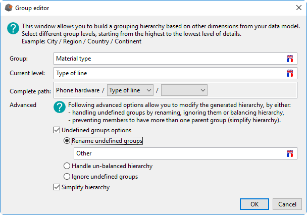
- The default group name is Groupe 0, rename it to Material type.
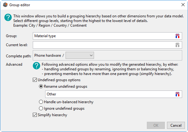
The complete path is displayed in the Complete path fields.
Each hierarchical level is separated by /.
Phone hardware is the first level of the hierarchy.
- Open the drop-down list on the second level and select Type of line.
- Click OK to save.
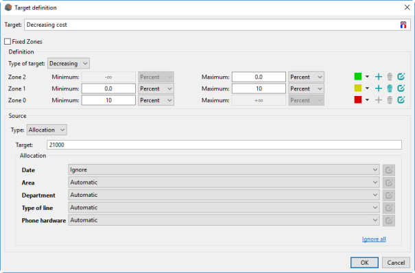
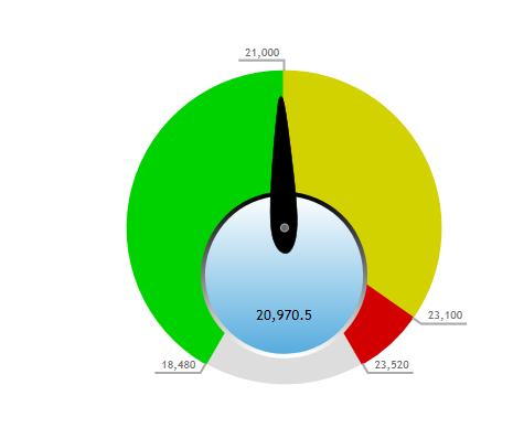
Create a new target of 21000€ on the Cost measure. To reach the target the cost has to decrease.
- Select the measure Cost then click on Add… in the Target panel.
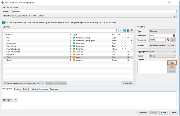
- Name the target Decreasing cost.
- In the Type of target drop-down list select Decreasing.
- In the Type drop-down list select Allocation then fill in the value 21000.
- Click OK to save your target
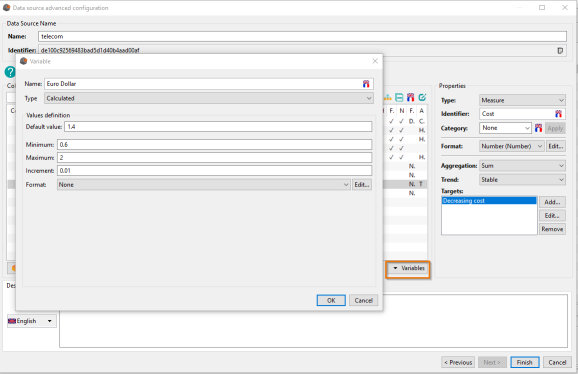
Creating a Euro/Dollar conversion variable.
Click Variables then Add a variable…
In the window Variable fill in the following fields:
- Name: Euro Dollar
- Default value: 1.4
- Minimum: 0.6
- Maximum: 2
- Increment: 0.01
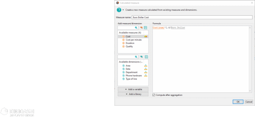
Create a calculated measure which changes the Cost based on the exchange rate €/$.
- Click Create a calculated measure (advanced)...
The window Derived measure appears.
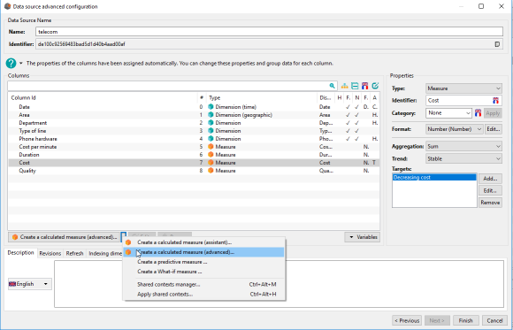
- Name the new measure Euro Dollar Cost.
- On Add measure and double click on Cost.
- Type *1.4/ and add the variable Euro Dollar.
The data model “telecom” is now ready.
- Click Finish then Ignore in the window Add a comment on the modification.
Don’t close the next window as we will use it.
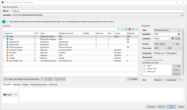
Chart creation: “Cost by Type of service”
Objective: display a bar chart showing the Cost by type of service.
The user can navigate through the Type of service hierarchy.
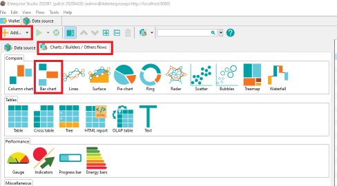
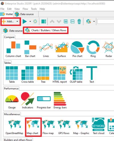
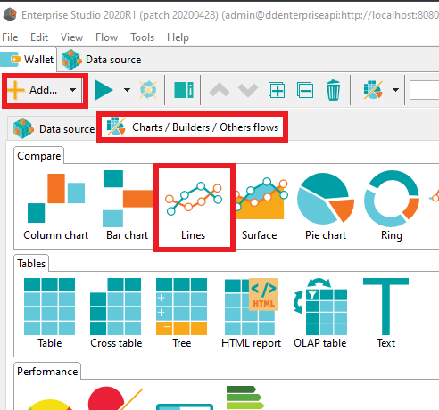
- After saving the data model, click on Add…,
- then click on the tab Charts / Builders / Others flows then Bar chart.
- Then select the data model previously created.
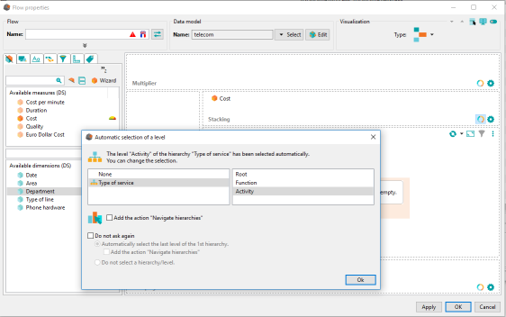
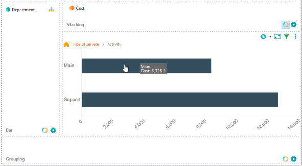
- Drag & drop the Cost measure on the stacking axis.
- Drag & drop the Department dimension on the bar axis.
- Select the hierarchy “Type of service” and the level “Activity”
- Check Add the action “Navigate hierarchies”
- Open the interaction tab.
You can see that the action Navigate on hierarchy has been set.
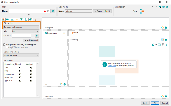
- Click the link “Click here” to display the preview.
- You can also activate the Automatic refreah in the drop down box
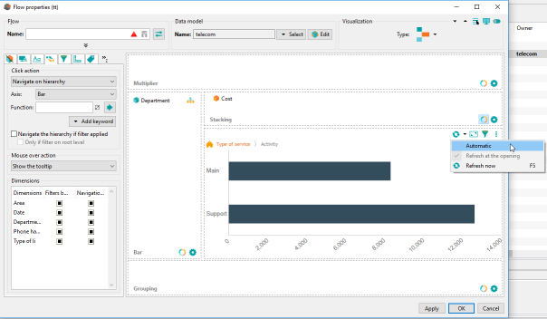
- You can now click “Main” or “Support” to navigate through your data along the Department axis.
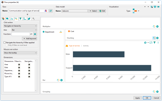
- Rename the new chart to Communication cost by type of service.
- Click OK to validate. The chart is now saved into your wallet.
Synchronization
When a graph appears in bold in the wallet, it means that its configuration has changed.
It is then necessary to update the data for the dashboard.
- Right-click the graph, and then click Synchronize.
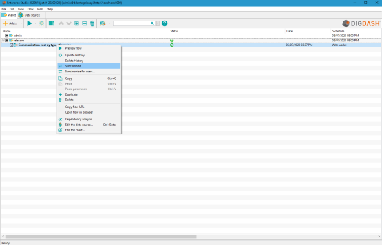
Chart creation “Communication cost by area“
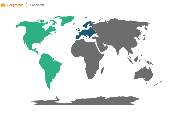
Objective : Create a map showing the communication cost by continent. Users can navigate through the geographic axis from continents to regions level when displaying the dashboard.
This chart uses the “telecom” data model previously created.
Step 1: Select an existing data model
- Click on the Add… button at the top of your screen.
- On the tab Charts / Builders / Others flows, under the Miscellaneous section select Map chart.
- Select the data model telecom previously created.
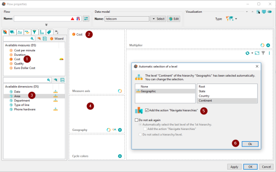
The window Visualization configuration is displayed.
Step 2: Visualization configuration
- Drag & drop the measure Cost on Measure axis.
- Drag & drop the dimension Area on Geography axis.
- In the dialog Automatic selection of level, keep the hierarchy selected and check Add the action “Navigate hierarchies”
- Once you have refreshed the chart, click on “Europe” and “France” to display the cost details for this area.
- Name the chart “Communication cost by area”
- Click on OK to save your visualization.
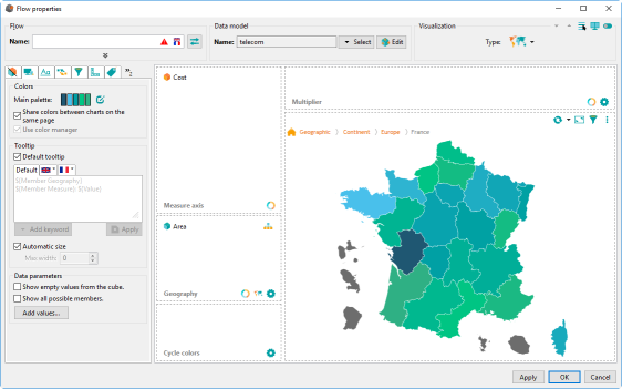
Chart creation: “Cost reduction target”
Objective : your management wants to monitor the communication cost and set a target to achieve. Create a gauge showing that target and the actual communication cost.
This chart uses the telecom data model previously created.
Step 1: Select an existing data model
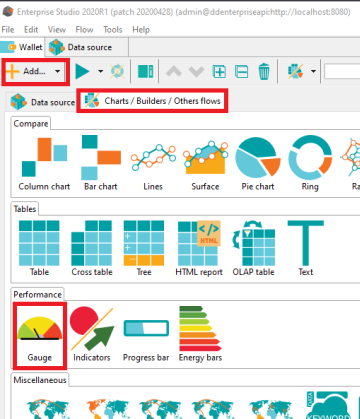
- Click on the Add… button at the top of your screen. On the tab Charts / Builders / Others flows, under the Performance section select Gauge.
- Select the data model telecom previously created.
The window Flow properties is displayed.
Step 2: Visualization configuration
- Drag & drop the Cost measure in the measure panel and select the Decreasing cost target.
- Rename your gauge Cost reduction target.
- Click OK to save your visualization.
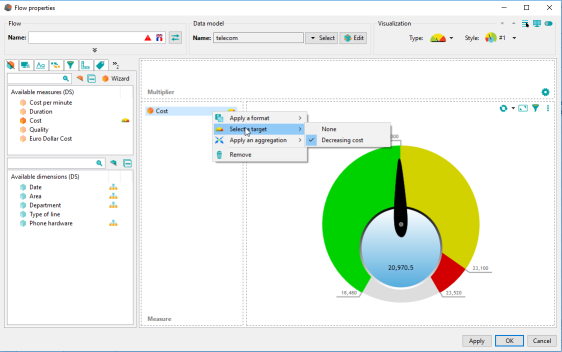
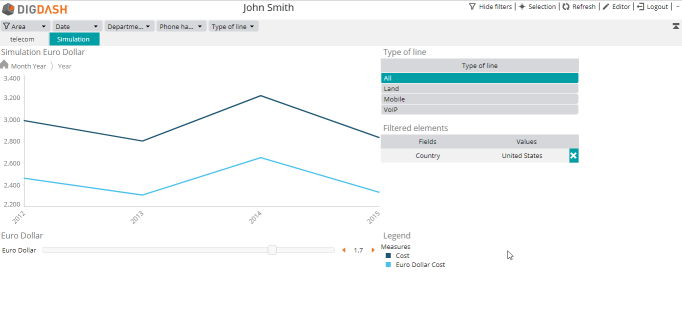
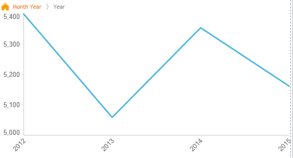
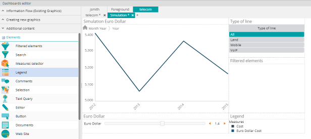
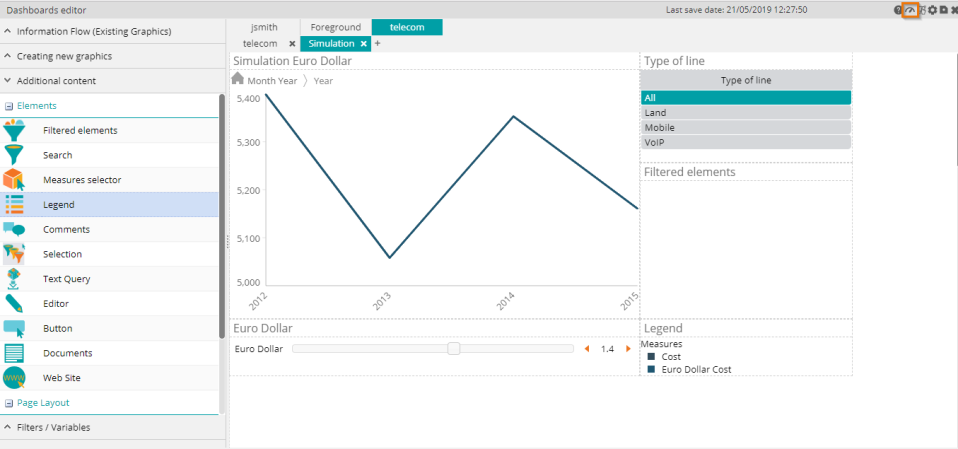
Chart creation: “Simulation Euro Dollar”
Objective : show the impact of Euro/Dollar change on the communication cost.
This chart uses the “telecom” data model previously created.
Step 1: select an existing data model
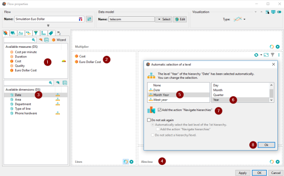
Create a line chart (Lines in the Compare category).
The window Datasource model manager appears. Select “telecom” and click OK.
Step 2: Visualization configuration
- Drag & drop the measures Cost and Euro Dollar Cost on the Lines axis.
- Drag & drop the Date dimension on the Abscissa axis.
- Right-click on Date and choose the Month Year hierarchy at the Year level.
- Check Add the action “Navigate hierarchies”
- Rename your chart Simulation Euro Dollar and click OK to save your chart.
Data model reation "retail"
Step 1: import a data source
Objective : Import into DigDash Enterprise the Excel file “retailen.xls” (included) which represents products sales in a fictive organization.
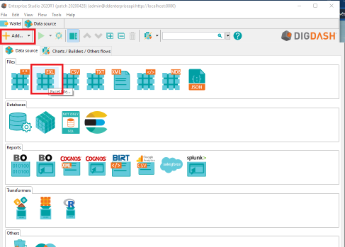
- In the panel at the top of the main window click the Add… button.
- Then select the Data sources tab then Files and Excel.
The window Search remote files appears:
- Click on Select at the top then choose the documents server “Common Datasources”.
- Click “Add a file to the server...”. The window Select local file or URL appears.
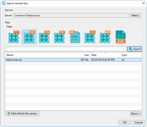
- Select Choose a local file then click on Browse to select the file “retailen.xls» which can be found in the folder documentation\en\sample of your installation directory.
- Click OK.
The file is now saved on the DigDash server and accessible to all users.
NB : if you select the documents server “UserDocs », you will be the only one who can access the document.
- In the window Search remote files, select “retailen.xls” then click OK
The window Load data from an Excel spreadsheet appears.
- Check the boxes:
- First row as header
- Disable empty columns
- Click Add... to the right of Disable empty columns.
The window Edit filter rule is displayed.
- Leave the default values (Date in the first drop-down list and is not empty in the second drop-down list)
- Click OK then Next.
Step 2: Configure the data model
- Select « Store area » column and rename its identifier to « Area » (so that is can be linked to the Area column in telecom data model).
- Rename the data model “retail”. Click on Finish to save the data model.
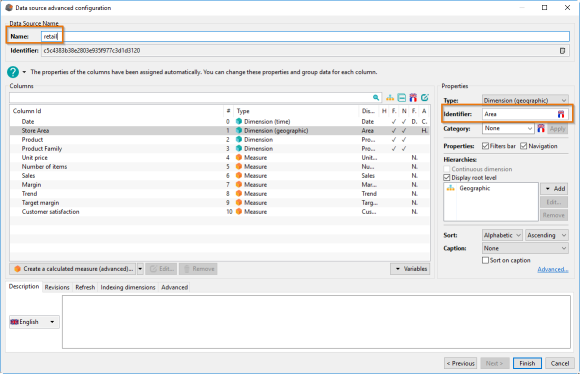
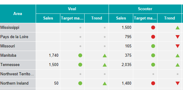
Chart creation: “Top 3 products”
Objective : create a cross table showing the 3 best material revenue. Show the revenue trend and Margin goal as icon.
Your cross table use the “retail” data model.
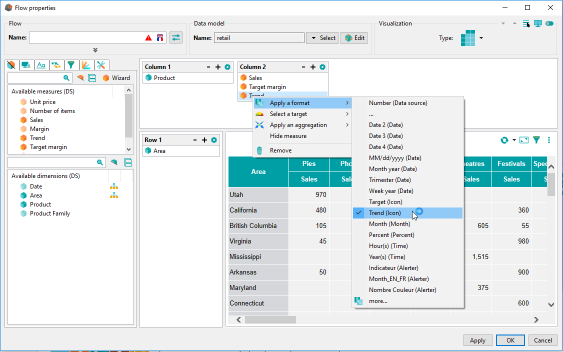
- Create a Cross table chart, then add two columns and drop in:
- Column 1 : Product
- Column 2 : Sales, Target Margin and Trend
- Row 1 : Area and remove the hierarchy (select “None” in dialog Automatic selection of a level)
- Right click Target Margin and select format : “Target (Icon)”.
- Do the same with Trend and the format “Trend (Icon)”.
- Click the star wheel in the upper right corner of "Column 1".
- Show the 3 best products sales and apply an ascending sort.
- Rename the chart “Top 3 products” and close the Vizualisation Configuration.
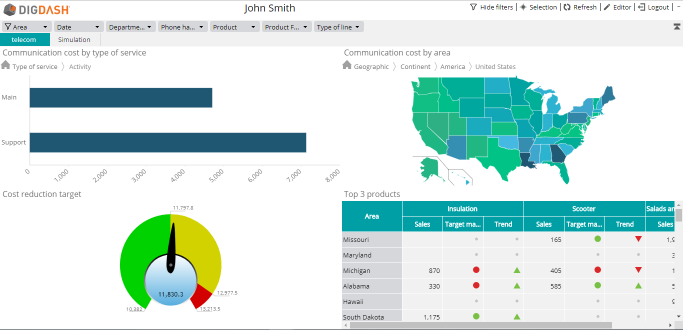
Dashboard configuration
- Go back to the application StartDigDash.exe and click on “Dashboard editor” under Execute.

- Select the tab “telecom”.
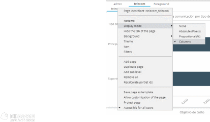
- Right-click the sub tab also called “telecom” and change the Display Mode to Columns.
This will divide the page in two areas where elements are automatically sized and positioned.
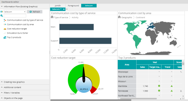
- From the left side panel, drag & drop the following charts:
- Communication cost by type of service
- Communication cost by area
- Cost reduction target
- Top 3 products revenue
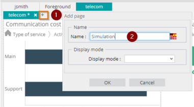
- Create a new page and name it Simulation.
- Drag & drop in your new page the chart Simulation Euro Dollar from your wallet.
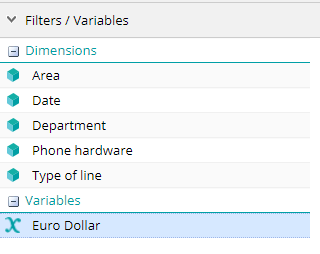
- Drag & drop the Euro Dollar variable from the Filters / Variables tab.
- Do the same with Type of line.
- Open the Additional content in the left panel and drag & drop in your page the following elements:
- Filtered elements
- Legend
Click on  at the top right corner of your screen to save your dashboard.
Access dashboard
- Click on the second icon at the top right corner to access the dashboard.
On the first page, “telecom”, Communication cost by area shows the communication costs for America and Europe.
- Click on America to display the cost by country.
- Click on “United States” to display the cost by state.
Other charts on your page are filtered and display their values for the “United States” only.
Open the page “Simulation” and move the cursor “Euro Dollar” to display the change rate effect on communication cost.