Studio
- I. MANAGE INFORMATION WALLETS AND FLOWS
- II. Add a data model
- II.1 Extract data from a data source
- II.1.1 Extract data from a file
- II.1.2 Extract data from a database
- II.1.3 Extract data from a cognos portal
- II.1.4 Extract data from Business Objects XI portal
- II.1.5 Extract data from an OLAP query
- II.1.6 Mix data from several data sources (union)
- II.1.7 Mix data from several data sources (join)
- II.1.8 Transform data from a data source
- II.2 Configure the data model
- II.2.1 Modify the refresh frequency
- II.2.2 Modify the column type
- II.2.3 Modify the column identifier
- II.2.4 Modify the aggregation function of a measure
- II.2.5 Modify the column format
- II.2.6 Sort a column
- II.2.7 Modify the time zone
- II.2.8 Add a caption
- II.2.9 Modify display and navigation parameters
- II.2.10 .Hide/Show a column
- II.2.11 Assign to a category
- II.2.12 Create a hierarchy on a column
- II.2.13 .Create a target on a measure
- II.2.14 Create a derived measure
- II.2.15 Add a description to the data source
- II.2.16 Display data source revisions
- II.2.17 . Modify indexation options
- II.2.18 .Modify the cube processing mode
- II.3 Select a visualization
- II.3.1 Select the chart type
- II.3.2 Define axes properties
- II.3.2.1 Add sorts on axes
- II.3.2.2 Select the top or the bottom n values
- II.3.2.3 Select values in a range
- II.3.2.4 Add the overall value
- II.3.2.5 Add a filter on a dimension
- II.3.2.6 Add a transformer on a dimension
- II.3.2.7 Modify the format of a dimension
- II.3.2.8 Select a hierarchy level for a dimension
- II.3.3 Define measures properties
- II.3.4 Configure the visualization parameters
- II.3.5 Configure the text generation
- II.3.6 Preview flow
- II.3.7 Modify table styles
- II.5 Schedule refresh
- II.1 Extract data from a data source
- III. Add a podcast
- IV. Add a RSS flow
- V. Add emails
- VI. Add a calendar
- VII. Add documents builder
- VIII. Publish an information flow
- IX.Menus
- Annex 1 : User variables
In this guide, you will find information allowing you to create information wallets and information flows.
The information wallet is the central piece of DigDash Enterprise where the administrator can manage the data needed in a regular way by users or roles.
An information wallet is a set of information flows.
An information flow is a preregistered access to a data source:
-
-
- Emails
- Agendas
- Podcast
- Fill RSS
- Data model : Databases, Business Objects, Cognos and BIRT Business
- Emails
-
Intelligence reports, Excel files, CSV files and HTML files.
-
-
- Documents builder

- Documents builder
-
You can create information wallets for users or roles. Information flows created for roles wallets can be used by users sharing these roles in the organization.
I. MANAGE INFORMATION WALLETS AND FLOWS

I.1 Manage Information Wallets
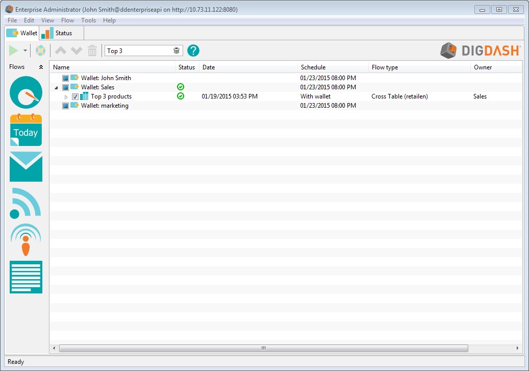
I.1.1 Open an information wallet
• Open you internet browser, then type the following URL: http://serverName/serverPort (example: http://localhost:8080). DigDash welcome page opens.
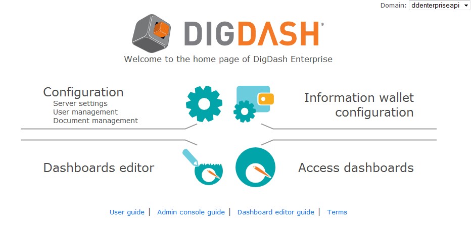
• Click the Information Wallet configuration link
- In the connection dialog box, enter the user name and password. Click the advanced button to select the server (localhost:8080 by default) and domain.
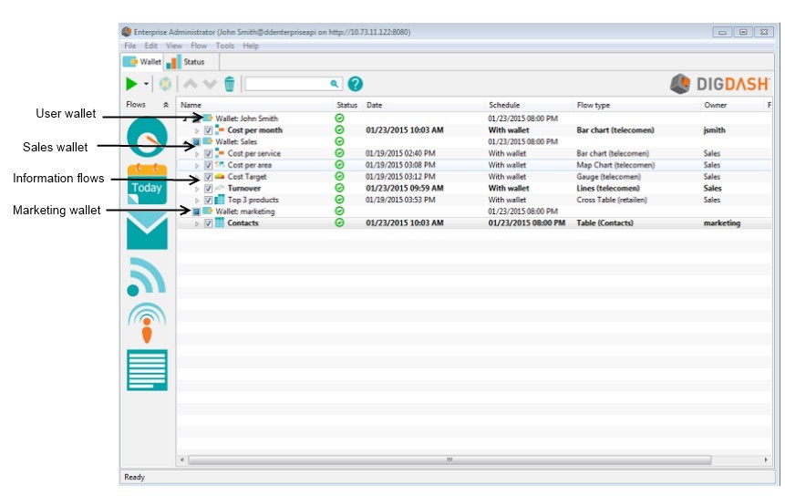
- The information wallets of the user and his roles are displayed in a tree. The first wallet is the user's wallet and is named with the user name. Roles wallets are displayed under user's wallet and are named with the role names. Click the arrow besides the wallet name to display its flows.
- To display only the wallet of a role, open the File–Open menu, then select the role in the drop-down list (you must have the authorization Load wallet for a role).
I.1.2 Edit an information wallet
- Select the information wallet
- Right click and choose Properties.
- You can modify the localized name of the information wallet. To do so, click the Edit button, then enter the value for each language.
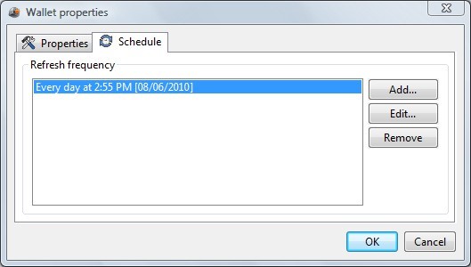
- To modify the schedule (by default, everyday at 8 PM) or add a schedule, open the Schedule tab then click Edit or Add. At the schedule time, information flows of the wallet are refreshed (unless you have define specific refresh frequencies for some flows). To get more information on how to add a schedule, please refer to chapter “schedule refresh”.
I.2 Manage information flows
You can execute following actions on information flows
I.2.1 Add an information flow
Double-click the type of flow you want to add, then choose the wallet you want to use (user or role). You can use various type of flows:
- Emails

- Agendas

- Podcast

- RSS flow

- Data model
 : Databases, Business Objects, Cognos and BIRT Business
Intelligence reports, Excel files, CSV files and HTML files.
- Documents builder
I.2.2 Configure the properties of an information flow
You can modify the following properties of an information flow:
Rename an information flow:
Select the flow, right click and choose Properties. Type the name in the name field. Click the Multi-language edit button  to translate this name into several languages.
Select output devices:
By default, information flows are synchronized for the dashboard. If you want to synchronize a flow for other devices, select the flow, right-click and choose Properties. Open the output tab then select the devices on which you want to synchronize the flow (you must first add the devices in the favorite devices list from the Tools-device manager menu).
Schedule flow:
By default, the flow is refreshed then synchronized at the same time as the wallet.
To select another schedule time, select the flow, right click and choose Properties. Open the schedule tab, clear the With wallet box then click the Add... button (refer to chapter “schedule refresh” for more information).
Once you have selected the refresh frequency, close the Properties dialog box. The Schedule column displays the hour of the next refresh.
At the schedule time, the flow is refreshed then synchronized on the selected devices.
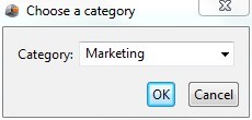
Add flow in a category
To classify flows, you can add them in different categories To do so, right-click the flow, choose Properties and type the category name in the Category field.
Flows are ordered by category in the information wallet.
You can add several flows in a category at once. To do so, select the flows, right-click and choose Properties. Enter the name in the category field.
Define export names:
Once you have selected the data source and the visualization of your flow, you can enter a name that will be used when exporting the flow (as PDF, PPT,...).
I.2.3 Manage flow history
Keep flow history :
By default, only the last item generated for the flow is kept . If you want to change this, select the flow, right-click and choose Properties. Open the History tab, then select the maximum number of items you want to keep. If you clear the Keep flow history box, only the latest item generated will be kept.
Update history:
Select the flow you want to update, right-click and choose Update history. The flow history is updated. A new item is created if necessary (example : change in visualization, in the data source,...) .
Delete flow history :
Select the flows, right-click and choose Delete history. All flow items are removed. If you also want to delete associated cubes, check the box Also delete the associated data cubes in the selected flow. You must update flow history to create a new item.
I.2.4 Synchronize flow
You can synchronize a flow for a user or all the users of a role. Synchronization can be done manually or automatically by the scheduler. The two options described below correspond to manual synchronization (automatic synchronization is described in the chapter “schedule refresh”).
Synchronize flows for a user :
Select the flows, right-click and choose Synchronize. The flows are synchronized for the user logged and the output devices selected (only checked items of the flows will be synchronized).
If you want to synchronize all flows of a wallet, select the wallet, right-click and choose Synchronize.
Synchronize flows for all users of a role :
This option is available for role wallets only. It lets you synchronize flows for all users of a role.
Select the flows, right-click and choose Synchronize for all users. The flows are synchronized for all selected devices.
I.2.5 Preview flow
Preview flow as document:
Select the flow, right-click and choose Preview flow. The preview takes into account the latest modifications you have made on the flow.
Preview flow item as document:
Select the flow item, right-click and choose Preview as document. The preview displays the item as it has been synchronized.
Preview flow item as video:
If your license includes video generation, you can generate a video. To do so, select the flow item, right-click and choose Preview as video.
I.2.6 Search for a flow
A search field is displayed in the toolbar. Enter a flow name, a flow identifier or a category to display the corresponding flows:
I.2.7 Copy flow
Select the flows you want to copy, right-click and choose Copy (or CTRL+C). Click Paste (or CTRL+V) in the location where you wish to copy it (same wallet or another wallet) .
If you copy a flow from a role to another role (where the data source doesn't exist), you will be asked whether you want to copy the data source as well.
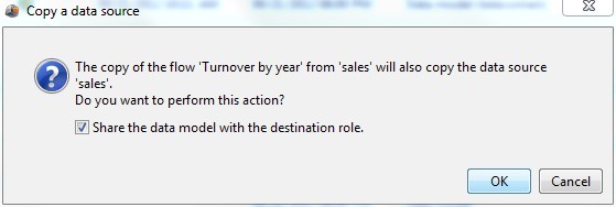
Several options are available:
- If you want to share the data source with the destination role, click OK (the data source still belongs to the original role and can't be updated from the destination role. The modifications you make on the data source from the original role are available in the destination role).
- if you want to copy the data source to the destination role, clear the Share the data model with the destination model box, then click OK.
- if you don't want to copy the data source, neither share it, click Cancel (the flow will be copied but won't have any data source associated to it).
I.2.8 Remove flow
Select the flows you want to remove, right click and choose Remove.
I.2.9 Copy flow URL
You can view a flow in a browser or embed it (graphic component) into an iframe
Select the flow, right-click and choose Copy flow URL. Paste the flow URL (using CTRL+V) in your browser or document (to get more information, refer to documentation “url_parameters_en.pdf”).
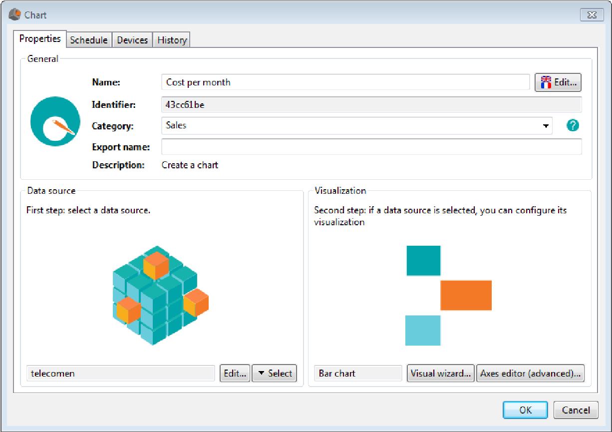
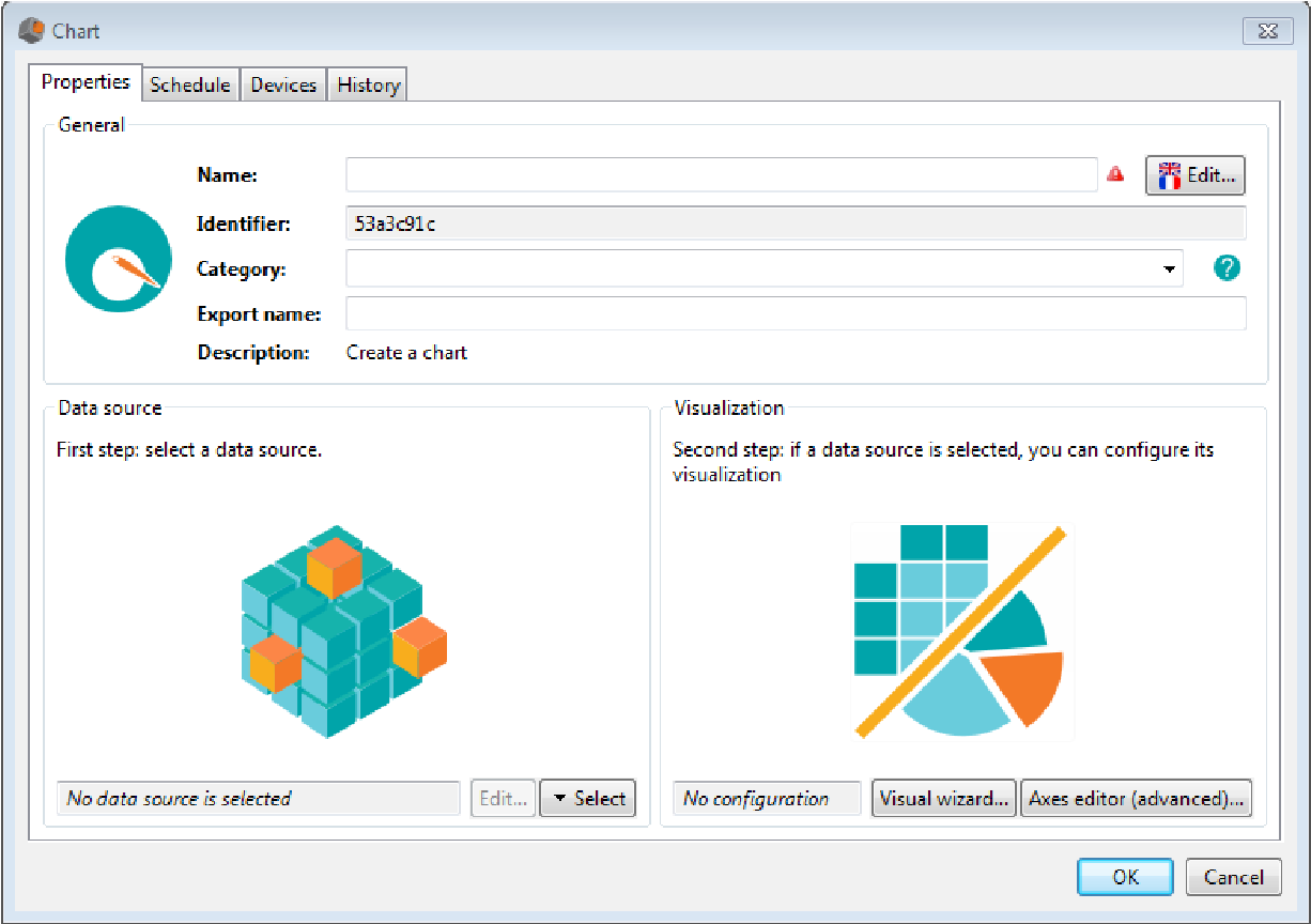
II. Add a data model
Data models describe :
- The data source (Databases, excel, CSV files, Business Objects reports or Cognos report,OLAP cube,...),
- Dimensions and hierarchies,
- Indicators (coming directly from the data source or calculated),
- Refresh frequency
II.1 Extract data from a data source
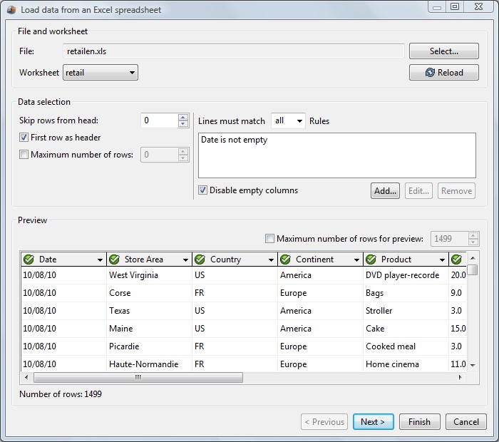
II.1.1 Extract data from a file
Using DigDash Enterprise, you can extract data from a wild range of files:
- Business Intelligence reports: Business Objects, Cognos, BIRT,
- Excel files,
- Csv files,
- HTML tables,
- XML files.
You first need to define the connection parameters to the file, then configure the data source.
Step 1 : Setting the connections parameters:
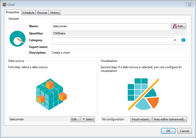
- In the flows pane located on the left, click the Data model icon . If the user has roles, the dialog box Add flow is displayed. Select the wallet in which you want to add the data model: current user or role. The Chart dialog box opens up.
- In the Data source section, click the Select button, then click the New button. Select the file type you want to use: Excel, Cognos, Business Objects, BIRT, CSV, HTML, XML,...
- Files available in the documents server are displayed. Select the appropriate file or add a new document to the documents server by clicking the Add a file to the server button and then selecting the file you want to add.
- Click the OK button
- The Load data from... dialog box is displayed
Step 2 : Configure the data source
- If you use an excel spreadsheet having several worksheets, select the worksheet in the worksheet drop-down list.
- Check First row as header if you want to use the names in the first row of the file as columns names.
- Limit the number of lines to be used:
- To remove lines at the beginning of the files, check Skip rows from head then enter the number of lines you want to remove.
- To remove lines at the end of the file, check Maximum number of lines then enter the maximum number of lines to take into account.
- Add filters on columns:
- Check the Disable empty columns to remove empty columns from the data model.
- Click the Add button to define filters on columns:
- Select the column to filter in the drop-down list on the left
- Select the operator in the list of available operators:
Operator Description Is not empty Displays the line if the column value is not empty Is empty Displays the line if the column value is empty Equals to Displays the line if the column value is equal to the value set as the operand. Contains Displays the line if the column value contains the value set as the operand. Doesn't contain Displays the line if the column value doesn't contain the value set as the operand. Differs from Displays the line if the column value differs from the value set as the operand. Match regular expression Displays the line if the column value matches the regular expression set as the operand. Is superior to Displays the line if the column value is greater than the value set as the operand. Is superior or equal to Displays the line if the column value is greater or equal to the value set as the operand. Is inferior to Displays the line if the column value is less than the value set as the operand. Is inferior or equal to Displays the line if the column value is less or equal to the value set as the operand. Start with Displays the line if the column value starts with the value set as the operand. Ends with Displays the line if the column value ends with the value set as the operand. Is in Displays the line if the column value is in the value set as the operand. Is not in Displays the line if the column value is not in value set as the operand. - Enter the operand used to compare the column:
The operand can be a fixed value (Example: Name equals to John Smith) or a variable. Variables allow data models personalizing .
You can use as variables all the attributes defined in your LDAP server. To add a filter using a variable, use the syntax: column_name operator ${user.variable}.
Example: Name equals to ${user.displayName}. When the chart is displayed, {user.displayName} is replaced by the name of the connected user. See annex 1 “user variables”.
- Click OK to validate the filter creation
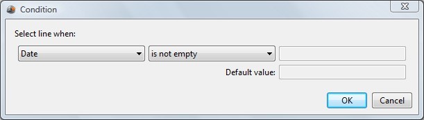
Data preview is displayed:
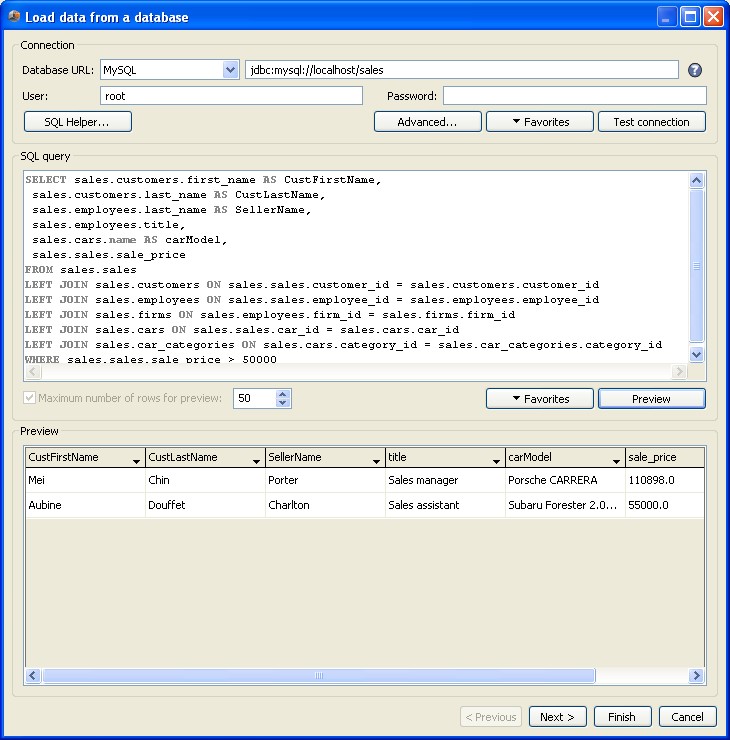
II.1.2 Extract data from a database
In the flow pane, click the Data model icon . The Chart dialog box opens up. In the Data source section, click Select then click New, and choose Database....
The Load data from a database dialog box shows up.
Enter the connection information:
- Select the JDC driver in the drop-down list:Oracle, SQL Server, MySQL, ODBC, DB2, DB2(AS 400) , PostgreSQL,Sybase , JDBC Proxy or H2
- In the Database URL field, enter the URL of your database using the syntax required by the driver (Syntax example for mysql: jdbc:mysql://[host] [,failoverhost...][:port]/[database][?propertyName1][=propertyValue1] [&propertyName2][=propertyValue2]... default port number is 3306).
- In the User field, enter the name of the user to use to connect to the database.
- In the password field, enter the password of the user to use to connect to the database.
- Click the Advanced button to enter the query timeout (in seconds)
- Click the Test connection button to get the connection status (connection success or connection error). In case of an error, you can modify the connection parameters.
- You can save the connection information as a favorite. To do so, click the Favorites button, then click Add to favorites....and enter the name of the connection.
You can write your SQL query manually or use the SQL helper as described below:
II.1.2.1 Write a SQL Query manually
- You can write your query directly in the SQL query field
- The query can include variables. Variables allow you to personalize data models . You can use as variables all the attributes defined in your LDAP server. To define a condition using a variable, use the syntax: where column_name operator $ {user.variable}. Example : where Name = ${user.displayName} (where Name is a column of your database). When a chart using the data model is displayed, $ {user.displayName} is replaced by the name of the logged user. For more information on variable, see annex 1 “user variables”
- Click the Preview button. By default, 50 lines are displayed. You can modify this parameter by typing the value in the Maximum number of rows for preview field.
- You can save the query to reuse it later. To do so, click the Favorites button, then click Add to favorites... and enter the name of your SQL query.
II.1.2.2 Generate a SQL Query using the SQL Helper
- You can generate your SQL query graphically using the SQL wizard. To do so, click SQL Helper....
- The window Support for the creation of sql query shows up. This window has three tabs used for three distinct steps:
◦ Step 1 : Tables selection and tables joins
◦ Step 2 : Columns selection and filtering
◦ Step 3 : Preview of the generated query
A) Step 1 : Tables selection and tables joins
On the left pane, you can see tables and views available in your database:
◦ select tables
◦ apply joins between the selected tables
◦ apply aliases on tables
Available operations:
| Operation | Execution |
| Add a table | Drag-and-drop table(s) containing the desired information on the drawing board located on the right. |
| Delete a table | To remove a table placed on the drawing board, right-click the header of the table, then select Delete the table. |
| Add a join | To add a join between two columns of tables placed on the drawing board, click successively on the two columns. A join between the two columns (represented by an arrow) is displayed. |
| Delete a join | On a join, right click the circle at the middle of the arrow, then select Delete the join. |
| Change the join type | On a join, right click the circle at the middle of the arrow, then select Change the join type. Select Left join, Right join or full join. |
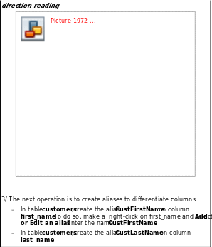
| Change the direction of a join | On a join, right click the circle at the middle of the arrow, and then click Reverse the direction of reading. |
| Add a table alias | Right-click the header of the table, and then click Add or edit a table alias. The alias table is displayed below the name of the table. |
| Add a column alias | Right-click the column, and then click Add or edit an alias. The alias is displayed besides the column name. |
| Add an aggregation on a column | Right-click the column and then click Add an aggregation. Select the desired type of aggregation:Sum, Average,Minimum, Maximum |
Legend :
| Symbol | Signification |
 | Loaded catalog |
| Loaded schema | |
 | Table not selected |
 | Selected table, without join |
 | Selected table with at least one join |
 | View not selected |
 | Selected view, without join |
 | View with at least one join |
 | LEFT JOIN |
 | RIGHT JOIN |
 | FULL JOIN |
 | Table content:
|
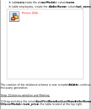
You can save your schema to reuse it later. To do so, click Favorites, then click Add to favorites and enter the favorite name.
When your schema is complete, click Next > to continue the creation of your query. B) Step 2 : Columns selection and filtering:
Three tables are displayed in the page:
- the table on the left contains the columns available in the schema created in step 1.
- the table at the top right is empty. Add the columns you want to display in this table.
- the table at the bottom right is also empty. Add the columns you want to filter in this table.
Available operations:
Operations Execution Select a column Drag and drop the desired column(s) on the table at the top right. Filter a column Drag and drop the desired column(s) on the table at the bottom right. The Edit filter rule window shows up. Select the type of filter you want to apply.
When you are done with the selection and filtering of your columns click Next>.
C) Step 3 : Preview of the generated query
Click Finish to preview the query generated by the SQL helper
Note: You can manually modify the query generated by the SQL helper. In that case,be aware that the changes won't be taken into account when you will reedit the query using the SQL Helper.
- Click the Preview button. By default, 50 lines are displayed. You can modify this parameter by typing the value in the Maximum number of rows for preview field.
- You can save the query to reuse it later. To do so, click the Favorites button, then click Add to favorites... and enter the name of your SQL query.
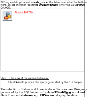
Example of a query generation:
Note: This example has been made using the sample database provided in the installation_folder/documentation/en/sample folder (sales.sql). This script was executed on a MySQL database.
Goals :Select the name and surname of customers, the vendor name and title, the model of car purchased and the price of transactions above 50000$.
Step 1 : Creation of a relational schema:
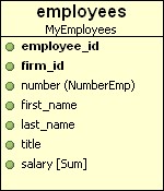
1/ Once connected to your database via the SQL Helper, select all available tables: customers, employees, firms, sales, car_categories, cars and place them on the drawing board. clear the Use names extended box.
2/ join the tables:
- Create a join between the tables sales and customers: click the column customer_id in the sales table, and then, click the column customer_id in the customers table.
- Create a join between the tables cars and sales: click the column car_id in the sales table, and then click the column car_id in the cars table.
- Create a join between the tables cars and car_categories: click the column car_category in the cars table, and then click the column category_id in the car_categories table.
- Create a join between the tables sales and employees: click the column employ_id in the sales table, and then click the column employe_id in the employees table.
- Create a join between the tables employees and firms: click the column firm_id in the employees table, and then click the column firm_id in the firms table .
Note : When creating a join, the order in which you select the columns is important because it defines the direction of the join. If you want to change the direction of the join, right-click on the symbol of the join and select Reverse
II.1.3 Extract data from a cognos portal
To get information on how to extract data from a cognos portal, refer to the documentation “cognosconnector_technical_en.pdf “
II.1.4 Extract data from Business Objects XI portal
To get information on how to extract data from a Business Objects XI, refer to the documentation “boconnector_technical_en.pdf”
II.1.5 Extract data from an OLAP query
- DigDash Enterprise allows you to extract data coming from OLAP database.
- In the flow pane, click the data model icon . The Chart dialog box shows up. In the Data source section, click Select, then New and OLAP query.
- The dialog box Load data from an OLAP query is displayed.
- Enter the connection information:
- Select the driver in the drop-down list: Olap4j
- In the OLAP URL field, enter the URL of your database using the correct syntax (example: jdbc:xmla:Server=http://localhost/olap/msmdpump.dll;Catalog=TestCatalog).
- In the User field, enter the name to use when connecting to the database.
- In the Password field, enter the password to use when connecting to the database.
- Click Test connection to get the connection status (success or error). In case of an error, modify you connection settings.
- Enter you MDX query manually or use the MDX query helper to generate it.
II.1.5.1 Write a MDX query manually
- You can directly enter your query in the MDX query field
- Click the Preview button to display the first fifty lines of the result. You can modify the number of lines displayed in the preview by updating the value in the Maximum number of rows for previews field.
- If you want to save your query, click the Favorites button below MDX. Select Add to favorites, then select the name of your query.
II.1.5.2 Generate a MDX query using the MDX helper
• You can generate your MDX query graphically using the MDX wizard. To do this click MDX Helper ....
• The window Support for the creation of mdx query shows up,
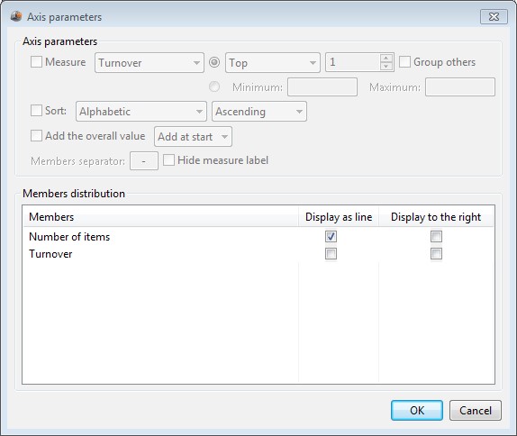
- The first step is to select the cube that you want to query. In the available cubes list displayed at the top left of the window, select your cube. All measures and dimensions of the selected cube are displayed.
- The table displayed at the top left of the screen shows the available measures. Drag and drop the measures you want to use from this table to the table on the right.
- Available dimensions are displayed below available measures. Drag and drop the dimensions you want to use in your query from this table to the dimensions table on the right. You can then select the hierarchy and the level to analyze by selecting them respectively in the Hierarchy and Level drop down boxes.
- To apply filters on a dimension, click Off > New.... The window Edit filter shows up. Choose the hierarchy and level you want to filter then select the members.
To add a filter on a dimension which is not displayed on an axis, click the Filters button. Click Off <New... on the line of the dimension you want to filter, then select the members you want to display.
- To modify properties of your axes, click the Properties button
 . The window Axis parameters shows up. You can choose to display the n top or n bottom values of a measure. The second line allows you to apply a sort on the axis.
- When you have completed the selection of your dimensions, click Next>.The query generated by the MDX helper is displayed. At this stage you can still modify the query. Once you are done, click Finish to quit the MDX helper.
Note: If you modify the MDX query generated by the wizard, changes will not be taken into account when you will come back to the MDX Helper.
II.1.6 Mix data from several data sources (union)
With DigDash Enterprise, you can merge data coming from several data sources into a single data source.
- In the flow pane, click the Data Model icon . The dialog box Chart is displayed. In the Data source section, click Select, then choose Source Merger (union)...
- The dialog box Load and merge data from other data sources shows up. Select the data sources you want to use by clicking the add button then by choosing Existing (in that case, select the data source in the list of existing data sources) or New (in that case, create a new data source).
- Dimensions and measures of each selected data source will be merged based on their name and type: if an object has the same name and type in the selected data sources, it will be considered as the same object and will appear only once in the result data source.
- Select the way you want to manage doubles by selecting one of the following options in the drop down box:
- No Exclusion: This is the default value. Doubles will be kept.
- Deduplicate all: Check the dimensions columns that will be used as keys to find out doubles. Only the first value of the key will be kept. All the doubles will be removed.
- Deduplicate all except those in first data source: Check the dimensions columns that will be used as key to find out doubles. Doubles coming from the first data source are kept, those coming from other data sources are removed.
- Deduplicate all except those in the same data sources: Check the dimensions columns that will be used as key to find out doubles. Doubles coming from the same data source are kept, those coming from other data sources are removed
Example: Merge between 2 data sources: Source 1 based on sales1.xls and Source 2 based on sales2.xls.
File Sales1.xls :
Date Product Unit price Quantity Total price 12/24/11 Ref2 32 11 352
12/24/11 Ref3 12 14 168
12/24/11 Ref5 10 6 60
12/24/11 Ref3 12 15 180
12/24/11 Ref2 32 24 768
File Sales2.xls :
Date Product Unit price Quantity Total price 12/24/11 Ref2 32 6 192
12/24/11 Ref3 12 4 48
12/24/11 Ref6 18 6 108
12/24/11 Ref1 5 20 100 12/24/11 Ref4 40 23 920
12/24/11 Ref3 12 10 120
12/24/11 Ref7 10 3 30
12/24/11 Ref3 12 12 144
12/24/11 Ref2 32 23 736
12/24/11 Ref1 5 10 50
12/24/11 Ref4 40 7 280
- If you select Date and Product as key columns and choose the option Deduplicate all, only the first occurrence of each key value will be kept. The result will be:
Date Product Unit price Quantity Total price 24/12/2011 Ref1 5 20 100
24/12/2011 Ref2 32 11 352
24/12/2011 Ref3 12 14 168
24/12/2011 Ref4 40 23 920 24/12/2011 Ref5 10 6 60 24/12/2011 Ref6 18 6 108
24/12/2011 Ref7 10 3 30
- If you select Date and Product as key columns and choose the option Deduplicate all lines except those in first data source, all occurrences of each key value will be kept except those of the first data source. The result will be:
Date Product Unit price Quantity Total price 24/12/2011 Ref1 5 20 100 24/12/2011 Ref2 32 35 1120 24/12/2011 Ref3 12 29 348 24/12/2011 Ref4 40 23 920 24/12/2011 Ref5 10 6 60 24/12/2011 Ref6 18 6 108 24/12/2011 Ref7 10 3 30 - if you select Date and Product as key columns and choose the option Deduplicate all lines except those in the same data source, all occurrences of each key value will be kept except those coming from the same data source. The result will be:
Date Product Unit price Quantity Total price 24/12/2011 Ref1 5 30 150 24/12/2011 Ref2 32 35 1120 24/12/2011 Ref3 12 29 348 24/12/2011 Ref4 40 30 1200 24/12/2011 Ref5 10 6 60 24/12/2011 Ref6 18 6 108 24/12/2011 Ref7 10 3 30
II.1.7 Mix data from several data sources (join)
With DigDash Enterprise, you can join data coming from several data sources into a new data source. Joining is done using one or more key dimensions.
- In the flow pane, click the Data Model icon . The dialog box Chart is displayed. In the Data source section, click Select, then choose Source Merger
(join)...
- The dialog box Load and combine data from other data sources shows up. Select the data sources by clicking the add button then by choosing Existing (in that case, select the data source in the list of existing data sources) or New (in that case, create a new data source).
- In the Key columns table, check the dimension that will be used as key to join the data sources.
- Select the join mode in the drop down box:
- inner join: Join will return rows where there is at least one match in all data sources.
- Outer join (first source): Outer joins return all rows of the first data source even if there is no matching rows in other data sources.
Exemple of join between two excel files : The first file contains customer information (customer.xls) and the second one sales done for those customers (sales.xls). • Create a first data source customer using the file customer.xls:
1 John Smith John.Smith@yahoo.com 04/02/68 626 222-2222 2 Steven Goldfish goldfish@fishhere.net 04/04/74 323 455-4545 3 Paula Brow n pb@herow ndomain.org 05/24/78 416 323-3232
• Create a second data source sales using the file sales.xls: | |||||||||||||||||||||||||||||||||||||||||||||||||||||||||||||||||
CustomerID Date Sales amount
6 07/29/09 50
This time, sales done for customer 6 is part of the result (it contains all rows of the sales table even if the customer ID is not in the customer file). |
II.1.8 Transform data from a data source
DigDash Enterprise lets you transform data from a data source. The data transformer offers several functions:
- Compact data coming from the data source: remove dimensions, measures, hierarchy levels or add filter on the original data source.
- Translate data coming from the data source: use hierarchies levels of your original data source as dimensions of the transformed data source.
Example: On your original data source, create a hierarchy “country code” . This hierarchy has one level “Code” with values “FR” for France and “US” for United States. In the transformed data source, add the dimension “Country” and select the level “Code”. Codes will be directly usable as dimensions values of your transformed data source.
- Concatenate dimensions : Group values of several dimensions in a single dimension (example: add the dimensions “customer ID” and “customer name” in one single dimension “customer ID-customer name”) .
- Change the column types : once you have selected your dimensions and measures, click Next. The Data Source advanced configuration dialog box opens up. Select the column, then the type in the Type drop down box.
- In the flow pane, click the Data Model icon . The dialog box Chart opens up. In the Data source section, click Select, then choose Source transformer.
- The dialog box Transform data from another data source shows up. Select the data source you want to use by clicking the Select button then by choosing Existing (in that case, select the data source in the list of existing data sources) or New (in that case, create a new data source). The content of the data source is displayed.
- Use drag and drop to remove measures or order them differently
- Use drag and drop to remove dimensions or reorder them. Place the dimensions you want to concatenate on the same column. If you want to use specific hierarchy levels, select them in the hierarchy and Level columns.
- Click Next. The dialog box Data source advanced configuration shows up. Enter the name of the data source, then modify the columns parameters (name, type) if you want to.
II.2 Configure the data model
DigDash Enterprise Selects the columns properties automatically.
You can change these properties in the Data source advanced configuration dialog box showing up when clicking the Next button in the Load data from... dialog box
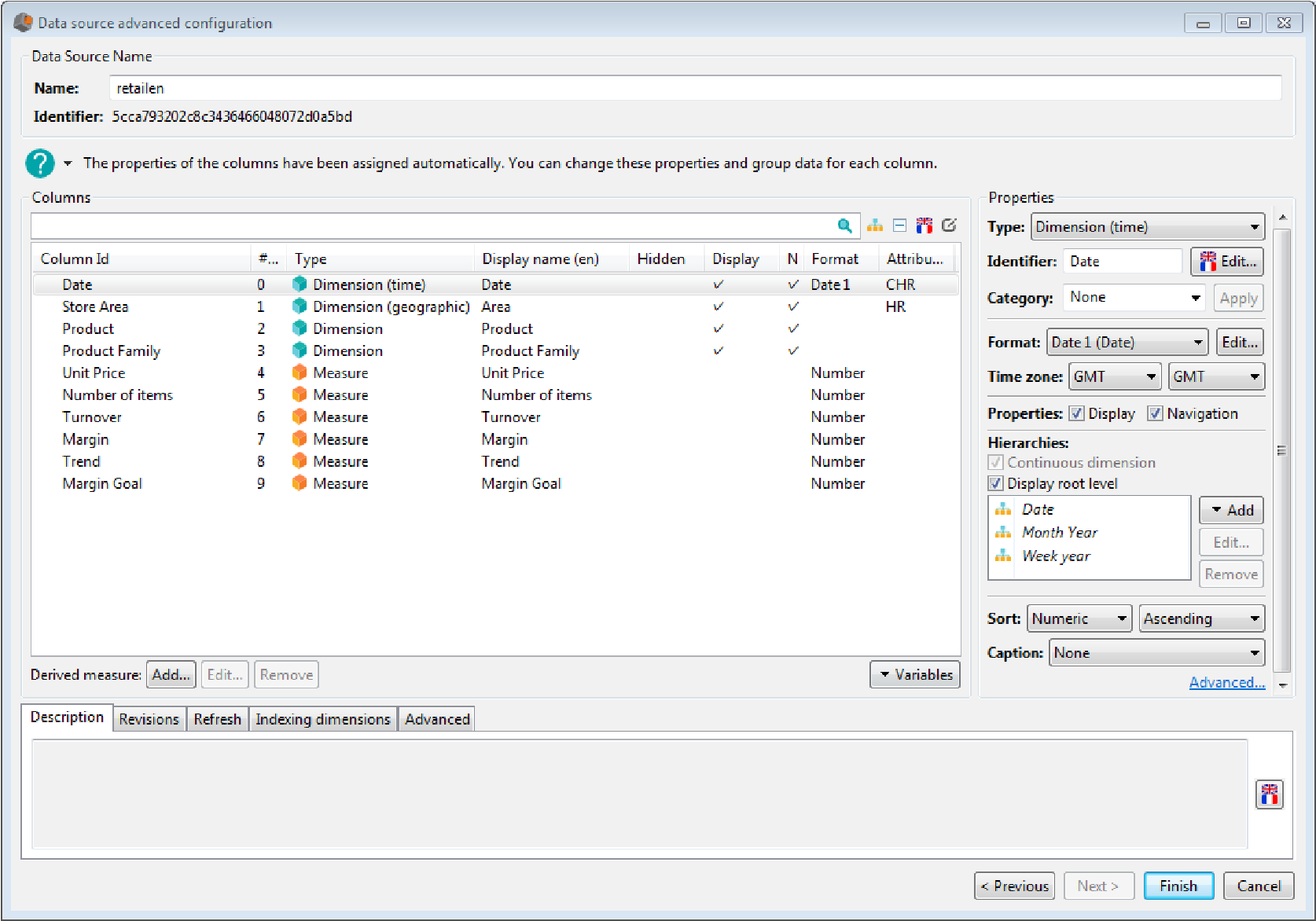
From this dialog box, you can modify the data source parameters:
- Change the data source name: type the name in the Name field,
- Modify the refresh frequency (by default, the data source is refreshed everyday at 8pm).
- Add a description to the data source
- Display data source revisions
- Define the cube processing mode: on the server or automatic (client or server depending on the cube size)
- Define data search options (used by Query Text)
You can also modify the column properties:
- Type
- Name
- Aggregation function
- Format
- Sort
- Time zone (for time dimensions)
- Caption
- Display and navigation properties
- Display or not of the column (in the visualization configuration dialog box)
- Category
You can create a hierarchy on a column, add an objective on a measure or create a derived measure.
II.2.1 Modify the refresh frequency
By default, the data source is refreshed every day at 8PM. You can modify this refresh frequency or add a new refresh frequency.
To add a new refresh frequency, open the Refresh frequency tab, then click Add and select the refresh frequency.
To edit an existing schedule, select it then click the Edit button and choose the refresh frequency.
To get more information on schedule, refer to chapter “schedule refresh”
II.2.2 Modify the column type
Select the column, then in the columns properties on the right, select the type you want to use in the drop-down list:
- Dimension: alphanumeric data used to analyze data (examples: City, Product,...) . If you use numeric value, indicate whether the dimension is continuous (you can create specific hierarchies on continuous dimensions)
- Dimension (time) : Date. Default hierarchies are created on time dimension to allow exploration of data by years or months.
The first hierarchy, “Date”, has three levels: “Day”, “Month” and “Year” (example: for the date “02/25/2011”, the day level will display 02/25/2011”, the month level “February” and the year level “2011”) l
The second hierarchy “Month Year” has four levels: “Day”, “Month”, “Quarter” and “Year” (example: for the date “02/25/2011”, the day level will display 02/25/2011”, the month level will display “February 2011”, the quarter level will display “Q1 2011” and the year level “2011”)
the third hierarchy “week Year” has two levels: “Week” and “Year”, (example: for the date “25/02/2011”, the week level displays “ 8-2011 “ and the year level “2011”)
- Dimension (geographic): Geographic dimension (example : State) that can be used in map charts. A geographic hierarchy with levels “State”, “Country” and “Continent” is automatically created on those dimensions.
- Measure: Numeric data measuring a number or a quantity. Measures are automatically aggregated by dimensions used as analysis axes (examples :
Turnover , Margin,...)
Notes :
- You can modify the type of several columns at once. To do so, select the columns, then choose the desired type.
- DigDash Enterprise shows dimensions with a blue cube
 and measures with an orange cube
II.2.3 Modify the column identifier
Select the column, then type the name in the identifier: field.
By default, this identifier is used as the dimension name.
Use the multilingual edition to translate the column name in different languages. In that case, the column name displayed depends on the language of the user.
Note: if you change the identifier of a column, it will be removed from all the flows using it (which can result in making flows invalid). If you want to rename a dimension without impacting the flows, modify its label from the multilingual edition.
II.2.4 Modify the aggregation function of a measure
By default, the aggregation function used for a measure is the sum. To modify it, select the measure, then choose the aggregation function in the drop-down list: Average, Min, Max or Running sum (running sum of the measure values).
The function will be used to aggregate measure value on the dimensions axes.
II.2.5 Modify the column format
You can modify measure and dimension (time) formats.
Select the format you want to use it in the drop down box besides Format: or edit the format by clicking the edit button. The dialog box Format editor shows up.
Select the format you want to use or create a new format (see chapter “Format data”).
II.2.6 Sort a column
Select the dimension, then choose the sort type in the drop down box Sort:
Alphabetic, Numeric (choose this sort type to sort time dimensions) or Manual...
If you select Manual, the dialog box Sort root members on dimension shows up. Drag and drop the items at the correct position or use the move up  and move down
  icons
icons
II.2.7 Modify the time zone
You can modify the time zone of time dimensions by specifying the time zone of the data source (first drop down box) and the time zone in which you want to display the date (second drop down box).
II.2.8 Add a caption
You can add a caption to a column. In that case, values of the caption will be displayed instead of values of the column. For example, if you add a caption B on a dimension A, then display the dimension A in a chart, the values of the caption B will be displayed. You must have a relation 1-1 between the dimension and the caption. It can be used for example to set a caption on numeric dimensions.
II.2.9 Modify display and navigation parameters
- If you don't want to display a dimension in the interactive filters bar, clear the Display box. This property will be used by default on all information flow using the dimension. It is then possible to modify it in the information flow itself.
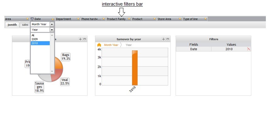
- If you don't want to navigate on a dimension, clear the Navigation box.
II.2.10 .Hide/Show a column
Right click a column, then select Show/hide to hide the columns that you don't want to use in your charts (hidden columns are not displayed in the configuration of the visualization).
These measures are still visible in the Data Source (you can for example hide measure that are only used to create derived measures)
II.2.11 Assign to a category
Right click the column, then select Assign to category. Choose New... to create a new category or select an existing category.
II.2.12 Create a hierarchy on a column
You can create hierarchies on dimensions to allow exploration of data by hierarchy levels.
On a time dimension, three date hierarchies are automatically created: “Date” “Month Year” and “Week Year”. Date and Month Year hierarchies have three levels: day, month and year. Use the “Date” hierarchy to display the months with the month name only (January, February,...) . Use the “Month Year” to display the months with the month and year name (Jan 2010).
To create a hierarchy, select the column then click Add under hierarchies. Depending of the dimension you select (discrete or continuous), you can create different types of hierarchies.
II.2.12.1 Create a hierarchy on discrete dimensions
You can create three types of hierarchy on discrete dimensions:
- Automatic: hierarchy levels are based on dimensions of your data model
- Manual: hierarchies levels are created by selecting values for each level manually.
- Drill path: define the navigation path between the dimensions of your data models.
If your dimension contains geographic values, you can also create geographic hierarchies.
Create an automatic hierarchy:
In the Hierarchies section, click add then Automatic grouping.
The default hierarchy name is group0. You can rename it by entering a new name in the group field.
The path of the hierarchy is displayed in the Complete path field. Each hierarchy level is separated from the following one by a /. The column on which you create the hierarchy is the first level of the hierarchy. You must select the columns to use for the following levels in the drop-down lists available for each level.
Following options are advanced settings of the hierarchy:
- For undefined groups, you can either choose to rename or ignore them. You can also balance the hierarchy. The default option is to rename undefined groups as “other”. You can change this label by clicking the Edit... button then updating the translation. You can also select one of the 2 other options: Handle un-balanced hierarchy or ignore undefined groups.
- By default, the hierarchy is simple. It means that each element has only oneparent (example: a country belongs to only one continent). If you want to use a multiple hierarchy (an element can have several parents), clear the Simplify hierarchy box.
Create a manual hierarchy:
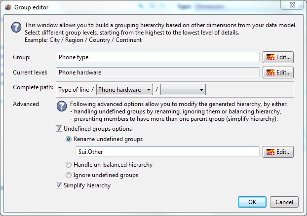
In the hierarchies section, click Add then Manual grouping. The Group editor dialog box shows up.
- The name of the hierarchy is Group0. You can rename it by entering the new name in the group field. A first level called level0 contains all the column values. You can rename this level by entering a name in the Current level field.
- To add a new hierarchy level click the Add level button and enter the hierarchy level name.
- To remove a level, select it in the path then click the Remove level button. Selected level as well as following levels are removed.
- To add a member in the selected level, click the Add button at the bottom left of the dialog box and enter the member name. Check the values that you want to add to this hierarchy member (in the list of values displayed on the right). Click the next page
 and previous page
  icons to display following or previous value.
 - To create one group for each member of the dimension, click Tools, then Assign one member per group.
- To assign all members which are not part of a group to a specific group, select the group, then choose Tools-Assign unselected members to the selected group
- To remove some groups of a hierarchy level, select them, then click the Remove button or right click and select Delete.
- To remove some members of a group, select the group then clear the boxes of the members you want to remove from the group. If you want to remove all members of a group, right-click the group, then select Remove all members.
- To rename a group, click F2 or right-click the group and choose Rename.
- To translate a group name, select the group, right click and choose Multilanguage edition. Enter the name for each language.
- To modify sort used on groups (by default, the sort used is the sort of the dimension), click Inherited from button, then choose alphabetic, Numeric or Manual. If you select Manual, drag and drop groups at the correct position.
Create a drill path:
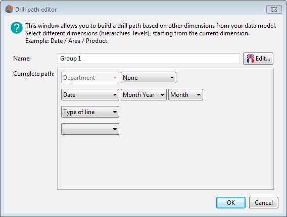
In the Hierarchies section, click Add then Drill path. The Drill path editor opens up.
- Enter the drill path name.
- The path is displayed in the Complete path field. Each level is set on a different line and is made of a dimension and possibly its hierarchy level.
- The column on which you create the drill path is the first level of the drill path and is displayed on the first line.
- To add the second level, unfold the drop-down box on the second line then select the dimension to use. If a hierarchy is available, a drop-down box Hierarchy is displayed besides the dimension name. Select one if you want to.
- Do the same for the following levels:
II.2.12.2 Create a hierarchy on continuous dimensions
You can create hierarchies (calculated or explicit) or drill paths on continuous dimensions.
Create a hierarchy:
Click Add then Hierarchy. The dialog box Grouping for continuous dimension shows up. This dialog box contains two tabs: New Hierarchy and Shared hierarchies. To create a new hierarchy, select the type of hierarchy (explicit ot calculated), then enter the values of the hierarchy (for more information, refer to section Add a hierarchy in the paragraph Hierarchy manager).
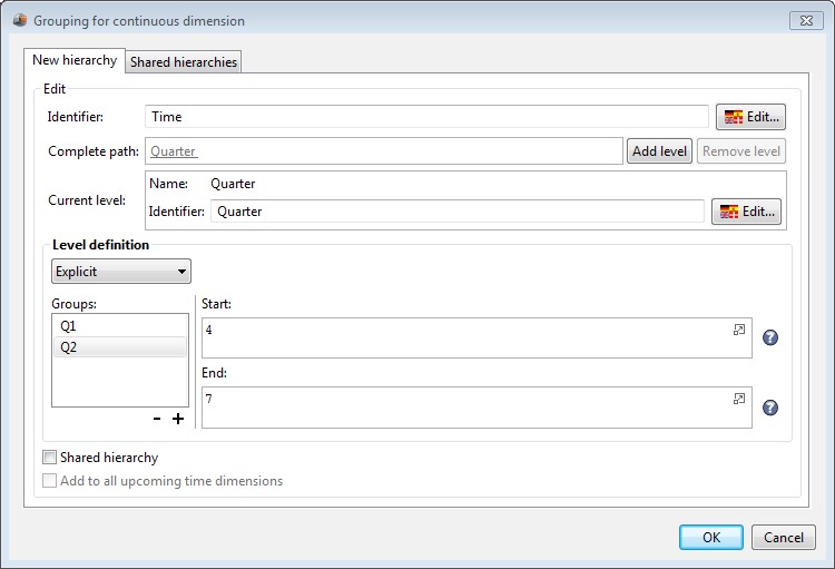
You can share the hierarchy. In that case, the hierarchy can be used on every dimension and all data models.
If you want this hierarchy to be automatically added to all the new time dimensions, check the box Add to all upcoming time dimensions.
If you want to use a shared hierarchy, open the Shared hierarchies tab, then select the hierarchy in the dictionary.
II.2.13 .Create a target on a measure
You can define targets on measures. These targets can be used in charts like gauges or indicators for example.
To create a target on a measure, select the measure, then in the Target section, click the Add button.
The Target definition dialog box is displayed.
- Enter the name of the target in the Target field.
- In the definition section, enter the main parameters of the target:
- Select the target type in the Good when drop-down list: Increasing , Decreasing or stable
- Enter the difference that you consider acceptable (Acceptable field) and bad (Bad field) between the value and the target. These values can be percentages or added values.
- Select the colors that you want to use for each area. By default, green is used for values greater or equal to the target, yellow for acceptable values and red for bad values.
In the Allocation section, select the type of allocation you want to use:
- Automatic: the target is shared equally between all members of the dimension (example: the target of your turnover is 10 million dollars. This target is equally shared on each branch of your company. If you have 10 branches, each branch has to reach 10% of the target).
- Manual: define manually the distribution of the target between each member of the dimension (in percentage)
- Ignore: the target is the one you have defined initially and is not shared between dimension members (example: on time dimensions, the target is the same regardless of the date).
In the Target over time section, select the evolution type:
- Fix: If your target is fixed, select Fix then enter the target value.
- Measure: if your target is defined by a measure value, select Measure, then select the measure.
Example: You want to create a target of 3 Millions on your turnover . You consider acceptable a difference of 5% compare to the target and you consider bad a difference of 10% compare to the target. • In the definition section, select Good when Increasing. |
II.2.14 Create a derived measure
You can create measures based on existing measures or dimensions.
These new measures can use variables that can be changed in the dashboard.
Click the Add button besides Derived measure:. The dialog box Derived measure shows up.
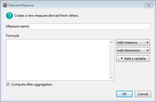
Enter the name and the formula (in JavaScript) of the measure.
- Add a measure in your formula: typing the first letters of your measures in the formula field displays all the corresponding measures. You can also click Add measure then select the measure that you want to use. “Measure(sum)” is added to the formula. Sum is the default aggregation function used for a measure. You can modify this function by clicking “Sum” then by selecting the function you want to use (Average, Min, Max,Axis Running sum) in the Associated measure dialog box.
You can also add parameters to the selected measures (filters, exploration levels,...) to the selected measure. To do so, click the measure. The dialog box Associated Measure shows up.
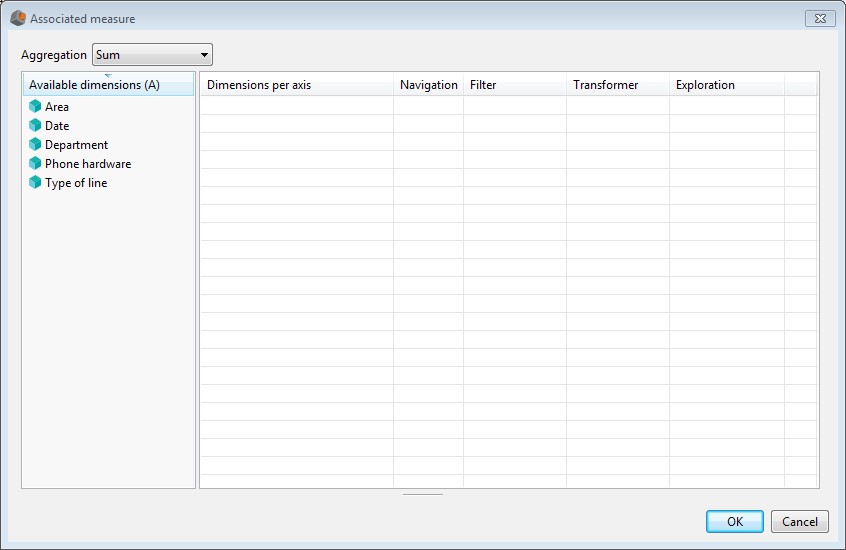
In this dialog box, you can specify parameters to use for each dimension.
- Navigation: if you don't want to activate navigation on a dimension (and get the overall value of the measure for this dimension), add the dimension to the table on the right, then clear the Navigation box.
Example :
You want to create a measure calculating the percentage of the communication costs for each department compare to the value for all departments:
- Filter: to add filter on a dimension, add the dimension, then click “Off” in the filter column. Enter the filter values after selecting the filter type:
- Elements : select the values manually,
- Min/Max : only available on date dimensions. Enter minimum and maximum values used for the date,
- Rule : describe the rule to follow for the filter
- Function : only available on date dimensions. The minimum and maximum functions define limit values of the date. They are stored in a function dictionary and can be reused. Select one of the existing JavaScript functions or use your own functions.
if you want to use a minimum and a maximum based on the current year (and not a fixed year), you can use the following Minimum and Maximum functions : minimum = return new Date(new Date().getFullYear()-1 , 0, 1).getTime()/1000 maximum = return new Date(new Date().getFullYear()-1 , new Date().getMonth(), new Date().getDate()).getTime()/1000 ) |
- Transformer: a transformer allows you to transform a filter used on a chart. This can be used to follow an evolution for example (from Year N-1 to Year N or from month N-1 to Month N). To add a transformer on a dimension, add the dimension, then click Off in the transformer column. The dialog box Edit transformer for dimension shows up. Select an existing JavaScript function or create a new one.
- Exploration level: enter the hierarchy level to use compare to the one used in the visualization. You can select levels between +1 to +10: +1 is the parent level, +2 means two levels above the current selection,.... For example, if you use a date dimension which has a “month year” hierarchy (with levels “Day”, “Month”, “Quarter” and “Year”): If you display values using “Day” level, a derived measure displaying Date with level +1 will return values for the month level (if you select +2, it will return values for the quarter level,...) .
- Add a dimension to your formula: typing the first letters of your dimensions in the formula field displays all the corresponding dimensions. You can also click Add dimension then select the dimension you want to use. “Dimension (dcount)” is added to your formula. Dcount calculates the count distinct of your dimension values. If you click the dimension, the dialog box Associated measure shows up. From this dialog box, you can change the aggregation function to use Dmember. DMember returns the dimension value.
- Add a variable to your formula: typing the first letters of your variables names in the formula field displays all the corresponding variables. You can also click Add a variable to add a new variable.
- Enter the name,
➢ Enter the default value,
- select the type of variable you want to use:
- Calculated: define a range of values that can be used for the variable. Define the Minimum and Maximum values (give the same value for the minimum and maximum if you don't want to use a maximum and a minimum) and an increment value.
- Explicit: define all possibles values for your variable. Enter each value and its name.
- Manual: Enter the default value only. User will manually enter the value in the dashboard.
- select the variable format
Example :
You want to create a measure Turnover_Euro which converts a turnover in $ (Turnover_dollar) in €. This measure is based on a variable which is the dollar exchange rate. The formula you want to use is Turnover_Euro
= Turnover_Dollar * Dollar exchange rate
- Click Add besides Derived measure
- Enter “Turnover_Euro” in the measure name field
- Click the Measure button, then select “Turnover_Dollar”. “Turnover_Dollar(sum)” is inserted in the formula
- Type * in the Formula.
- Click Add a variable to define your “Dollar exchange rate” variable:
- Name = Dollar exchange rate
- Type = Calculated
- Default value =0.70
- Minimum = 0 ➢ Maximum = 2
- Increment = 0.1
II.2.15 Add a description to the data source
In the first tab, Description, click the multilingual edition icon  then enter the description for each language.
II.2.16 Display data source revisions
Open the Revisions tab to display all versions of the data source. Comments entered for each revision are displayed. Each time you modify the data source, you are asked to enter a comment. If you do so, a new revision will be added. If you don't want to enter comments when you modify the data source, clear the Prompt for a comment when saving box.
II.2.17 . Modify indexation options
Indexing data model allow you to use them in text query (refer dashboard_editor_guide_en.pdf for more information).
To modify indexing options, open the Advanced tab then choose one of the three different options:
- Automatic (default value): only the models used by flows will be indexed.
Data models that are not used directly by a flow won't be indexed
(intermediate models used to build other models)
- Always: data model will be indexed even if it is not used directly by a flow
- Never: data model won't be indexed even if it is used directly by a flow
II.2.18 .Modify the cube processing mode
The cube can be processed on the client or the server (depending on the number of
lines in the cube as defined by parameters LARGE_ROW_LIMIT and SMALL_ROW_LIMIT in the server settings page) .
If you want to process your cube on the server, open the Advanced tab then select Always on server in Cube Processing mode.
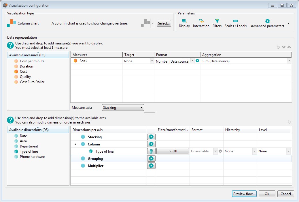
II.3 Select a visualization
Once you have selected a data source, you must select a graphical representation.
In the Chart dialog box “No configuration” is displayed in the Visualization section.
Click Visual wizard... or Axes editor (advanced) to select a chart type.
The visual wizard shows axes in a visual way and automatically displays the resulting chart after each modification.
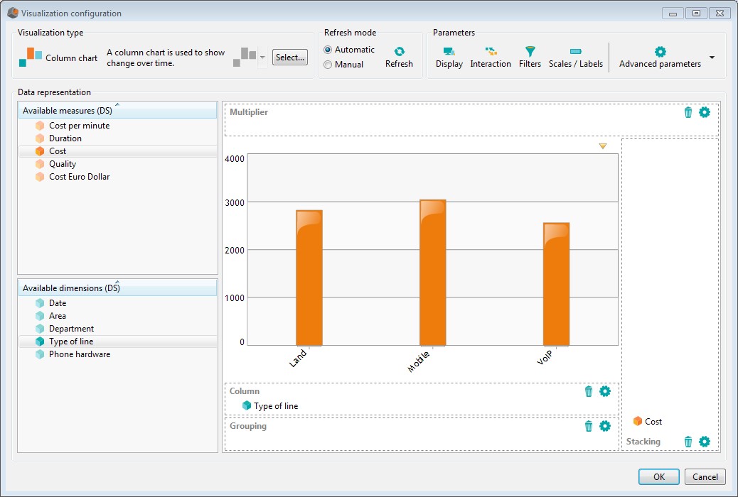
The axes editor is designed for users knowing DigDash Enterprise. Data must be added on each axis but the resulting chart is not displayed until you click the Preview button. Building a chart using axes editor can be quicker than with the visual wizard as the chart is not updated each time you modify it.
II.3.1 Select the chart type
DigDash Enterprise offers a wild range of charts types: bar, columns, gauges, lines, maps, pies,.... Depending on your data and the analysis you want to perform, you can pick up the one that best suits your needs.
Charts type are grouped in different categories according to their usage:
- Compare: compare charts are used for data comparison
- Maps: maps charts are used to visualize data in geographic map
- Performance: performance charts are used to visualize achievement of a measure compare to a target
- Tables: table charts are used to visualize data in rows and columns
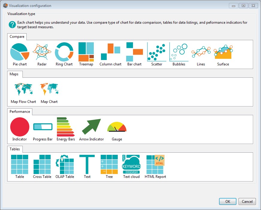
Note: Depending on your data, some charts might not be available. For example, if you don't have any measure in your data source, you won't be able to select charts in which measures are mandatory (performance charts for example).
You will find below a description of available charts.
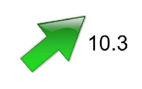
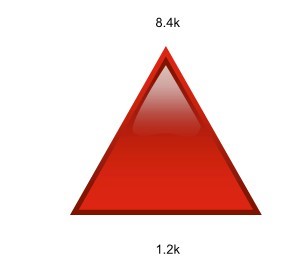
II.3.1.1 Arrow Indicator 
Description:
An arrow indicator is used to compare a measure with a goal and visualize its trend (2nd measure as a percentage) Usage:
- Drag and drop the measure along the measure axis.
- Select the measure target:
- if you use the axes editor, select the target in the drop down list of the target column (you must have defined your target in the data source first.)
- if you use the visual wizard, right click the measure, then choose Select target and the objective.
- Select a second measure representing the trend of the measure (as a percentage)
The color of the arrow represents the behavior of the measure compare to the target (by default, green means good, yellow means acceptable and red means bad).
The arrow direction (up, down or flat) shows the trend. The value displayed besides the arrow is the values of the trend.
Note: you must have at least two measures to use this chart
Example:
Indicator showing that the value of the measure is good compare to the target. The trend is increasing and its value is 10.3%:
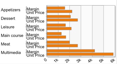
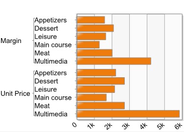
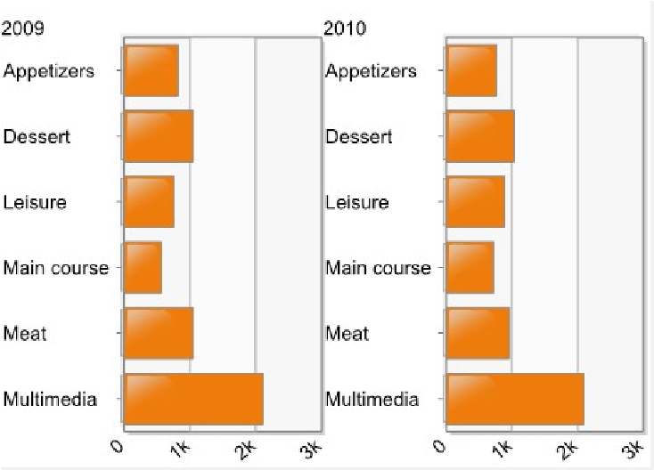
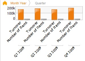
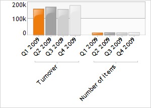
II.3.1.2 Bar 
Description:
A bar chart is used to compare items.
Usage:
- If you use the axes editor, add the measures on the measures table, then select the measure axis in the drop down list under the table. If you use the visual wizard, add directly the measures on the desired axis:
- Stacking (default axis) : Values of each measure are displayed side by side on a same bar.
-
- Bar: Each measure is displayed on a different bar. Bars are displayed one below the other, horizontally:
-
- Grouping: Each value of the measure is a different group on the Y axis:
- Drag and drop the dimensions on the desired axis
- stacking, bar and grouping: see the description above.
- Multiplier: the chart will be replicated for each value of the dimension: example: year is set on multiplier axis, so one chart is displayed for each year
Note: you must have at least one measure to use this chart
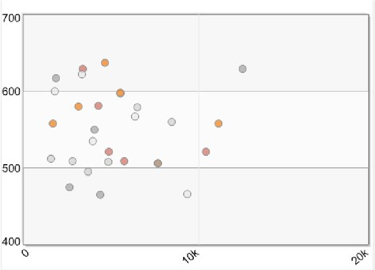
II.3.1.3 Bubbles 
Description:
This diagram shows the correlation between three sets of values. The first two ones are used as X and Y axes.
The third value determines the size of the bubble marker.
Usage:
- Add the 3 measure you want to display: one along the X horizontal axis, one along the Y vertical axis and the last one representing the size of the bubble.
If you use the axes editor, the selection of X, Y and size is done using the dropdown lists at the left of the measures names.
If you use the visual wizard, drag and drop the measures on the X,Y and size axes.
- Drag and drop the dimension that you want to display on the bubbles axis
- You can add a dimension on the multiplier axis: the chart will be replicated for each value of the dimension Example:
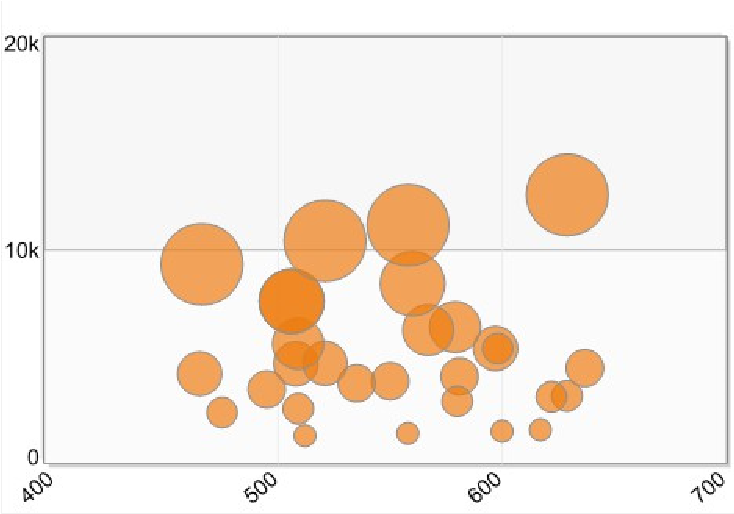
Note: you must have at least three measures to use this chart
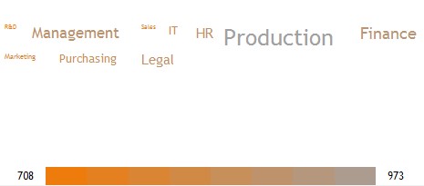
II.3.1.4 Cloud text 
Description:
A cloud text is used to represent measures values in a visual way. The cloud gives the largest font sizes to the dimensions values that have the highest measures values Usage:
- Drag and drop the measure in the measure axis.
- Drag and drop the dimension in the Words axis
Note: you must have at least one measure and one dimension to use this chart
Example:
Cloud text showing the cost by department:
II.3.1.5 Column and column plus line 
Description:
A column chart is used to show changes over time.
Usage:
- Add the measures on the measures axis (if you use the axes editor, you must select the measures axis in the drop-down list displayed under the measures table):
- Stacking (default axis) : Values of each measure are displayed one over the other on a same column.
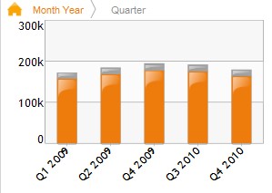
If you want to display some measures on columns and other on lines. Edit
the Stacking axis properties by clicking the properties icon . Click the Show members link, then select the measures you want to display as line.
If you want to display your measures on two different scales, check the measure that you want to display to the right.
The chart displayed is as follows:
-
- Column: Each measure is displayed on a different column. Columns are displayed one besides the other, vertically:
-
- Grouping: Each value of the measure is a different group on the X axis:
- Drag and drop the dimensions that you want to display on the appropriate axis ➢ stacking, bar and grouping: see the description above.
- Multiplier: the chart will be replicated for each value of the dimension: example: if you set year on multiplier axis, one chart will be displayed for each year
Note: you must have at least one measure and one dimension to use this chart
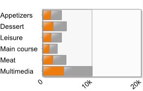
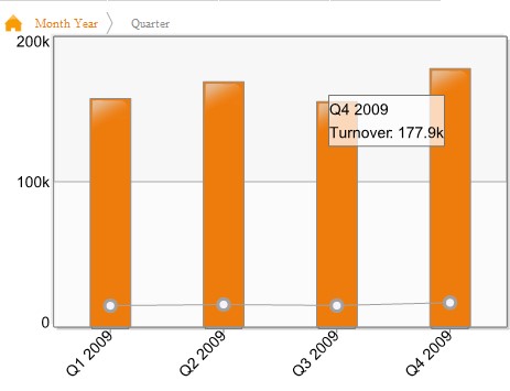
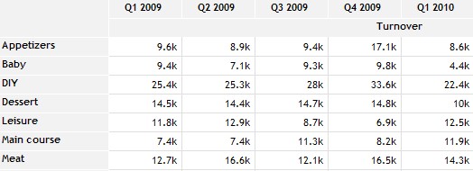
II.3.1.6 Cross table 
Description:
A cross chart is used to show data in columns and rows.
Usage:
- Add the measures on the desired axis:
- if you use the axes editor, add the measures in the measures table then select the measures axis in the drop-down list (column or row )
- if you use the visual wizard, drag and drop the measures in the desired axis (column or row )
- Drag and drop the dimensions in column and lines axes: you must add at least one dimension on the line axis and one dimension on the column axis. Note: you must have at least one measure and two dimensions to use this chart
Example:
Chart showing a “Turnover” ( on column2) per “quarter” ( on column 1) and “product family” (on row 1).
II.3.1.7 Energy Bar 
Description:
Energy bars are used to compare a measure with a goal and give a score between A and G.
Usage:
Add the measure you want to display on the measure axis then select the target:
- If you use the visual wizard, right click the measure and then choose Select a target and select your objective.
- If you use the axes editor, select the target in the Target column. Example:
Note: you must have at least one measure to use this chart
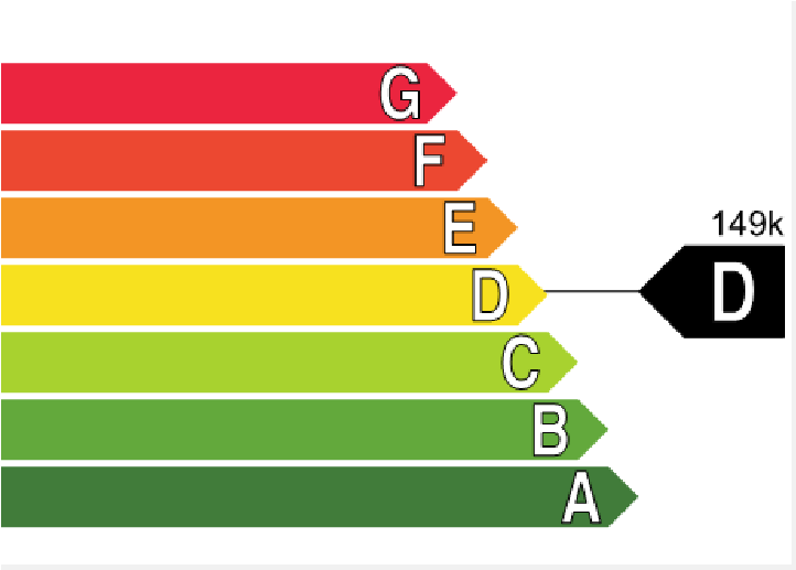
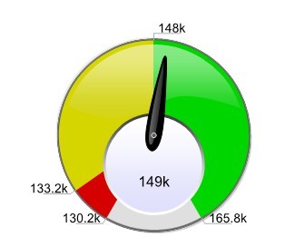
II.3.1.8 Gauge 
Description:
A gauge is used to compare a measure with a goal Usage:
- Drag and drop the measure along the measure axis.
- Select the measure target:
- if you use the axes editor, select the target in the drop down list of the target column (you must have defined your target in the data source first.)
- if you use the visual wizard, right click the measure, then choose Select target then choose the objective.
- Select the gauge type in the drop down list in the visualization type tool bar (from gauge 1 to gauge 6)
Note: you must have at least one measure to use this chart
Example:
Value of the measure is 149K which is greater than the target value:148K
II.3.1.9 HTML report 
Description:
HTML report shows data based on an HTML template.
Usage:
- Drag and drop the measures on the measures axis
- Drag and drop the dimensions in column axes
- Edit the HTML template by clicking Parameters/Extra Configuration. This template must have an item whose class is row_template
II.3.1.10 Indicator 
Description:
An indicator is used to compare a measure with a goal Usage:
- Drag and drop the measure on the measure axis.
- Select the measure target:
- if you use the axes editor, select the target in the drop down list of the target column (you must have defined your target in the data source first.)
- if you use the visual wizard, right click the measure, then choose Select target then choose the objective.
- You can select a second measure representing the trend of the measure (the trend can be positive if the trend is good, negative if the trend is bad or null)
The color of the indicator represents the behavior of the measure compare to the target (by default, green means good, yellow means acceptable and red means bad).
If you have selected a trend, it will be represented by an icon (up arrow, down arrow or equal).
Note: you must have at least one measure to use this chart
Example:
Indicator showing that the value of the measure is good compare to the target:
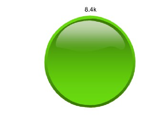
Indicator showing that the value of the measure is bad compare to the target. The trend is increasing:
II.3.1.11 Lines 
Description:
A line chart is used to compare several trends of data Usage:
- If you use the axes editor, drag and drop the measures in the measures table then select the measures axis in the drop down list.
- If you use the visual wizard, drag and drop the measures directly on the desired axis:
- Lines (default axis): Each measure is displayed on a different line:
-
- X : Each value of the measure is displayed on the horizontal X axis:
- Drag and drop the dimensions that you want to display on the appropriate axes (see the axes description above)
Note: you must have at least one measure and one dimension to use this chart
II.3.1.12 Maps 
Description:
A map is used to compare components in a geographic dimension
Usage:
- Drag and drop the measure in the measures axis.
- Drag and drop a geographic dimension on the geography axis (example: state).
Note: if you don't use a geographic dimension, Open the Parameters – Extra configuration dialog box and select the values to use for each level till the level you want to use. For example, if you want to use the state level, select values for World, Continent, Country and State. You can either select a fixed value for the level (for example, for the continent level, in the selection column, select Preselection, then in the value column, select America) or select a level of a hierarchy you have created (See chapter create a hierarchy on a column). To do so, select the hierarchy level in the selection column.
Example:
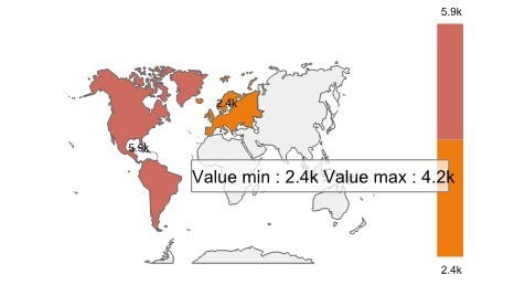
Note: you must have at least one measure and one dimension to use this chart
II.3.1.13 Maps flow 
Description:
A map flow is used to present links from source to destination on map Usage:
- Drag and drop the measure in the measures axis.
- Drag and drop a geographic dimension on the geography source axis (example: departure state).
- Drag and drop a geographic dimension on the geography destination axis (example: destination state).
Note: if you don't use the first level of the hierarchy, open the Parameters – Extra configuration dialog box and select the values to use for each level till the level you want to use. For example, if you want to use the state level, select values for Continent and Country. You can either select a fixed value for the level (for example, for the continent level, in the selection column, select Preselection, then in the value column, select America) or select a level of a hierarchy you have created (See chapter create a hierarchy on a column). To do so, select the hierarchy level in the selection column.
Example:
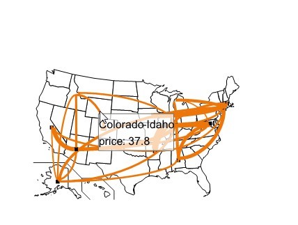
Note: you must have at least one measure and two dimensions to use this chart. One dimension must represent the source area and the other the destination area.
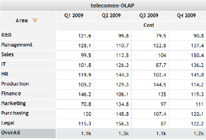
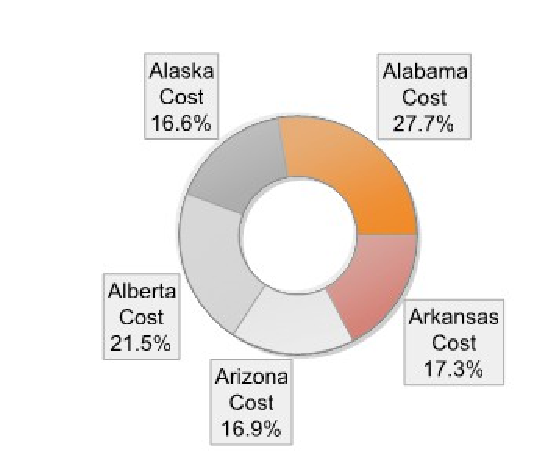
II.3.1.14 OLAP table 
Description:
An OLAP chart is used to show data in columns and rows. A dimension is used to filter data.
Usage:
- Add the measures on the desired axis:
- if you use the axes editor, add the measures in the measures table then select the measures axis in the drop-down list (column or row )
- if you use the visual wizard, drag and drop the measures in the desired axis (column or row )
- Drag and drop the dimensions in column and row axes: you must add at least one dimension on the row axis and one dimension on the column axis.
- Drag and drop a dimension on the filter axis
When displaying the OLAP chart, you can:
- Filter the values of the dimension set on the filter axis by selecting values in a drop down list (Example: select Area “New York” for the are dimension set as filter)
- Modify the filter axis: right click the dimension you want to filter, then select Filter Dimension.
Note: you must have at least one measure and three dimensions to use this chart Example:
Chart showing a “cost” (set on column2) per “quarter” (set on column 1) and “departments” (on row 1) in the company. The dimension “Area” has been set on the filter axis. You can select values to filter by clicking the arrow besides “Area”, then selecting values
II.3.1.15 Pie 
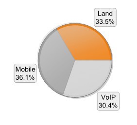
Description:
A pie chart is used to compare components.
Usage:
- Drag and drop the measures on the measures axis
- Drag and drop the dimension on the sector axis (optional as a pie chart can be made of measures only)
Note: you must have at least one measure to use this chart
Example:
Chart showing a cost for 3 types of line: ”Mobile”, “Land” and “VoIP”
II.3.1.16 Progress bar 
Description:
A progress bar shows the progression of the measure towards a limit. You can add additional measures as markers on the bar.
Usage:
- Add the measure and its target on the measure axis (you must have defined the target in the data source first):
- If you use the axes editor, use the drop down list in the target column to select it.
- If you use the visual wizard, right click the measure then choose Select a target and select your target.
This measure must be at the first position on the axis
- Add the limit measure as the second measure
- Add additional measures that will be used as markers (8 measures maximum) Note: you must have at least 2 measures to use this chart Example:
Progress bar with three markers: 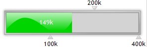
II.3.1.17 Radar 
Description:
A radar diagram allows you to compare values of several categories having a large number of indicators Usage:
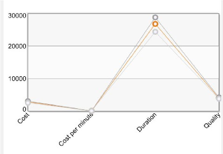
- If you use the axes editor, Drag and drop the measures in the measures table (at least one measure) then select the measure axis.
- If you use the visual wizard, drag and drop the measure on the desired axis:
- Lines: (default value) each measure is displayed on a different line of the radar.
- Axes: Each value is displayed on the radar perimeter.
- Drag and drop the dimension on the appropriate axis (see description above)
Example:
Chart showing the temperature of 3 cities over the year (the temperature measure has been set on the “line” axis, the “city” dimension on line and the “month” dimension on axes)
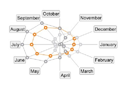
Note: you must have at least one measure and one dimension to use this chart
II.3.1.18 Ring 
Description:
A Ring chart is used to compare components.
Usage:
- Add the measures on the desired axis: ring or sector.
- Ring: each measure is displayed on a different ring (default axis).
Each ring is divided into sectors showing the measure value for each dimension member. The size of each sector is proportional to the measure value.
Example: chart showing the measure Cost (on ring axis) by Area (on sector axis)
-
- Sector: each measure is placed on a different sector
- Drag and drop the dimension on the axis of your choice (see axis description above)
Note: you must have at least one measure to use this chart
II.3.1.19 Scatter 
Description:
This diagram allows you to study the correlation between two variables. The size of the bubble is fixed.
Usage:
- Add two measures: one for the horizontal X axis, the other one for the vertical Y axis
- If you use the axes editor, select X and Y axis in the drop-down lists at the left of the measures names.
- If you use the visual wizard, drag and drop the measures directly on the desired axes
- Drag and drop the dimension that you want to display on the bubbles axis
- You can add a dimension on the multiplier axis: the chart will be replicated for each value of the dimension
Note: you must have at least two measures and one dimension to use this chart Example:
Chart showing the price (on X axis) and the number of products (on Y axis) by product (dimension set on bubbles axis)
II.3.1.20 Surface 
Description:
A surface chart is used to compare several trends of data Usage:
- Add the measures on the measures axis:
- if you use the axes editor, add the measures in the measures table then select the measures axis in the drop-down list
- if you use the visual wizard, drag and drop the measures on the desired measures axis:
- zone (default axis): Each measure is displayed on a different zone:
-
- X : Each value of the measure is displayed on the horizontal X axis
- Drag and drop the dimensions that you want to display on the appropriate axes (see the axes description above)
Note: you must have at least one measure and one dimension to use this chart
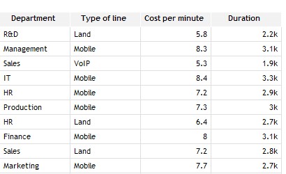
II.3.1.21 Table 
Description:
A table is used to show data in columns Usage:
- Add the measures on the desired axes:
- If you use the axes editor, drag and drop the measures in the measures table
- If you use the visual wizard, drag and drop a first measure on the column marked with an orange cube . Click the + button at the top right of the measure column to add another measure.
- Drag and drop the dimensions on the desired columns
Dimensions, will be displayed first, then measures. You can reorder the measures and dimensions by drag and dropping them at the desired position.
Note: you must have at least one dimension to use this chart
Example:
table showing department (on column 1), type of line (on column 2), Cost per minute and duration:
II.3.1.22 Text 
Description:
A text chart is used to format data into text paragraphs Usage:
- Add the measure in the measures axis
- Drag and drop the dimensions in column axes
- Configure the text to generate from the Parameters/Text setup menu. From this dialog, you can describe the way to display data.
Example:
Note: you must have at least one dimension or one measure to use this chart
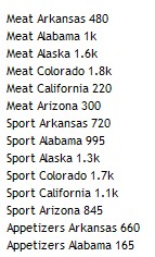
II.3.1.23 Treemap 
Description :
A treemap is a representation of hierarchical data in a limited space.
Usage:
- Add measures on the desired axis:
- if you use the axes editor, add measures on the measures table, then select the axis in the drop-down list (Axis 1, Axis 2 or Axis 3).
- If you use the visual wizard, drag and drop the measures on one of the axis: Axis 1, Axis 2 or Axis 3
- Drag and drop the dimensions on the desired axes.
The chart is divided into rectangles (the larger one is at the top left). The size of each rectangle is proportional to the value it represents. Each rectangle can itself be divided into sub rectangles (if you add dimensions on several axes).
Example 1 : The measure «Cost» is along axis 1 and the dimension “Department” along Axis 2:
Exemple 2 : the measure « Cost » is along Axis 1 the dimension « Department » along Axis 2 and the dimension « Type of line » along Axis 3.Each rectangle corresponding to Axis 1 members are divided into rectangles corresponding to Axis 2 members:
II.3.1.24 Tree table 
Description:
A tree table is used to show hierarchical data in columns Usage:
- Add the measures on the desired axes:
- If you use the axes editor, drag and drop the measures in the measures table
- If you use the visual wizard, drag and drop a first measure on the column
marked with an orange cube . Click the + button at the top right of the measure column to add another measure.
- Drag and drop the dimensions in the dimensions list
Dimension placed on the first column of the tree will be displayed. Click a value to display the following dimension in the tree (set on the second column). Note: you must have at least one dimension to use this chart
Example:
Tree table showing “turnover” by “Product Family” (on column 1). Dimension “Area” is on column 2. Clicking a product Family display “Turnover “values for areas of this “Product family”
II.3.2 Define axes properties
You can modify following properties on each dimension axis:
- Add sorts on axes,
- Filter values to display: Top n values, bottom n values, values between a minimum and a maximum
- Add a total on an axis (overall value)
- Add filters on dimensions • Modify the dimensions formats,
- Select the hierarchy levels.
Depending on whether you use the visual wizard or the axes editor to configure your chart, axes properties are accessible as follow:
- Axes editor: the dimensions table (displayed at the bottom of the Visualization configuration dialog box) displays dimensions added on each axis. Click the Properties icon displayed at the right of the axis name to display the properties
II.3.2.1 Add sorts on axes
- Click the Properties icon displayed on the line of the axis you want to sort.
- The Axis parameters dialog box is displayed.
- Check the sort button.
- Select the sort that you want to use:
- Data model sort: sort defined for the dimension in the data model (by default, alphabetic for dimensions and numeric for time dimensions)
- Alphabetic sort,
- Numeric sort or
- Measure sort: select the measure to sort in the drop down list on the right
- Select a sort order: Ascending or Descending,
- Click the OK button.
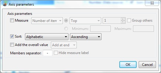
II.3.2.2 Select the top or the bottom n values
- Click the Properties icon displayed on the line of the axis. The Axis parameters dialog box shows up.
- Check the box on the left of the Measure field
- Select the measure that you want to use for your top or bottom sort in the dropdown list.
- Select Top or Bottom in the drop-down list.
- Select the number of values that you want to display
- Check Group others to group remaining values in a field called other.
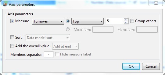
II.3.2.3 Select values in a range
- Click the Properties icon displayed on the line of the axis. The Axis parameters dialog box shows up.
- Check the box on the left of the Measure field
- Select the measure that you want to filter in the drop-down list.
- Select the radio button besides Minimum, then enter values for minimum and
maximum
II.3.2.4 Add the overall value
To add an overall value on your chart (overall aggregation of the measure values), click the Properties icon displayed on the line of the axis. The Axis parameters dialog box shows up. Check the box Add the overall value. By default, the overall value is displayed at the end. If you want to display it at the beginning, select add at start.
II.3.2.5 Add a filter on a dimension
To add a filter on a dimension:
- From the axes editor:Click the Off button in the Filter/Transformation column, then select New filter... on the same line as the dimension you want to filter:
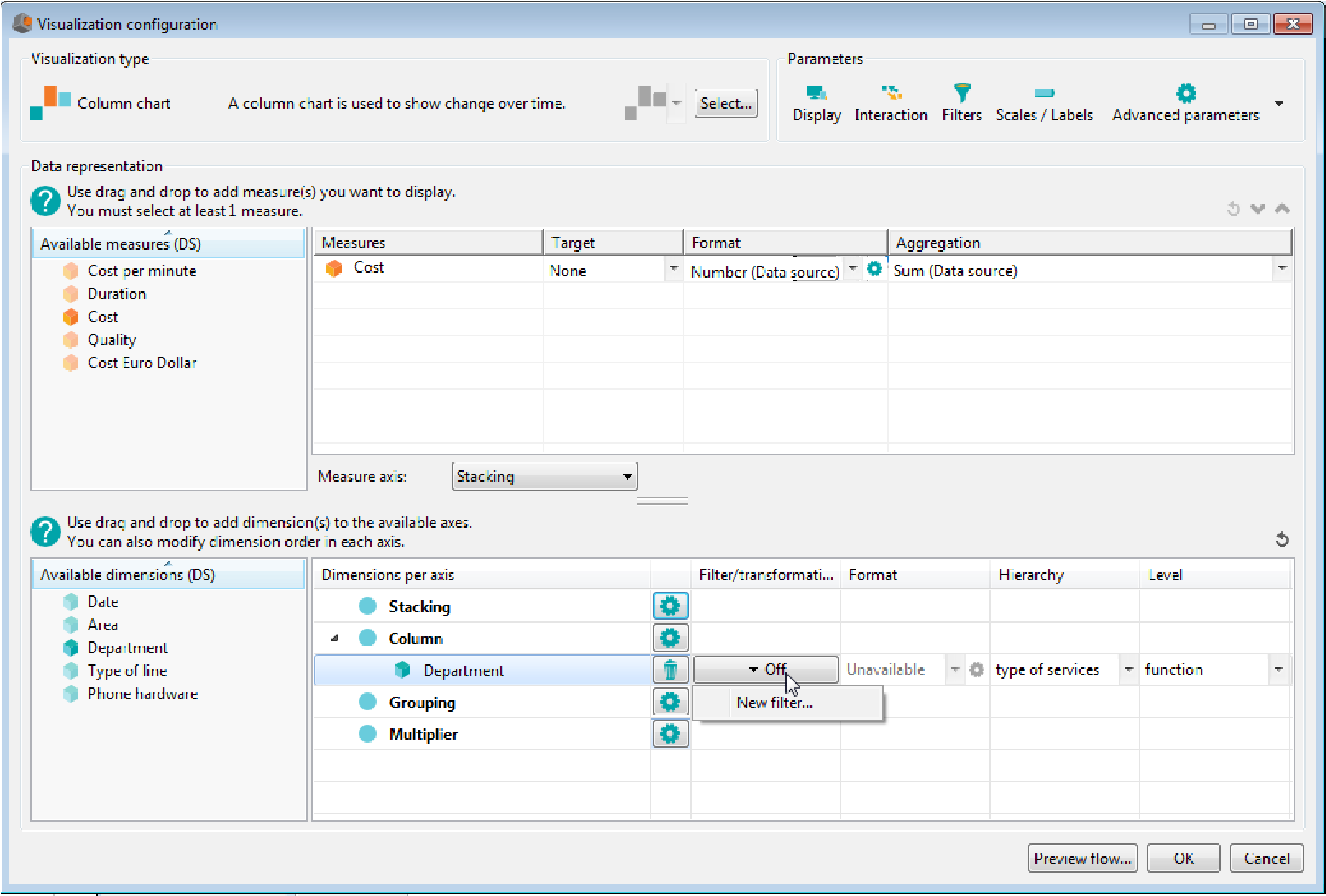
- From the visual wizard: right click the dimension, then select Apply a filter and New...
- The dialog box Edit filter for dimension shows up.
- Select the type of filter you want to use:
- Rule : Select the hierarchy and level you want to filter in the drop down lists Hierarchy and Level then enter the filter rules (you can use javascript). You can add several rules. In that case, select whether the lines must match all rules or any in the drop down box.
-
- Elements: Select the hierarchy and level you want to filter in the drop down lists Hierarchy and Level then check values to use in the filter:
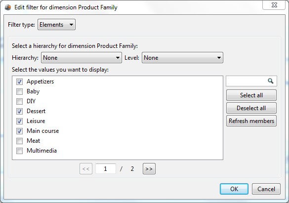
-
- Range : this filter type available for continuous dimensions only allows you to select a range of value (you can use JavaScript).
Example: filter displaying values of the two lasts months for the “week” dimension.
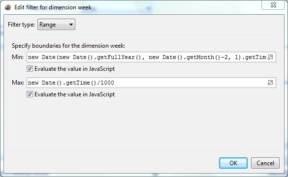
-
- function : this filter type available for continuous dimensions only allows you to select a JavaScript function. You can create a new function or use one of the existing functions:
| Function name | Description |
| Year (Selection) | Cumulative value from the beginning of the year to the selected date (included) Example: if the selected date is January 26 2015, returns the cumulative value from January 1st 2015 to January 26 2015. |
| Year -1 (Selection) | Cumulative value from the beginning of the year to the selected date (included) for the previous year. Example: if the selected date is January 26 2015, returns the cumulative value from January 1st 2014 to January 26 2014. |
| Full Year -1 (Selection) | Cumulative value for the year preceding the selected year Example: if the selected date is January 26 2015, cumulative value from January first 2014 to December 31 2014. |
| Current year | Cumulative value for the current year Example: if the current date is January 26 2015, cumulative value for 2014 |
| Month (Selection) | Cumulative value from the first day of the month to the selected date. Example: if the selected date is January 26 2015, |
| cumulative value from January first to January 26. | |
| Current month | Cumulative value from January first to the current month (non included) Example: if the current month is December 2014, cumulative value from January first 2014 to November 30th 2014 |
| Current month (Variable) | Cumulative value for the month specified by a variable. To use this function, you must create a variable. By default, the name of this variable is VAR_M (you can modify this name in the function script). Months are numbered from 0 to 11 (0 is for January and 11 is for December) Example: if VAR_M=4, cumulative value is displayed for May. |
| Previous month | Cumulative value for the previous month Example: if the current date is January 26 2015, cumulative value from December first 2014 to December 31st 2014. |
| Last N months (Variable) | Cumulative value for the last N months. To use this function, you must create a variable VAR_NB_MP representing the number of months. Example: if VAR_NB_M = 2, cumulative value for the last two months. |
| Période Year -1 (Selection) | Cumulative value for the selected period of the previous year. Example: if the selected month is January 2015, cumulative value for January 2014. |
| Previous week | Cumulative value for the previous week. |
II.3.2.6 Add a transformer on a dimension
You can add a filter transformer on continuous dimensions. When a filter is selected in the dashboard, the transformation is applied on the specified chart.
For example, you can display data of the year preceding the selected year ia a chart (selecting year 2015 displays values for 2014).
To add a transformer on a dimension:
- From the axes editor:Click the Off button in the Filter/Transformation column, then select New transformer... on the same line as the dimension you want to filter:
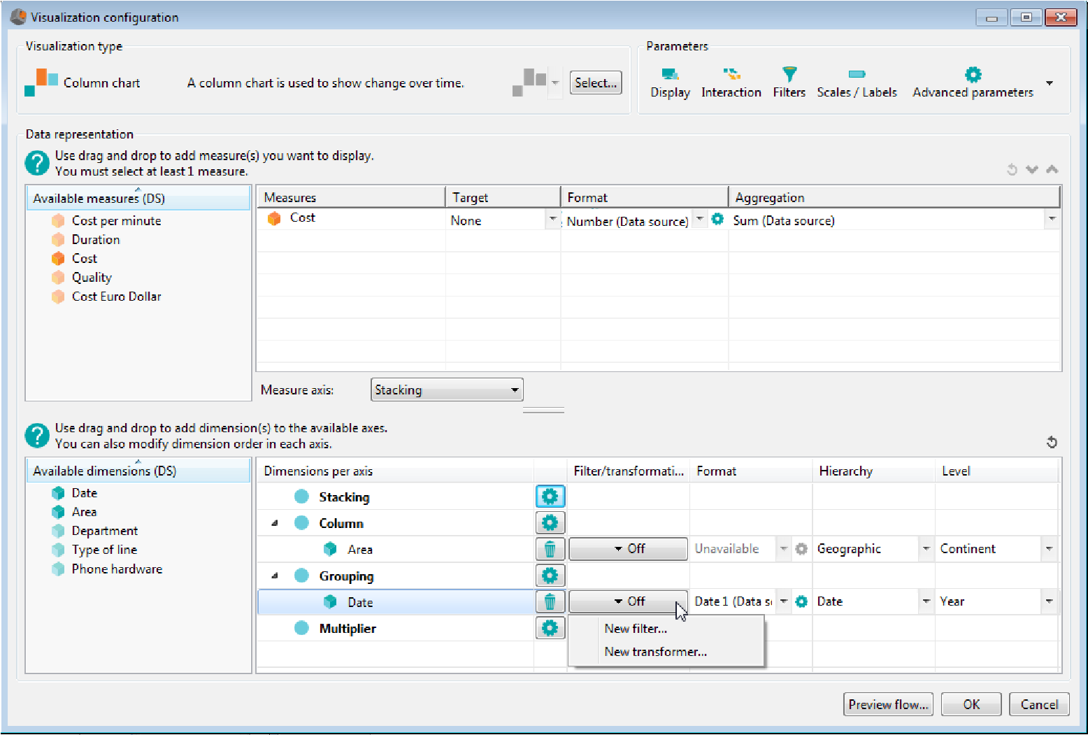
- From the visual wizard: right click the dimension, then select Apply a transformer and New...
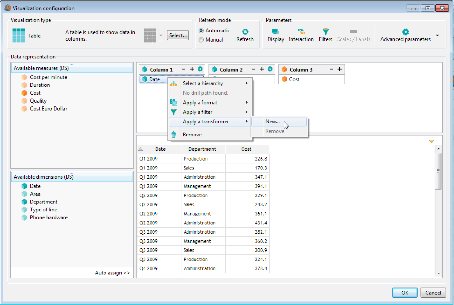
- The dialog box Edit filter for dimension shows up. Select the function you want to use to transform the filter (for example “”Full year -1 (selection)” to display data for the year preceding the selected year) or click + at the bottom of the dialog box to add a new function.
Note: the list of functions is described above in the chapter Add a filter on a dimension.
II.3.2.7 Modify the format of a dimension
You can modify formats used for time dimensions .By default, the formats used are the ones defined in the data source. To change it:
From the axes editor: open the drop-down list in the Format column. Available formats are displayed. Select the format you want to use or click the Properties icon  to create a new format (see chapter “format data”).
Form the visual wizard : right click the dimension, then select Apply a format. Select the format you want to use or click the … at the end of the list to create a new format (see chapter “format data”).
II.3.2.8 Select a hierarchy level for a dimension
Available hierarchies are the ones created by the user in the data source or those automatically created by DigDash Enterprise on the time dimension and geographic columns.
To select a hierarchy level:
From the axes editor: select the hierarchy in the Hierarchy drop-down list, then select the level in the Level drop-down list.
From the visual wizard: right click the dimension, then choose Select a hierarchy. Available hierarchies are displayed. Select the hierarchy and the level you want to use.
II.3.3 Define measures properties
Following actions are available on measures:
- Add a target on a measure,
- Modify a measure format,
- Modify the aggregation function of a measure.
II.3.3.1 Add a target on a measure
Available targets are the ones defined by the user on the data source.
To add a target on a measure:
From the axes editor: measures table (at the top of the dialog box) displays measures used in your chart. Select the target in the drop-down list of the Target column.
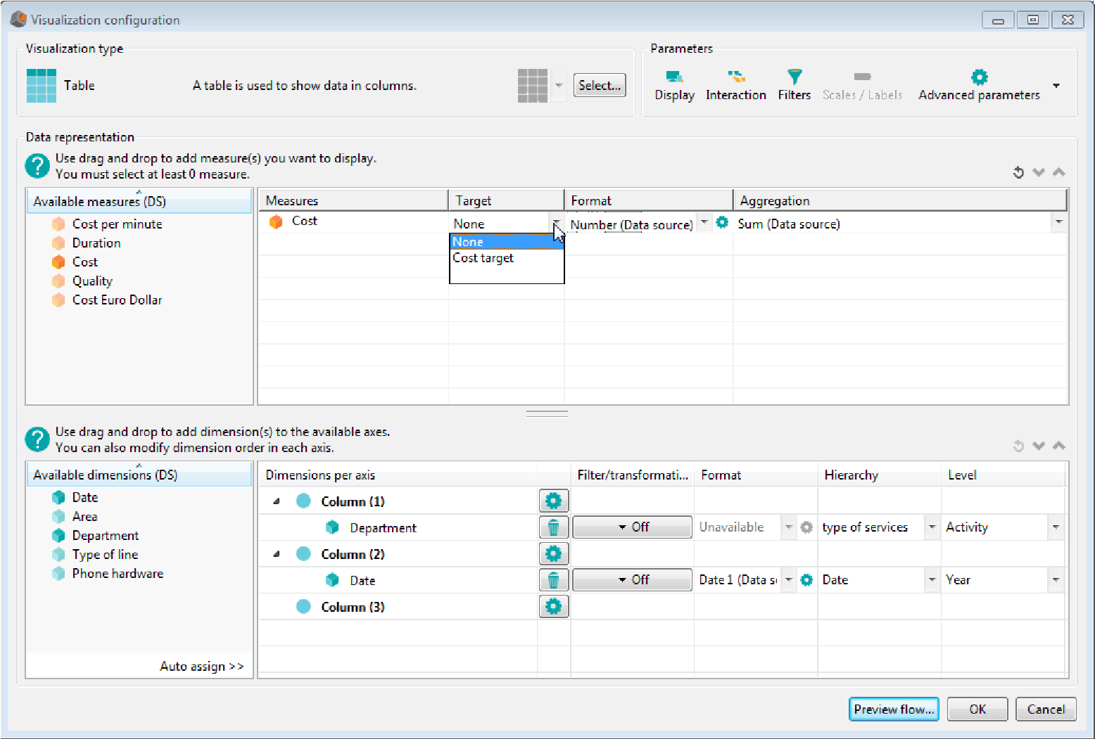
From the visual wizard: right click the dimension, then choose Select a target and choose the objective.
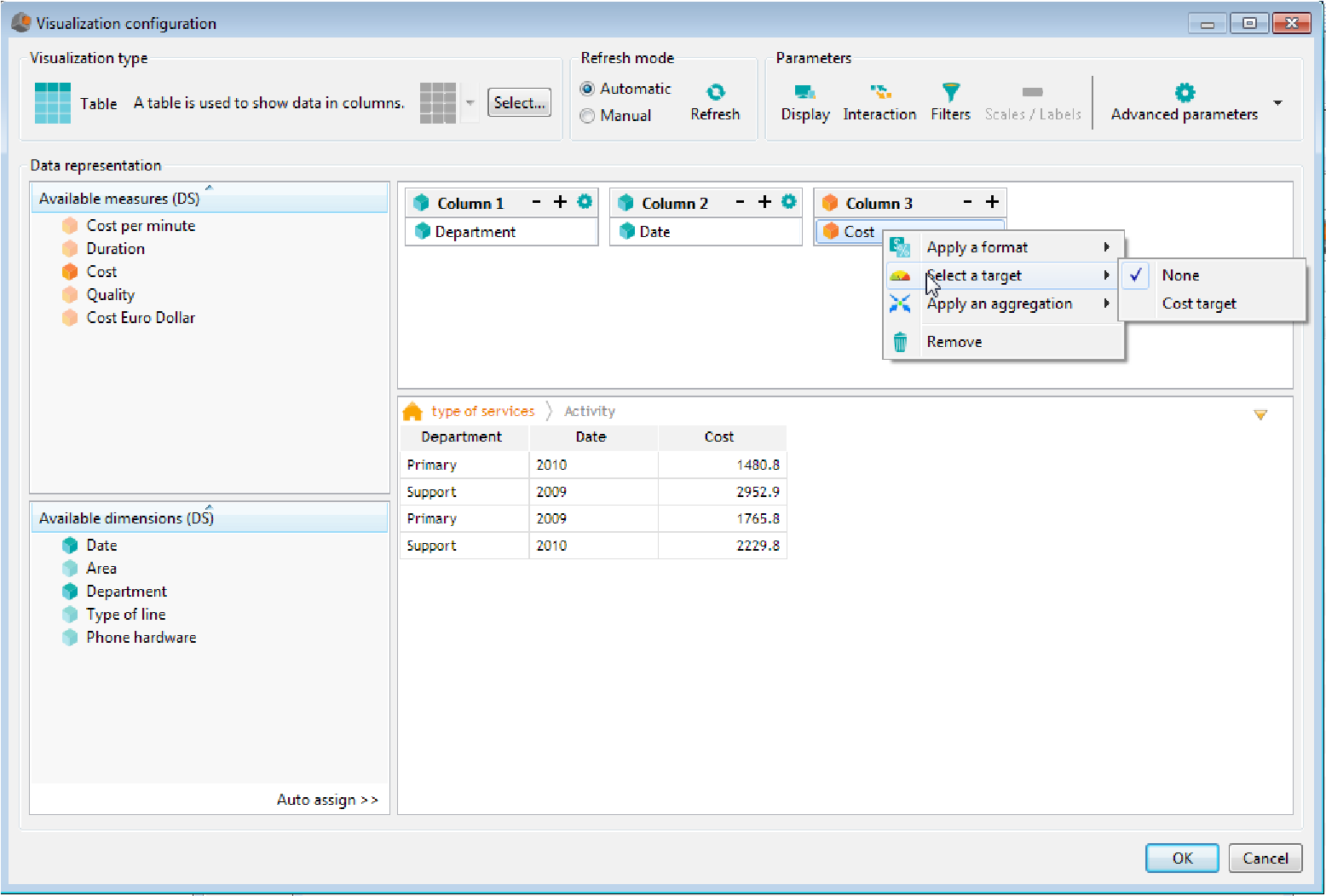
II.3.3.2 Modify a measure format
By default, the formats used are the ones defined in the data source. To modify the format:
From the axes editor: measures table (at the top of the Visualization configuration dialog box) displays measures used in your chart.
Open the drop-down list in the Format column. The list of available formats is displayed. Select the one you want to use or click the Properties icon to create a new format (see chapter “Format data” for more information)
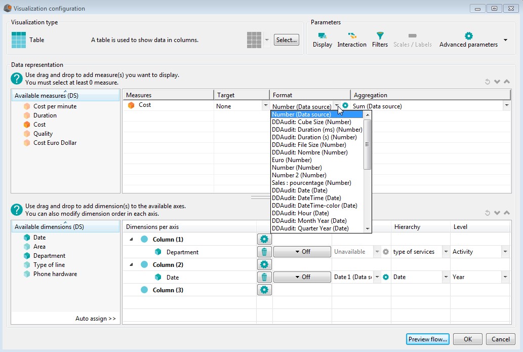
From the visual wizard: right click the measure then choose apply a format
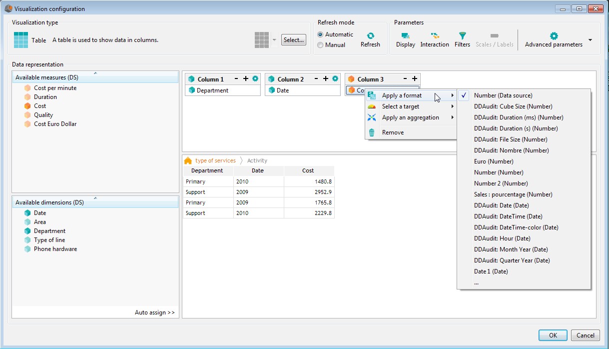
II.3.3.3 Modify the aggregation function of a measure
By default, the aggregation function used for a measure is the one defined in the data model. To change it:
From the axes editor: open the drop-down list in the aggregation column and select the desired function:Sum, Average, Min, Max, Running sum
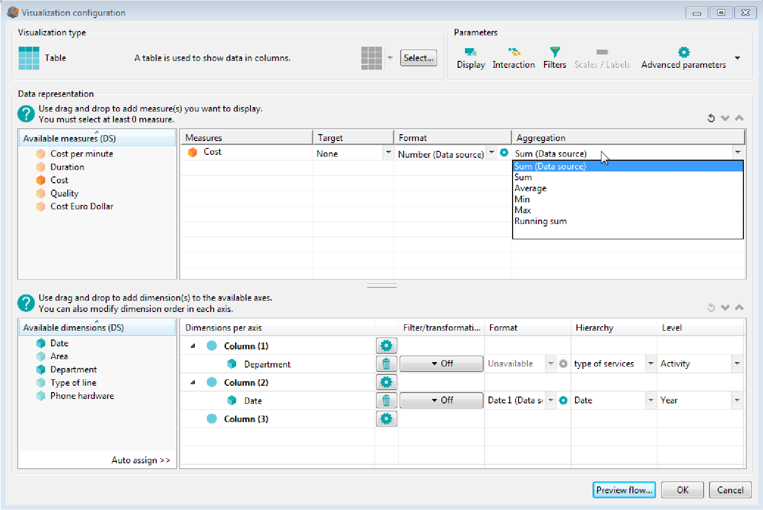
From the visual wizard: right click the measure, then choose Apply an aggregation then choose the aggregation.
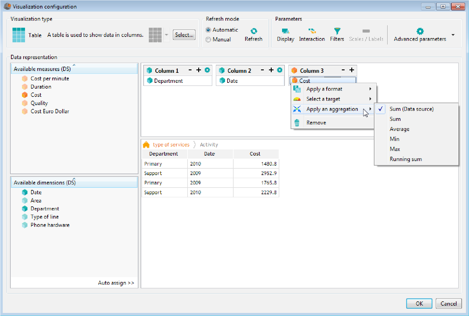
II.3.4 Configure the visualization parameters
Visualization parameters can be modified from the Parameters section at the top of the Visualization configuration dialog box:
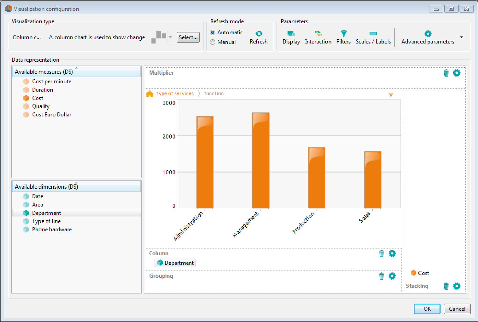
- Click the Display button to modify the colors parameters, the tooltips, the fonts,...
- Click the Interaction button to modify the user interactions on the chart,
- Click the Scale/labels button to modify the scale or the labels displayed on charts,
- Click the Advanced parameters button then Visualization Parameters and open the Specific Features tab to modify specific features of the chart
II.3.4.1 Modify the colors of the chart
To modify the colors palette:
- From the Visualization configuration dialog box, click the Display button,
- In the Colors parameters section, the colors palette used is selected by default. Click Edit. The Color palette setup opens up.
- To modify a palette, select it using the radio button, then select the color you want to modify. Choose the color or enter its RGB or HTML code. You can also choose a pattern and a color for the border.
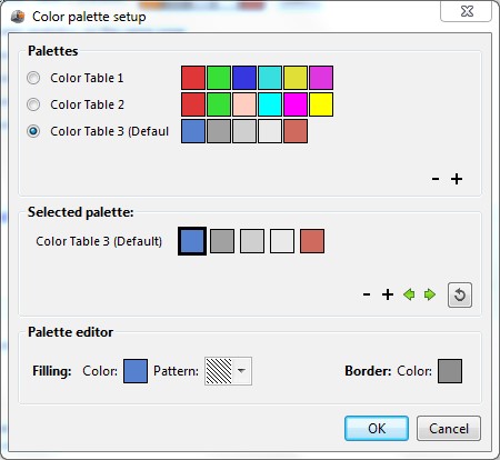
- To add a palette, click the + button below the list of palettes. To add a color to a palette, select the palette, then click the + button in the selected palette section.
- The colors cycle is done on one axis (for example, for a column chart, the colors cycle is done on the stacking axis by default). A different color will be applied for each value of the selected axis. You can modify the axis on which the colors cycle is one by checking the appropriate axis.
- By default, colors used can be different on each chart even if they use the same dimension (for example, the same area can have two different colors in two different charts). If you want the charts of the same page to share the same colors, check the box Share colors between analytics on the same page.
II.3.4.2 Modify the tooltips
The tooltip is the value displayed on the chart when you put your mouse over an item.
To modify the text showing up in the tooltip:
- Click the Display button
- In the Tooltip section, clear the Default tooltip box
- Enter the text that you want to display in the tooltip. You can use keywords available when clicking the Add keyword button:
- Member Axis name: displays the value of the axis member selected
- Value: displays the measure value
- Percent value: displays the measure value as a percentage
Example of a tooltip on a column chart showing turnover per product: ${Member Column} ${Member Stacking}: ${Value} ${Member Column} displays the value of the column member , ${Member Stacking} displays the member of the stacking axis and ${Value} displays the measure value. When positioning the mouse over the Salad column, the tooltip displays Salad Turnover 27.6K |
II.3.4.3 Modify data parameters
To modify display options for empty values, open the display tab then select the appropriate options:
- Show empty values from the cube: by default, empty values from the cube are not displayed (example: if you display a turnover by Area and don't have any values for California, California won't be displayed). Check this option if you want to display the empty values.
- Show all possible members: display all possible members of the cube (Cartesian product)
To add values: click Add values and then enter values to display in the chart. Click the + button to add a new line. You can use the drop-down lists to select an existing measure or a dimension value. You can also add your own values.
II.3.4.4 Configure user interactions
Click the Interaction button in the parameters section.
If you are adding an action on a table chart (Table, cross table, OLAP table, Tree, Text cloud, HTML report), select the axis (column n, row n,...) then click Edit action to choose the action.
To add an action on charts other than tables, you must first select the action, then the axis.
Select the action in the drop-down list:
- Navigate on hierarchy: Select the axis you want to navigate on. When the user clicks the appropriate axis, the values of the next hierarchy level are displayed. You can add an URL that will be executed when user clicks the last level of the hierarchy (root level) . The URL can use key words.
Example:
a column chart displays a turnover by year (turnover is on the stacking axis and a date using the hierarchy “Date” and the level “Year” is on the column axis). In the user interaction, select Navigate on hierarchy action then select the column axis. Clicking a year will display the turnover by month for the selected year.
Clicking a day (most detailed level of the hierarchy) opens the URL set in the field Function to execute on the root level. To add a key word, click the Add key word button, then select the appropriate word: “Dimension Axis name” to retrieve the name of the dimension, “Member Axis name” to retrieve the value of the selected axis member or “Value” to retrieve the value of the selected measure

- Navigate on hierarchy (synchronized): When the user clicks the appropriate axis, the values of the next hierarchy level are displayed. The navigation is synchronized between all charts using this interaction on the same hierarchy level.
- Change dimension : When the user clicks the axis, DigDash Enterprise changes the analysis dimension (by displaying the following dimension in the hierarchy or the first one if the dimension on which the click is done is the latest of the hierarchy). Unlike “Navigate on hierarchy”, no filter is applied on the selected value of the dimension.
- Change dimension (synchronized): When the user clicks the axis, DigDash Enterprise changes the analysis dimension (by displaying the following dimension in the hierarchy or the first one if the dimension on which the click is done is the latest of the hierarchy). Unlike “Navigate on hierarchy”, no filter is applied on the selected value of the dimension. The changes is synchronized with other charts using this interaction on the same hierarchy level.
- Activate filter: when the user clicks a chart item, a filter is set on the selected item. This filter applies to all the charts displayed in the dashboard.
- Launch URL: when the user clicks a chart item, DigDash Enterprise opens the URL displayed in the URL to execute field. The URL can use keywords. To add a key word, click the Add key word button, then select the appropriate word: Member Axis name to retrieve the value of the selected axis member or Value to retrieve the value of the selected measure (URL example:
http://127.1.0.1:80/show_bug.cgi?id=${Member Column2})
- Execute Javascript function: when the user clicks an item of the chart, the javascript function is executed. You can use key words available when clicking Add key word:
-
- Dimension Axis : ${Dimension Axis}
- Member Axis : ${Member Axis}
- Filter : filter('${Dimension Axis}', '${Member Axis}'): when user click an item of the chart, a filter is set on the dimension '${Dimension Axis}' and the member '${Member Axis}'. The filter is applied to all charts of the dashboard.
- Open flow in popup: openFlowInWindow('flow identifier', width, height); When user clicks an element of the chart, a window opens up with the specified chart. This identifier is visible in the flow properties (right click the flow, then select Properties). You can specify width and height of the window. To let the default height and width, just indicate the flow identifier (openFlowInWindow('flow identifier')
- Open flow in popup with filters: openFlowInWindowWithFilter('flow identifier', width, height, '${Dimension Column1} ', '${Member Column1}'); This function is the same as openFlowInWindow except that you can add some filters. You can filter as many dimensions as you want by adding in the JavaScript '${Dimension ColumeN}' ,'${Member ColumnN}' for each filter.
Example : openFlowInWindowWithFilter(''6bec84', 400, 600, '${Dimension Column1} ', '${Member Column1}','$Dimension Column2}','${Member Column2}') ;
Filters are applied only when the flow is displayed as popup.
-
- switch page: switch_page('Page name'): when user clicks the chart item, the page specified opens up. To display a role page, the role name must be indicated before the page name (example: to open a page 'page2' of a role 'sales', enter switch_page('sales.page2')
- switch page and filter: switch_page_filter('Page name','${Dimension Axis}', '${Member Axis}'): when user clicks the chart item, the page specified opens up. A filter on dimension '${Dimension Axis}' and member '${Member Axis}' is also applied.
In the section Filters on dimensions, select dimensions used for interactive filter These filters are displayed in a bar of the dashboard. User can select values he wants to display for each dimension.
In the example below, the user has selected the year 2010 for the dimension Date which is part of the interactive filters bar.
By default, properties regarding interactive filtering are defined in the data model (the box is full for each dimension which means “inherited from the dimension”).
- If you don't want to display a dimension in the bar, clear the Display box.
- If you don't want to navigate on a dimension, clear the Navigation box.
Note : If the dimension belongs to several information flows, you must clear the Display box for all flows. You can also deactivate the display of a dimension in the dashboard editor (see “dashboard_editor_guide_en.pdf” for more information).
For example: clear the Display box for dimension “Product” removes the dimension from the bar:
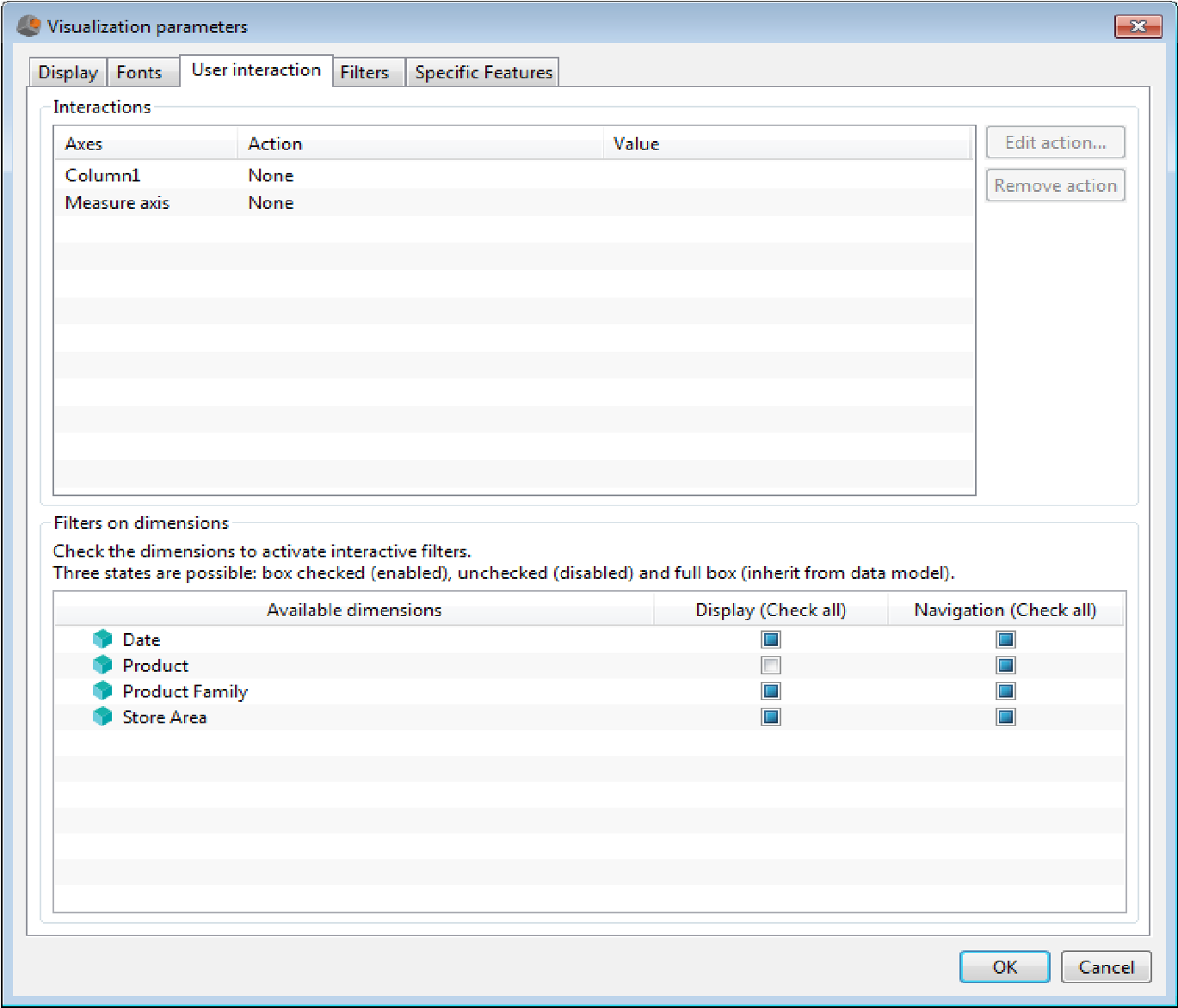
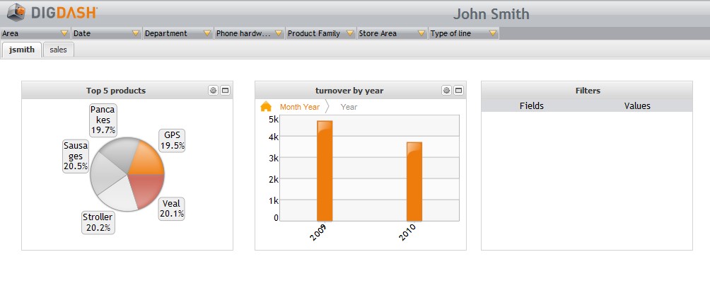
II.3.4.5 Modify scales
Click the Scales/labels button in the Parameters section. For each axis you can:
- modify minimum and maximum values: clear the Automatic box then enter the Minimum and Maximum values.
- select a format: click the Select... button besides the Format field, then select an existing format or create a new one.
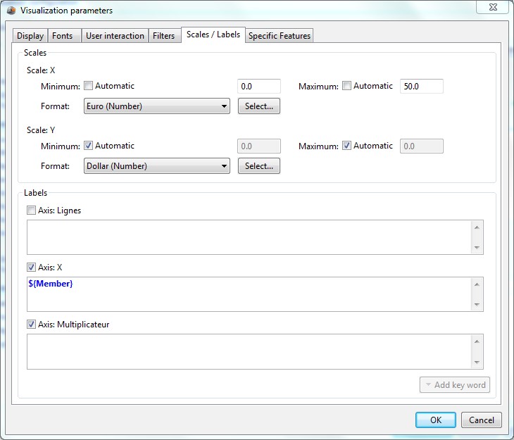
II.3.4.6 Modify axes labels
DigDash Enterprise generates labels displayed on axes automatically. Labels depend on the type of chart you are using.
For example, on a column chart displaying a cost by product (measure “turnover” is on the stacking axis and dimension “product” is on column), product names are displayed under each column. No label is displayed for the turnover:
To modify labels:
- Click the Scales/labels button in the Parameters section,
- In the Labels section, check the axes on which you want to display labels and clear the “others” box.
- Enter labels to display: They can use some of the key words available when clicking Add key word:
- Member : displays the member value
- Absolute Value : displays the measure value
- Percent value : displays value of the measure in percentage
Example: A bar chart displays a turnover by area. You want to display labels for turnover (on the stacking axis) and the percentage of the turnover for each product
|
II.3.4.7 Adding specific features
Specific features are available on each chart. To add one of them, click the Advanced Parameters button then Visualization Parameters. Open the Specific features tab, then add the feature you want to use.
Some features are directly available in the user interface. To add other features, click the Add button, then enter the feature name and value.
The specific features are documented in « specific_features_en.pdf ».
II.3.5 Configure the text generation
Text generation is used in two cases:
- to configure the text displayed in text charts: to access it, click the Advanced parameters button then Text setup
- to configure the audio/video generation (in case your license allows thegeneration of audio/video output): to access it, click the Advanced parameters button then Audio/video setup
Dialog box showing up displays default navigation parameters (for audio/video setup, default parameters depend on the selected chart).
Example :
You have created a text chart displaying a turnover per product. (Product dimension is on the part (1) axis and the Turnover measure is on the stacking axis).
Chart displayed is as follow:
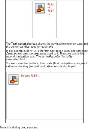
- Modify the order of the navigation axes
- Modify the navigation axes
- Modify the sentences displayed (in case of video generation, you can modify sentences read while the video is played)
Modify the order of the navigation axes :
Drag and drop the navigation axis at the position you want.
Modify the navigation axes:
For video setup only, you can add dimensions.
To do so, click the + button under the table displaying the axes and then select the dimension or axis that you want to add to your video.
To remove an axis, click the - button.
Modify the sentences displayed and read during the navigation:
You can add an introduction or a conclusion sentence. To do so, select the sentences in the drop-down lists besides the Introduction and Conclusion fields (you can use the default Introduction and Conclusion sentences available in the sentences list).
You can also add sentences describing target achievement. To do so, select desired sentences in the drop-down lists good in regards to the target, acceptable in regards to the target , bad in regards to the target
You can modify the sentences by creating new sentences or editing sentences you have previously created (default DigDash Enterprise sentences are not editable).
To add a sentence, click the Sentences manager button. List of available sentences is displayed. Right click the list and choose Add to add a sentence.
To edit an existing sentence, select it in the list.
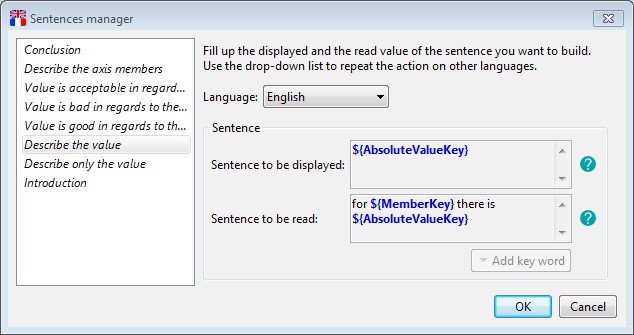
- Select the language of the sentence in the drop-down list
- If you are creating a new sentence, enter the sentence name .
- Enter the sentence to be displayed (sentence used in text chart). You can use one of the available key words by clicking the Add key word button:
Keyword Description Member Displays the current value of the dimension. Percent value Displays the measure value in percentage. Dimension name Displays the name of the dimension. Absolute value Displays the measure absolute value. Measure measure_name Displays the value of the measure_name measure.
(you can display values of all the measures of your data model).
Target name Displays the target name - Enter the sentence to be read (sentence read while the item is displayed during the video). You can use key words by selecting them in the key words list available when clicking the Add key word button.
II.3.6 Preview flow
If you use the visual wizard, the chart preview is automatically displayed.
If you use the axes editor, click Preview flow to display it
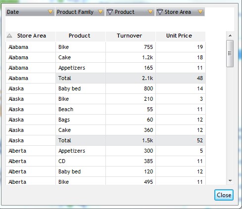
II.3.7 Modify table styles
If you creat a table chart (or cross table, OLAP table, tree table, cloud text and HTML report), you can modify the format and style of the table:
- To modify column width: drag and drop the border of the column header till you get the appropriate width.
- To modify the style of a column, a line or a cell:
- select the cell, right click and select the element you want to modify:cell, line or column
- Select the type of modification: background, Text or Border:
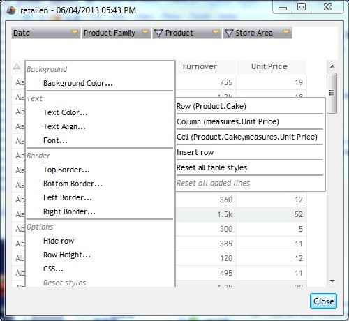
- You can also:
- Hide a row or a column: select row or column then choose Hide row or Hide column
- Change cell text: select cell, then in the options section, select Text and enter the text to display. The text can include variable like ${Filter Dim}, where Dim is the name of the filtered dimension. When the chart is displayed, the variable is replaced by the filter value on the dimension Dim.
- Insert a row: select Insert row, then choose whether you want to display it before or after the current row. You must then enter values for each cell of the row.
- Reset all table styles
The style is automatically saved when you close the preview. If you want to cancel the modifications, click Cancel in the Visualization Configuration dialog box.
You can modify the format of measures and time dimensions in the data source or the visualization of the chart:
- From the data source (dialog box Advanced configuration), select the object that you want to modify. The default format is displayed in the field Format: Click edit..., the Format Editor dialog opens up.
- From the visualization configuration dialog box, click the Edit icon in the format column of the object you want to modify
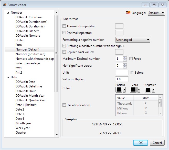
From the format editor dialog, you can:
- Create a format: In the left pane, select the format type you want to create (Number, Date, Icon, Month, Percentage or Alerter), right click and choose New. Enter the format name then click OK. Enter the format parameters as specified in the formats descriptions below.
- Duplicate a format: Select the format, right click and choose Duplicate. Enter the format name and click the OK button.
- Remove a format : Select the format, right click and choose Remove. Confirm that you want to remove the format by clicking the OK button
- Rename a format: Select the format, right click and choose Rename. Enter the format name and then click OK.
You can use different formats for different languages (for example, dates and numbers can have different formats in English and french)
When creating a format, the language Default is selected (in the drop down box, at the top right of the window). The default format will be applied to all languages unless a specific format is specified for a language. To specify a format for a language, select the language in the drop down box, then specify the format.
Description of number formats :
| Parameter | Description |
| Thousands separator | Example : using the point as thousands separator, 10000 will be displayed 10.000 |
| Decimal separator | Example: use. or comma as decimal separator |
| Formatting a negative number | Select the desired formatting for negative values: Examples :
-5212 will be displayed (5212)
|
| Prefixing a positive number with the sign + | Example : 5212 will be displayed +5212 |
| Replace NaN values | Choose the value to display if the value returned by the measure is not a number. Else, NaN (Not a Number) will be displayed. |
| Maximum Decimal number | Enter the number of decimals to display. If the value to display has more decimals that the |
specified number, the value will be rounded. Check Force to display the display the number of decimals specified even if the number to display has less decimals Example : if you have selected 2 decimals and check the box Force, the value 8.2 will be displayed 8.20. The value 5,452 will be displayed 5,45. | |
| Non significant zeros | Enter the number of digits to display before the decimal (zeros will be added at the beginning of the number if needed) Example: if you enter 5, the number 8.25 will be displayed 00008.25 |
| Unit | Enter the unit. The unit will be displayed after the value unless you check Before. Example: if you enter $ and check Before, the value 42 will be displayed $42. |
| Value multiplier | Enter the number by which you want to multiply the result (by default, 1) |
| Color | Select colors to display positive, negative and null values. |
| Use abbreviations | Check this box to use numeric abbreviations (k for thousands, M pour millions, G pour billions) Example: if you check this box, the value 5000 will be displayed 5K. |
Date formats description:
| Format code | Format |
| y | year : yy displays the year on 2 digits (example : 2013 is displayed 13 ) yyyy displays the year on 4 digits |
| M | Month : M displays the month as a number between 1 and 12. MM displays the month as a number between 01 and 12. MMM displays the month as Jan, Feb,.. MMMM displays the month a January, February,... |
| Q | Quarter : Q displays the quarter as a number between 1 et 4 QQ displays the quarter as a number between 01 et 04 QQQ displays the quarter as a number between Q1 and Q4 QQQQ displays the quarter as first quarter, 2nd quarter,... |
| w | Week in the year |
| W | Week in the month |
| d | Day of the month (d displays a number between 1 and 31, dd displays a number between 01 and 31) |
| D | Day in the year |
| F | Day of week in month |
| E | Day in week |
| a | AM / PM marker |
| H | Hour displayed between 0 and 23 |
| k | Hour displayed between 1 and 24 |
| K | Hour from 0 to 11 followed by AM for the morning and PM for the afternoon. |
| h | Hour from 1 to 12 followed by AM for the morning and PM for the afternoon. |
| m | minutes |
| s | seconds |
Icon formats description:
These formats can be used to visualize a trend or a target.
Select icons and colors to use for numbers positive, negative, null or equal to zero.
Month formats description:
The month format is used to associate a month name to a month number (1 = January, 12 = December).
Percent format description:
The percent format is used to display a number as a percentage. (example : 0.4567 = 45.67 %).
Enter the number of decimals to display (2 by default). Check Force to display the number of decimals specified even if the value to display has less decimals.
You can also choose to replace NaN values (not a number) by other values. To do so, check the box Replace NaN values, then enter the value. Else, NaN will be displayed.
Example: If you select 2 decimals and check the box Force, the value 0.823 will be displayed %82.30 .
Time format description:
The time format is used to associate a time in seconds to a duration in year, month, days, hours, minutes and seconds.
Example : value 70 will be displayed 0:1:10 (1 minute ,10 seconds), the value 100000 will be displayed 1d 3:46:40 (1 day 3 hours 46 minutes and 40 seconds)
Alerters formats description:
The alerter format is used to highlight particularly high or low values with specific texts, colors or icons
- In the Alerter section, right click and select New to create a new format, then enter its name
- Click Add to add a new value or new range of values to format
- In the section Input type, select Value or Range, then enter the value or the range of values to format. If you select Range, you must enter a Minimum and a Maximum values. Minimum can be -∞ and Maximum +∞ (select these values by clicking the arrows besides Minimum and Maximum fields)
- In the section Output type, select Text, Color or Icon
- if you select Text, enter the text to display in the Value field and select a color if you want to.
- If you select Color, click the box besides color and select the color to use. You can use a specific format if you want to.
- If you select Icon, select the icon in the drop-down box
- Click Add again to create a new range of values to format
- Select the value that will be used as the default
Example of an alerter creation: You want to create an alerter displaying in red turnover greater than 7500$
|
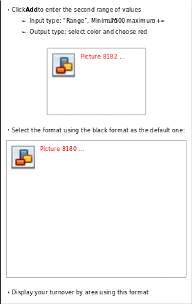
II.5 Schedule refresh
DigDash Enterprise allows you to automatically refresh data. You must first configure the scheduler, then start it (the configuration has to be done from the “server settings” page).
You can schedule refresh at three different levels:
- Information wallet,
- information flow,
- Data model.
DigDash Enterprise first checks what flows have to be refreshed (depending on their schedule time). If a flow must be refreshed, the scheduler checks if the data model used by the flow must be refreshed as well.
If this model uses other data models (join, union, transformers,...), these flows are refreshed as well if needed (depending on their schedule time).
Schedule example: two flows “monthly data” and “ daily data” use the same data model. This model is refreshed every day. The first flow “monthly data” is refreshed every month and the second flow “daily data” is refreshed every day.
By default, the wallet is refreshed every day at 8PM and the flows are refreshed with the wallet. When you create a data model, a default schedule is also defined every day at 8PM (same as the wallet).
You can add or modify existing schedules.
To access wallets and flows schedules, right click the wallet or flow, select Properties and open the Schedule tab. If you want to schedule the flow at a different time than the wallet, clear the With wallet box.
To access data models schedules, in the Data source advanced configuration dialog box, open the Refresh frequency tab (at the bottom of the window).
To add a schedule, click Add. The dialog box Refresh frequency opens.
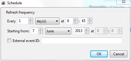
Enter the refresh frequency (every day, month, year,...) and the start date of the schedule.
You can also enter an external event ID.
This event allows you to trigger a refresh using an URL “fire event” working with the scheduler. The refresh is done as soon as the URL is executed.
To configure this event, you must add a schedule on the flow and the cube, enter the External event ID and specify a frequency (which defines in this case the minimum time between 2 refresh).
For example, the schedule below indicates that the flow and the cube will be refreshed when “EVENT1” will be received but not more than once every minute. If no event is received, the flow and cube won't be refreshed (unless another schedule is setup)
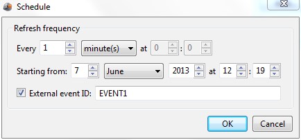
You can define several events for a flow or cube and the same event can be used for several flows or cubes. It can be used to define several channels of refresh.
The URL to call from a browser or an external process (like Windows scheduler) is: http://localhost:8080/ddenterpriseapi/fireevent?eventid=EVENT1 (be careful, the event name is case sensitive).
If you execute the URL from your browser, a connection screen is displayed if needed, then the event is fired. You will get a message mentioning that the event has been fired.
This doesn't mean that the event has been handled. In fact, if the scheduler is already busy, the event will be wait listed. Moreover, if the previous event has been sent too recently (minimum time requirement between 2 refresh is not fulfilled), the event will be ignored.
In case, you fire the event using an external process, you must add "&user=<user name>&pass=<user pass>" at the end of the URL. The user must have the authorization “schedule refresh”.
III. Add a podcast
Podcasts are audio and video programs published on the internet. DigDash Enterprise provides a directory of podcasts you can add to your information wallet.
- In the flows pane located on the left, click the Podcast icon. The Podcast selection dialog box shows up. These podcasts are grouped into categories designed to facilitate browsing (Business and Finance, Computer,...).
- Click on the category of your choice, then select a podcast and click OK. The podcast is added to your information wallet.
- Each time the information flow is refreshed, the new podcast episodes will be downloaded.
IV. Add a RSS flow
RSS feeds are free contents feeds published on the internet.
DigDash Enterprise Provides a directory of RSS feeds that you can add to your information wallet.
- In the flows pane located on the left, select the RSS icon . The RSS selection dialog box shows up.
- RSS feeds are grouped into categories designed to facilitate browsing (News,...). Click the category of your choice, then select a RSS feed and click OK. The RSS feed is added to your information wallet.
- Each time the information flow is refreshed, the new RSS feed contents are downloaded.
V. Add emails
In the flows pane on the left, click the Emails icon . The Chart dialog box shows up. Enter the emails parameters :
- Select the Server type in the drop-down list: pop3 or IMAP
- In the Server name field, enter the name of the user emails server (for example, mail.example.com)
- In the Server port field, enter the server port (by default 110)
- Select the user account. To do so, click the Select button besides the User name field. In the Password Manager dialog box, select an existing account or create a new account:
- The default user account displays the emails of the logged user. It uses the variables ${user.digdashMail} and ${user.digdashMailPassword}. When mails are displayed, ${user.digdashMail} and ${user.digdashMailPassword} are replaced by the email address and the password of the logged user (fields
Email and Email password set for the user )
-
- To create a new account, select the New account button. The Account dialog box shows up. Enter the name you want to use for the account in the Account name field. Enter the email address in the User name field and the email password in the Password field. Click OK.
- Select the security level in the drop-down list: nothing, TLS if available, TLS or SSL.
- Check the secured authentication box if needed.
- Click the Test button. The account status is displayed: Connection success or Connection error.
- Click OK to add the emails to your information wallet.
VI. Add a calendar
In the flows pane located on the left, click the Calendar icon dialog box shows up. Enter the parameters of the calendar you want to use:
- Select the Ical calendar provider
- Enter you calendar URL
- Select the agenda account. To do so, click the Select button besides the user name. In the Password manager dialog box, select an existing account or create a new one. To create a new account, click the New account button. The Account dialog box shows up. Enter the name you want to use for the account in the Account name field. Enter the email address in the User name field and the email password in the Password field. Click OK.
- In the field Choice of number of items per select Number of days or Number of events.
- Enter the number of days or the number of events you want to display in the Value field..
- Click OK to add the calendar to the wallet.
VII. Add documents builder
Documents builder lets you build PowerPoint documents including information flows generated by DigDash Enterprise. You can also add legends for these information flows.
You can create Microsoft Office PowerPoint 2007, Microsoft Office PowerPoint 2010 or Microsoft Office PowerPoint 2013 documents.
Two steps are required:
- Step1: create a PowerPoint document including the identifiers of the flows and the legends
- Step 2: create a document builder flow using the PowerPoint document created previously.
VII.1 Add an information flow or a legend in a Microsoft PowerPoint document
- Open Microsoft Office PowerPoint, then the document in which you want to insert flows,
- Open the menu Insert-Shapes, then draw a shape (rectangle) in which you want to include your flow or legend
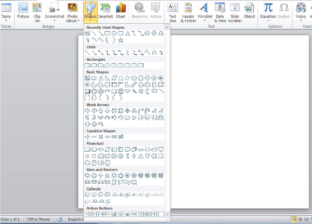
- From Microsoft Office PowerPoint 2007: right-click the rectangle, choose Size and position, then open the Alt text tab.
- From Microsoft Office PowerPoint 2010 or PowerPoint 2013: right click the rectangle, choose Format shape, then open the Alt text menu.
- To add a flow:
➢ In the Alt Text field on PowerPoint 2007 or Description field on powerpoint 2010 and PowerPoint 2013, enter « digdash_id= » followed by
the flow identifier (to get the flow identifier, right click the flow then select Properties).
Note: To get the flow identifier, right click the flow then select Properties:
- To add a legend:
-
- in the Alt Text field on PowerPoint 2007 or Description on PowerPoint 2010 and PowerPoint 2013, enter « legend= » followed by the legend parameters. You must use the following syntax:
legend=[all|id].[horizontal|vertical].[noname|showname].[size].
-
- all: displays the legend of all charts on the slide. By default, the legend is displayed vertically.
- id: displays the legend of the information flow whose identifier is specified (the identifier is visible when you right click the flow and choose Properties).
- horizontal: displays the legend horizontally.
- Vertical: displays the legend vertically (default value).
- showname: displays the axes names (default value).
- noname: doesn't display the axes names.
- size: display each label in the size defined in pixels.
Examples :
-
- legend=all: displays the legend for all the charts on the slide.
- legend=all.horizontal: displays the legend horizontally for all charts on the slide.
- legend=fc2a7d06.vertical.noname.40: displays the legend for the chart whose identifier is fc2a7d06. The display is vertical. Axes names are not displayed and the size of each label is 40 pixels. VII.2 Create a documents builder information flow
In the flows pane located on the left, click the documents builder icon . The dialog box Chart shows up.
Click Search then select the PowerPoint document you created previously.
By default, existing filters on flows are not taken into account. clear the Ignore existing filters box to take them into account.
If you want to add filter on dimensions used in your information flows, click Select besides Filters, then select the values to use in the filters.
Click OK to create the information flow
Note: if you create a flow in a role wallet, it can only use flows of this role (else, you will get an error message when displaying the document).
VIII. Publish an information flow
VIII.1 Publish an information flow for mobile
• Open the menu Tools-device manager
- Unfold the Mobile section then select the devices on which you want to publish flows (example: Android-Document to display flows as interactive documents on your Android mobile, Mail device to send flow as emails).
- In your information wallet, select the information flow you want to publish on your mobile. Right click and choose Properties. Open the Devices tab, then select the device (example : Android-Document) then click OK.
- Check the flow item you want to publish, then choose Synchronize.
- From your mobile, connect to the URL http://servername:serverport/ddenterpriseapi/mobile.
- Enter your user name and password and then click Connection
the number of flows synchronized for the device is displayed:
- display the list of flows by clicking Click for details. If you have synchronized videos, click the video icon in the toolbar
 to display them.
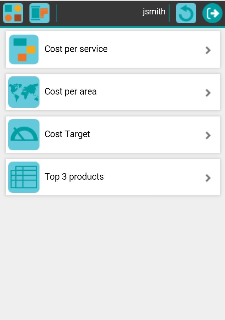
To display the list of documents as icons, click the “view icons” icon 
- Click the flow to display it:
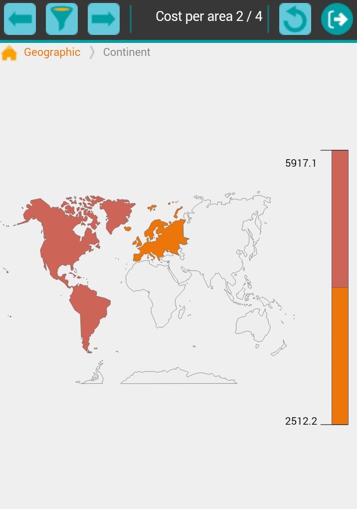
Click the previous  or next
  icons to display the previous or the next flow.
- Click the filter icon
 to modify filters or variables:
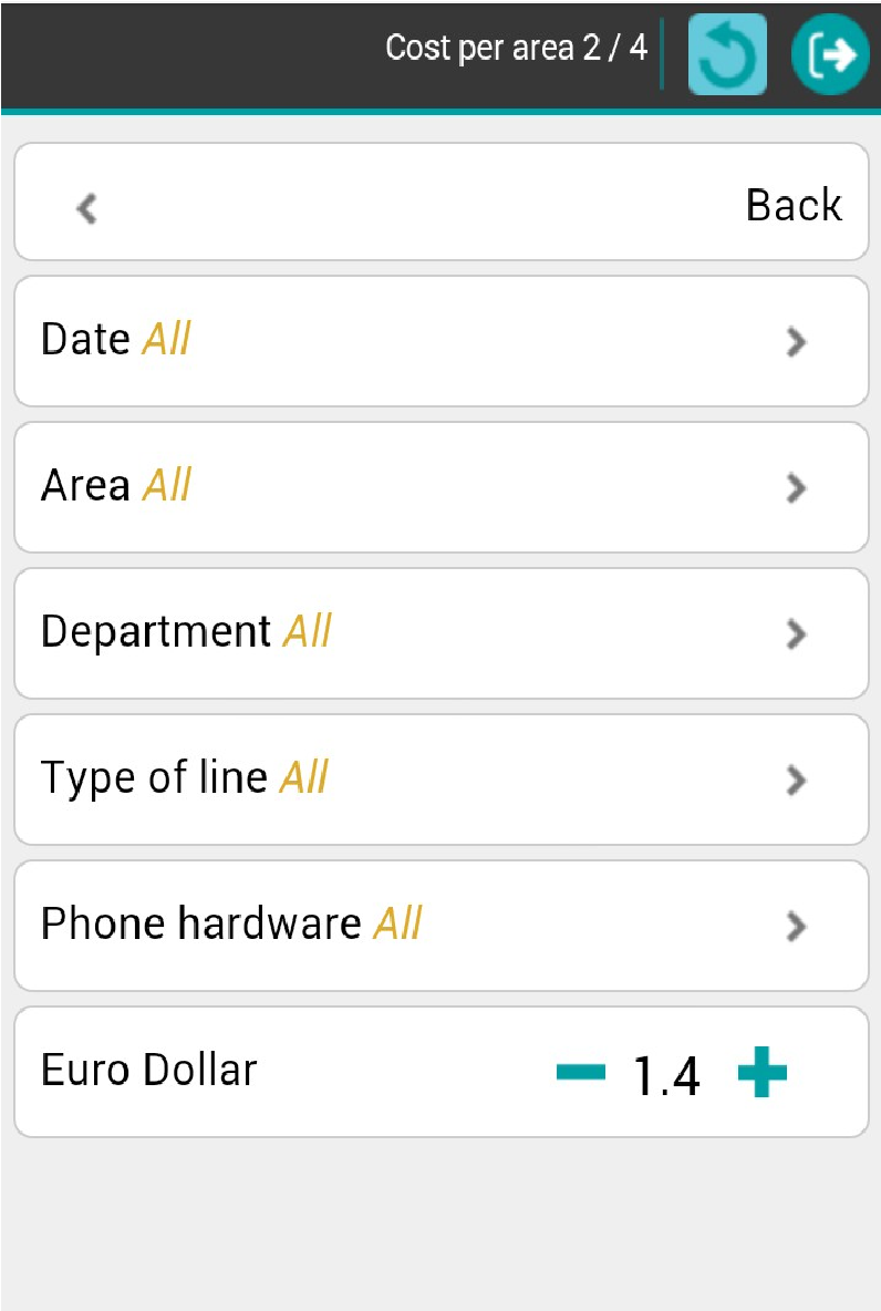
- Click Back to display the chart taking into account the modifications.
- User interactions (navigate on hierarchy, activate filter,...) work on your mobile.
- To log out, click the logout icon

VIII.2 Publish an information flow through email
• Open the Tools-device manager menu
- Unfold the Others section, then select Mail-device and click Add
- The Configuration of device Mail device dialog box opens up.
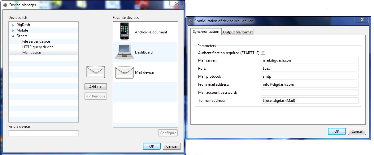
- Open the Synchronization tab to enter information regarding the mail server used to send emails:
- name
- port: by default 1025
- Mail protocol: smtp, pop3
- Mail address and password
- Enter the mail address of the recipient in the To mail address field. By default, the email address is ${user.digdashMail}. When sending the flow, the variable $ {user.digdashMail} is replaced by the user email (the Email is visible in the users management page after selecting the user). If you publish a role flow, the variable will be replaced for all users of the role.
- Enter the mail format in the File Format tab (pdf, ppt, image, ...)
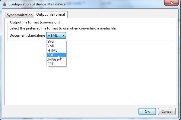
- Click OK to validate the device creation.
- To rename the device,right click “Mail device”, select Rename and enter the desired name (for example “Mail PDF”).
- Select the information flow you want to publish as email in your wallet. Right click and choose Properties. Open the Output tab, then check the Mail device, then click OK.

- Select the flow, right click and choose Synchronize. The flow is published through email using the specified format.
VIII.3 Publish an information flow based on a condition
If you want to publish a flow based on a condition, select this flow, right click and choose Properties. Click the Edit icon besides the device on which you want to add a condition.
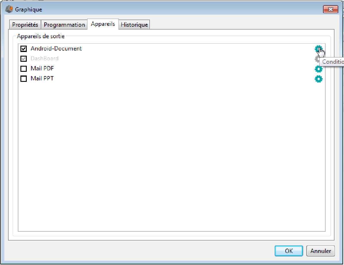
The dialog box Conditional synchronization opens up. Create a formula which describes the condition to fulfill for the flow synchronization.
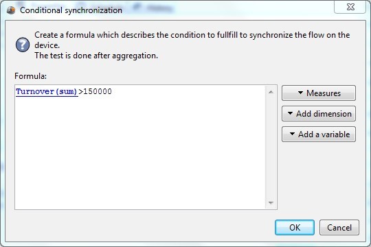
IX.Menus
IX.1 File
Create Chart
Create a chart flow
Create Calendar
Create a calendar flow
Create Emails
Create an emails flow
Create RSS
Create RSS flow
Create Podcast
Create a podcast flow
Create Documents builder
Create a documents builder flow
Open
Open the wallet of the current user or a role
Exit
Closes DigDash Enterprise
IX.2 Edit
Undo paste
Undo the latest Paste action
Redo
Redo the last executed action
Copy
Copy the selected items to the clipboard Paste
Paste items from the clipboard
Delete
Delete the selected items
Select all
Select all the items in the page displayed
IX.3 View
Toolbar
You can hide or show the toolbar by clicking the View/Toolbar menu.
Tabs
By default, the only tab displayed in the administration console is Wallet. You can display others tabs by selecting them in the View/Tabs menu. The available tabs are: Dashboard editor, Server Settings, Users Settings, License manager, Documents management and Server status.
Skins
You can select one of the skin provided by DigDash: RedCaptor, DigDash or Classic
(which is the default skin)
Refresh
Refresh the content of the wallet
IX.4 Flow
Preview as document
This command allows you to view the flow or item selected.
Update history
This command allows you to update the history of the selected flows. If a wallet is selected, it updates the history of all the flows contained in the wallet.
Delete history
This command allows you to delete the history of the selected flows. If a wallet is selected, it deletes the history of all the flows contained in the wallet.
Synchronize
This command allows you to synchronize the selected flows. If a wallet is selected, it synchronize all flows contained in the wallet.
Synchronize for all users
This command is available for role flows only.
It allows you to synchronize the selected flows for all users of a role. If a wallet is selected, it synchronize all role flows contained in the wallet.
IX.5 Tools
The tools menu provides access to centralized meta data of DigDash enterprise (data source, formats, colors,...).
IX.5.1 Datasource model manager
The datasource model manager lets you view and edit data sources of the user and his roles:
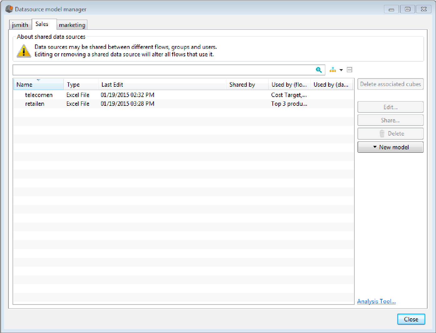
The first tab shows the user data models, the next tabs show the roles data models. In the example above, the user john smith has two roles: marketing and sales. In the sales role, the user has two data models: retail and telecom.
- The column “shared by” indicates the role who shares the data source when applicable
- The column “used by (flows)” lists the flows using the data model
- The column “used by (data source)” list the source mergers using the data models
You can perform actions on data sources and metadata in datasources:
- actions you can perform on data sources:
- Share a data source (only available for role data sources): click the Share button to share a data source with other roles. The data source is owned by the original role but can be used by other roles to create flows. The data model can only be modified in the original role.
- Copy a data source: select the data source, right click and choose Copy. Open the destination tab, right-click and choose Paste.
- Edit a data source: Click the Edit button to edit properties of the data source
- Delete a data source: select one or several data sources and click Delete
- Delete associated cubes: select data sources and click Delete associated cubes
- Create a new data source: click New to create a new data source. If you select several data sources and click New then source Merger, the resulting Source merger will use the selected data sources.
- Search for a data source: enter the name or part of the name of the data source you are looking for in the search field (besides the magnifying glass). List of models is filtered accordingly.
- Analyze your data model: click the Analysis tool link at the bottom of the window. The analysis tool lets you visualize information regarding your data model (data model identifier, columns information, dependencies with other data models, flows using the data model...) and your wallets.
- Actions you can perform on metadata
To display metadata, click the arrow on the right of the search field. You can then select the data you want to display (select Show all) to display all the meta data.
Click the arrow besides the data model name to display the data (columns, then groups, targets or formats,... depending on the selected meta data. Click the + button to display all the data (or - to hide them all).
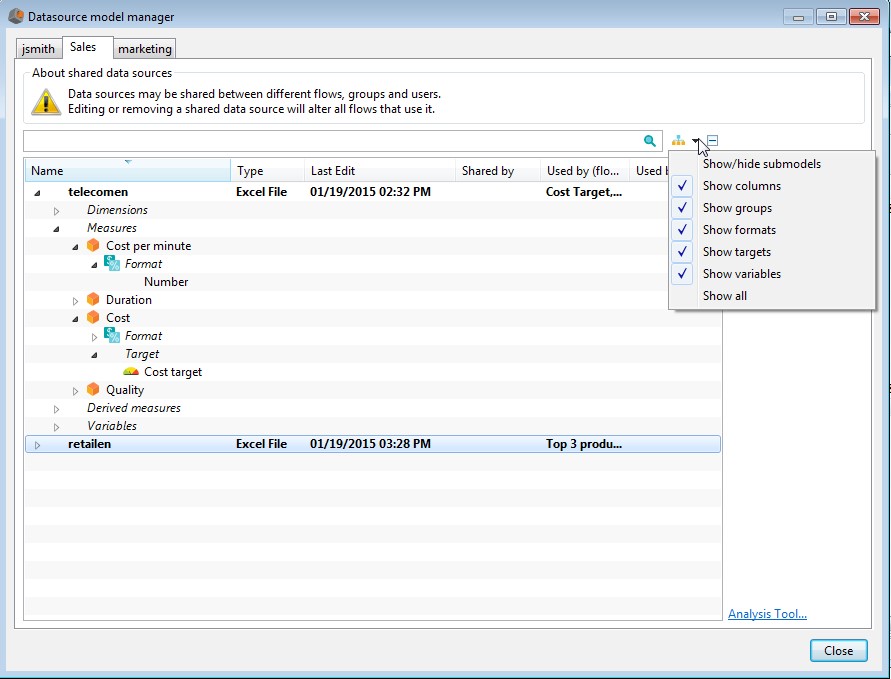
You can edit, remove or copy meta data (targets, groups, formats, variables,...) from a data model to another one.
-
- Edit/Copy/Remove a hierarchy:
- Edit a hierarchy: select the hierarchy, then click Edit or right click and select Edit
- Copy a hierarchy: select the hierarchy, right click and select Copy. Select the dimension on which you want to copy the hierarchy and select Paste.
- Edit/Copy/Remove a hierarchy:
Note: some groups can use values that are not available in the dimension where you copy the hierarchy. In that case, groups are copied but don't include missing values.
-
-
- Remove a hierarchy: select the hierarchy, then click Delete or select the hierarchy, right click and choose Delete.
-
- Edit/Copy a format:
- Edit a format: select the format, then click Edit or right click and select Edit
- Copy a format: select the format, right click and select Copy. Select the column (measure or continuous dimension) on which you want to copy the format and select Paste.
- Edit/Copy/Remove a target:
- Edit a target: select the target, then click Edit or right click and select Edit. The target definition dialog box shows up.
- Copy a target: select the target, right click and select Copy. Select the measure on which you want to copy the format and select Paste.
Remove a target: select the target, then click Delete or select the hierarchy, right click and choose Delete.
IX.5.2 Dictionary manager
The dictionary manager lets you view and modify the translation of meta data (flow names, dimensions names,...).
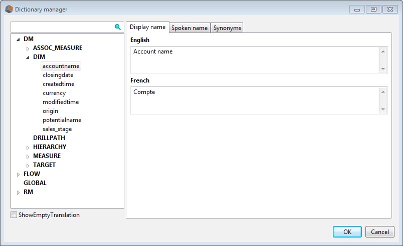
Meta data are displayed in a tree:
- In the DM section (Data Model), you can find translations defined for Hierarchies (HIERARCHY section), Dimensions (DIM section), Measures (MEASURE section), derived measures (ASSOC_MEASURE section) , drill paths (DRILLPATH section) and targets (TARGET section)
- In the FLOW section, you can find translations of flow names.
- In the RM section (Rendering Model), you can find translations added to the chart.
From the dictionary manager, you can:
- Search for a label: type the label or part of the label in the search field besides the magnifying glass. Corresponding labels will be displayed.
- Add a label: select the section in which you want to add a label (example:FLOW), then select Add. Enter the name and its translations. For each language, you can define three different names:
- Display name: name that will be displayed in the user interface.
- Spoken name: if you have a license allowing you to generate audio/videocontent, the spoken name will be used in the audio content.
- Synonyms: this name can be used in query text in replacement of the dimension or measure name. If you want to add several synonyms, use the carriage return to separate them.
Example: if you create a synonym T/O for the measure turnover, you can create a query “T/O by year”.
Note: the list of available languages must be defined in the server settings page.
- Duplicate a label: right-click the label, then select Duplicate
- Rename a label: right-click the label, then select Rename and enter the name
- Remove label: right-click the label, then select Remove
IX.5.3 Device manager
The device manager lets you manage favorite devices that can be used to synchronize flows.
From the device manager, you can:
- Search for a device: type the name or part of the name of the device you are looking for in the field Find a device. List of appropriate devices will be displayed.
- Add a favorite device: select the device you want to add to your favorites and then click Add.
- A device named “Dashboard” is automatically part of your favorites. You can always synchronize flows for dashboard on your computer.
- In the mobile section, you will find available mobile devices: SMS device or mobile phones. Each mobile phone comes in one or two versions: “Mobiledocument” (to display interactive documents on your mobile) and “mobilevideo” (to display video on your mobile. “Mobile-video” is available only if your license authorize video content generation).
You can configure favorite devices by selecting the device, then clicking Configure. Mobile devices can be configured in the following way:
SMS device: enter the phone number and signature content. By default,the phone number is ${user.mobile} (“mobile” LDAP field for the user) and the signature content is ${user.displayName} (“display name” LDAP field for the user). Before using the SMS device, you must configure the SMS service in the server settings page (for more information, refer to the guide configuration_guide_en.pdf).
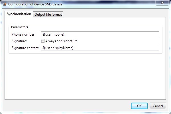
Mobile device: by default, the configuration is the one that best suits your device. You can modify it by selecting another output type (image, video or document) and other files formats (example BMP for images).
-
- in the Others section, you will find three types of devices:
File server device: use this device, to synchronize flows on a file server. In that case, you must select the file server on which you want to synchronize the flows and the format of the file you want to generate (pdf, ppt,excel...)
Http query device:
Enter the URL and the output file format Mail device:
Select the mail used for synchronization and the output file format (refer to chapter “publish flows for email” for more information)
- Remove a favorite device: select one or several devices and click Remove
IX.5.4 Format manager
This menu lets you access the format editor. For more information regarding format edition, refer to chapter “Format data”.
IX.5.5 Server URL manager
This menu lets you access the documents server manager. From the documents server manager, you can add, edit or remove documents server.
IX.5.6 Color palette manager
From this menu, you can create modify or remove color palette. To get more information on colors settings, please refer to chapter “Modify the colors of the chart”
IX.5.7 Predefined functions manager
From this menu, you can create, edit or remove predefined functions. These functions can be used when filtering time dimensions for example.
IX.5.8 CSS manager
From this menu, you can create, edit or remove CSS. These CSS can be used to customize flows visualization.
IX.5.9 Hierarchy manager
Shared hierarchies are automatically created on time dimensions: Date, Month Year and Week Year.
You can also share hierarchies created on continuous dimensions (time dimensions or other).
To display shared hierarchies, open the menu Tools-Hierarchy Manager.
The hierarchies are displayed on the left. When you select a hierarchy, its definition shows up on the right.
From the hierarchy manager, you can:
Add a hierarchy :
Right click the hierarchies list, then click Add. Enter the hierarchy name then select the hierarchy type: explicit or calculated .
To define a hierarchy using calculated values, you must fill up the following fields: • function: JavaScript formula returning the level value. Example: for the date hierarchy, the formula of the day level is new Date(t*1000).getDate() (t corresponds to the date timestamp in the data source. We multiply this timestamp by 1000 as the value is in milliseconds) .
- Minimum formula and Maximum formula: these formulas are used to drill into hierarchies (if you don't want to drill, it is not necessary to fill up these fields). When you drill down, a filter is set using the functions “minimum formula” and “maximum formula”. The formula used to display the value is the one of the lower level.
Example: in the “Month Year” hierarchy, when you drill down from “Year” to “Quarter”, a filter is set using the year minimum and maximum formulas:
-
- minimum formula=(new Date(s, 0, 1)).getTime()/1000 (s représente la
sélection courante)
-
- maximum formula= (new Date(s+1, 0, 1)).getTime()/1000–1
- The calculation of the quarter is done using the quarter function : new Date(new Date(t*1000).getFullYear(), Math.floor(new Date(t*1000).getMonth() / 3)*3, 1).getTime()/1000
To define an explicit hierarchy, you must enter manually the limits of each group. The values of a group are greater or equal to the value Start and strictly less than the value End.
Click + to add a group then enter the limit values. You can rename, remove, or translate a group. To do so, right click the group and select the appropriate menu.
Example: to add a hierarchy “Quarter” on numeric values between 1 to 12, add a group Q1 with start value 1 and end value 4, a group Q2 with start value 4 and end value 7, Q3 with start value 7 and end value 10 and Q4 with start value 10 and end value 13.
If you want to add the hierarchy to all the time dimensions, check the box Add to all upcoming time dimensions.
Remove a hierarchy: select a hierarchy, right click and choose Remove.
Duplicate a hierarchy: select a hierarchy, right click and choose Duplicate. Enter the name of the hierarchy.
Rename a hierarchy: select a hierarchy, right click and choose Rename. Enter the name of the hierarchy.
IX.5.10 Options
General
From the Options/General menu, you can choose to display or not the splash screen when starting DigDash Enterprise.
You can also select the user interface language (languages available are the one you selected in the server settings page)
In the HTML browser section, you can select the browser that will be used when viewing document (the default brower used is Chromium).
To use mozilla Firefox, you must install XULRunner first (by clicking the link Install XUL Runner).
Security
You can protect password manager with a global password
Interface
In the tabs section, check the tabs that you would like to display in the administration console (by default the tab Wallet is the only one to be displayed).
In the defaults section, you can choose to restore hidden dialog (dialog that show up only once to ask for global settings) , Restore tool tips seen once,....
For example, if you edit a data source, a warning message is displayed. If you check the box Do not ask again, this warning message won't be displayed again.
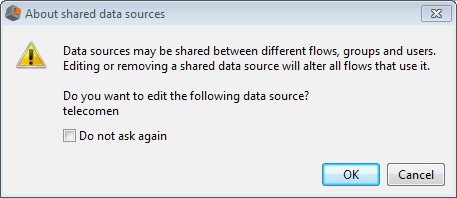
Click Restore hidden dialogs to display it again.
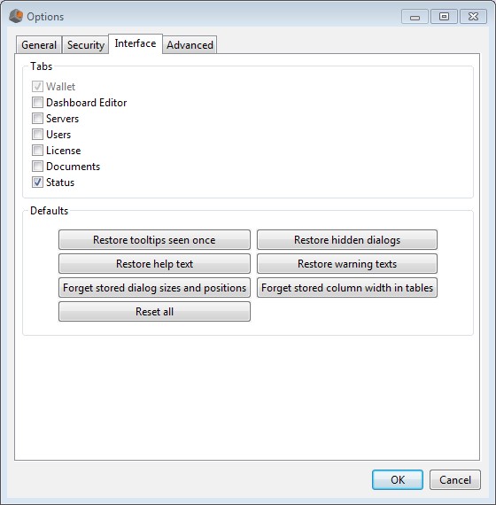
Advanced:
In the advanced tab, you can configure the HTTP proxy (by default, no proxy) and define Storage options
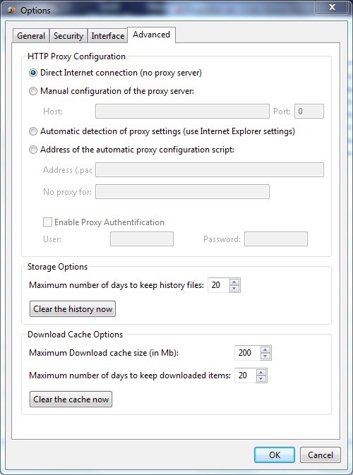
IX.6 Help
From this menu, you can access available documentations (admin console, dashboard editor, tutorial)
Annex 1 : User variables
Variables let you personalize charts by user.
Variables examples :
| Variable | Description |
| user.displayName | Returns the value of the field Display Name field (defined in the Users Settings page). Example of a filter: Name equals to $ {user.displayName} |
| user.uid | Returns the value of the field LDAP login (uid) (defined in the Users Settings page). Example of a filter: uid equals to ${user.uid} |
| user.cn | Returns the value of the field Common name(cn) (defined in the Users Settings page). Example of a filter: uid equals to ${user.cn} |
| user.sn | Returns the value of the field sn (defined in the Users Settings page). Example of a filter: uid equals to ${user.sn} |
| user.SAMAccountName | Returns the value of the field LDAP connection id (SAMAccountName) (defined in the Users Settings page). Example of a filter: uid equals to $ {user.SAMAccountName } |
| user.mobile | Returns the value of the field mobile (defined in the Users Settings page). Example of a filter: uid equals to ${user.mobile } |
| User.digdashMail | Returns the value of the field Email (defined in the Users Settings page). Exemple de filtre : email equals to $ {user.digdashMail} |
| User.digdashMailPassword | Returns the value of the field Email password (defined in the Users Settings page). Exemple de filtre : emailpassword equals to $ {user.digdashMailPassword} |
Administration Console Guide Copyright ©2006-2015 DigDash SAS 122