
Advanced Tutorial : Designing a dashboard
- Introduction
- Prerequisites
- Source files
- Step 1: Connect to the Studio
- Step 2: Create the data model 'telecom'
- Step 3: Create the charts 'telecom'
- Step 4: Create the data model 'retail'
- Step 5: Creating a "retail" chart
- Step 6: Create the dashboard
- Step 7: Display the dashboard
- Congratulations!
Introduction
In this tutorial, we're going to find out how to design a dashboard using relatively advanced functions.
We'll look at how to :
- import data;
- configure a data model, and in particular enrich the imported data by creating hierarchies, a target, a variable and a measure;
- create different types of charts : column chart, map, gauge, etc;
- create a dashboard using these charts;
- display the dashboard.
This tutorial uses 2 fictitious data sets:
- a dataset from a telecommunications company containing information such as call cost and duration, line type, call quality, etc.
- a retail company dataset containing product information and data such as price, turnover, margin, etc.
We'll start by preparing the data, from importing the data to creating the graphs using the Studio.
We can then create the dashboard in the Dashboard Editor and display it using the Dashboard.
Before we do that, however, we'll check that the prerequisites for completing this tutorial have been met.
ℹ The screenshots in this tutorial were generated using the Chrome browser. Depending on your browser, some presentations may differ slightly.
Prerequisites
In order to complete this tutorial, you need to :
- have installed DigDash Enterprise version 2025 R1 or later ;
- be a member of the"Data Model Modeler" and"Dashboard Designer" authorization groups.
These requirements are detailed below.
Version DigDash Enterprise 2025 R1 or higher
To be able to follow this tutorial, you must be using version 2025 R1 or later of DigDash Enterprise.
To find out which version you are currently using:
- Log in to the DigDash Enterprise home page as described in the section Login to DigDash Enterprise section of this tutorial.
- Explore the central area at the bottom of the page: the version of the installation currently in use is displayed at the bottom.
- If you do not have a sufficiently recent version of DigDash Enterprise, contact your administrator or your DigDash contact. You can also consult the Update Guide.
If you do not have DigDash Enterprise and need to install it yourself, please contact your administrator or your DigDash contact. You can also consult the Installation guides. Then go to the Connection section of this tutorial.
Authorization group
In order to be able to use the required functionalities, in particular the Studio, your DigDash Enterprise user account must be a member of the Dashboard Designer authorization group.
If you do not have administrative rights, or if in doubt, contact your DigDash Enterprise administrator.
Source files
In order to complete this tutorial, you must first retrieve the source data files: the Excel files "" and ""
Please click the name of each file to download it.
Step 1: Connect to the Studio
Once you have checked the prerequisites in the previous section and retrieved the source files, you are ready to start this tutorial!
We're going to use the Studio to prepare the data for our future dashboard. We'll start by connecting to DigDash and the Studio.
Log in to DigDash Enterprise
Connect to the home page
- First of all, make sure you have the internet address of the DigDash Enterprise installation as well as your user name and password.
- Your DigDash Enterprise administrator should have given you this information beforehand.
- If in doubt, please contact your DigDash Enterprise administrator.
- Using your web browser, go to the address you have been given: the DigDash Enterprise home page will be displayed.
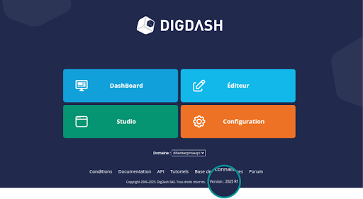
Home page overview
Once you have completed the previous connection stage, the following home page will be displayed in your browser.
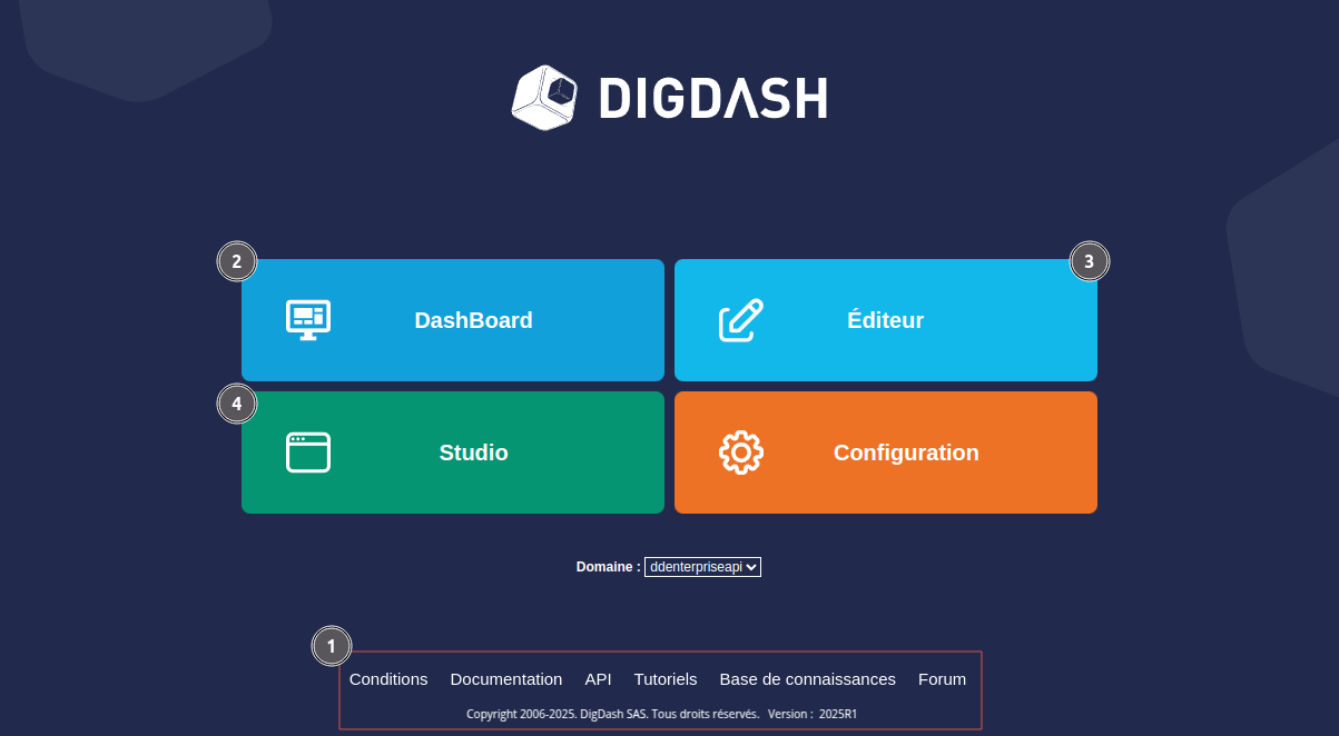
This home page contains a main menu giving access to the various components of DigDash Enterprise as well as an insert giving access to various items such as documentation or the software version.
The numbered items are the ones we are interested in for this tutorial. They are detailed in the table below:
| 1: Help and version | In the central area at the bottom of the home page, you can access help on DigDash Enterprise in the form of online documentation and a forum. The version currently in use is also displayed in the lower part of this area. |
|---|---|
| 2: DashBoard | The DashBoard button gives you access to the dashboards you or your team have already created. This is where you can view the dashboard you've built. |
| 3: Dashboard editor | The Dashboard Editor button gives you access to dashboard editing. From this menu you can insert graphs in the dashboard, add filters, etc. |
| 4: Studio | The Studio button provides access to data preparation. This is where you can import data, configure the data model and create flows (graphs, tables, etc). This is why, in this tutorial, we will concentrate mainly on this part of DigDash Enterprise. |
As you can notice, the main menu also provides access to the Configuration component. This contains advanced configuration elements that are not covered in this tutorial.
Connect to the Studio
- From the home page, click the Studio button: a login page opens.
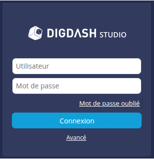
Enter your username and password, then click the Login button: the Studio window appears.
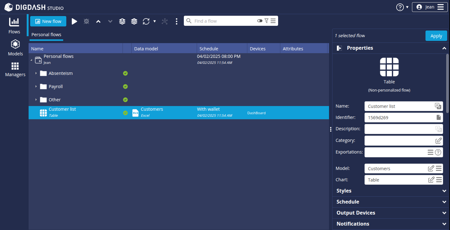
The window opens to the Flows page, which contains all the graphs, tables, etc., that are available in the Studio. We'll come back to this later when we talk about creating charts. First, we'll look at the Data models section.
Step 2: Create the data model 'telecom'
Here we will import data from the Excel file "telecomen.xls" (retrieved earlier), which represents data from a fictitious telecommunications company. We will then enrich this source to build a data model that will enable us to create relevant charts.
To do this, switch to the Models page by clicking the Models button on the left of the window.
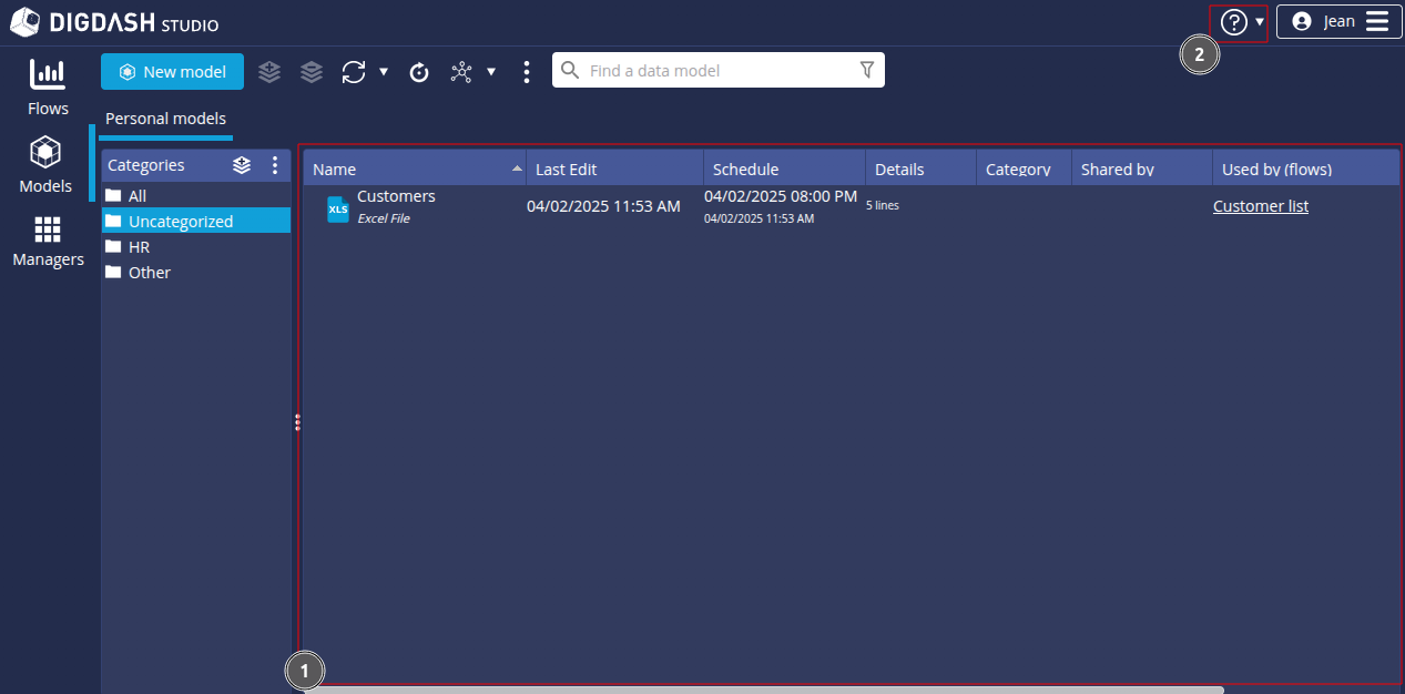
In the central area (1), you can view the list of existing data models for each role. In this illustration, no role has been created, so there is only the Personal models tab attached to the automatically created Personal role.
At the top right (2), you can access the help menu  .
.
Import the data source "telecom"
To import data from the "telecom" source file:
- Click the New model button.
- In the Create a new data model box, select All types in the Files section.
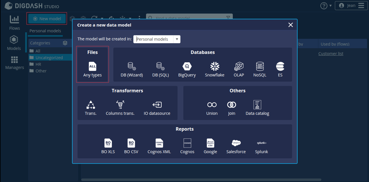
➡ The Search remote files box appears:

- In the Server drop-down list, select "Common Datasources".
- Click the Add file... button.
- In the Select file dialog that appears, keep the default selection From your computer.
- Click Add to select the "telecomen.xls" file retrieved earlier.
- Click OK.
The file is now saved on the DigDash "Common Datasources" server and accessible to all users.
- In the Search remote files box, select "telecomen.xls".

- Click OK.
The Excel File window appears. It offers options for selecting and transforming data, as well as a preview of the data.
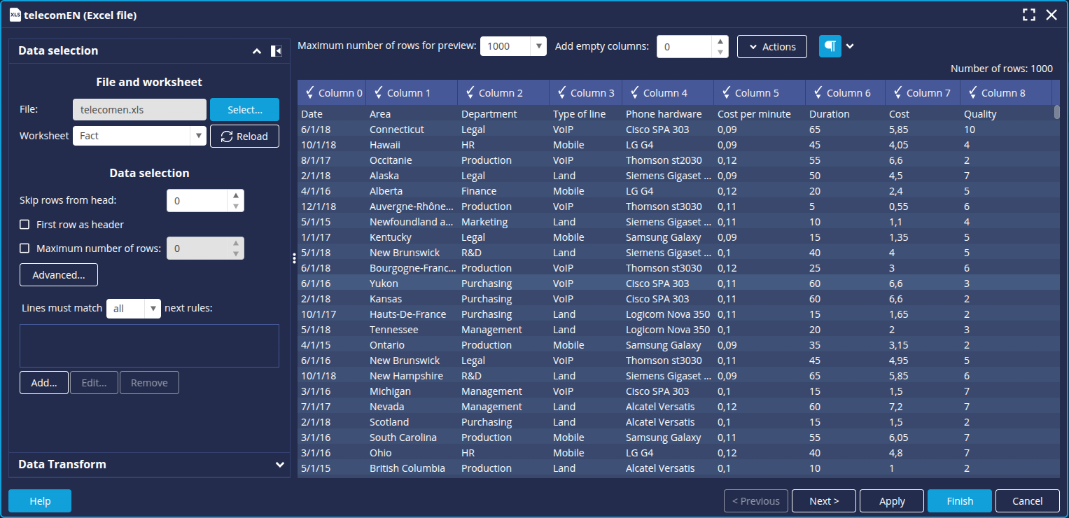
The elements in the first row of the table correspond to the data types in each column. We will therefore use them as column headers. For example, Region for column 1. To do this:
- In the Data selection section, check the First row as header box.


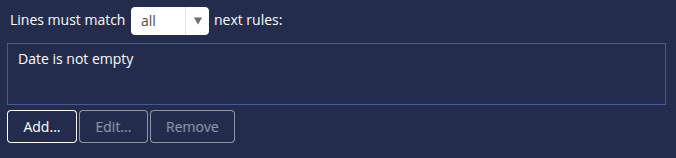
We are now going to filter out any rows where the Date field is empty. To do this :
- In the Data selection section, click on the Add... button under Lines must match ... next rules.
The Edit filter rule box appears: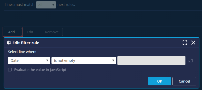
- Leave the default values: Date in the first drop-down list and "is not empty" in the second drop-down list.
- Click OK.
The rule is then added in the corresponding field.
We can now move on to configuring the data model: click the Next button at the bottom right to open the Advanced onfiguration window.
Configure the data model
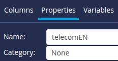
The Excel File window opens on the first Columns tab. You will notice that the title of the second Properties tab is preceded by a cross on a red background.
A name needs to be entered for the data model.
- Click the Properties tab.
- Name the data model "telecom".
We are now going to enrich the source data in order to create a data model that will enable us to create relevant charts. We will create :
- a manual hierarchy of company departments (Management, Production, etc)
- an automatic hierarchy for hardware (phone models)
- an objective on consumption costs
- a calculated measure to simulate communication costs according to the €/$ exchange rate.
To do this, go back to the Columns tab.
Create a manual hierarchy
💡Remember to save your data model regularly by clicking the Apply button at the bottom right of the screen.
Here we are going to create a manual hierarchy of the company's departments. We will first group the departments into Functions. We will then group these functions into Activities. For example, the Administration function will group together the Purchasing, Legal and IT departments and will be attached to the Support activity.
- In the list of columns, select Department.
- In the Hierarchies section of the right-hand panel, click the Add button symbolised by a + and select Manual Grouping.
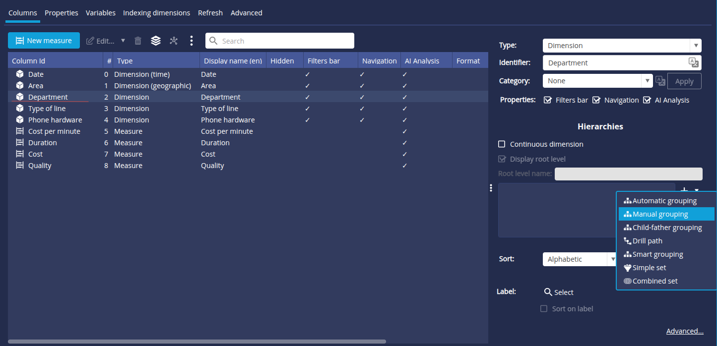
➡ The Create a hierarchy on the "Department" dimension box appears.
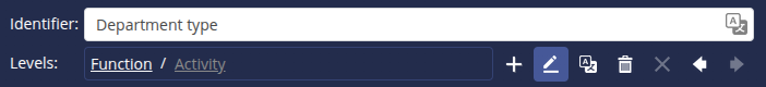
- The default Identifier is Group 0. Rename it to Department Type.

- A first level called Level 0 contains all the values in the column, rename this level Function.
- Click the pencil button
 button to the right of the field.
 - Change the name in the Rename level "Level 0" box.
- Click OK.
- Click the pencil button

Create Function groups
To create groups at this Function level :
- Click the Add... button in the bottom left-hand corner.
- In the Group Name dialog box which appears, enter the name of the first function: Sales.

- Repeat the operation for the Management, Production and Administration functions.
Allocate members to function groups
We are now going to allocate members to each group, i.e. assign activities to each function.
- In the Group list on the left, select Administration and then tick Purchasing, Legal and IT in the Member list on the right.

- Repeat the operation for :
- Sales: Marketing and Sales
- Management : Management, Finance and HR
- Production : Production and R&D
Add a second level and create Activity groups
Let's add a second Activity level which will allow us to group the functions into 2 activities: Main and Support.
- Add a second level by clicking the + button.
- A level called Level 1 is added after Function. Rename this level Activity.
- Click the pencil button to the right of the field.
- Change the name in the Rename level "Level 1" box.
- Click OK.
- Click the pencil button
To create groups at this Activity level :
- Click the Add... button at the bottom left.
- In the Group Name dialog box which appears, enter the name of the first activity: Main.
- Repeat the operation for the second activity: Support.
Allocate members to activity groups
- In the Group list on the left, select Main and then, in the Member list on the right, tick Sales and Production.
- Repeat the operation for Support: Management, Administration.

- Click OK to confirm the two-level hierarchy.
Create an automatic hierarchy
Here we are going to build a group hierarchy based on other dimensions of our data model. We will group the different types of equipment by row type.
- In the list of columns, select Phone hardware.
- In the Hierarchies section of the right-hand panel, click on the Add button symbolised by a + and select Automatic grouping.
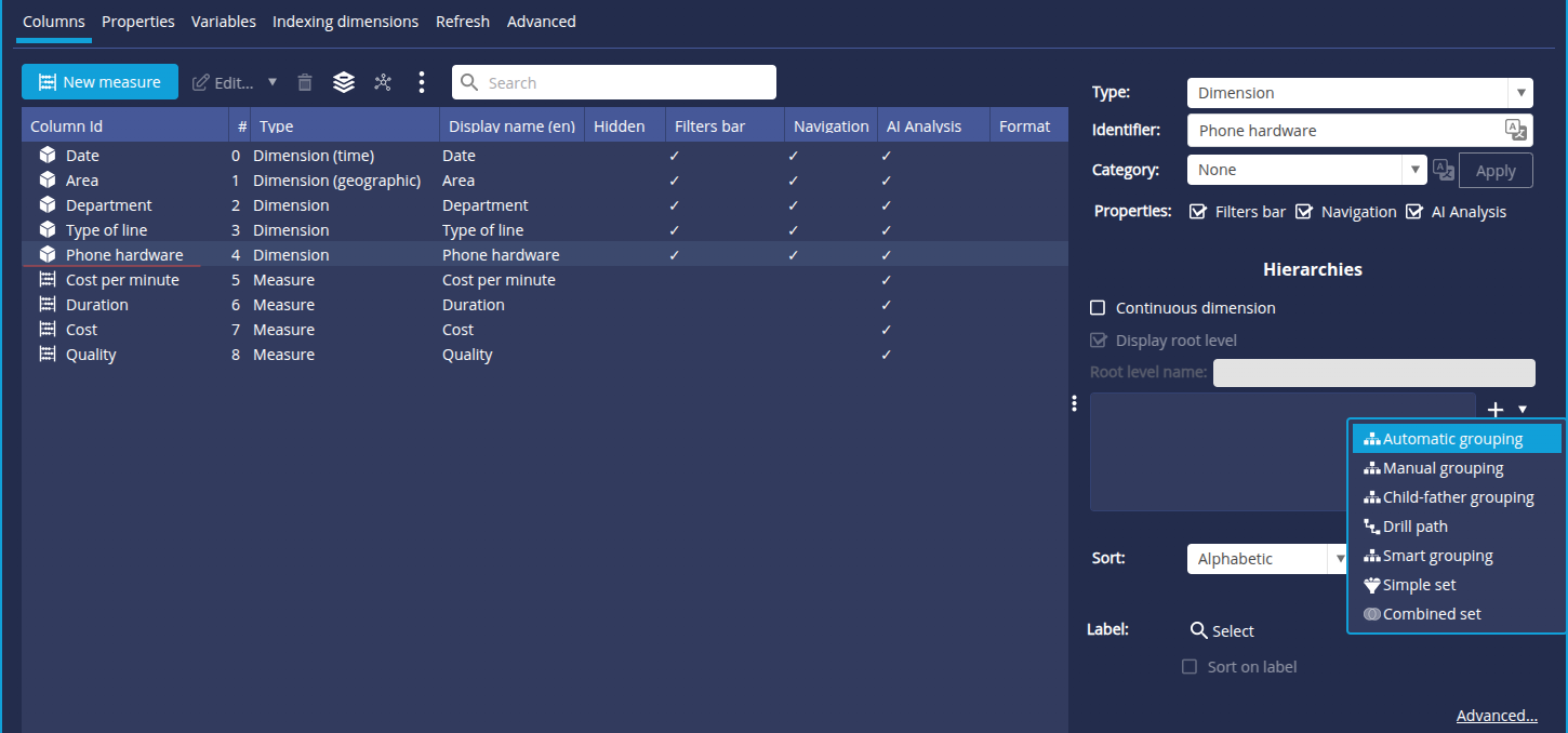 ➡ The Group Edit box is displayed.
 - The default group name is Group 0, rename it Hardware type.
The complete path of the hierarchy is displayed on the Complete path line.
Each hierarchy level is separated from the next by a /.
Hardware is the first level of the hierarchy. - Open the drop-down list for the second level and select Type of line.

- Click OK to confirm.
Create a target
We are now going to create a target for the Cost measure. Here we want to achieve less than €21,000 in communication costs.
- In the list of columns, select Cost.
- In the Targets section of the right-hand properties panel, click on the Add button, symbolised by a +.
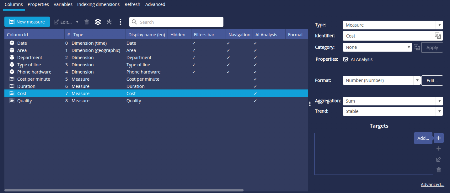
➡ The Target Definition box appears. - Enter the name of the target: Decreasing cost.
- In the Target type drop-down list, select Decreasing.
- In the Type drop-down list, select Allocation and then, in the Target field, enter the value 21,000.

- Click OK to confirm.
Create a variable
We are going to create a Euro/Dollar conversion variable which we will later use to create a measure calculating communication costs as a function of the Euro/Dollar exchange rate.
To do this :
- Click the Variables tab.
- Click the Add button symbolised by a + to add a variable.
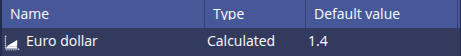
- In the variables edit window that appears, fill in the following fields:
- Name: Euro Dollar
- Default value : 1.4
- Minimum value : 0.6
- Maximum value : 2
- Increment : 0.01

- Click the Apply button to confirm: the variable is added to the list on the left.
Create a calculated measure
Here we are going to create a measure enabling us to calculate the communication cost as a function of the Euro/Dollar exchange rate. To do this, we'll use the Euro/Dollar conversion variable that we've just created.
- Return to the Columns tab.
- Click the New Measure and select Calculated Measure (advanced user)...
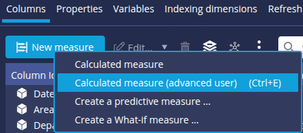
- In the Calculated Measure window that opens, enter the desired name in the Measure field: Euro Dollar Cost then click
 to confirm.
 - Enter the calculation formula:
- In the Measures list on the left, double-click Communication cost : the measurement is added to the Formula field on the right.

- After <Communication cost(sum)>, type *1.4/.
- In the Variables list on the left, double-click Euro Dollar to add it after the formula.

- In the Measures list on the left, double-click Communication cost : the measurement is added to the Formula field on the right.
- A preview of the result of the formula is shown on the right. The measurement is displayed as a temporary measurement with the extension tmp.
- Click OK to validate the formula.
Our data model is now complete.
Click Finish then Ignore in the Add a comment on modification dialog box.

You are now back on the Models page and your "telecom" data model is now listed.

We can now move on to creating the graphs which will later be used to build our dashboard.
Step 3: Create the charts 'telecom'
Here we are going to create several graphs and charts from the data model we have just prepared:
- a bar chart showing the cost of communication by type of department
- a map showing communication cost by region
- a gauge graph comparing communication cost to a target
- a Lines chart showing the impact of variations in the Euro/Dollar exchange rate on communication cost.
Charts and tables are called Flows in DigDash Enterprise. They are created from the Flow page in the Studio.

The Flow page lists the flows previously created in each role. Here, only personal Flows are visible, as there are no other roles.
The panel on the right shows the properties of the selection and provides access to a number of options and functions that we won't go into here.
Create the chart 'Communication cost per department'
Purpose : Create a bar chart showing the Cost per Department. From their dashboard, users can navigate the Department type hierarchy.
- On the Flow page, click the New Flow button: the Create flow such as a chart or document builder window is displayed.

- In the Comparison category, select Bar chart: the Flow Properties window appears.

First we need to select the data model to be used.
- In the Data model section, click the hamburger button to the right of the Name field and then, in the pop-up menu, on Existing.
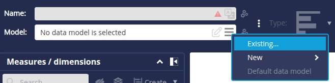
- In the Data model manager window that appears, select the model telecom from the list and click OK.
The Flow Properties window is then populated with the elements of the data model, such as the measurements and dimensions available in the Measurements/Dimensions panel on the left.
In the middle is the automatic preview, which will give a preview of the chart once the axes have been selected.
Around this area, the various rectangles (Bar, Stack, Multiplier, etc) are used to define the axes of the chart. Simply drag and drop the desired measures and dimensions into these rectangles.

- Drag and drop the measure Cost onto the Stacking axis.
- Drag and drop the dimension Department onto Bar axis: the Dimension "Department": automatic selection of a level window appears. We have already created a hierarchy for this dimension. It is therefore necessary to define the selected level.
- Keep the automatic selection: Department type hierarchy and Activity level.
- Check Add the action "Navigate hierarchies" so that you can then navigate the hierarchies directly on the chart.

- In the Interaction tab of the right-hand panel, you can check that the Navigate on hierarchy action has been applied.

- Use the Preview button
 to view the graph.
You can activate automatic refresh by clicking this button and selecting Automatic from the context menu.
You can now click the Main and Support members to move down the manual hierarchy prepared in the data model.

You can finish by entering the name of this new chart: Communication cost per department, then clicking OK at the bottom right of the window to save the chart.
The chart Communication cost per department now appears in the list of your Personal flows.

Creating the chart 'Communication cost per area'
Purpose : Create a map showing communication cost by continent. When the dashboard containing this chart is displayed, users can navigate through the continents to display cost by country and then by region.

- On the Flow page, click on the New Flow button: the Create a chart or document builder box is displayed.
- In the Maps category, select Map chart: the Flow Properties window appears.
First we need to select the data model to be used.
- In the Data model section, click the hamburger button to the right of the Name field: the "telecom" model is now directly proposed in the pop-up menu.

- Click it to select it.
The Flow Properties window is now populated with the elements of the "telecom" data model.
We can now configure the map.
- From the Measures / dimensions tab, drag and drop the Cost measure onto the Measure axis.
- Drag and drop the dimension Area dimension onto the Geography axis: the Dimension "Area" dimension: automatic selection of a level window opens.
- Keep the default hierarchy, and tick Add the action "Navigate in hierarchies" to be able to navigate in the different levels of the map.

- Refresh the chart preview if necessary.
- Click, for example, on Europe to see the detailed cost in this area.

We can finish by entering the name of this new chart: Communication cost per area, then clicking OK at the bottom right of the window to save the chart.

The chart Communication cost per area now appears in the list of your Personal flows.
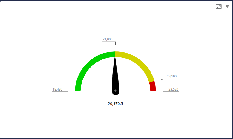
Create the gauge chart 'Cost target'
Purpose: Create a gauge comparing communication cost with a target, which we have previously defined in the data model.
As a reminder, the company wants to achieve a €21,000 reduction in communication costs.
- On the Flow page, click the New Flow button: the Create a flow such as a graph or document builder window is displayed.
- In the Indicators category, select Gauge: the Flow Properties window appears.
- As with the previous chart, start by selecting the "telecom" data model.
The Flow Properties window is then populated with the elements of the "telecom" data model.
We can now configure the gauge.
- From the Measures/Dimensions tab, drag and drop the Communication cost measure into the Measure area.
- Right-click the dropped measure to check that the selected target is the Decreasing cost as defined in the data model.

- Refresh the preview if necessary to view the gauge with the cost reduction target of 21,000 euros.
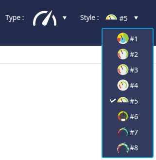
- You can change the style of the gauge to the right of the Type at the top of the window.
- Rename the chart: Cost target.
- Click OK to save the chart and add it to your Personal flows.
Creat the chart 'Euro Dollar Simulation'
Purpose: Create a chart showing the impact of variations in the euro/dollar exchange rate on communication costs.
- Create a Lines chart (in the Comparison category).
- In the Flow Properties window, select the "telecom" data model.
- From the Measures / dimensions tab, drag and drop the measures Communication Cost and Euro Dollar Cost onto Lines.
- Drag and drop the dimension Date onto the axis Abscissa.
Change the hierarchy to Month Year and the level to Year, then tick Add the action "Navigate hierarchies". - Refresh the graphical preview if necessary to view the chart.

- Rename the chart: Euro Dollar Simulation.
- Click OK to save the it and add it to your Personal flows.
Step 4: Create the data model 'retail'
Here we are going to import the data from the Excel file "retailen.xls" (retrieved earlier) which represents the data from a fictitious retail business.
To do this, switch to the models page by clicking the Models button on the left of the window.
Import a data source
To import data from the "retail" source file :
- Click the New template button.
- In the Create a new data model window, select All types in the Files section.

➡ The Search for remote files box is displayed - In the Server drop-down list, select "Common Datasources".
- Click the Add a file to the server... button.
- The Select a local file or URL box appears, keep the default selection From your computer.
- Click Browse to select the"retailen.xls" file retrieved earlier
- Click OK.
➡ The file is now saved on the DigDash "Common Datasources" server and accessible to all users.
- In the Search for remote documents box, select "retailen.xls".

- Click OK.
The Excel File box appears. It offers data selection options and a preview of the data.
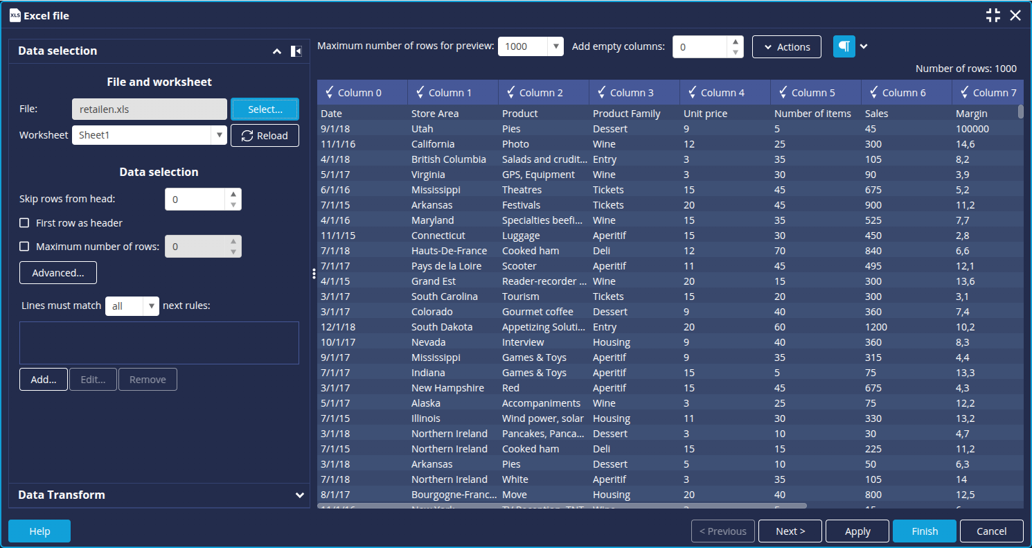
The elements in the first row of the table correspond to the data types in each column. We will therefore use them as column headings. For example, Store area for column 1. To do this:
- In the Data selection section, check the First row as header box.


We are now going to filter out any rows where the Date field is empty. To do this :
- In the Data selection section, click the Add... button
The Edit filter rule box appears:
- Leave the default values: Date in the first drop-down list and "is not empty" in the second drop-down list.
- Click OK then Next.
The rule is then added in the corresponding field.

We can now move on to configuring the data model: click the Next button at the bottom right to open the advanced data model configuration window.
Configure the data model
The Advanced configuration window opens on the Columns tab. You can notice that the title of the second Properties tab is preceded by a cross on a red background.
This means a name needs to be entered for the data model.
- Click the Properties tab .
- Name the data model "retail".

- Click Finish to close the Advanced configuration window.
➡ The "retail" data model is then added to the list of your Personal models.
Step 5: Creating a "retail" chart
We are now going to create a chart from the data model "retail" we have just prepared.
Purpose: Create a Cross table showing the sales achieved on the three best products. The sales trend and margin target will be displayed in the table in the form of icons.
- On the Flows page, click the New Flow button: the Create Chart or Document Builder box is displayed.
- In the Tables category, select Cross table : the Flow Properties window appears.
- Select the"retail" data model.
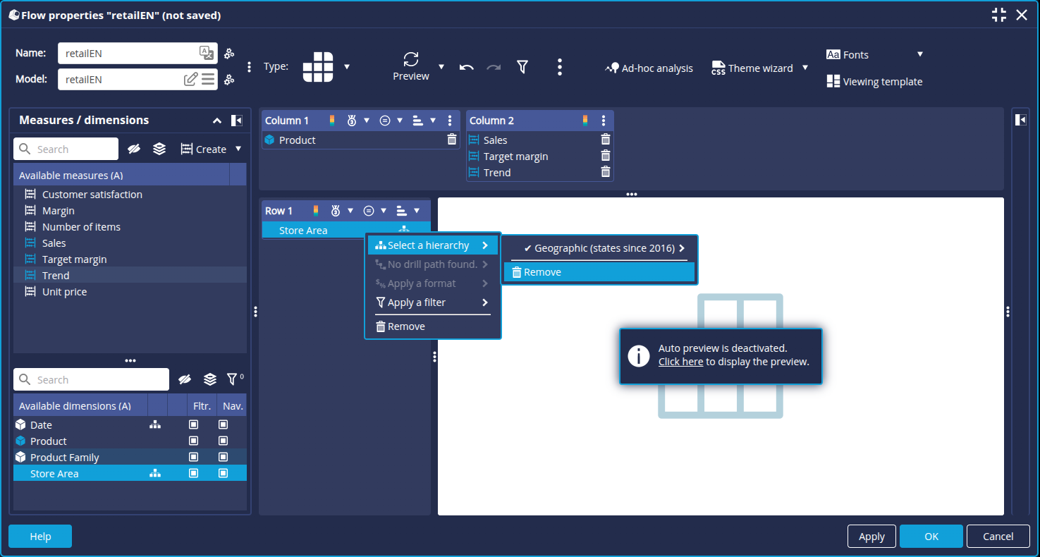
- From the Measures / Dimensions tab, drag and drop the dimension Product into the Measures or dimensions area at the top.
- Drag and drop the measure Sales on the right of Column 1. (Column 2 is created)
- Drag and drop the measures Target Margin and Trend into Column 2.
- Drag and drop the dimension Store area into the left-hand Measures or dimensions area.
- In the Dimension "Store area" : automatic selection of a level window is displayed, click OK and then remove the hierarchy.
We are now going to apply a format to the Margin and Trend measurements in order to display them as icons in the table.
- Right-click on Target Margin and apply the Target format (icon) to it.

- Right-click on Trend and apply the Trend format (icon).

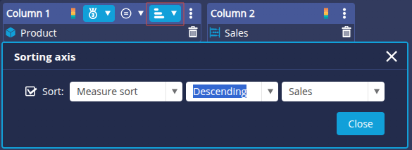
Here we want to rank the top 3 sales figures by product. To do this :
- Click the medal icon at the top of "Column 1" and then enter the following options:

- In Column 1, click the sort option:
- Check the "Sort" box.
- Choose "Sort by measure".
- Select "Descending".
- Click Close.
Refresh the graphical preview if necessary to view the Cross table.
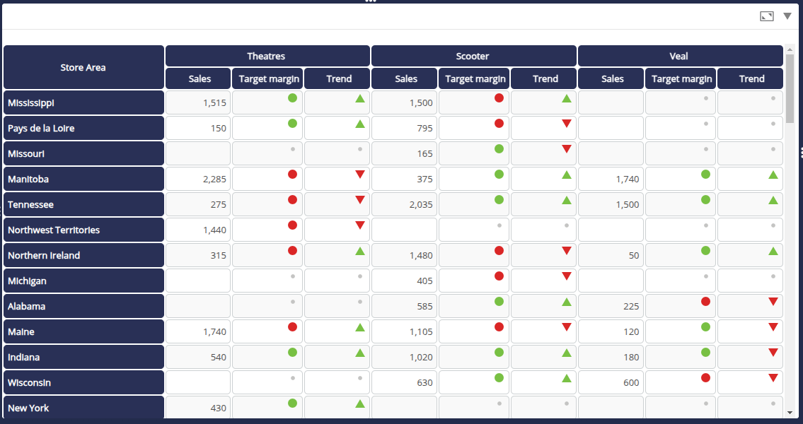
Rename the chart: Sales for top 3 products.
Click OK to save the table and add it to your Personal flows.
Step 6: Create the dashboard
We've finished creating the flows (charts, map, table). We can now leave the Studio and move on to creating the dashboard.
To do this, we're going to work in the Dashboard Editor.
Connect to the Dashboard Editor
- Return to the DigDash Enterprise home screen. From Studio, you can :
- Click the DIGDASH STUDIO logo at the top left of the page.

- Click Start Page in the expandable menu at the top right.
- Click the DIGDASH STUDIO logo at the top left of the page.
- Once on the Home page, click the Editor button: a login page will open.
- Enter your user name and password, then click the Login button: the DIGDASH Editor window will appear.

Let's have a quick look at the Dashboard Editor.
| 1: Roles and pages | The central area displays the dashboard pages (2nd line) for each role (1st line). When you log on for the first time, a personal page called My Dashboard is automatically created in your personal role (in this example: John). The personal role bears the user's name, and only the user has access to it. |
|---|---|
| 2: Menu bar | The menu bar contains various functions and options:
|
| 3: Page content menu | This menu provides access to the content elements, filters and variables that you can add to the dashboard. |

Choose a dashboard template and insert charts
First we will choose a dashboard template, i.e. a layout for the elements on the dashboard page. We can then add the desired charts.
- Select My Dashboard then, in the panel to the right of My Dashboard, click the cogwheel to the right of Display mode.
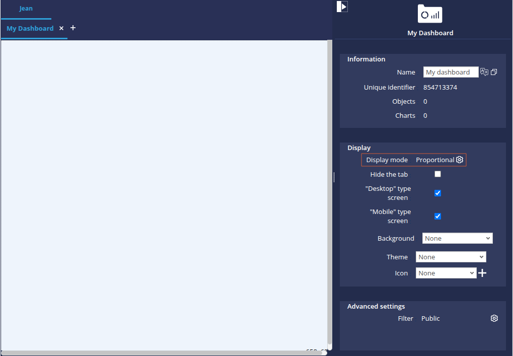
- In the window which appears, select Templates from the Display mode drop-down list, then click the cogwheel to access the available templates.
- In the Templates window that appears, select the"Graphics + Filters at top" template.

Your page now contains areas where you can drag and drop charts or filters.
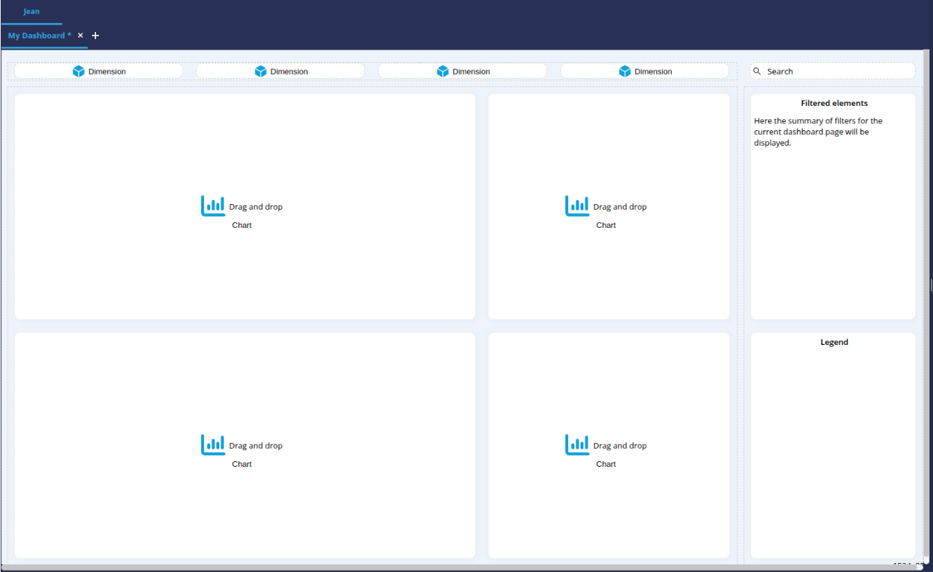
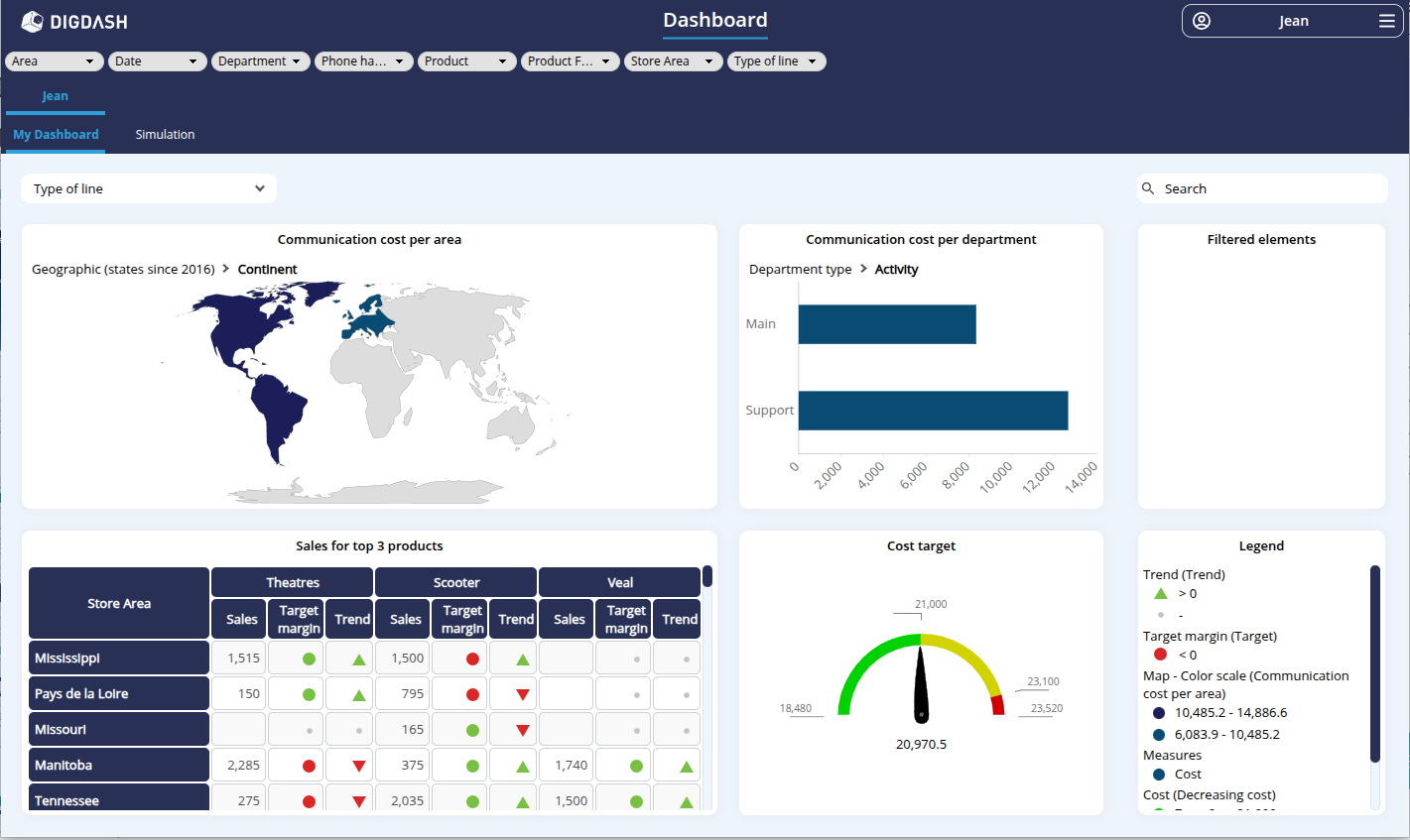
We are going to insert the following graphs:
- Communication cost per department
- Communication cost per area
- Target cost
- Sales for top 3 products
To do this
- In the left-hand side panel, select Information flow (Existing graphics) to display the list of existing charts.
- From this list, drag and drop the charts into the "Drag and Drop Chart" areas of your page.

Add a filter
We're going to add a filter for the Type of line to the page.
- In the left-hand side panel, select Filters / Variables to display the available filter elements and variables.
- Drag and drop Type of line into the first Dimension area of the dashboard page.

Add a dashboard page
Here we are going to add a dashboard page in which we are going to create a simulation of the communication cost according to the Euro Dollar conversion rate.
- Click the + icon to the right of My Dashboard to create a new dashboard page.
- In the Add page box that appears :
- enter the name Simulation;
- select Proportional mode then click OK.
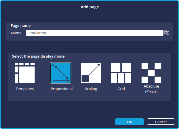
➡ The new page is added.
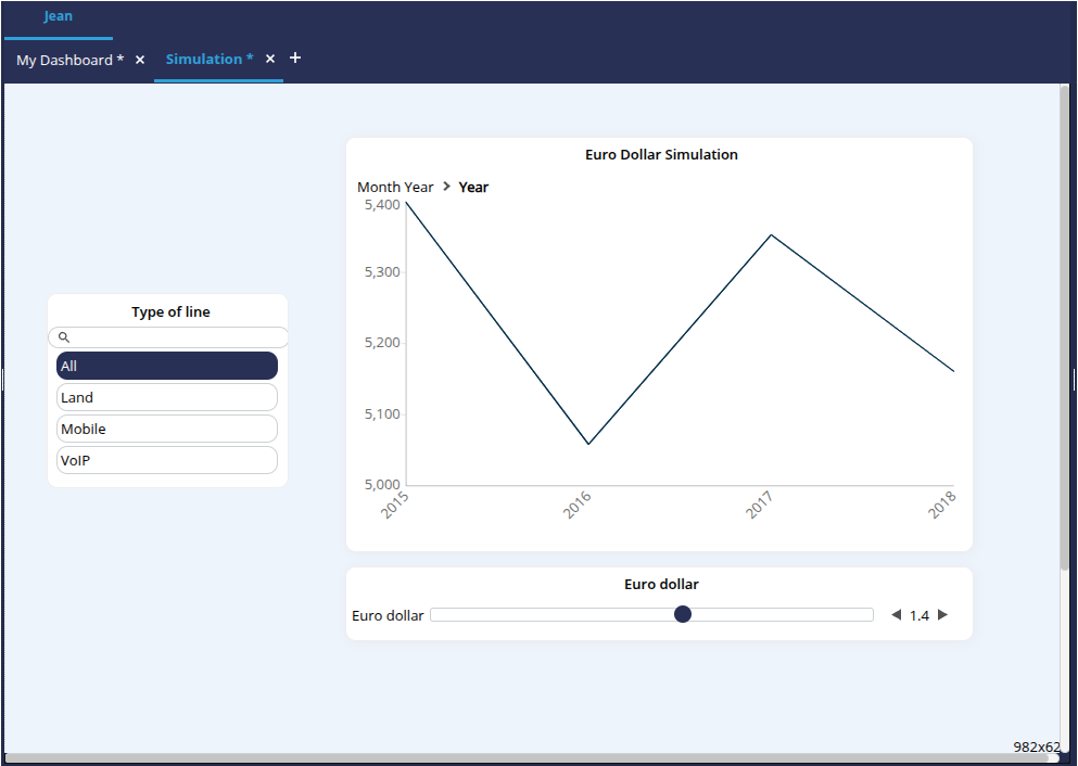
- From the Information Flow (Existing Charts) section of the left-hand side panel, drag and drop the Euro Dollar Simulation chart into the new page.
- From the Filters/Variables section, drag and drop the Euro Dollar variable below the chart.
- Then drag and drop the Line Type filter to the left of the chart.
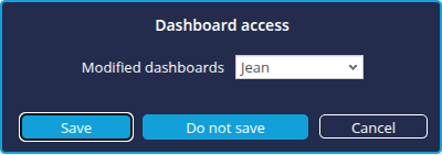
- Save the dashboard by clicking the Save button at the top right of the window.
Step 7: Display the dashboard
You can now view the final result of your work!
To do this, click the button Access the dashboard button ![]() at the top right of the window.
at the top right of the window.
You can now manipulate your dashboard by clicking on the charts and filters, or by changing pages.
Congratulations!
You've managed to create a real dashboard from Excel source files.
We've seen how to :
- load a file ;
- configure a data model
- configure charts based on this data model;
- create and configure dashboard pages.
Going further
You can go even further!
With the Studio, DigDash Enterprise lets you go into even more detail in configuring your data models, connect to your databases and join or combine several data sources.
Don't hesitate to get in touch with your DigDash Enterprise administrator or your DigDash referral contact to discuss this!