
Creating an age pyramid
- Introduction
- Prerequisites
- Step 1: Create and configure the data model
- Step 2: Configuring the chart Age pyramid
- Congratulations!
Introduction
The aim of this tutorial is to create an age pyramid. A population pyramid is used to represent the gender and age distribution of a population at a given time.
The dataset used in the tutorial corresponds to fictitious data from a company containing information about employees such as their ID, name, age, etc. This data is contained in the Excel file "".
This entire tutorial takes place in the Studio.
To create the age pyramid, we will first prepare the data and then configure a Bar chart.
Prerequisites
In order to complete this tutorial, you will need to :
- have installed DigDash Enterprise version 2025R1 or later;
- be a member of the"Data Model Designer" authorisation group;
- download the Excel file "".
ℹ The screenshots in this tutorial were produced using the Chrome browser. There may be slight differences depending on the browser.
Step 1: Create and configure the data model
Import the data
Here we're going to import data from the Excel file "Employee_Register.xlsx" (retrieved earlier), which represents the human resources data for a fictitious company.
To do this:
- Launch the Studio.
- Open the Templates tab.
- Click on the New Template button.
- In the Create a new data model box, select All types in the Files section.
➡ The Search for remote files box appears. - In the Server drop-down list, select "Common Datasources".
- Click on the Add a file to the server... button.
- The Select a local file or URL box appears, keep the default selection From your computer.
- Click Browse to select the "Employee_Register" file retrieved earlier.
- Click OK.
➡ The file is now saved on the DigDash"Common Datasources" server and accessible to all users. - In the Search for remote files box, select "Registre_RH".
- Click OK.
The Excel File box is displayed. It offers data selection options and a preview of the data.
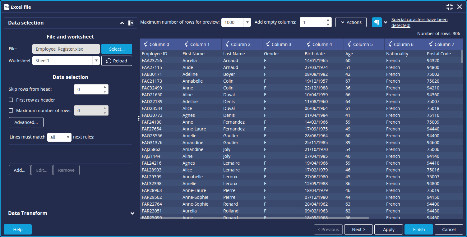
The items in the first row of the table correspond to the data types in each column. We will therefore use them as column headings. For example, Employee ID for column 1.
To do this:
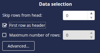
- In the Data selection section, select the First row as header checkbox.
Transform "Birth Date" into age (optional)
If you only have the date of birth, you can transform the data to obtain the age.
To do this:
- Open the Data transformation tab.
- Click Add to create a new data transformation.
➡ The Create Transformation interface is displayed. - Select the Birth Date column in the Target column drop-down list.
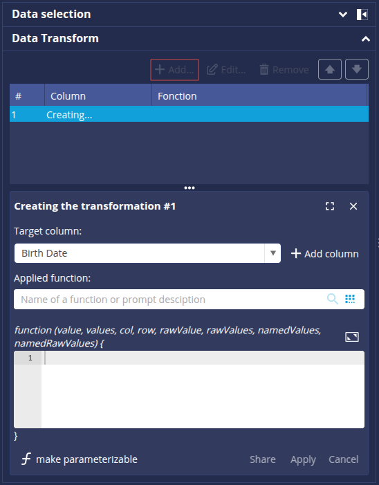
- In the Applied function field , click the
 button to display the list of functions, or type Age directly in the search field.
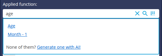
- Select the Age function and click Apply.
➡ The calculated age is displayed in the Birth date column.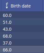
- Click the header and then select Rename to change the name of the column (Age).
- Click on the
 button to finish.
Grouping ages by group
Here we have chosen to group the ages in groups of 5.
To do this:
- Open the Data transformation tab.
- Click Add to create a new data transformation.
➡ The Create Transformation interface is displayed. - Select the Age column from the Target column drop-down list.
- Enter the following script in the Script Editor:
while(v%5 != 0) {
v++;
}
return v +'';
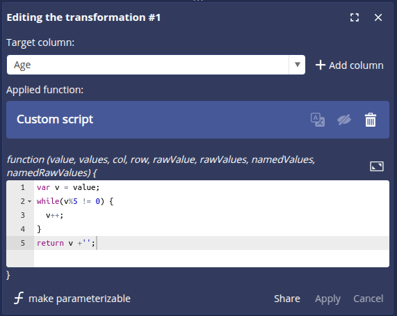
- Click Apply.
➡ The Age column is transformed.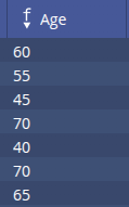
We can now move on to configuring the data model: click the Next button at the bottom right to open the data model configuration window.
Configure the data model
The data model configuration window opens on the Columns tab. We are going to make the necessary settings in the data model.
Change the type of the Age column
The Age column has been detected as a measurement. However, it will be used here as a dimension. To change this:
- Select the Age column.
- In the Type field at the top right, select Dimension.
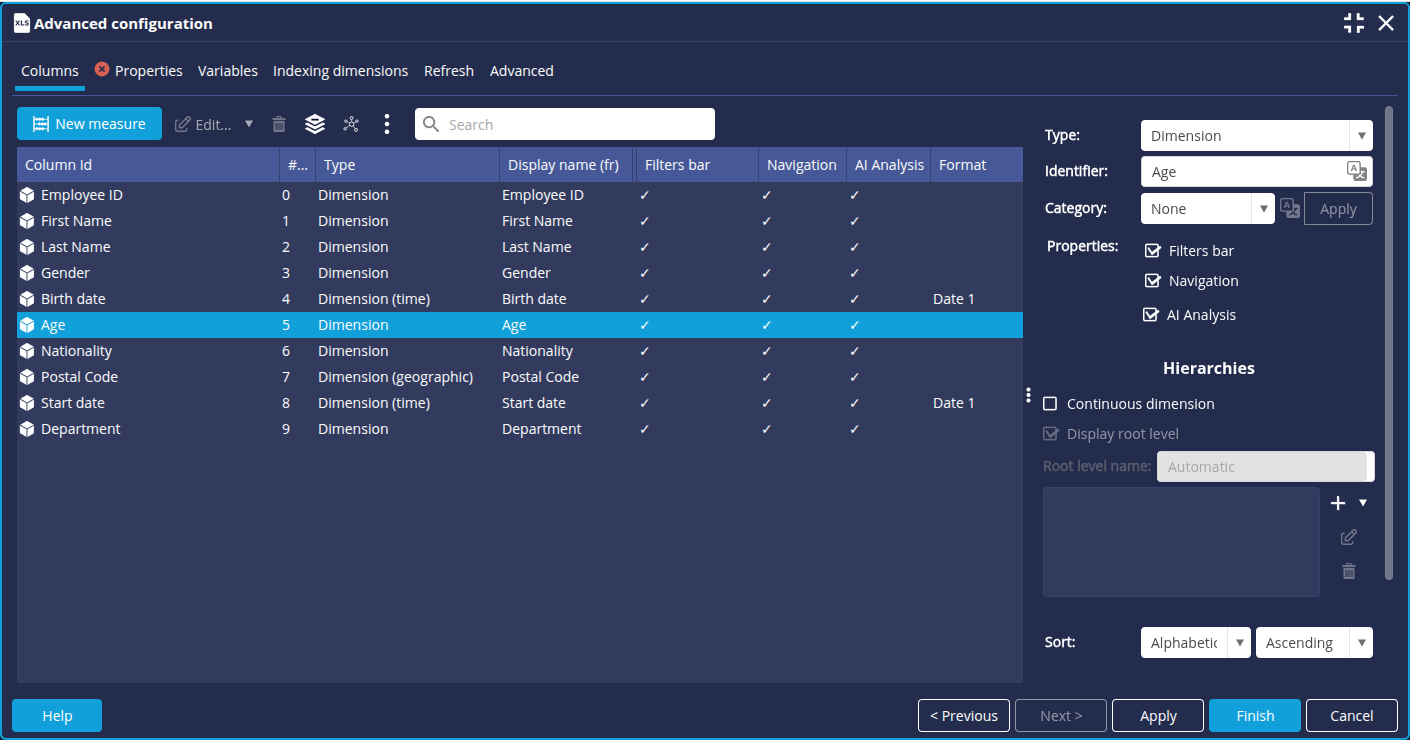
- Also change the type of the following columns:
- Postcode: select Dimension (geographic)
- Nationality : select Dimension
Create the measures Number of women and Number of men
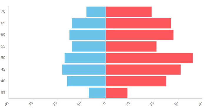
We need to know the number of women and men for each age group. To do this, we are going to create 2 calculated measures based on the unique identifier determining the person. The calculated measure displayed on the left of the axis must be negative. In this example, we choose to place men on the left and women on the right of the age pyramid.
- Click the New Measure button at the top left of the list of columns.
- In the window Calculated measure window that appears, enter the name of the new measure: Number of men.
- Then enter the following formula (double-click on the Employee ID dimension to insert it in the formula):

- Edit the dimension to add a filter (right-click and Edit).
➡ The associated Dimension "Employee ID" box is displayed. - In the Add dimension drop-down list, select the dimension Gender.
- In the Filter column, click Off and then New.
➡ The Edit filter for dimension Gender dialog box is displayed. - Keep the filter type Elements and tick M for men.
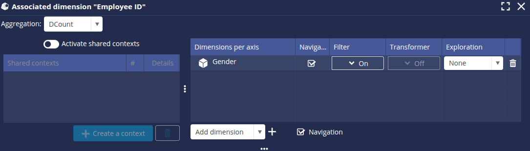
- Click OK.
- Repeat the operation for the number of women without the negative sign and selecting F at the filter step.
➡ The 2 new measures Number of men and Number of women are added to the list of columns. - Click Finish and enter a name for the model: Age pyramid to save.
Step 2: Configuring the chart Age pyramid
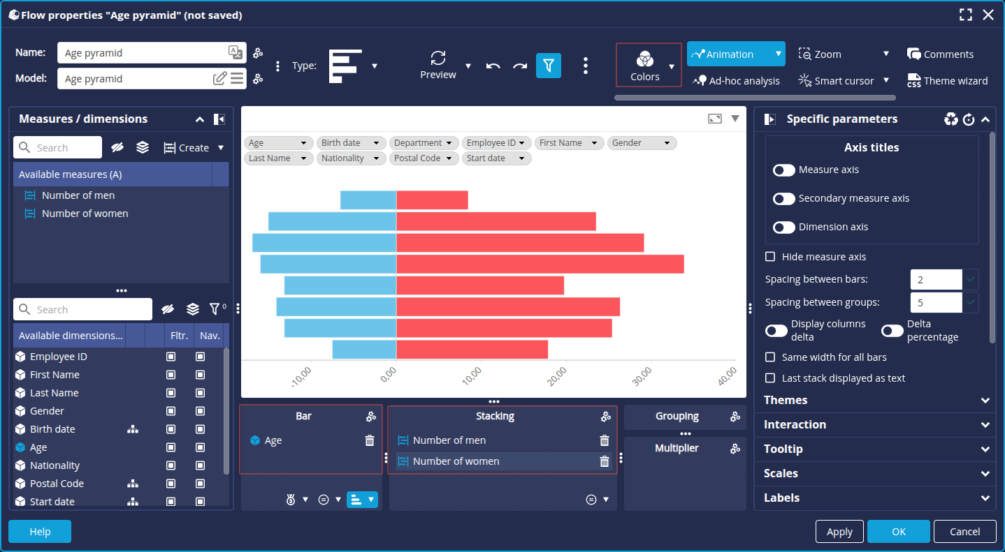
Create the Bar chart
- In the Flows tab of the Studio, click the New flow button.
- Select the Bar chart.
➡ The Flow Properties window appears. - Select the data model previously created : Age pyramid.
- Drag and drop the Age dimension onto the Bar axis (y-axis).
- Drag and drop the 2 measures Number of men (negative) and Number of women (positive) onto the Stacking axis (x-axis). The order is important.
- On the toolbar, click Colors and then the Edit button to change the color palette.
- Select the palette Color gender.
Change the age sorting
To display the ages in the desired order :
- Click the Sort button at the bottom right of the Bar axis.
- Select Sort: Numeric Descending.
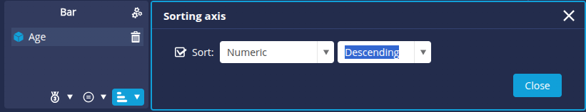
- Click OK.
Remove negative display
To remove the negative display for the values on the left :
- Go to the Scales tab.
- Change the horizontal scale format using the
 .
.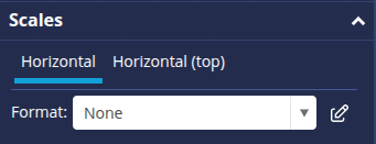
➡ The Format Editor appears. - Click + to create a new format.
- Enter the name Number (positive) and click OK.
- Then select Absolute value in the Formatting a negative number drop-down list and click OK.
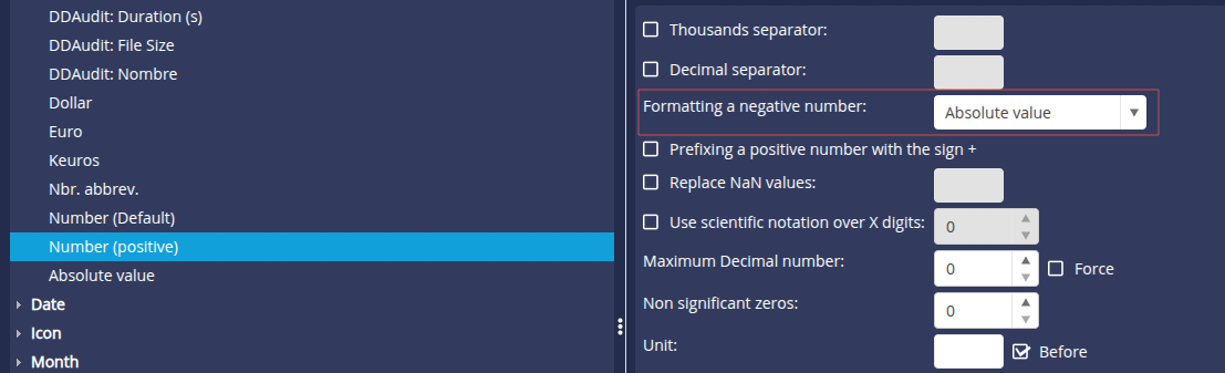
➡ This gives a positive scale on both sides. - You can select the Center at zero check box to see the differences clearly.
- Enter the desired name for the chart and click OK to save.
The age pyramid is now ready to be used in a dashboard.
Congratulations!
You've successfully created an age pyramid.
Now all you have to do is apply it to your data!