
Creating and applying an Alerter
- Introduction
- Prerequisites
- Step 1: Create and configure the data model
- Step 2: Create the charts
- Step 3: Create alerter formats
- Step 4: Apply the alerter to the data
- Congratulations!
Introduction
In this tutorial, we are goint to discover how to create and apply an Alerter (or alerter format), using two examples.
The Alerter format is used to modify the display of data according to its value, using specific text, colors or icons. This makes it quick and easy to identify data requiring specific attention.
The dataset "retail" used in the tutorial corresponds to fictitious data from a retail company containing product information and data such as price, turnover, margin, etc.
This tutorial takes place in the Studio.
The steps of this tutorial are as follows:
- Creation of the data model based on the file retailen.xlsx
- Creation of tables showing turnover and margin data
- Creation of new alerter formats
- Application of alerter formats and vizualisation of results
Prerequisites
In order to complete this tutorial, you need to :
- have installed DigDash Enterprise version 2025R1 or higher;
- be a user with the"Data model designer" authorization group;
- download the Excel file .
ℹ The screenshots in this tutorial were produced using the Chrome browser. There may be slight differences depending on the browser.
Step 1: Create and configure the data model
Import the data source retailen.xls
Here we're going to import the data from the Excel file retailen.xls downloaded earlier. To do this:
- Launch the Studio.
- Click the Models tab.
- Click the New model button.
- In the Create a new data model box, select All types in the Files section; Then add and select the file retailfr.en.
- Click OK.
The Excel File window appears. It offers data selection options and a preview of the data. Here we will configure the data model.
Configure the data model
The elements in the first row of the table correspond to the heading of the data in each column. We are therefore going to use them as column headings. To do this, in the Data selection section, check the First row as header box.
Filter product families
Here we are going to concentrate on the product families:
- Housing
- Deli
- Dessert
- Tickets
We are therefore going to filter the rows for which the Product Family field is equal to the above values. To do this, in the Data selection section :
- Click the Add... button.
- In the Edit filter rule box, select Product Family, then match regular expression and fill in Housing|Deli|Dessert|Tickets.
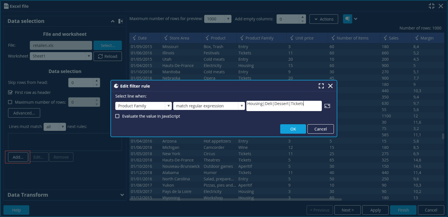
- Click OK.
➡ The other members of the Family dimension are greyed out. - Click the Next button at the bottom right to open the Advanced configuration window.
Create the measures Sales (Year - 1) and Sales (% Progression)
We are now going to create 2 new measures using the assistant: Sales (Year - 1) and Sales (% Growth) in order to obtain the change in revenue from one year to the next. To do this:
- In the Columns tab, click the New measure button.
- Click Calculated measure:
- For the measure Sales (Year - 1), drag and drop the Year - 1 function from the Transformer tab onto the Sales measure.

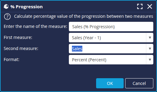
- For the measure Sales (% Progression):
- Drag and drop the % Progression function from the General tab onto the Sales measure.
- Define the progression between the First measure: Sales (Year-1) and the Second measure: Sales.
- Select the Format : Percentage and click OK.
➡ The calculated measures are added to the list of columns.
- For the measure Sales (Year - 1), drag and drop the Year - 1 function from the Transformer tab onto the Sales measure.
- In the Properties tab, enter retailen as name for the data model and then click Finish at the bottom right to save it.
Now that the data model retail is configured, we can create the charts based on this model.
Step 2: Create the charts
We are now going to create the charts in which we will use the alerters. They will be based on the data model retailen.
To create a chart (flow), in the Flows tab, click the New Flow button and then select the desired flow.
Table "Sales by Product family"
- Create a new Flow and select Cross table as type.
- Select the data model and enter the name Sales by Product family.
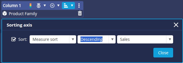
- Drag and drop the dimension the Family onto the Column 1 axis.
- Place the measures Sales, Sales (Year-1) and Sales (% Growth) on the Line 1 axis.

- Click the sort button for the Column 1 axis and apply a descending sort to the measure Sales.
- Click OK to save.
Table "Sales and margin for housing products"
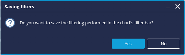
- Create a new Flow and select Table as type.
- Select the data model retailen and enter the name Sales and margin for housing products.
- Place the Product dimension on the Column 1 axis.
- Place the Sales and Margin measures on the Column 2 and 3 axes.
- Filter the Product Family on the member Housing.
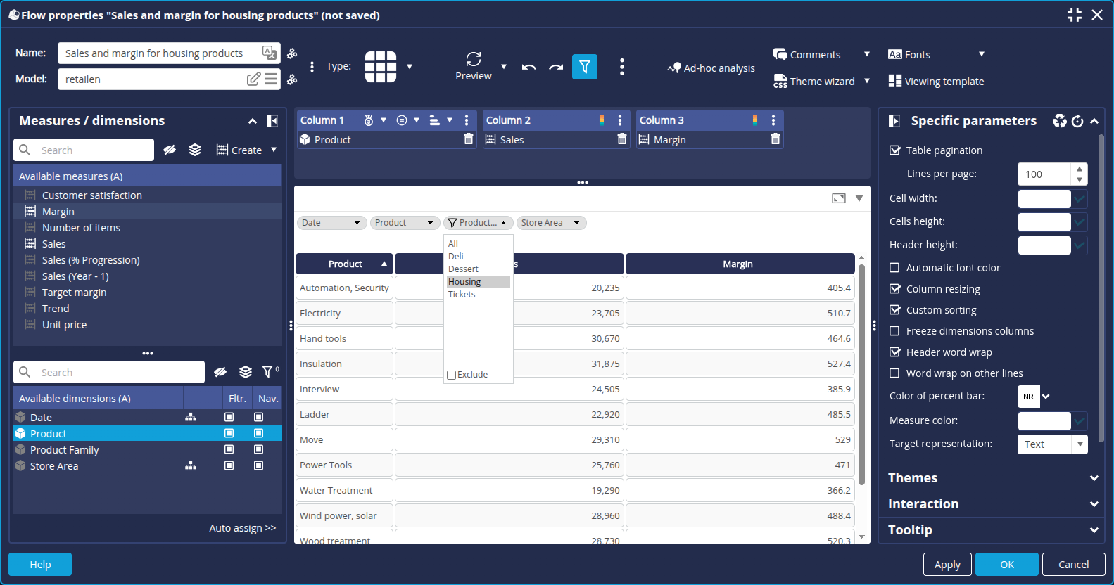
- Click OK to save and confirm saving the filter.
Step 3: Create alerter formats
We are now going to create the alerters or alerter formats that we will use in the tables we created earlier.
To create a new alerter :
- Go to the Managers tab and select Formats to open the Format editor.

➡ The Format editor opens and lists the available types and formats.
- Select the format type Alerter and click the + button.

Create the alerter "_tutorial_progression"
We are going to create a first alerter to highlight the percentage increase of sales in the table "Sales by Product family":
- A red downward arrow for negative progession
- A grey equal sign for zero progression
- A green up arrow for positive progression
- Create a new alerter with the name _tutoriel_progression and the role (None) (no role restriction).

➡ The new alerter is added to the list on the left. - In the Language field on the right, leave Default: the alert will apply by default to all languages.
- Click the + button in the Edit format... section on the right to configure the different outputs:
- Zero progression :
- For the Input Type, select Value and enter 0.
- For the Output Type, select Colour + icon with Percent Format.
- Then select the grey equal sign as Image.
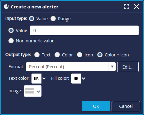
- Click OK.
- Negative progression :
- For the Input Type, select Range.
- Then select -infinite for the Minimum and enter 0 for the Maximum.
- For the Output Type, select Colour + icon with Percent Format.
- Then select the red down arrow sign as Image.
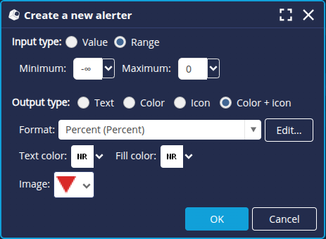
- Click OK.
- Positive progression :
- For the Input Type, select Range.
- Then enter 0 for the Minimum and select +infinite for the Maximum.
- For the Output Type, select Colour + icon with Percent Format.
- Then select the green up arrow sign as Image.
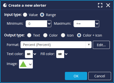
- Click OK.
➡ The alerter items are listed.
- Zero progression :
Create the alerter "_tutorial_margin"
We're going to create a second alerter to highlight the margin value for the table "Sales and margin for housing products".
Here, we're going to fill in the background of the data in green for any numerical value greater than or equal to 500. We will also add formatting to display data below the numerical value 480 in red:
- Create a new alerter format with the name _tutorial_margin and the role (None) (no role restriction).
➡ The new alert is added to the list on the left. - In the Language field on the right-hand side, leave Default: the alert will apply by default to all languages.
- Click the + button in the Format Editing section on the right to create the different layouts:
- Margin greater than 480 :
- For the Input Type, select Value.
- Then enter 480 for the Minimum and select +infinite for the Maximum.
- For the Output Type, select Color with Number as Format.
- Then select the Fill color (green: #71c31f).
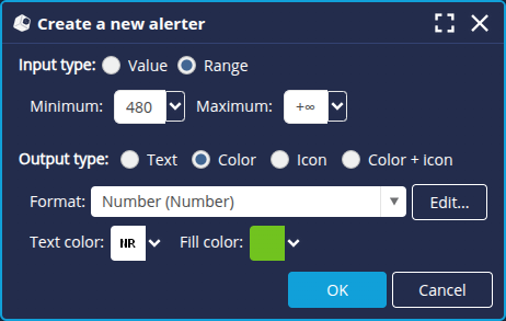
- Click OK.
- Margin less than 480 :
- For the Input Type, select.
- Then select -infinite for the Minimum and enter 450 for the Maximum.
- For the Output Type, select Color with Number as Format.
- Then select the Fill color (red: #d95858).
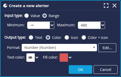
- Click OK.
➡ The alerter items are listed.
- Margin greater than 480 :
The creation of the alerters is now finished: click OK at the bottom right to save and close the Format editor.
We're now going to assign the alerters to the data.
Step 4: Apply the alerter to the data
It is possible to apply an alerter format to a flow or a data model.
It is generally recommended to apply an alerter format to the flow used to display the desired information.
Indeed, by applying a format to the data model, you will affect all the flows using this model. Similarly, if you edit an existing model by assigning an alerter or other format, then when the Flow is synchronized again, the data displayed will be modified.
Here we are going to apply the alerter formats to the Flows.
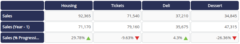
Progression alerter
- Open the table "Sales by Product family" from the Flows tab in the Studio.
- Right-click the measure Sales (% Progression).
- In the context menu that appears, click on Apply a format > Alerter > _tutorial_progression (Alerter).
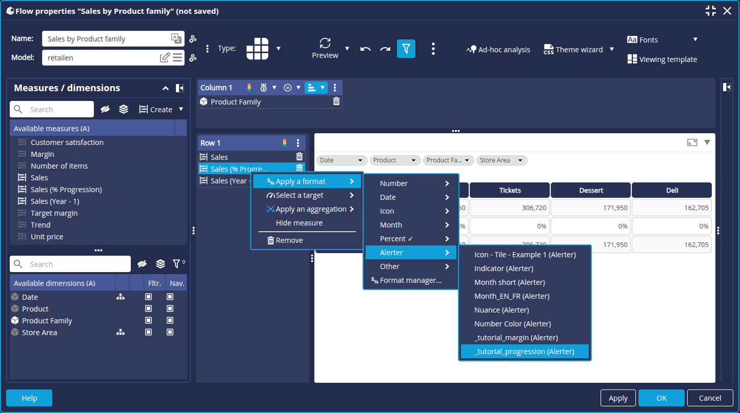
➡ The display of the measure Sales (% Progression) is modified.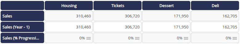
- Select a year in the Date filter, for example 2017, to view the case of positive or negative progression.
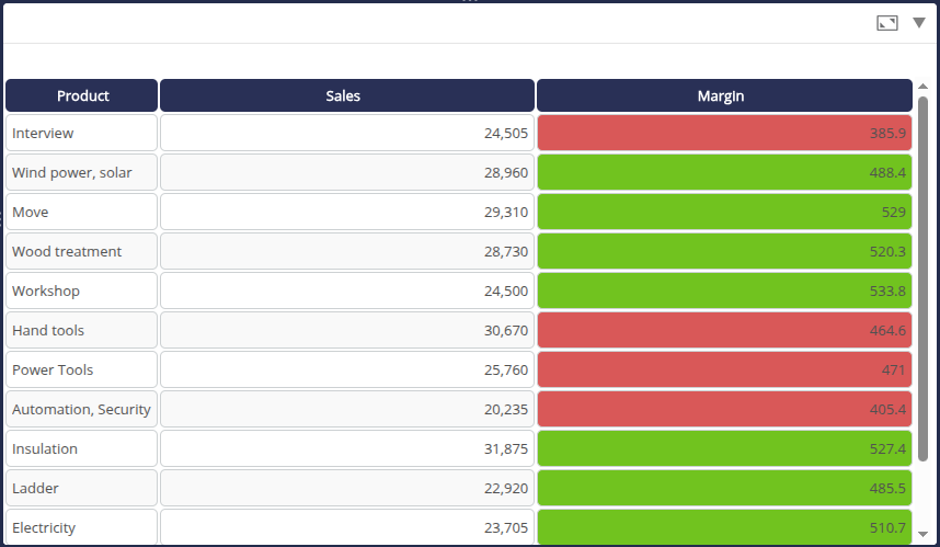
Margin alerter
- Open the table "Sales and margin for housing products" from the Flows tab.
- Right-click the measure Margin.
- In the context menu that appears, click Apply a format > Alerter > _tutorial_margin_tutorial (Alerter).
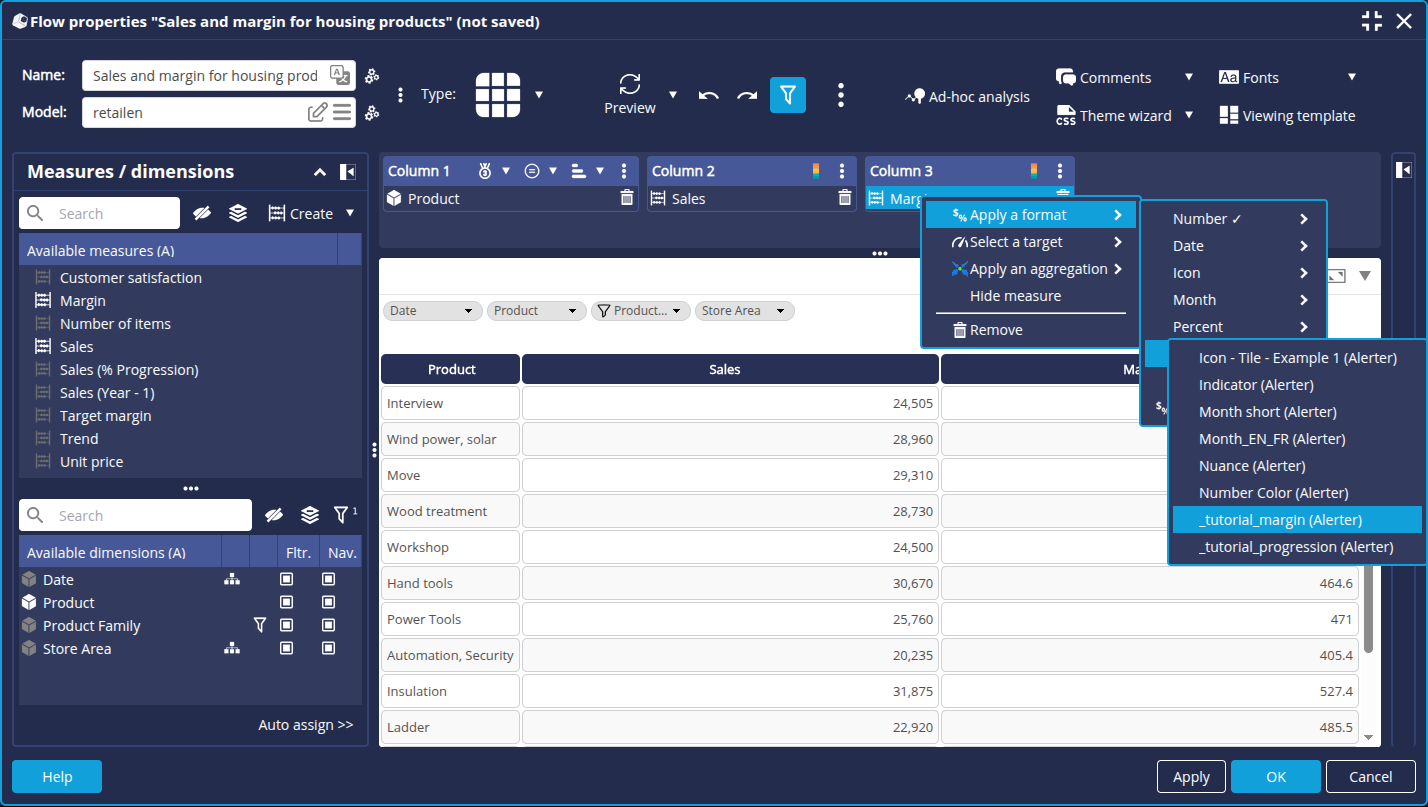
➡ The display of the Margin measurement is modified accordingly.
Congratulations!
You have successfully created and applied your first alerter formats.
Alerter formats allow more advanced formatting than a simple format or combination of colors and formats. You can display text in the user's language or display icons. It is possible to combine several alerters, as mentioned above.
Moreover, alerters can be applied to many types of charts, not just tables.The possibilities are endless, and it's up to you to discover all their facets!