Create a dashboard
CREATE A DASHBOARD
To create a dashboard for a user or a role :
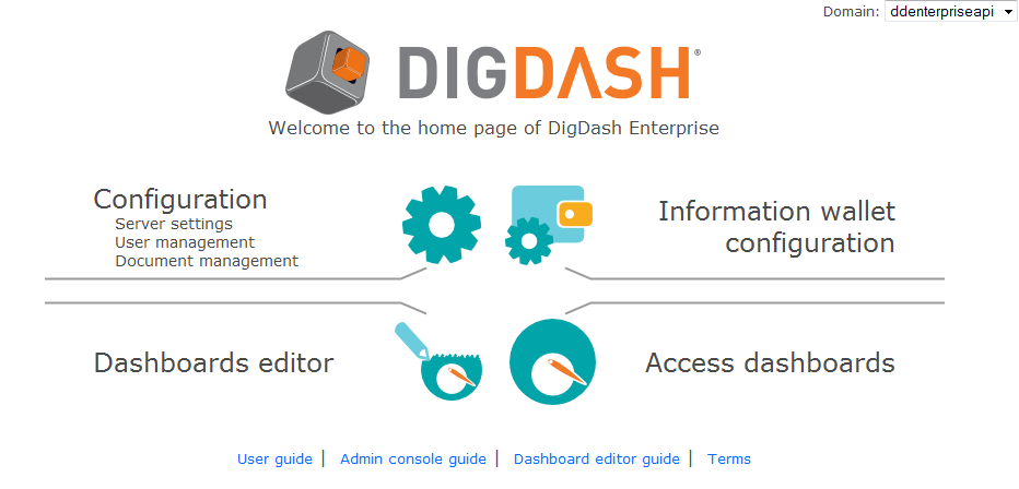
- Open the welcome page: Start your browser, then enter the URL http://ServerName:ServerPort (example: http://localhost:8080). The DigDash enterprise welcome page is displayed.
- Click the Dashboards editor link
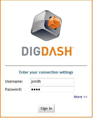
In the Connection dialog box, enter the user name and password (the user must have the authorization “Edit dashboard”). Click More to enter the DigDash Enterprise server address (localhost:8080, by default) and the domain. Click the Sign in button.
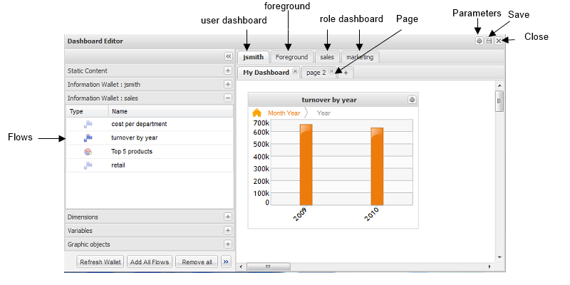
- The dashboard editor page shows up. You can find items you can add to the dashboard on the left of the page :
► Static content: text editor, legend, filters,...
► Information wallet: information flows of roles or users wallets
► Dimensions: list of dimensions used in the information flows. Adding a dimension in the dashboard displays the list of members for this dimension. Selecting dimension values filters the charts accordingly.
► Variables: list of variables used in the information flows. User can modify the value of the variables in real time to see the impact on other charts in his dashboard (what-if analysis)
► Graphic objects : list of objects displayed in the dashboard (flowsn dimensions, variables,...)
- The dashboards are displayed as tabs on the right of the page. The first tab is the user dashboard. The following tabs (except foreground) are roles dashboards (these tabs are displayed only if the user logged has the authorization “Edit dashboard for roles”).
Add items in a dashboard
Open the dashboard you want to edit by clicking the appropriate tab:dashboard of the user, dashboard of a role or foreground (objects you add in the foreground page will be displayed in the foreground of all the dashboard pages).
Add static items
- Click the + besides Static Content to display the available static content :
 Web site : Displays a web site
Usage :
- Drag and drop the web site item
 in the dashboard
 - Clic the Edit icon
 at the top right of the widget
 - Select URL, then enter the URL of your website.
 Query text: Allows you to write a query in natural language (google type)
Usage :
- Drag and drop the query text item
 in your dashboard
 - Enter your query (example: turnover by product)
 Documents : display users or roles documents
Usage :
- Drag and drop the documents item
 in your dashboard
 - If you use several documents servers, click the Menu icon
 , then select Server and choose your server
 - Personalize the display of your documents :
► Click the Menu icon ![]() then select Edit. The Enterprise content management dialog opens up
then select Edit. The Enterprise content management dialog opens up
► Select the visualization type (icons or list)
► Filter the documents list: select the documents in the list on the left, then click Add selected 
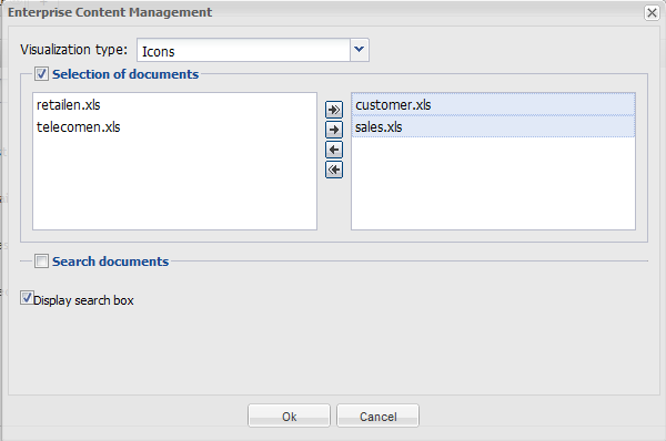
► or check Search documents and enter the regular expression to use when searching for documents.
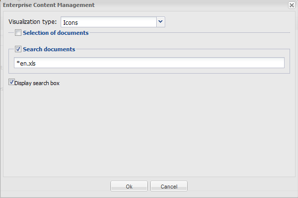
- Clear the Display the search box check box if you don't want the search box to be displayed.
 Web Applications
Usage :
- Drag and drop the Applications item
 in your dashboard
 - If you use several documents servers, select the server to use (click the Menu icon
 , then choose Server)
 Applications : Displays links to office applications (email, Microsoft office and Open Office) excel,...) .
Usage :
- Drag and drop the Applications item
 in your dashboard
 Calendar
Usage :
Drag and drop the calendar item
 in your dashboard
 Editor : Displays the HTML content entered by the user
Usage :
- Drag and Drop the Editor item
 in your dashboard
 - Click the menu icon
 then select Edit. In the Multi-language edition dialog box, select the language then click OK.
 - Enter the HTML content
 Filters : Displays the filters used in the dashboard
Usage :
- Drag and drop the Filters item
 in your dashboard.
 Legend
Usage :
- Drag and drop the legend item
 in your dashboard
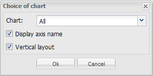
 - By default, the legend is displayed for all the charts in your dashboard. If you want to display the legend for one specific chart, click the Menu icon
 , then select Parameters and choose your chart in the chart combo box.
 - You can display the legend horizontally. To do so, clear the Vertical layout check box.
- You can also remove the axis name. To do so, clear the Display axis name check box.
 Comments
Usage :
- Drag and drop the comments item
 in your dashboard.
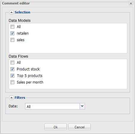
 - Click the Menu icon
 , then select Parameters and check the models and flows for which you want to display the comments. Check All if you want to display comments for all flows or all data models.
 - Filter the list of comments to display by selecting X last days or X last comments.
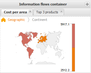
 Information flow container : Display your information flows in separated tabs of the same widget.
Usage :
- Drag and drop the charts container item
 in your dashboard
 - Drag and drop the information flows in your charts container
- to rename one of the tab or modify its CSS, right click the tab, then select Change name or CSS
 Widget container : Displays a window containing graphical objects of your page : static content, information flows, dimensions or variables.
Usage :
- Drag and drop Widget container
 in your dashboard
 - Drag and drop widgets in you widget container.
- Define objects properties: size, position, CSS, color,.....
 Selection : displays a window containing a list of predefined selections of dimensions values.
Usage :
- Drag and drop Selection
 in your dashboard
 - Click the Menu icon
 at the top tight of the widget. Select Parameters.
 - Click Add selection. The item « Selection 1 » shows up in the window.
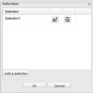
- Click the Edit icon
 then select the values to display for each dimension (by default all values are displayed)..
 - Rename the selection by clicking the existing name, then entering the new name.
Add information flows
Add an information flow available in your information wallet
- Click the + sign besides Information wallet to display available flows. If you create a dashboard for a role, you can only add flows created for this role.
- Select the flows you want to add in your dashboard. Add them by double-clicking the flows or by dragging then dropping the flows on the dashboard.
- Save the dashboard by clicking the Save icon
 in the toolbar
 - Quit the dashboard Editor by clicking the Quit icon
 in the toolbar.
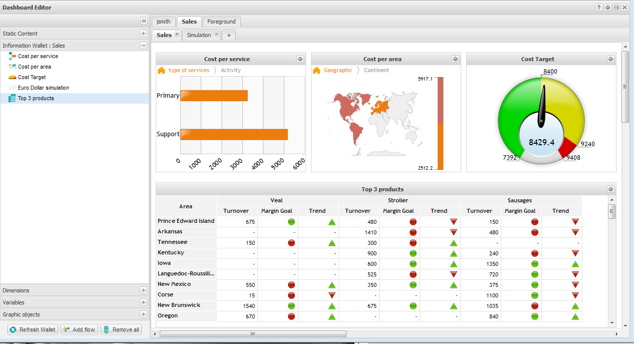
Add a new information flow
- Click the add flow button at the bottom left
- Enter your query using natural language (example: “Turnover by month”) then click Search.
- list of Flows generated by DigDash Enterprise and corresponding to your query are displayed
- Click the flow you want to use to display it
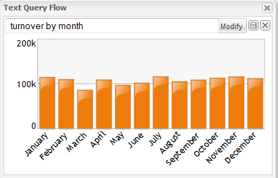
- Save the flow in the information wallet by clicking the Save icon
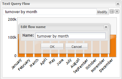
 . Indicate whether you want to save the flow for the user or the role (by selecting “user” or “RoleName”)
 - Enter the flow name then click OK
- Click the + besides the information wallet to display available flows then click Refresh wallet. The information flow you just created is displayed. Drag and drop it in your wallet.
- Save your dashboard by clicking the Save icon in the toolbar
- Close the dashboard editor by clicking the Quit icon in the toolbar
Add a dimension
You can add one or several dimensions used in the information flows you have added in your dashboard.
Selecting members of these dimensions filters the dashboard (all the charts based on data sources using these dimensions).
- Click the + besides Dimensions to display all available dimensions (dimensions displayed are dimensions used by the information flows you have added in your dashboard)
- Drag and drop the dimension you want to use in your dashboard
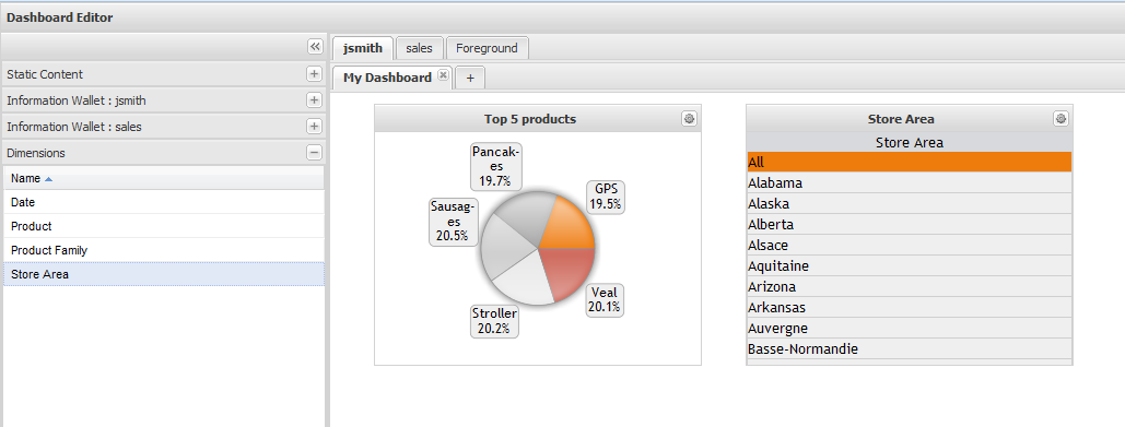
- If several data sources use this dimension, click the menu icon, then select Parameters and select the data source you want to use. You can also select the hierarchy and level to display for the dimension. In the display section, you can choose between different visualization types:
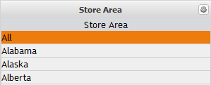
► Vertical list : members of the dimension are displayed one above the other.
Example :
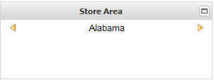
► One by one : members of the dimension are displayed one at a time. Left and right arrows allow you to select the previous and following member.
Example :
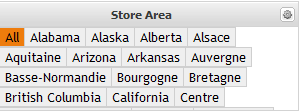
► Horizontal list: members of the dimension are displayed one besides the other
Example :
► Text search :a search box allows the user to enter the name or part of the name of the value he is looking for.*
Example :

► Combo box: members of the dimension are displayed in a combo box.
Example :
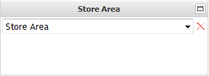
► Slider: available for continuous dimensions only. Display a slider between the first and last value of your dimension. By default a range of value is selected. If you want to select only one value, clear the Range selection check box.
Example :

You can also select a minimum and maximum value for the interval.
► Calendar : available for time dimensions only. Displays a range of date values. User can select the from and to dates from two calendars. If you don't want to display a range but only one value, clear the Range selection check box.
Example :

You can also select a minimum and maximum value for the the range of values.
- Depending on your dimension type, several options are available :
► Hide dimension name: the dimension name is not displayed at the top of the widget
► Hide element All: “All” (which select all members of the dimension) doesn't appear in the list of values
► Forbid empty selection: This option is available only if the element “All” is hidden (to do so, use the option described above). In that case, it is possible to forbid empty selection: when you display the dashboard, a value is selected by default. Also, you can't deselect all the items of the dimension (the last selected value can't be deselected).
► Hide elements with no values: values are filtered depending on values selected for other dimensions (example: if America is selected for the Country dimension, the area dimension will displayed areas for America only).
► Multi selection: multi selection is automatically activated (you don't need to push Ctrl or Shit keys to select several items).
► Display empty values at end: selectable itels are displayed first. Non-selectable elements are grayed out and displayed at the end. For example, display a dimension “Area” and check the option Display empty values at the end. If you select “America”, America areas will be displayed first. Area outside of America will be grayed out and displayed at the end.
► Show search box: display a search box allowing to search elements in the list of available elements.
Add a variable
The data models created in the information wallets can use variables that user can modify in his dashboard to analyze in real time the impact on other charts.
To add a variable in the dashboard :
- Click the + besides Variables to display available variables (variables used by information flows of your dashboard)
- Drag and drop the variable you want to use in the dashboard editor
- Click the menu icon
 , then select Display and choose the display type :
► Text field : displays a text field where user can directly type a value.
Text field can be used with manual variables (see administration console guide)
Example :

► Slider: displays a slider that user moves to select a value. The slider can be horizontal or vertical.
Sliders can be used with calculated variables (variables with a minimum, a maximum and an increment value. See the administration console guide)
Example :

► Combo box : displays the list of values as a combo box.
Combo boxes can be used with explicit variables (each possible value of the variable is defined. See the administration console guide)
Example :

► Spinner : displays the default value of the variable and a spinner button allowing the user to display the previous or the next value.
Spinners can be used with calculated variables (variables with a minimum, a maximum and an increment value. See the administration console guide).
Example :

Edit graphic objects
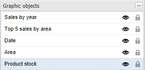
Dashboard widgets are displayed in the section Graphic objects. These objects are ranked in ascending order of their depth in the dashboard (in case the objects overlap).
In the example below, « Sales by year» is displayed at the bottom of the dashboard and « Product Stock » at the top :
A set of actions is available on these objects :
- Copy objects : select objects, right click, then choose Copy or Ctrl +C.
- Cut objets : select objects, right click, then choose Cut or Ctrl +X.
- Paste objects : Paste objects using right click then Paste or typing Ctrl +V. You can paste objects at the initial position (choose Paste at the initial position) or at the position of your mouse on the screen (choose Paste at this position).
- Copy objects as templates : copies objects settings without copying the objects themselves. Select the objects, right click then choose Copy as template
- Paste templates : right click then choose Paste templates at the initial position or Paste templates at this position.
- Remove objects : select objects, right click then choose Remove (or use CTRL+DEL keys).
- Hide object : click the Hide icon
 to hide the object while you are editing the dashboard.
 - Lock object : click the Lock icon
 to prevent movement of the object while you are editing the dashboard.
 - Increase/dicrease the depth of an object : click the up
 or Down
  arrows (under the graphic objects list) to move up or down the objects in the list. Moving an object up decreases its depth in the dashboard, moving it down increases its depth.
All widgets editing functions (sizing, renaming,...) are also available after right clicking the object. These functions are described in the chapter “Edit dashboard items”
Edit dashboard items
► Click the Edit icon ![]() at the top right of the widget. The Edit menu is displayed.
at the top right of the widget. The Edit menu is displayed.
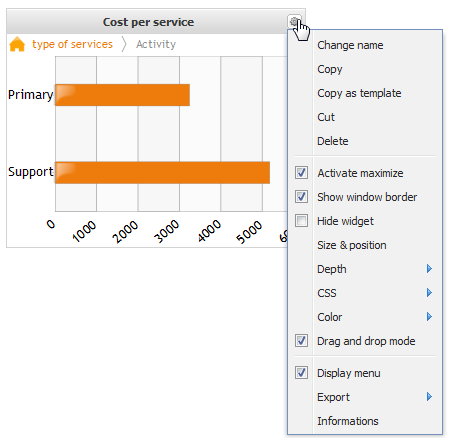
- Using this menu, you can modify the display of the widget :
► Change name : by default, the name of the widget is the name of the selected content (information flow or static content name). Click the Change name button to modify it.
► Copy : copy the selected item
► Copy as template : Copy the parameters of the selected widget (size, position, display parameters,..) but not the widget itself.
To paste the template, right click and choose Paste template. The template can be pasted in all dashboard pages, at the same position as the object previously selected (choose Paste template(s) at the initial position) or at the mouse position (choose Paste template(s) at this position).
Drag and drop the graphic object of your choice (flow, dimension, variable,...) on the template (marked by a dotted frame). The object will get the same properties as the original object.
► Delete : remove the widget from the dashboard.
► Activate maximize : a button at the top right of the widget allows the user to maximize or minimize the widget
► Show windows border : by default, the windows border is displayed. Clear the check box if you don't want it to appear.
► Hide widget : hide selected widget
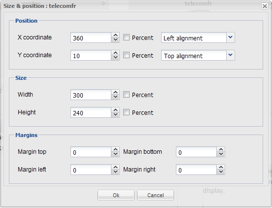
► Size and position :
- allows you to define :
- The position: X and Y coordinates are used for horizontal and vertical positioning. They can be defined in pixels or percentages. The percentages are relative to the page size or the widget container size (if the widget is in a widget container). If you use the pixels positioning, X=0 and Y=0 positions the widget at the top left corner of your dashboard.
- The size: the width and height of the widget can be defined in pixels or percentages. The percentages are relative to the page size or the widget container size (if the widget is in a widget container).
- Margins: you can define top, bottom, left and right margins in pixels.
► Depth : modify the depth at which the widget is displayed (in case several widgets overlap). Select Raise (to display the widget one level up), Lower (to display the widget one level down), Raise to top or Lower to bottom.
► CSS : Select the CSS you want to use. Select CSS type then enter the CSS (example:background-color:red) or select CSS class and enter the name of the class (CSS classes must be in <DigDashenterprise installation folder>\apache-tomcat\webapps\digdash_dashboard). Some classes are already defined in this folder (example hiddenPorlet to hide the portlet)
► Color : Select Color then select the color you want to display in the background
► Drag and drop mode : for table charts (tables, cross tables, OLAP tables, tree tables), two modes are available :
- drag and drop mode: allows you to move the item in the dashboard
- edit mode: allows you to edit the item (change the columns size, modify the style,...)
By default, objects use the drag and drop mode. Clear the Drag and drop mode check box to switch to edit mode.
► display menu : displays the menu on selected item (menu is used in the dashboard viewer to print the chart, save it as PDF, PPT,...)
► Export : allow to choose available type of exports (PDF, PPT, Excel or CSV). Clear the check boxes to restrict authorized exports types.
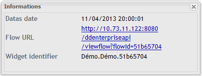
► information : displays the date of data, the flow URL (that you can use to integrate the flow in an iframe, for example) and the widget identifier.
Edit dashboard properties
By default, a dashboard has one page. This page is named My dashboard or has the role name. You can add new pages, modify them, change the background,...
Add a dashboard page
- click the + button besides the latest page of the dashboard.

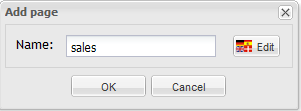
- Enter the name of your page. If you want to localize the name, click the Edit button and enter the value for each language.
To add a sub level to a page :
- Select the page, right click and choose Add sub level. A page appears below the selected page. If you want to rename it, right click and choose Change name.
- Sub-levels can be displayed as tabs or menus. To choose the visualization type, select the page, right click and choose Visualization type then Tabs or Menus.
- In the following example, the user has a page for his role “Sales”. In this role two pages have been created “2013” and “2014”. This sub level has 2 pages “invoices” and “Payments tracking”. These sub levels are displayed as tabs :

- if you display the sub levels as menus, the page will be displayed as follow :

Rename a page
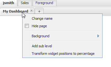
Select the page, right click and choose Change name. Enter the name you want to use. If you want to localize the name, click the Edit button and enter the value for each language.
Hide page
Select the page, right click and choose Hide page
Remove a page
Click the cross at the top right of the page. Confirm the deletion by clicking the OK button in the confirmation dialog box.
Move a page
Drag and drop the page at the correct position
Transform widget positions to percentage
By default, widget size is defined in pixels but you can define it in percentages of the page. This allows you to view dashboards on other devices (tablets,..) without resizing objects in the pages.
To do so, right click the page ans select Transform widget positions to percentage.
Change the background
You can modify the background of all the pages of the dashboard or only change the background of one page :
- To modify the background of all the pages, click the Menu icon
 in the toolbar (at the top right of the Dashboard Editor page), then click images manager
 - Click New image then select the image you want to use as a background and click Apply as background. This background will be used on all pages of the dashboard unless you have defined specific backgrounds for some pages.
- To modify the background of one page, right click the page and choose Background. If you want to set a background image, click Background image, then select the image you want to use. If you want to modify the color, select Background color and select the color.
Change the foreground
To modify the items displayed in the foreground, open the foreground page, then add the items you want to display as the foreground of your dashboard pages. The items you have added are displayed on all dashboard pages.
To add a header or a footer in the foreground, create a widget (example : HTML editor) with the desired content. Click the Edit icon ![]() at the top right of the item. The edit menu is displayed. Check Page header or Page footer.
at the top right of the item. The edit menu is displayed. Check Page header or Page footer.
The selected item will be placed on top of the page if you have selected Page header or at the bottom if you have selected Page footer
The item width will be the same as the page width (100% of the page).
When you display a dashboard page, header and footer are inserted on top or at the bottom of the page.
Manage legends
By default, colors are managed independently on each chart (for example, a same area can have two different colors on two different charts).
If you want to use the same colors for several charts displayed on the same page, you must first check the option Share colors between analytics on the same page in the visualization parameters of your charts (refer to the documentation “wallet_editor_guide_en.pdf” for more information).
You can then modify the legend of the charts displayed in the dashboard.
To do so, click the Parameters icon ![]() in the toolbar (at the top right of the dashboard editor page), then click Legend manager.
in the toolbar (at the top right of the dashboard editor page), then click Legend manager.
Select a dimension value in the drop down box on the left, then select a color in the palette (or click New color to add a new one).
Click the + button on the right to select another value and define the color you want to associate to this value.

Manage filters
You can modify parameters of the interactive filters bar displayed at the top of the dashboard pages.
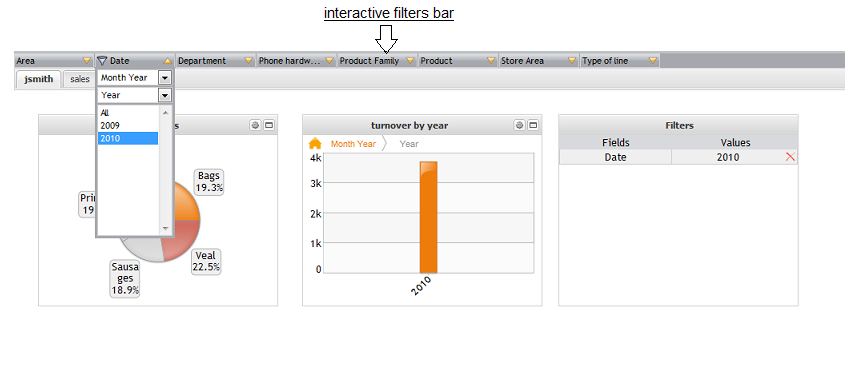
To do so, click the Parameters icon ![]() in the toolbar of the dashboard editor, then click Filters manager. The Filters manager dialog box opens up.
in the toolbar of the dashboard editor, then click Filters manager. The Filters manager dialog box opens up.
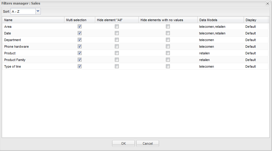
From this dialog box, you can :
- Modify sort order : in the drop down box displayed besides Sort:, select A-Z for ascending sort, Z-A for descending sort or Manual. If you select Manual, drag and drop the dimensions at the desired position.
To sort dimensions by data model name, click the Data Models header. In that case, Sort order will automatically switch to Manual.
- Hide element “All” : if you select this option, the element “All” won't be displayed in the values you can use to filter the dimension.
- Hide elements with no values : if you select this option, values will be filtered according to values selected for other dimensions (example: if you have selected “America” for the dimension “Country”, the “state” dimension will only display American states).
- Show/Hide a dimension : in the Display column, click the default column and select “Yes” to display the dimension, “No” to hide the dimension and “default” to keep the “display” parameter defined in the data model or the visualization.
The Data model column displays the model to which the dimension belongs. Click the column header to sort it.
Modifiy dashboard styles
By default, styles used in dashboards are located in the file:
<DD Install>/apache-tomcat/webapps/digdash_dashboard/Dashboard.css.
To modify the styles, you can change this file but if you update the webapps, the initial styles will be restored (for more information, refer to the documentation “customisation_en.pdf”).
Therefore, we advise modifying the styles from the CSS editor available in the dashboard editor (you must have the authorization “Customize dashboard”). The styles modified this way are stored in a file called “default.css” located in the application data folder. These styles can be saved and restored by DigDash Enterprise backup.
Dashboards use in priority the styles stored in default.css. If no style is found in default.css, styles used are “dashboard.css” styles.
To modify CSS styles from the dashboard editor, click the Parameters icon ![]() in the toolbar of the dashboard editor, then click CSS Editor. Click Graphic objects then select objects you want to modify. CSS classes are displayed. Modify the styles then click OK to to save them.
in the toolbar of the dashboard editor, then click CSS Editor. Click Graphic objects then select objects you want to modify. CSS classes are displayed. Modify the styles then click OK to to save them.
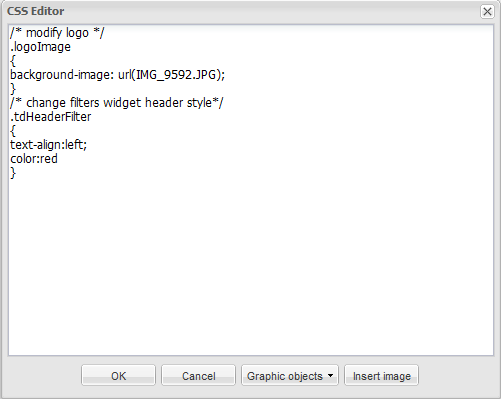
Execute Javascript code
To execute JavaScript, click the Parameters icon ![]() in the toolbar (at the top right of the Dashboard Editor page), then click Javascript editor.
in the toolbar (at the top right of the Dashboard Editor page), then click Javascript editor.
Enter the JavaScript you want to execute then click OK.
Type the first letters of a function to get the full list of matching functions (example: by typing « add », the function ddCtrl.addVariable is displayed in the list of proposals).
The JavaScript code is stored in a file js-default.js.
This JavaScript file can include other JavaScript files. To create a new JavaScript, open the JavaScript editor menu, then select New JavaScript. Enter the file name then the JavaScript you want to execute.
To include this JavaScript in another .js file, use the function includeJS (example: includeJS('file.js') ;
Customize role pages
You can customize role pages to display personalized view of the page. By default, user will see the page of the role, unless a personalized view of the page exists.
To allow customization of a page, right click the page, then check Allow customization of the page.
Once you have allowed page customization, users who want to personalize their page must right click the page and then select Personalized view. They can then edit their personalized view of the page.
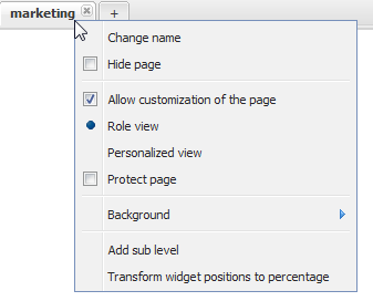
To delete a personalized view, select Back to the role page. You are asked whether you want to remove the personalized view. Click OK to remove it.
Protect role pages
You can protect edition of roles pages. To protect a page, right click the page then select Protect page
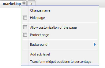
A user can edit a protected page only if he has the appropriate role and the authorization « edit protected dashboard pages » .