Advanced tutorial
- Source file download
- Creation of the “telecom” data model
- Creation of the graph “Communication cost by Type of service”
- Creating the "Communication Cost by Region" Chart
- Creation of the “Cost target” graph
- Creation of the “Euro Dollar Simulation” chart
- Creation of the "retail" data model
- Creation of the graph “ top 3 sales by products”
- Creation of the dashboard
- Dashboard display
Source file download
In order to be able to carry out this tutorial, you will need to recover two Excel files "telecomen.xls" and "retailen.xls" (click on each file name to download them).
Creation of the “telecom” data model
Objective : Import into DigDash Enterprise the Excel file “telecomen.xls” (downloaded previously) which represents the data of a (fictitious) telecommunications company. Enrich this source to build a data model to create relevant graphs.
This data model will then be used by several graphs.
- From the home screen, click on Web Studio
- In the login box, enter your account information in the Username and Password fields.

Step 1 : Import a data source
- In the toolbar at the top of the main window, click on the Sources... button, then All types in the Files section

The Search for Remote Documents box appears:
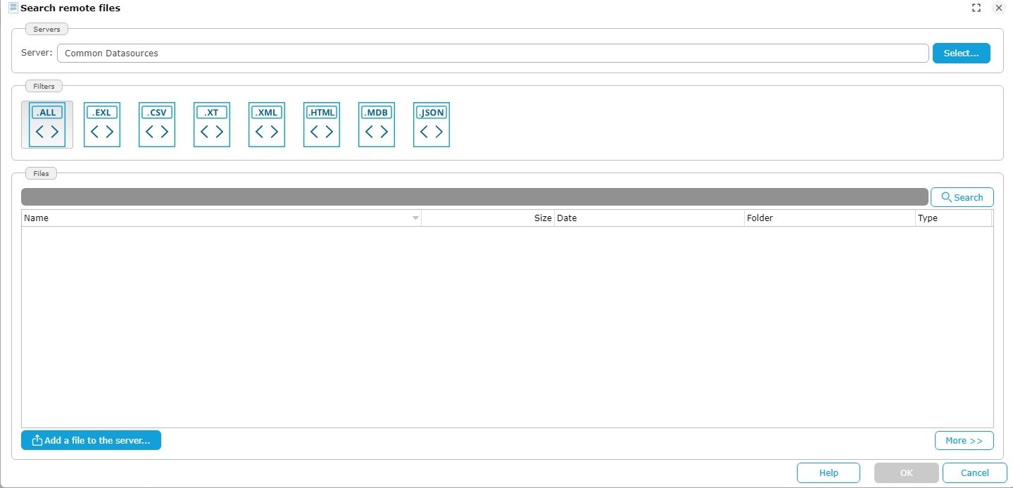
- Click Select at the top of the dialog then choose the “Common Datasources” document server.
- Click the Add File to Server... button. The Select Local File or URL box will appear.
- Select Choose a local file and then click Browse to select the "telecomen.xls" file retrieved earlier.

- Click on OK.
The file is now saved on the DigDash "Common Datasources" server and accessible to all users.
- In the Search for remote documents box, select “telecomen.xls”.

- Click on OK
The box Load data from an Excel spreadsheet appears.

- Check the box First row as header.

- Click on the button Add…, to the right of the button Disable empty columns.
The popup Edit filter rule appears :

- Let the default values (Date in the first drop-down list and “is not empty” in the second drop-down list)
- Click on OK then Next >.
Step 2 : Configure the data model
- Name the data model “telecom” :
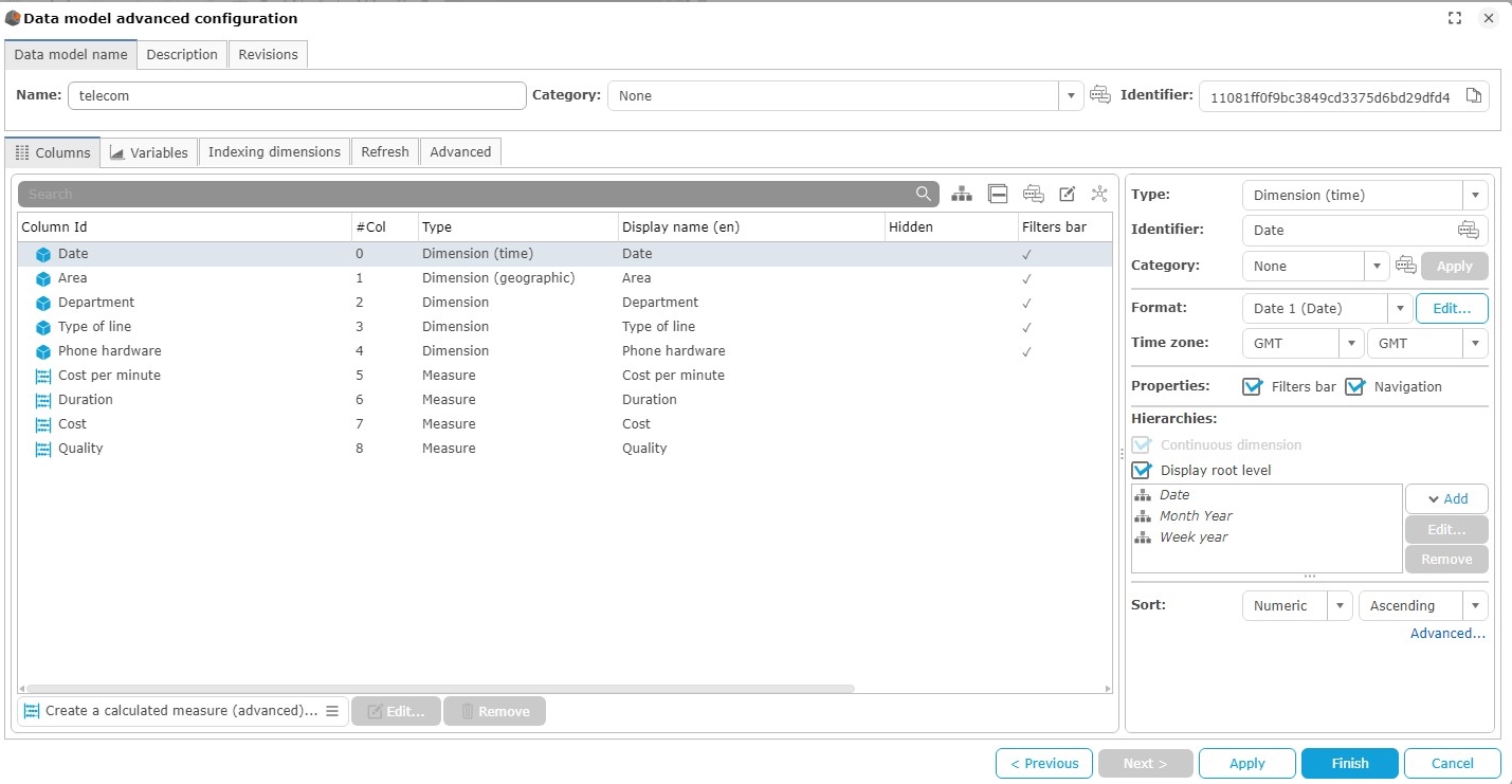
Next steps :
Create a manual hierarchy of corporate departments. Create an automatic hierarchy on phone hardware.
Create a communication cost target. Create a calculated measure that varies communication costs based on the €/$ exchange rate.
Creation of a Manual hierarchy
- Select Departement, then click on Add and choose Manual grouping.
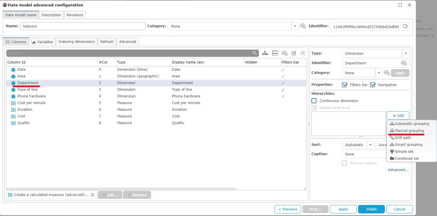
- The popup Creating a hierarchy on the dimension 'Department" appears.

- The default name of the group is Groupe 0. Rename it to Type of service.
A first level named Level 0 contains all the values of the column.
- Rename this level to Function.
- To create groups on this level, click on Add… on the bottom left of the popup.
The popup Group name appears.
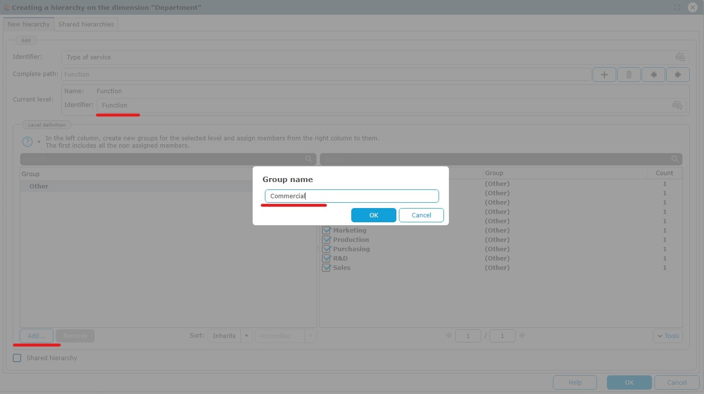
- Type Commercial and do the same with Management, Production and Administration.
Allocation of members to groups :
- Select Administration then check Purchasing, Legal and IT in the list on the right.

Do the same with :
- Commercial : Marketing and Sales
- Management : Management, Finance and HR
- Production : Production and R&D
Add a second level by clicking the "+" button and name it Activity.
Add two groups Main and Support, and add the following members to them:
- Main : Commercial, Production
- Support: Management, Administration
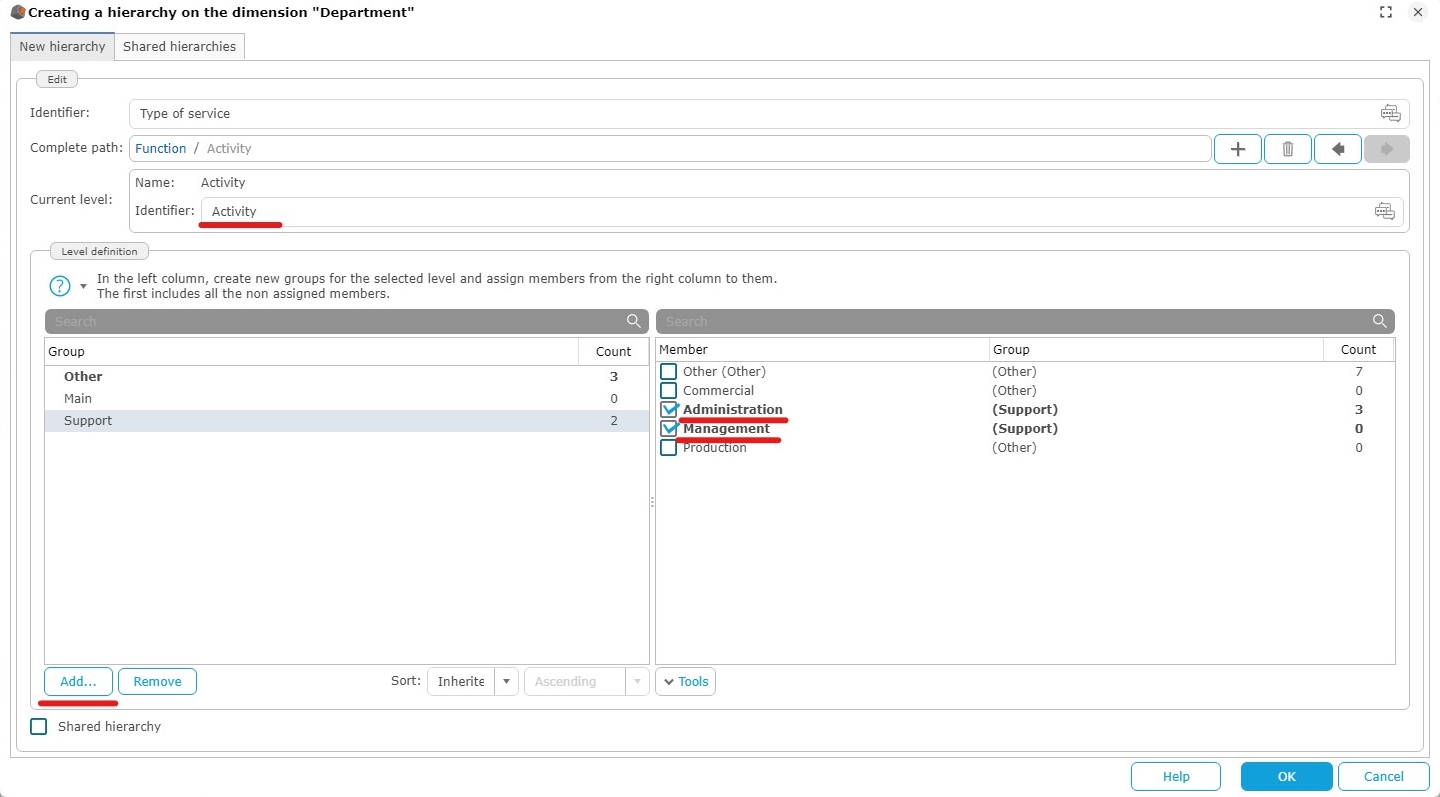
- Click OK to validate the two-level hierarchy.
Creation of an Automatic grouping
- Select Phone Hardware then click Add and select Automatic grouping.

The pop-up Group editor appears.
- The default group name is Group 0, rename it to Hardware Type.
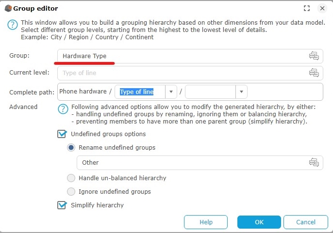
The full path to the hierarchy is displayed on the Complete path line. Each hierarchical level is separated from the next by a /. Phone hardware is the first level of th hierarchy.
- Open the drop-down list of the second level then select Type of line.
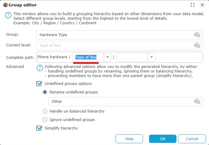
- Click OK to validate.
Creation of decreasing communication costs target to 21 000€
- Select the Communication Cost column and click Add...
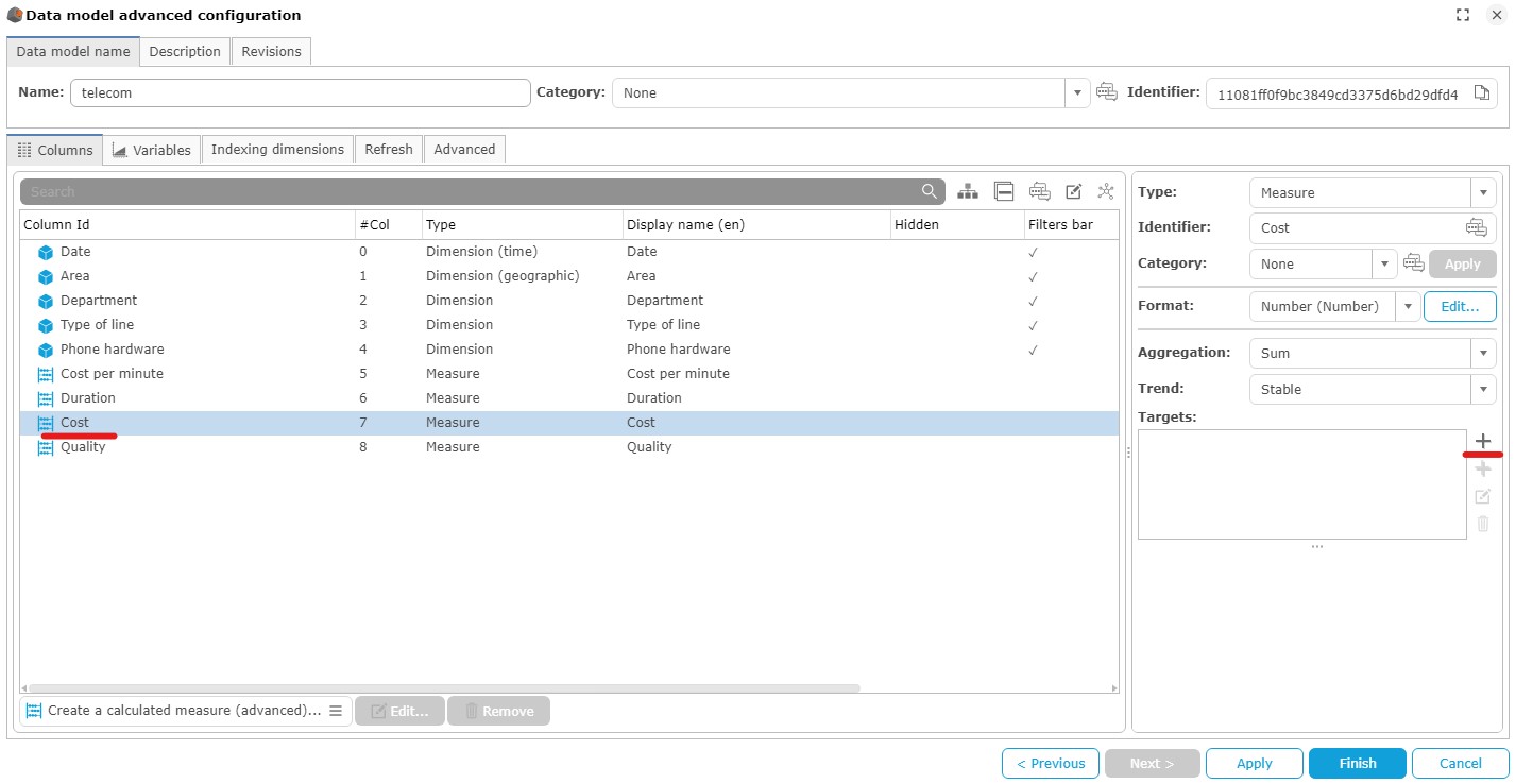
- Name the target Decreasing cost.
- In the drop-down list Type of target select Decreasing.
- In the drop-down list Type select Allocation then type the value 21 000.
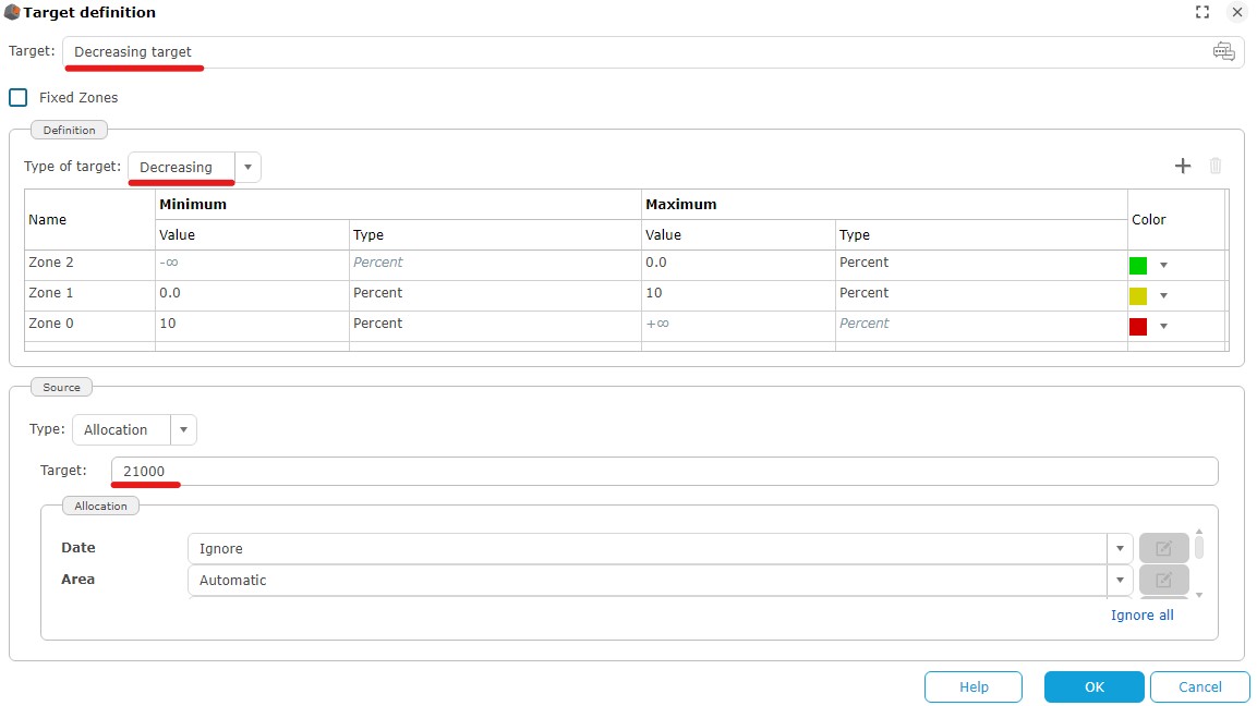
- Click OK to validate.
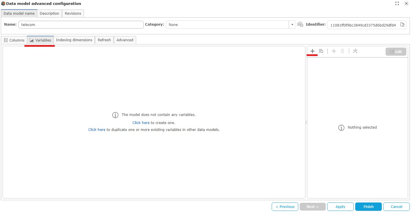
Creation of a Euro / Dollar conversion variable.
- Click on the Variables tab and then the "+" icon to add a variable
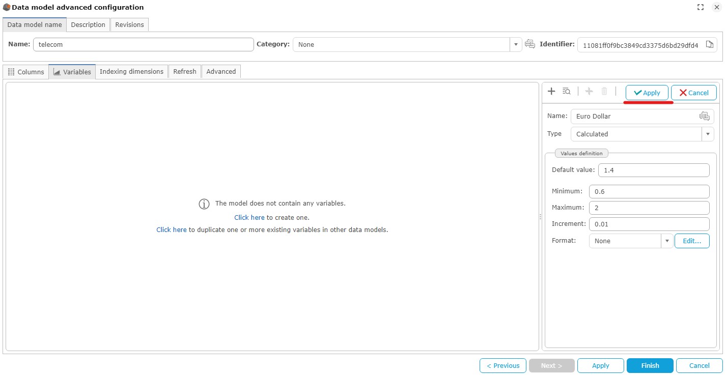
In the variable editing window, fill in the following fields, then click the Apply button:
- Name: Euro Dollar
- Default value : 1.4
- Minimum : 0.6
- Maximum : 2
- Increment: 0.01
Creation of a measure calculating communication costs based on the Euro/Dollar exchange rate
- Switch to the "Columns" tab, then click Create calculated measure (advanced)... under the list of columns.
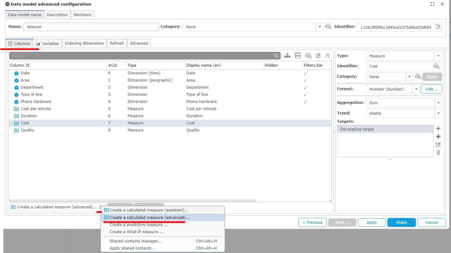
The pop-up for editing calculated measures appears.
- Name the measure Cost Euro Dollar and press Enter.
- Double click on communication cost within Available measures.
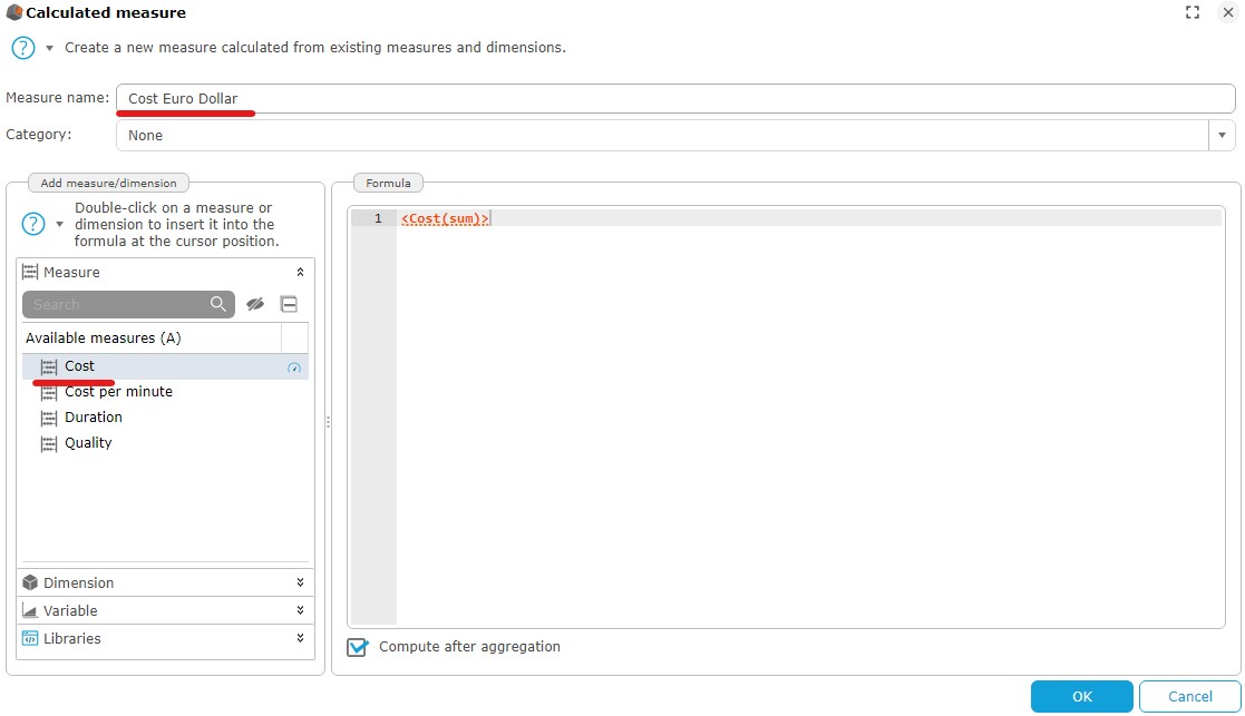
- Type *1.4/ and add the variable created earlier.
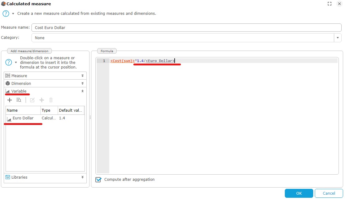
Our data model is now complete.
- Click Finish then Ignore the dialog box Add a comment on the modification.
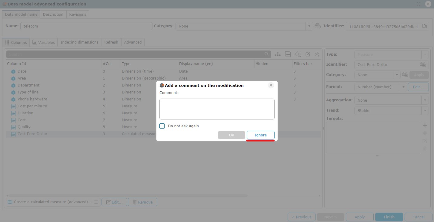
The list of data models created in your wallet appears, you can click on the "Flows" panel to go to the next step.
Creation of the graph “Communication cost by Type of service”
Objective : Display a bar graph showing Communication Cost by Service Type. From his dashboard, the user will be able to navigate in the Type of service hierarchy.
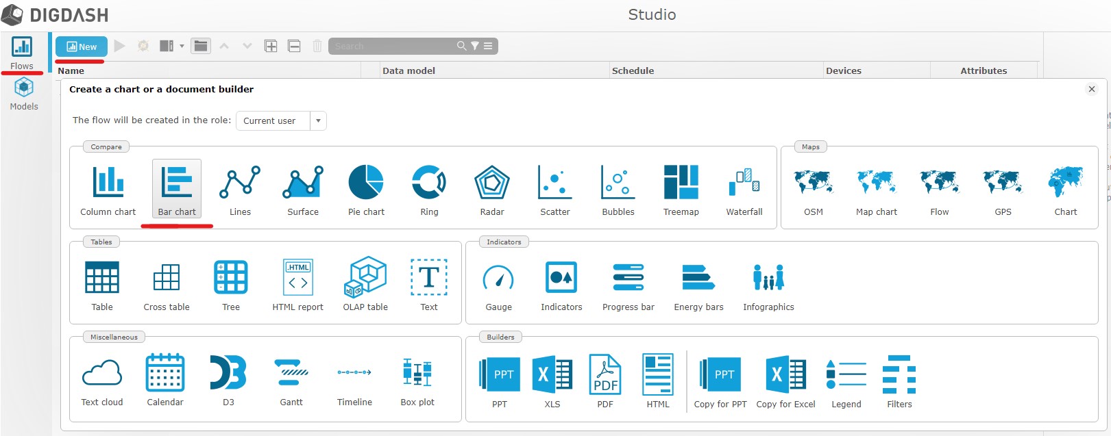
- Click Flows..., then Bar chart on the Compare category.
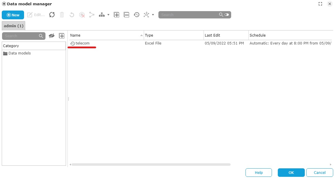
- Then select the model created previously.
- Drag and drop the Communication Cost measure onto the Stack axis.
- Drag and drop the Department dimension onto Bar axis.
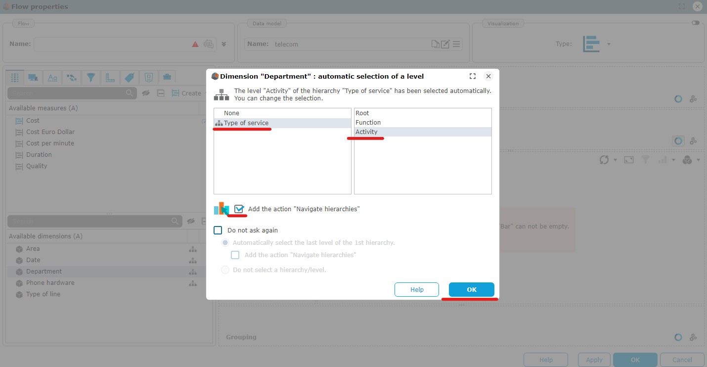
- Select the hierarchy Type of service and the level Activity.
- Check Add the action “Navigate hierarchies”.
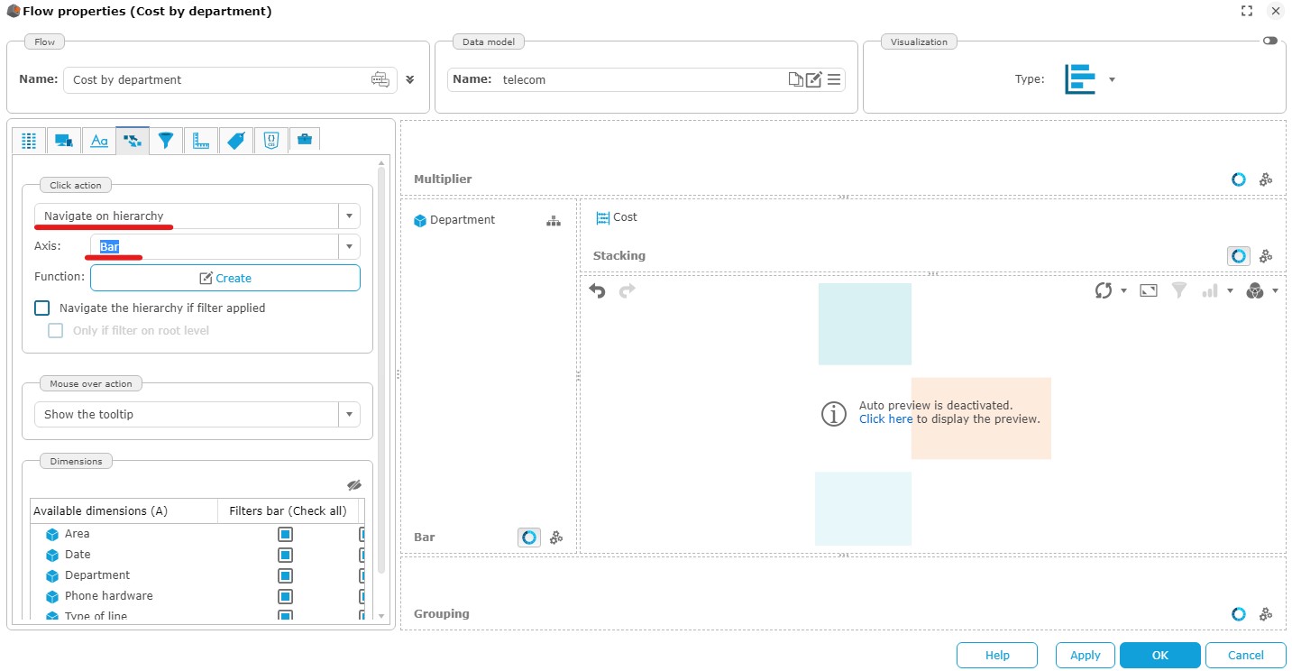
In the Interaction tab ( two twirling arrows icon), you can verify that the Navigate Hierarchies action has been applied.
- Use the “Refresh” button to preview the graph.
The drop-down menu also allows you to enable automatic preview.
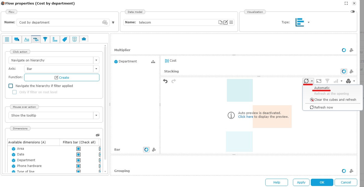
Main and Support bars can now be clicked to drill-down the manual hierarchy prepared in the data model.

- Rename the new chart to Communication Cost by Service.
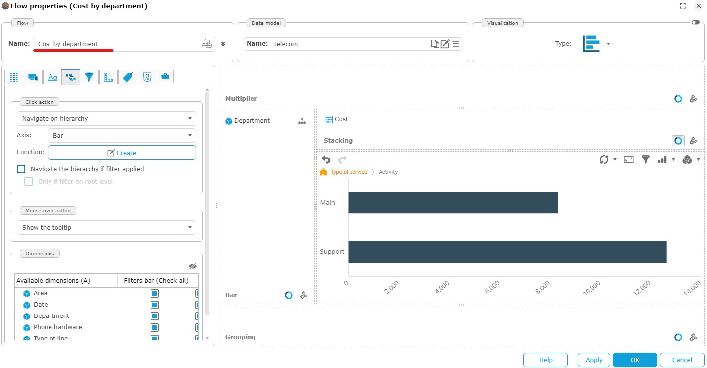
- Click OK to save the chart.
Creating the "Communication Cost by Region" Chart
Objective : Creation of a map showing communication costs by continent. When viewing the dashboard containing this graph, the user can navigate to the continents to view costs by country and then by region.
This graph uses the telecom data model created earlier.

Step 1: Selecting the chart type and an existing data source
- In the toolbar at the top of the main window, click Flows then New In the Maps category, select Map chart.
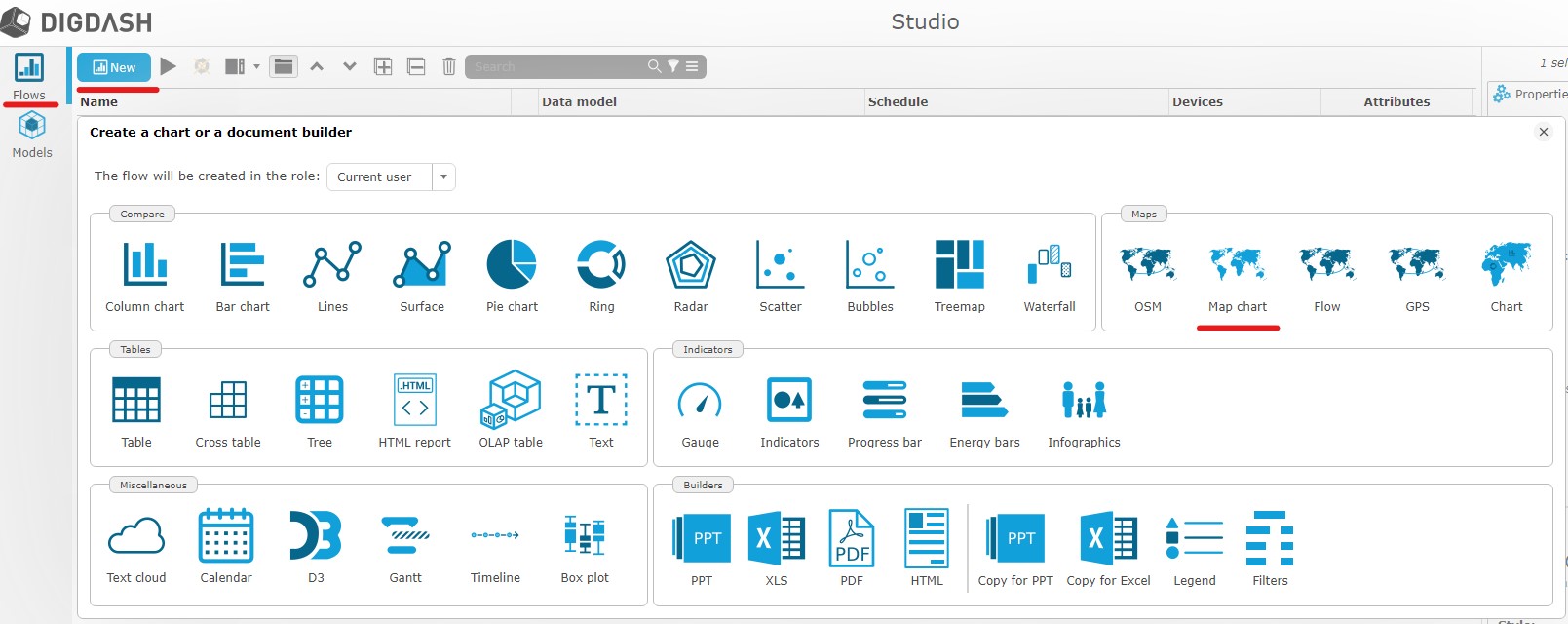
- Select the telecom data source previously created.

The pop-up Flow properties appears.
Step 2 : Flow properties
- Drag and drop the measure Communication cost on the measure axis.
- Drag and drop the dimension Area on the Geography axis
- Keep the default hierarchy, then check Add the action "Navigate hierarchies".

- After refreshing the chart preview, you can click on Europe to view the cost details in that area.
- Name the chart Communication Cost by Region
- Click OK to save the visualization.
Creation of the “Cost target” graph
Objective : The company wants to reduce its communication costs. Create a gauge comparing communication costs to a goal.

Step 1: Selecting the chart type and an existing data source
This graph uses the telecom data model created earlier.
- As seen previously, create a Gauge type chart, always using the telecom source.
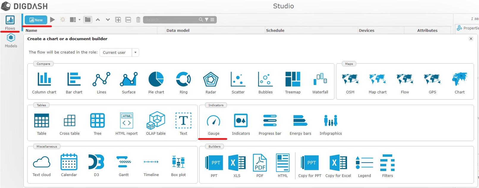
Step 2 : Flow properties

- Set the measure Communication cost in measure axis. The target Decreasing cost should be enabled by default.
- Rename the chart to Cost target.
- Click OK to save the visualization and add the graph to your wallet.
Creation of the “Euro Dollar Simulation” chart
Objective : The company wishes to visualize the impact of the variation of the Euro/Dollar exchange rate on its communication costs.

This chart uses the telecom data model.
Step 1: Selecting an existing data source
- Create a lines graph (in the Compare category) always using the telecom source.

Step 2 : Flow properties
- Drag and drop the measures Communication cost and Euro Dollar on the Line axis.
- Drag and drop the dimension Date on the Abscissa axis. Edit the hierarchy to Month Year and the level to Year.Check Add the action "Navigate hierarchies".

Rename the chart to Euro Dollar Simulation and click OK to save the chart.
Creation of the "retail" data model
Step 1: Import a data source
Objective : Import into DigDash Enterprise the Excel file “retailen.xls” (retrieved earlier) that represents the product sales of a fictitious company.
- In the left of the window, click on Models, New then Any types in the Files category.
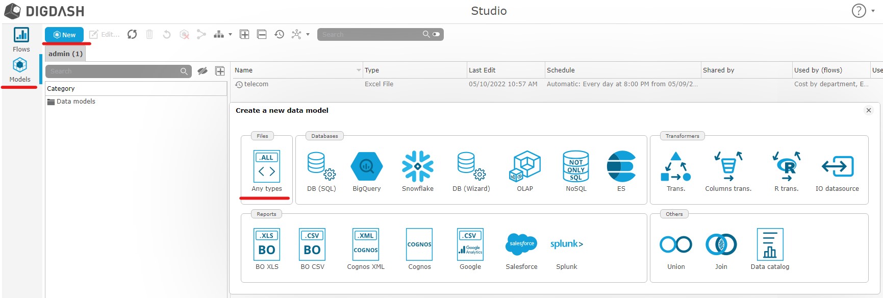
The pop-up Search remote files appears :
- Click Select at the top of the dialog then choose the "Common Datasources" server URL.
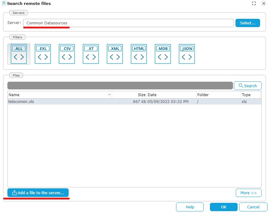
- Click Add a file to the server... The popup Select local file or URL appears.
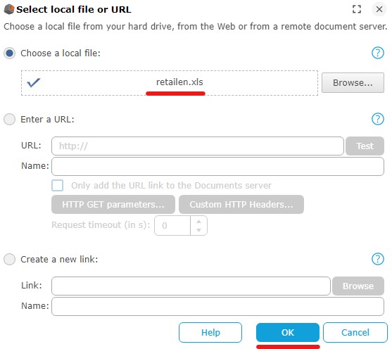
- Select Choose a local file then click Browse to select the retailen.xls file that you previously downloaded.
- Click OK
The file is now saved on the DigDash server and accessible to all users.
- In the pop-up Search remote files, select retailen.xls then click OK.
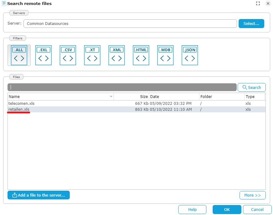
The window Load data from an Excel spreadsheet appears.
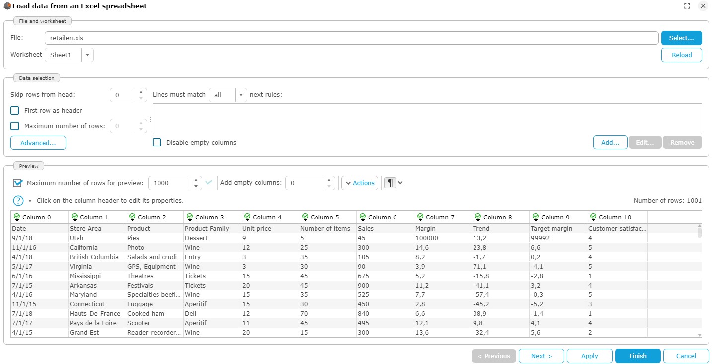
Check the box First row as header
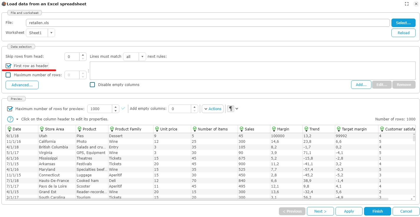
- Click Add…, to the right of Disable empty columns.
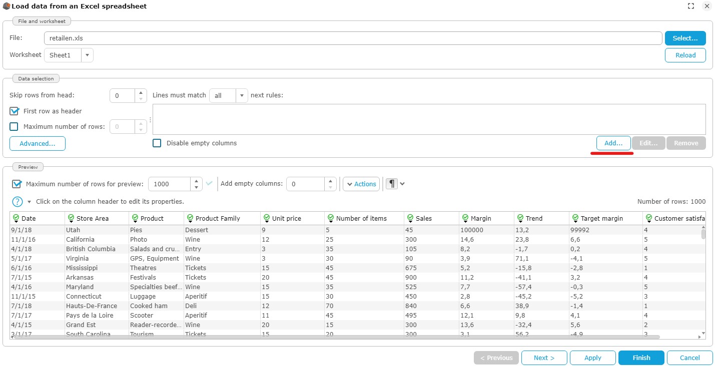
The pop-up Edit filter rule appears :
- Keep the default values (Date on the first drop-down list and is not empty to the second drop-down list)
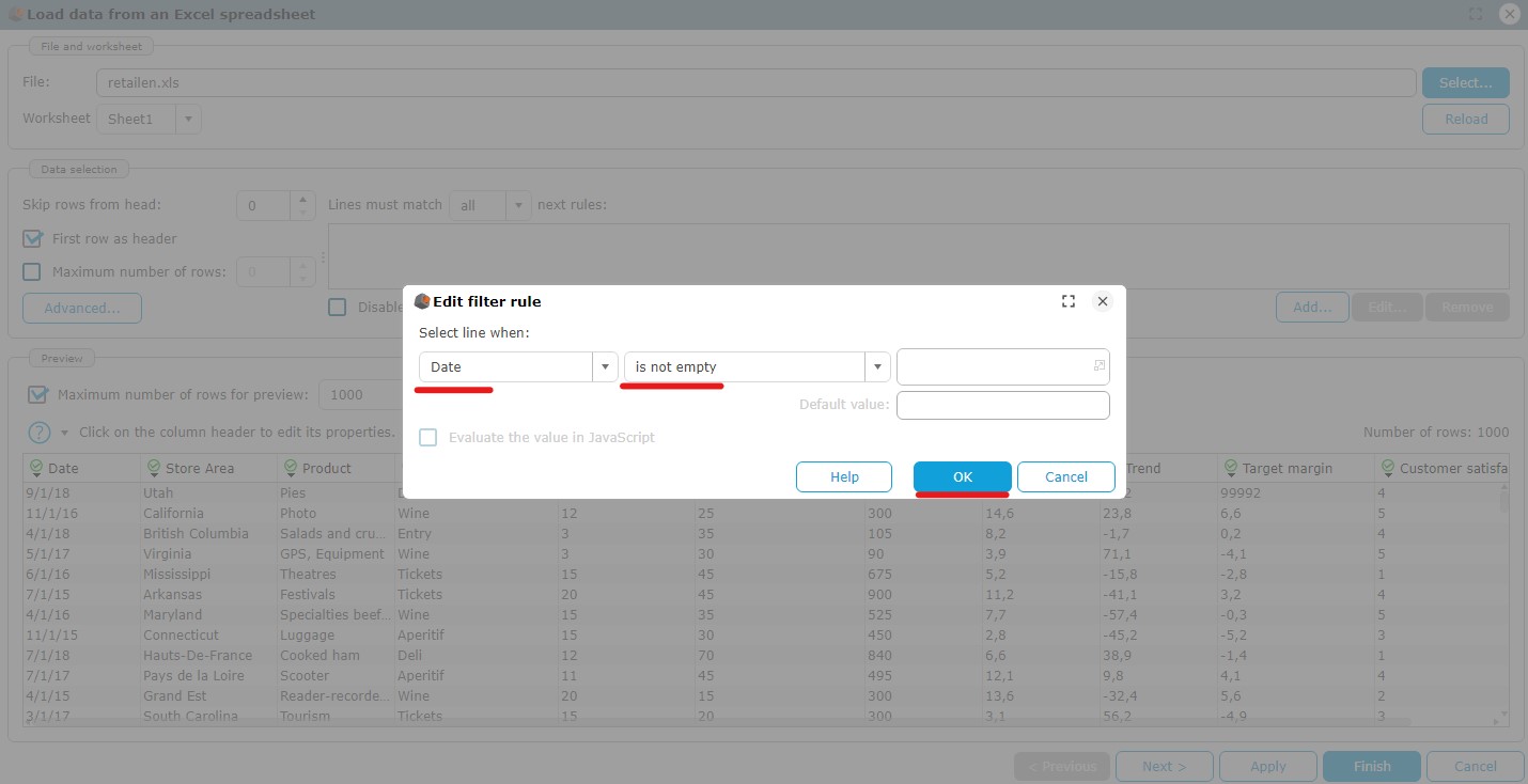
- Click OK then Next.
Step 2: Configure the data model
- Name the model “retail”.
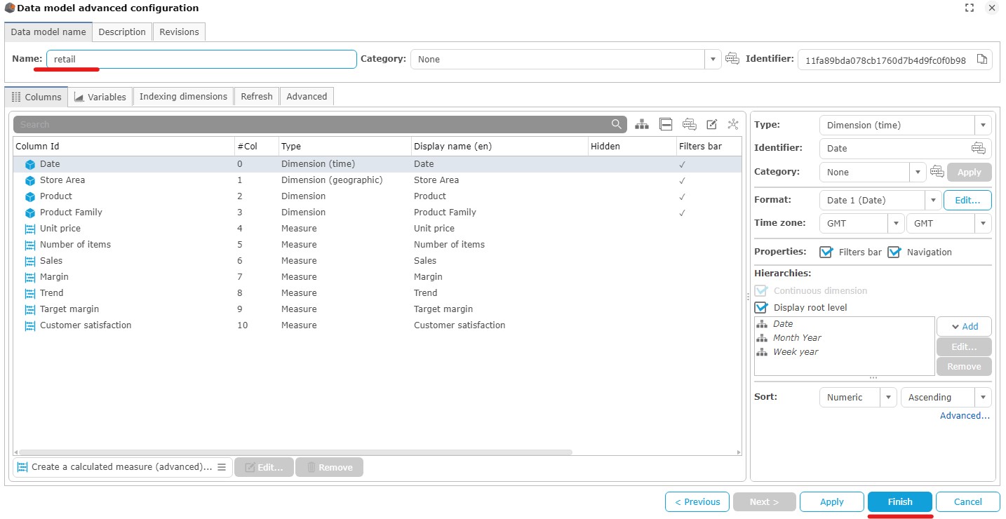
- Click Finish to close the Data model advanced configuration window.
Creation of the graph “ top 3 sales by products”
Objective: Create a cross table showing the sales made on the 3 best products. The trend of sales and the target regarding to the marginare displayed in the table as icons.

This chart uses the “retail” data model.
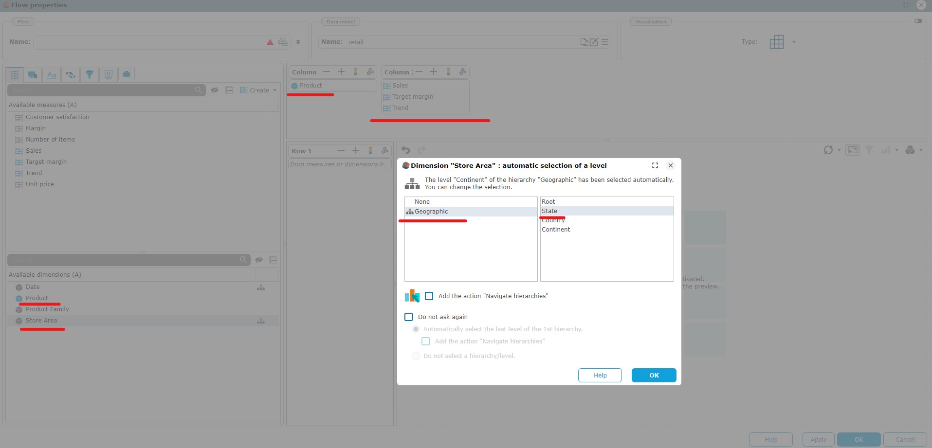
- Create a cross table graph, then add two columns and drag and drop :
- Column 1 : Product
- Column 2 : Sales, Target margin et Trend
- Line 1 : Area then remove the hierarchy.
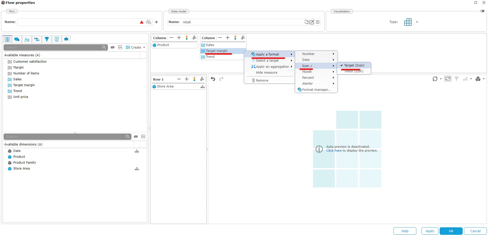
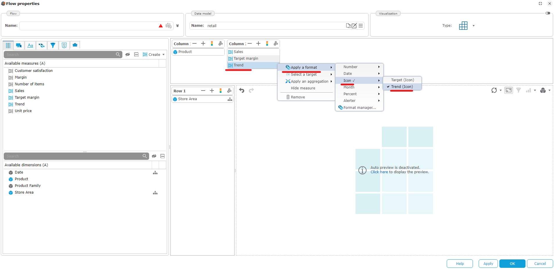
- Right click on Target margin and apply a format Target (icon). Do the same with Trend with the “Trend (icon)” format.
- Click the cog wheel at the top right of "Column 1" and then click Properties...
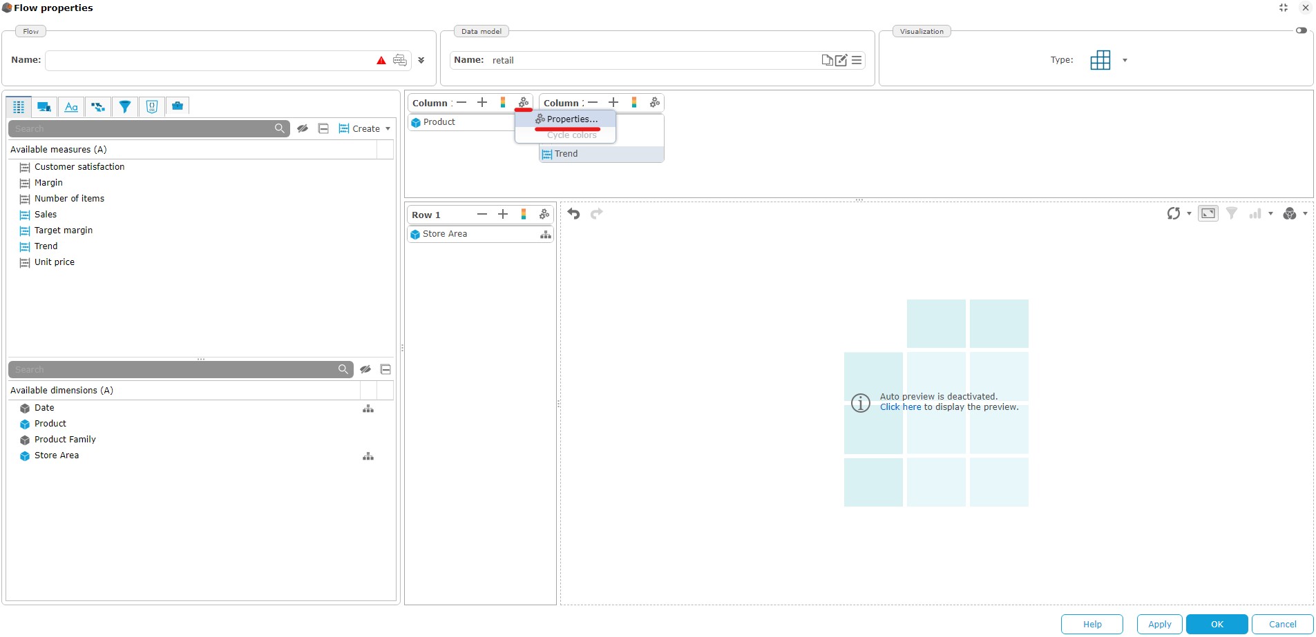
- Make a ranking of the 3 best sales (revenue) by product.
- Apply a descending sort on the sales mesure.

- Name the chart “Top 3 Products sales” and close the visualization setup.
Creation of the dashboard
Return to the DigDash Enterprise home screen, then click on "Dashboard Editor"
- Log in with the same credentials as before.
- You should see your username at the top of the page, along with a "My Dashboard" page.. Right click on it, then "Display mode" then "Templates.."
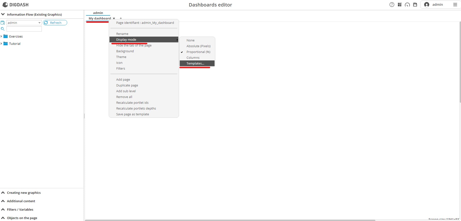
A pop-up appears, select the model "Charts + filters on top" :
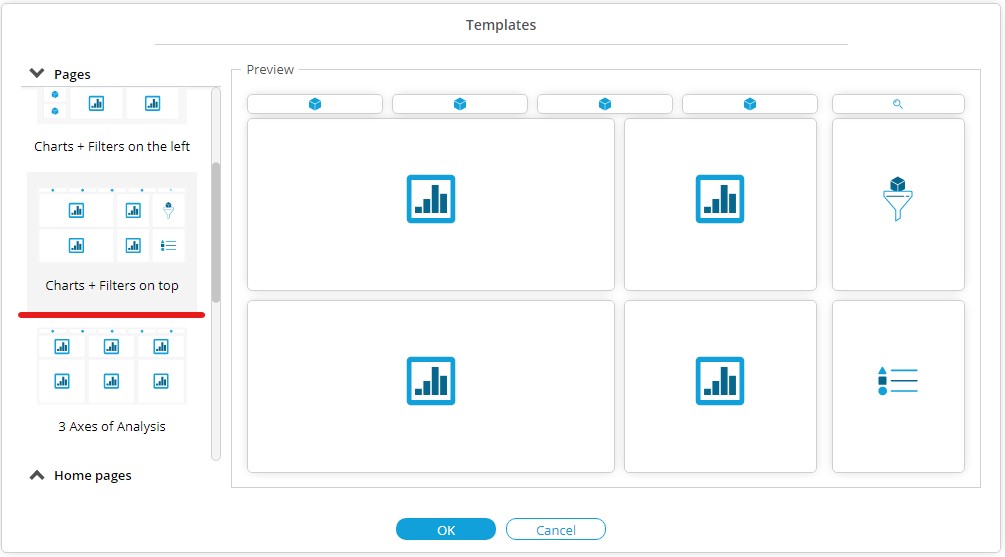
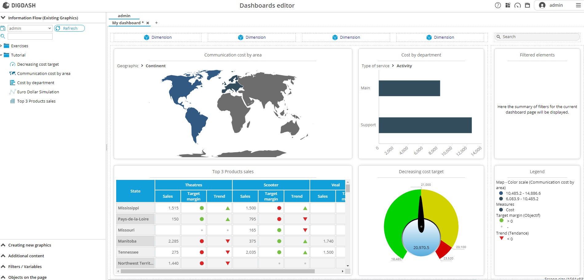
- Your page now contains areas where you can drag graphics or filters. Drag and drop the following charts into the “My Dashboard” page:
- Communication cost by service
- Communication cost by region
- Cost target
- Top 3 Products sales
- To do this, in the left side menu, select Information flow (Existing Graphics) then drag and drop the graphs related into the zones "Drag and drop chart" of your page.
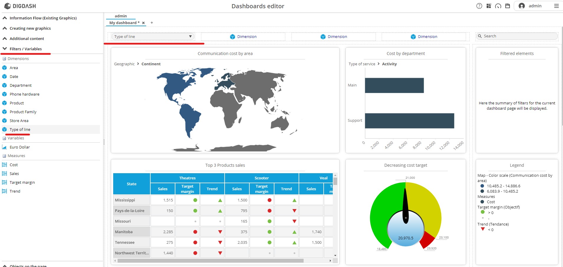
To add filters on the page, select the "Filters / Variables" side menu, then drag and drop Type of line in a template named "Dimension"
- Click on the “+” icon to the right of My Dashboard to create a Simulation page.
- Select the Proportional (%) page mode
- From the left side panel click Information flow (Existing Graphics), drag and drop the Simulation Euro Dollar chart into the new page.
- From the Filters/Variables tab add the Euro Dollar variable.
- Do the same with Type of line.

Save the dashboard by clicking on the floppy icon located at the top right of the window.
Dashboard display
- Click the gauge icon in the top right to access the dashboard.

You can now manipulate your dashboard by clicking on charts, filters, or changing pages.