Mobile dashboards
- Introduction
- Mobile dashboard configuration
- Displaying a dashboard in "Mobile" mode
- Navigation in the dashboard
- Best practice
- Customisation
Introduction
Digdash allows you to create dashboards adapted to mobile devices.
The term "mobile" is used here as shorthand for small screens. This could be a mobile phone or a small tablet.
To display a dashboard on a mobile device, you have 2 options:
- Create both Desktop (large screen) and Mobile (small screen) dashboard pages by selecting Scaling as the display mode.
In this case, you will have the same content whether in Desktop or Mobile view.
The dashboard will be usable on mobile but not optimised for this type of screen.
See the page Configure scaling page for more details on this display mode. - Create dedicated dashboard pages for each type of display : Desktop pages and Mobile pages.
In this case, you can optimise the pages for display on mobile devices. Often, the needs of mobile users are not the same as those of desktop users. The page can therefore be slimmed down, presenting only the key indicators, for example. Vertical display will also be preferred.
However, the pages will need to be maintained for each type of screen.
Mobile dashboard configuration
Displaying pages in "Mobile" mode
To enable a page to be displayed on a mobile device:
- Select the page and go to the properties panel.
- In the Display section, check that the Mobile screen box is ticked.
- If you wish to use the page ONLY for Mobile display, uncheck the "Desktop" screen type box. The page will not be displayed on the Desktop screen.
Mobile" mode activation threshold
Display in "Mobile" mode depends on the " Mobile" mode activation threshold defined in the global properties of the dashboard. If the height or width in pixels of the user's screen is less than this threshold, the dashboard will switch to "Mobile" mode. For example, if the screen is 456x950 pixels and the activation threshold is 768 pixels, "Mobile" mode will be activated.
The activation threshold is set to 768 pixels by default. You can change this value in the global properties of the dashboard.
In "Mobile" mode, the dashboard display will be adapted. See the paragraph below for more details.
Displaying a dashboard in "Mobile" mode
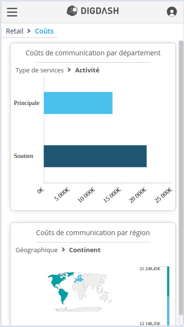
In the case of a "Mobile" screen, the following changes are automatically applied for optimum display:
- The default navigation menu mode is Vertical, regardless of the mode defined in the global properties.
- The banner is simplified:
- an icon replaces the user name and the corresponding menu is simplified
- the logo is centred
- the icon on the left disappears and is replaced by a button giving access to the vertical navigation menu.
- The breadcrumb trail is displayed automatically, allowing you to navigate through the sub-pages.
- When scrolling down, the banner is hidden for better visibility.
Case of an integrated dashboard
Adding the hideBanner=true parameter to the URL hides the banner and navigation menu.
A small tab is added on the left to display the navigation menu.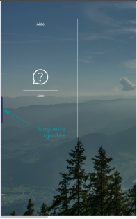
Alternatively, you can add a button button to call up the navigation menu via the Unfold or Retract vertical navigation menu action or the expandCollapseNavigationMenu() custom function.
Navigation in the dashboard
Navigation in the dashboard is conventionally done by scrolling around the screen.
You can navigate through the data in a graph by tapping on the graph. You can then Interact with the data (for example, navigate through a hierarchy) and Access options at the top right of the object.
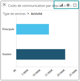 | Activate zone selection | Enables you to select values by drawing a rectangle.
|
| Chart menu | Provides access to the options defined for the object (save, print, add comments, etc.). | |
| Display full screen | Press the icon to display the chart in full-screen mode. |
To return to dashboard navigation, click on the cross at the top left of the object.
Best practice
Here you'll find best practice for creating mobile dashboards and making navigation easier.
Creating the dashboard
If you choose to create pages dedicated to "Mobile" screens (different pages for each type of screen), it is advisable to use page templates. You will then have a template for Desktop screens and a template for Mobile screens, which will simplify the creation of new pages.
See the paragraph Page templates for more details.
Navigating the dashboard
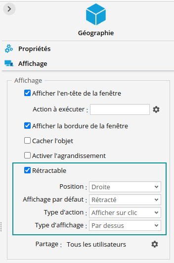
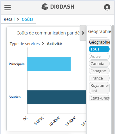
We recommend displaying Filter, Caption and Filtered Items objects in the form of a Retractable panel (preferably on the left or right). To do this
- In the Display tab of the object settings panel, check the Retractable option.
- Set the Position and retain the following default settings:
- Default display: Retractable
- Action type: Show on click
- Display type: Overlay
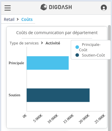
You can also add an icon at the top right of the graph to display the legend. To do this, in the Properties tab of the object settings panel, tick the Show an icon for displaying the legend option.![]()
Customisation
You can customise the mobile display in your custom theme, for example by colouring the banner.
Use the #dashboard_mobile CSS selector to differentiate the dashboard in "Mobile" view mode from other modes.
Review the page CSS styles page for more details.
