Dashboard Creation Wizard
- Preamble
- Prerequisite
- Using the wizard
- Case n°1 : no pre-configured dashboard has been detected
- Case n°2 : pre-configured dashboards have been detected
- Dashboard construction
- Datamodel edition
Preamble
The dashboard creation wizard aims at helping you to create a complete dashboard in few clicks from a datasource and this, in an intuitive manner.
This tool suggests multiple dashboards that are meant to be configurable so they can fit the users' usage as much as possible.
Prerequisite
Anyone who wants to use the assistant should have the authorization group named "Access Dashboard Assistant".
Using the wizard
From the dashboards editor, select on the top right toolbar the button Dashboard creation assistant.
The first view shows two options :
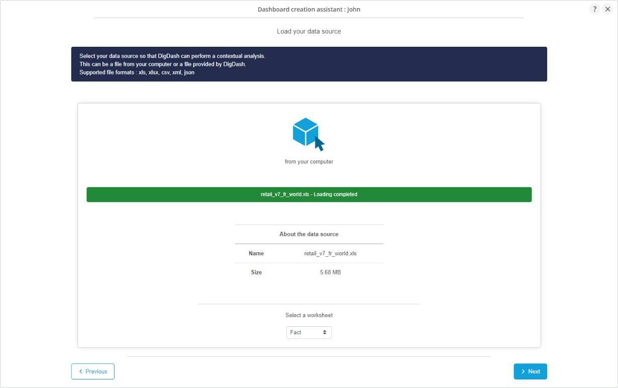
- The first consists in loading your file directy from your computer. Supported formats: xls, xlsx, csv, xml and json.
- The second consists in selecting a data file provided by DigDash. Each corresponds to a pre-configured dashboard.

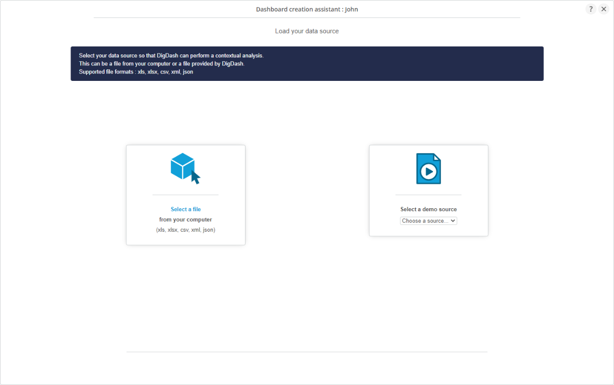
- For Excel files, you can select the sheet to work with.
- The tool then does a contextual analysis of the file to suggest the most appropriate dashboards.
Case n°1 : no pre-configured dashboard has been detected
It is possible that no pre-configured dashboard correpond to the loaded datasource.
In this case, you will only have the possibility to create an automatic or personalized dashboard.
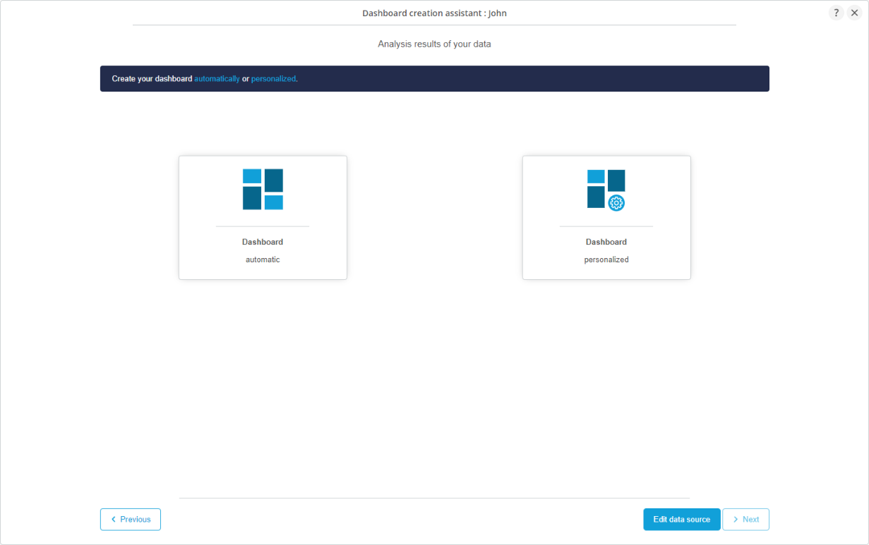
Selecting the automatic dashboard
The automatic dashboard pre-selects graphics in your dashboard that you can of course enrich afterwards according to different analysis axis explained below.

Selecting the personalized dashboard
With the personalized dashboard, you are completely free to choose the graphics to create for your dashboard according to the analysis axis explained below.

Data source edition
It is highy recommended to have knowledge of the way the data is structured and to bring any potentiel corrections.
The button 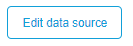 will allow you to learn more about your source. Wou will be able to vizualize your data and configure them.
Preview of the datasource
The tab "Preview data" allows you to visualize a part of your data to understand it.
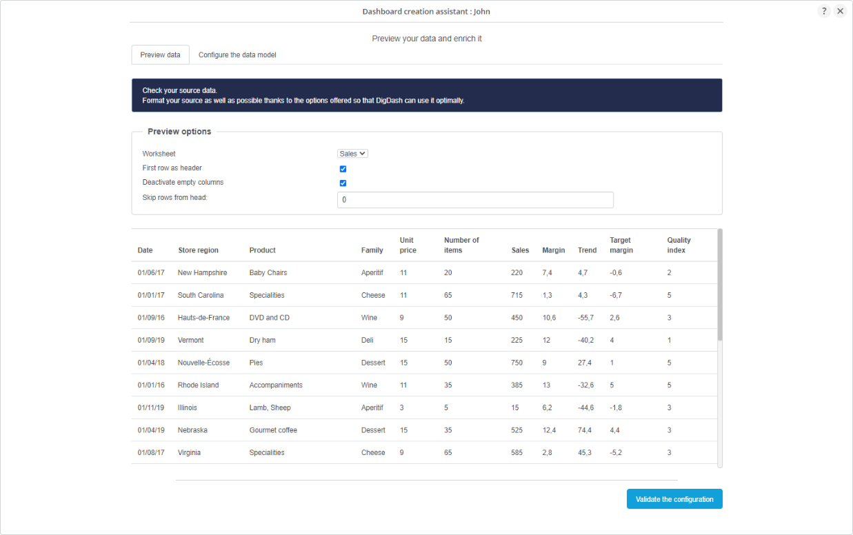
Options exist so you can form your data in better ways.
These are different according to the type of the imported source. For example, you can choose the sheet only for an Excel file.
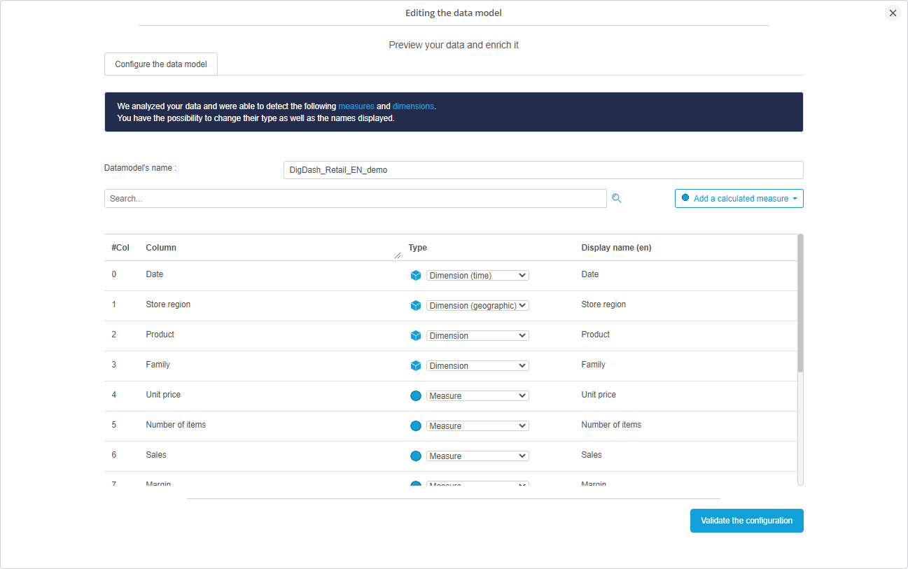
Configuration of the datamodel
The tab "Configure the datamodel" allows you to configure the measures and dimensions detected by DigDash.
You will be able to modify their type, their diisplay name and event create derivated measures from them.
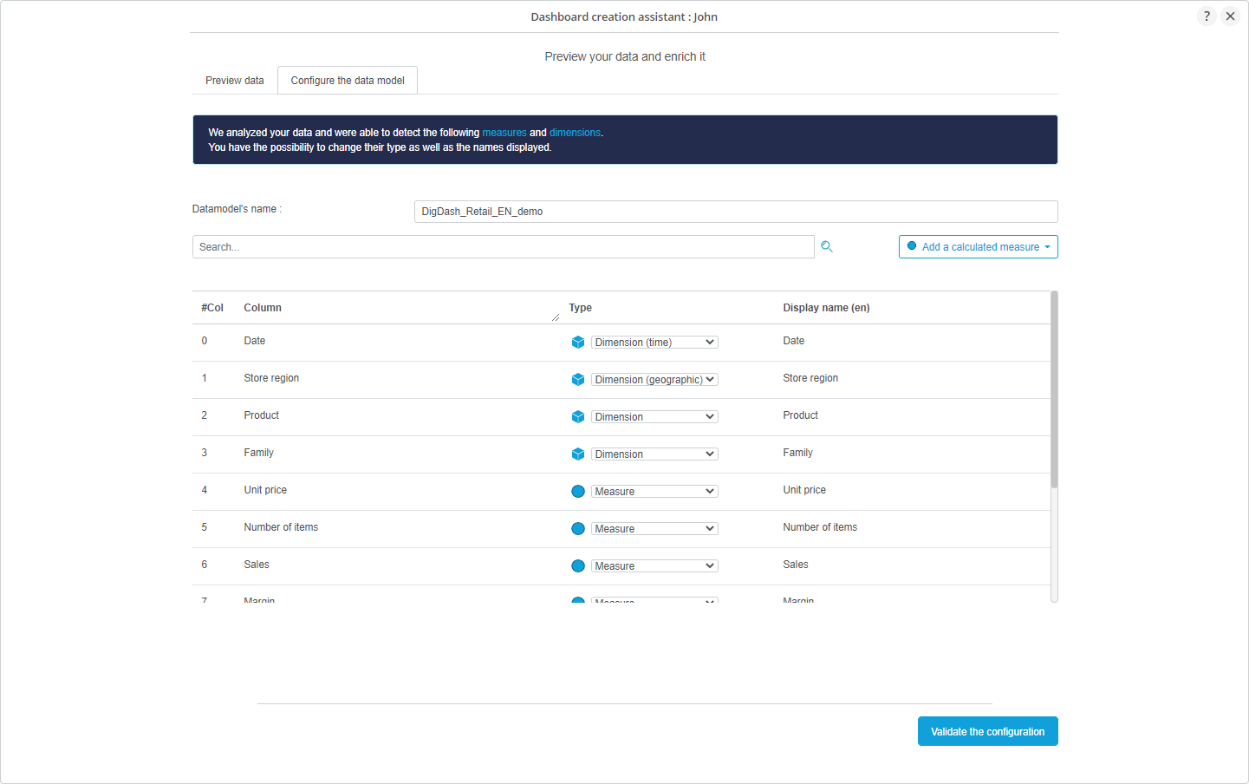
Changing column types
Digdash automatically detects whether the columns of your source are dimensions or measures.
If you decide than a column is a measure instead of a dmension, or vice versa, you can change its type.
Note that the configuration of the data can have consequences in the contextual analysis of the data and then change it.
Adding derivated measures
The button 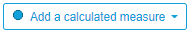 allows you to add calculated measures to your datamodel.
There are different ways to create them. you can use the existing preestablished functions (general or transformers) or define your own formulas.
General functions
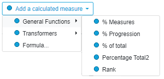
General functions are basic formulas.
Transformers
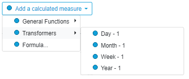
Les fonctions de transformations s'appliquent sur des mesures et vous permettent d'afficher les valeurs pour l'année précédente, le mois précédent la semaine précédente ou le jour précédent.
Formula
- Selecting "Formula..." you will have this following dialog appear :
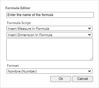
- This dialog allows you to freely define the formula to apply to the associated columns.
- You will need to enter a name for it.
Graphics choice
Selecting an automatic or personalized dashboard will lead you to a view similar to this one below.
The left part shows the list of graphics to choose for the right part of this interface.
The right part shows the content of the dashboard you want to build.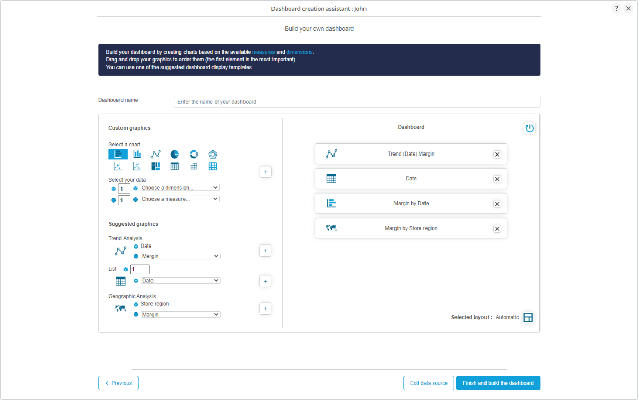
Dimensions and measures of your datasource are automatically recognized. The user can simply create the graphics from them.
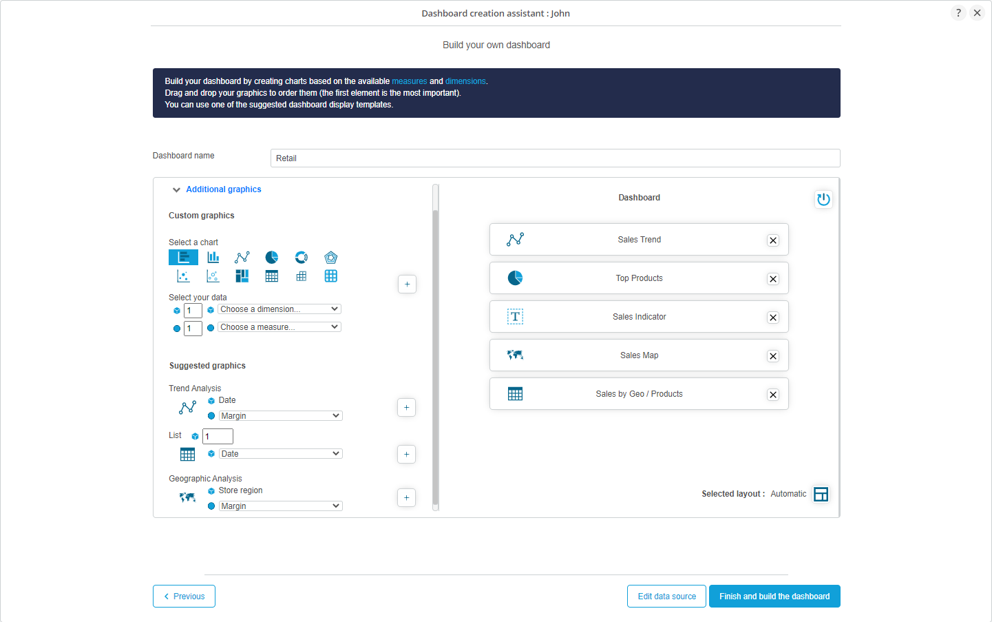
- The part Custom graphics allows you to do a free analysis: according to the number of dimensions and measures of the graphic you want to create, you will also be able to choose the type of graphic to display.
- The part Suggested graphics corresponds to list of suggested analyses. This list depends on the columns of your datamodel. For example, the suggestion of a geographic analysis will ony appear if at least one geographic dimension exists.
Three types of analyses exist:- Trend analysis: at least one dimension of time has been detected. The line chart is automatically suggested.
- Geographic analysis: at leat one geographic dimension has been detected. The representation by a map is automatically suggested.
- List: one or multiple dimensions have been detected. The table representation is automatically suggested.
If you choose to have an automatic dashboard, dimensions et measures are pre-selected and graphics are automatically selected for the dashboard.
If you choose an personalized dashboard, you can select the dimensions and measures yourself for each analysis.
- Click on
 to add the graphic to the dashboard.
Case n°2 : pre-configured dashboards have been detected
- DigDash can detect if a pre-configured dashboard matches to your datasource.
- You can then select this pre-made dashboard with pre-configured and pre-selected graphics or choose to create an automatic or personalized dashboard.
Selecting a pre-configured dashboard
In your example, the source file retail_v7_de_world.xls matches the "Retail" dashboard.
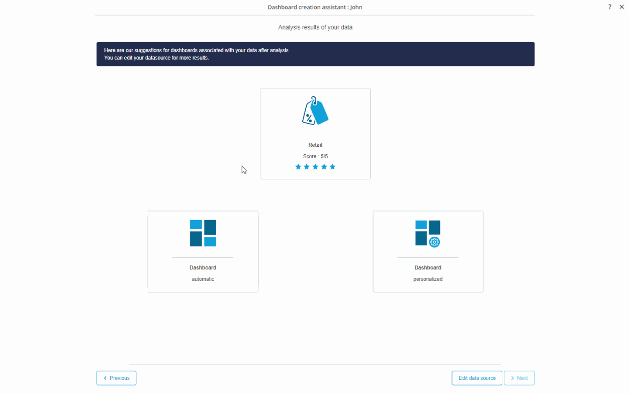
- When selecting it, the dashboard will be composed of graphics dealing with Retail (Sales, Turnover, etc.).
Graphics choice
- Selecting this dashboard will generate a list of relevant graphical representations that will copose yout dashboard: these graphics below are specific for a Retail dashboard.
The pre-configured graphics associated to the selected dashboard are directly added to the content of the dashboard to build.
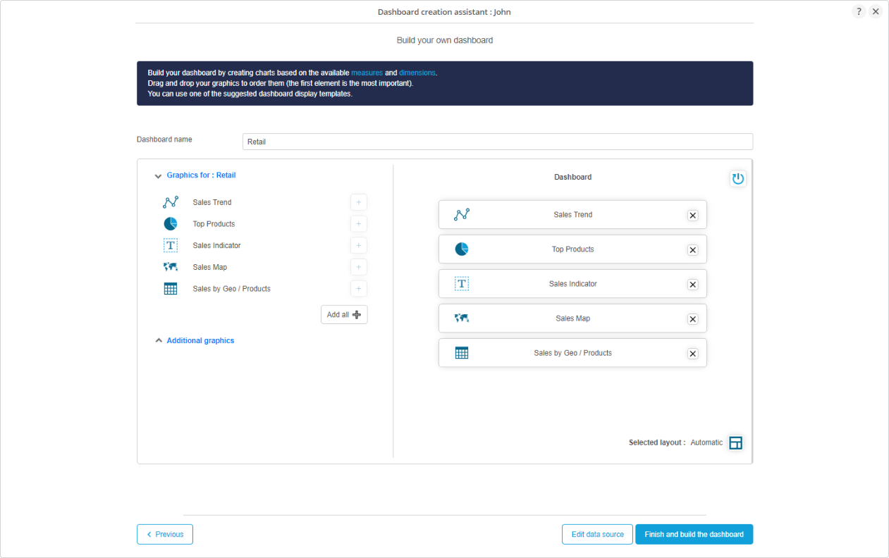
Moreover, you can enrich the content of your dashboard adding your own graphics.
Dashboard construction
- You have mutiple options to handle the vizualisation of your dashbord.
Dashboard name
Give a name to you dashboard. It is mandatory.
Indded, it will be used as the name of a category in the wallet.
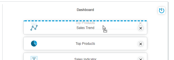
Graphics arrangement
DigDash offers multiple layouts to conviniently arrange your graphics in your dashboard. The default layout is the automatic one.
The automatic layout automatically arranges your content adjusting it at its best, without any graphics limation.
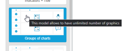
Each layout has a maximum of graphics capacity, you can know it hovering it.
Drag and drop the graphics of your dashboard to order them. The first is the most important..
Validate and finish the dashboard construction
Click on the button 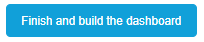 to terminbate the dashoard construction.
Wait a few seconds.
The assistant will close eventually and your final dashboard will be dsisplayed in the Editor.
If you wish, you can enrich it in the Dashboards Editor.
Datamodel edition
A datamodel issued from this assistant can be modified afterwards. You can add more derivated measures for example if you need to.
To access the edition interface, you have two possibilities:
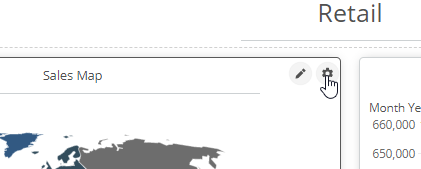
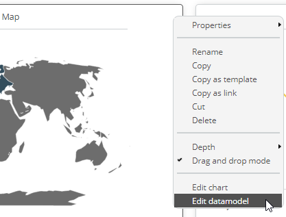
- Click on the wheel on a graphic and select the menu "Edit the datamodel.
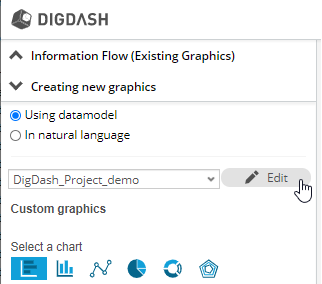
- via the button "Edit" when creating new graphics using a datamodel.