Tutorial : Dashboard Creation Wizard
- Introduction
- Prerequisite
- Connection to the dashboard editor
- Loading data and editing the data model
- Personalized dashboard creation : first charts
- Finalization of the dashboard : absenteeism
- Creation of the second page: payroll
- Conclusion
Introduction
During this tutorial, we will discover the Dashboard Creation Wizard.
Included in the dashboard editor, this feature allows you to quickly create your charts from your data file, without any intermediate step.
From an example dataset of the human resources of a company in Ile de France (the France's capital administrative region), we will carry out all the stages from the loading of the data to the creation of the graphs and their integration into the dashboard pages.
Prerequisite
In order to be able to perform this tutorial, it is required to:
- have an installation of DigDash Enterprise of version 2020R2 or more recent;
- be part as a user of the "End User for Self-Service BI" authorization group;
This part discusses this two prerequisites.
Prerequisite 1 : DigDash Enterprise (2020R2 ou plus récent)
Installation
- In case you need to perform the installation yourself, contact your administrator or your contact, and follow this tutorial to perform the installation. Then go to the Connection part of this tutorial.
- If you already have a link to connect to a DigDash Enterprise installation, as well as connection identifiers, go directly to the Connection part of this tutorial.
Version
- To be able to follow this tutorial, it is necessary to use a version 2020R2 or more recent of DigDash Enterprise ;
- To find out which version you are currently accessing, go to the address given to you by your DigDash administrator ;
- In the page that appears, at the bottom left, in the white area, you can find out which version of the installation is in use.

Prerequisite 2 : authorizations group "End User for Self-service BI"
- To be able to use the Dashboard Creation Wizard functionality, your DigDash Enterprise user account must be part of the "End User for Self-service BI" authorization group.
- If you do not have administration rights, or in case of doubt, contact your DigDash Enterprise administrator.
Connection to the dashboard editor
Once the prerequisites of the previous part have been verified, we can now proceed to the connection to the Dashboard Editor.
It is from this editor that we will launch the Dashboard Creation Wizard.
This part will allow us to connect for the first time to DigDash Enterprise and to briefly tour the home page that you will access, before accessing and discovering the Dashboard Editor
Connection to DigDash Enterprise
Connection to home page
Connection in the case of a local installation on your computer
- First, make sure your DigDash Enterprise installation is already started.
- If it's not the case :
- go to the DigDash Enterprise installation directory on your computer.
- double click on the start_tomcat.bat file to run it.
- double-click on the home_page.bat file to run it: your default browser will open the DigDash Enterprise home page.
- You can also directly follow the following link from your browser: http://localhost:8080/
- If it's not the case :
Connection in the case of an online installation
- First, make sure you have the Internet address of the DigDash Enterprise installation as well as your username and password.
- This information must have been provided to you previously by your DigDash Enterprise administrator.
- In case of any doubt, do not hesitate to contact your DigDash Enterprise administrator
- Go, using your internet browser, to the address given to you.
Home page tour
- Once the previous connection step has been completed, you will see the following page appear in your browser:

Help accessible from the home page
- A documentation section is present in the white triangular insert at the bottom left;
- Within this insert, you will be able to find the various documentations if necessary.

Home page menu
DashBoard
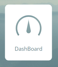
- This menu item allows you to access dashboards already completed by you or your team.
- It is from this menu that you will be able to view the dashboard built in the wizard.
Dashboard Editor
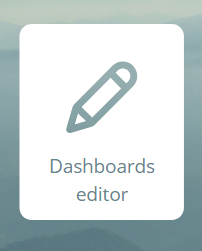
- This menu item takes you to the dashboard edit.
- In this tutorial, we will mainly focus on this part of DigDash Enterprise
- As you will have noticed, the home page contains three other menus: Configuration, Desktop Studio and Web Studio;
- These menus cover advanced configuration features and items that are not covered in this tutorial.
Access to the dashboard editor
Connection to the editor
- From the home page click on the "Dashboard editor" button ;
- A login page then opens;
- Enter your username and password.

Editor tour
Top bar
La barre supérieure de l'éditeur de tableaux de bord présente différentes fonctionnalités et options :
The top bar of the dashboard editor presents several features and options :
- a help menu
- the dashboard creation wizard
- switching to consultation mode of the dashboard being edited
- a menu that can be deployed from the username with several advanced options
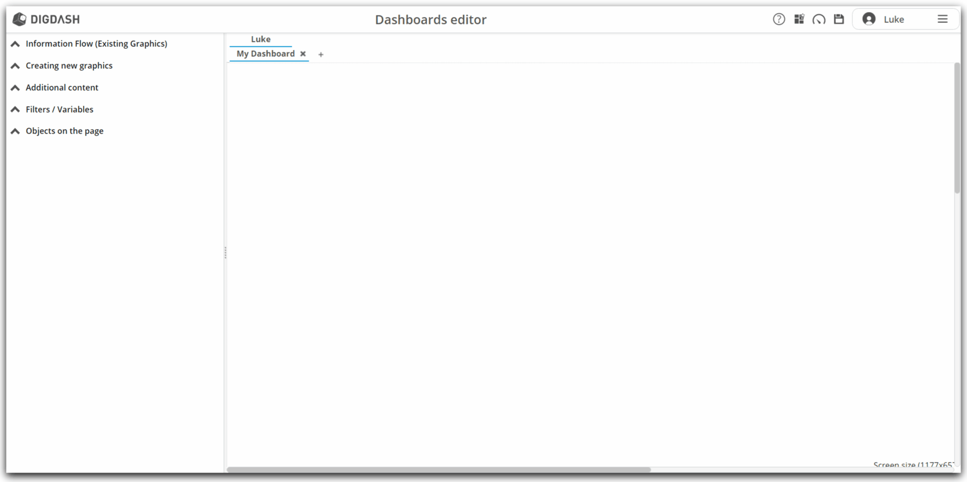
Roles and pages
- In the central space are presented the dashboard pages;
- When you log in for the first time, a page called "My Dashboard" is automatically created;
- The list of roles is presented above the list of pages;
- Each page of the dashboard is associated with a role:
- thus, the "My Dashboard" page belongs to the "Luke" role;
- this role is personal: it bears the name of the user, and only him has access to it;
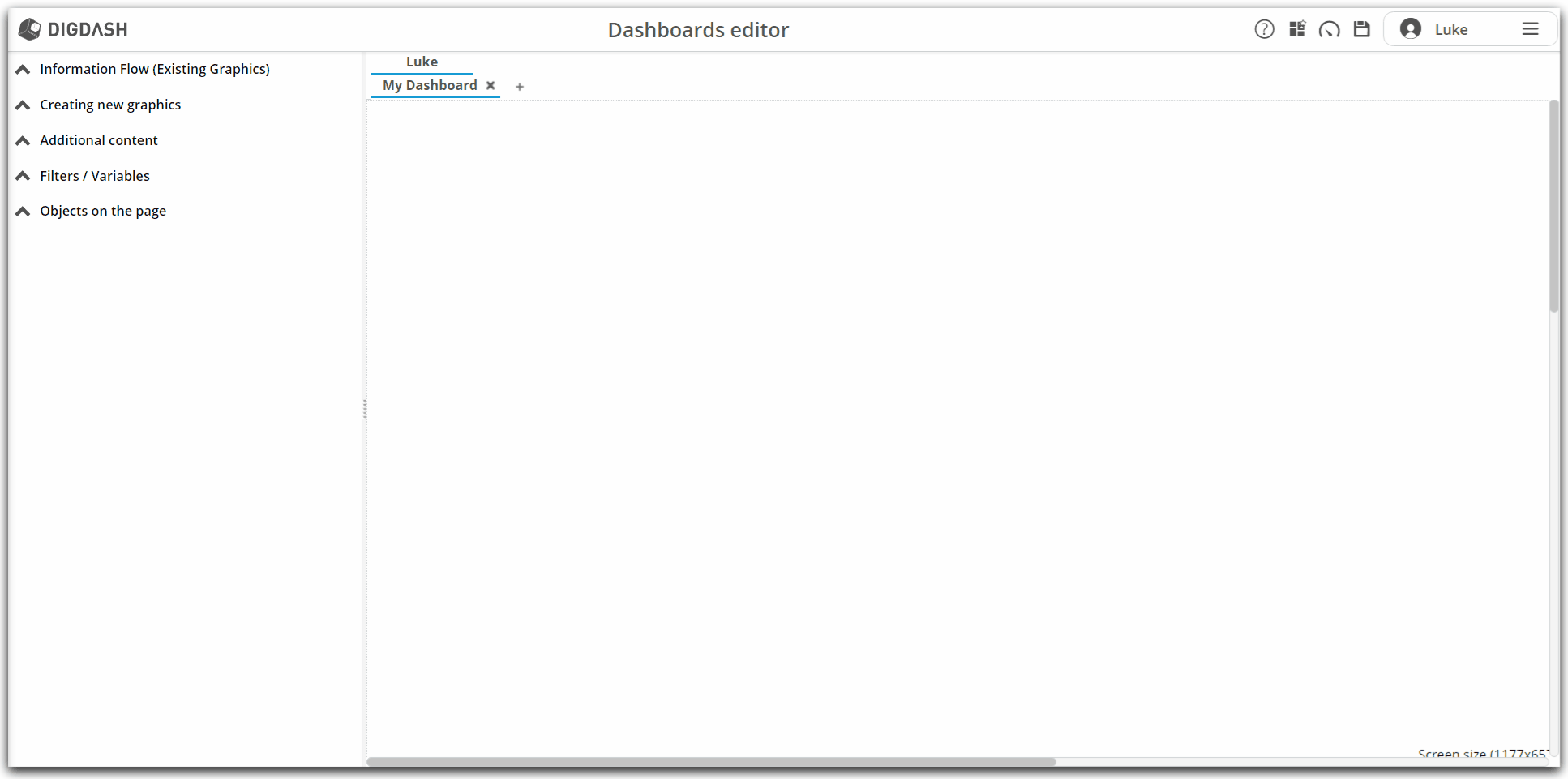
Access to the wizard
- From the dashboard editor, in the top banner, click the icon
 ;
; - The wizard window then opens ;
Loading data and editing the data model
After making the first connection to DigDash Enterprise and familiarizing ourselves with the home page and the dashboard editor, we will now learn about the Dashboard Creation Wizard.
The first step will be to load the data. Secondly, we will edit the model in order to configure new measures and make sure we have the correct model to make our first graphs.
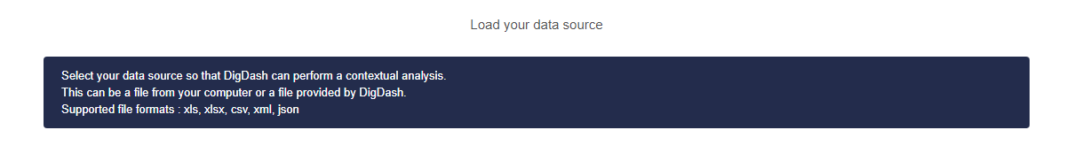
Loading data
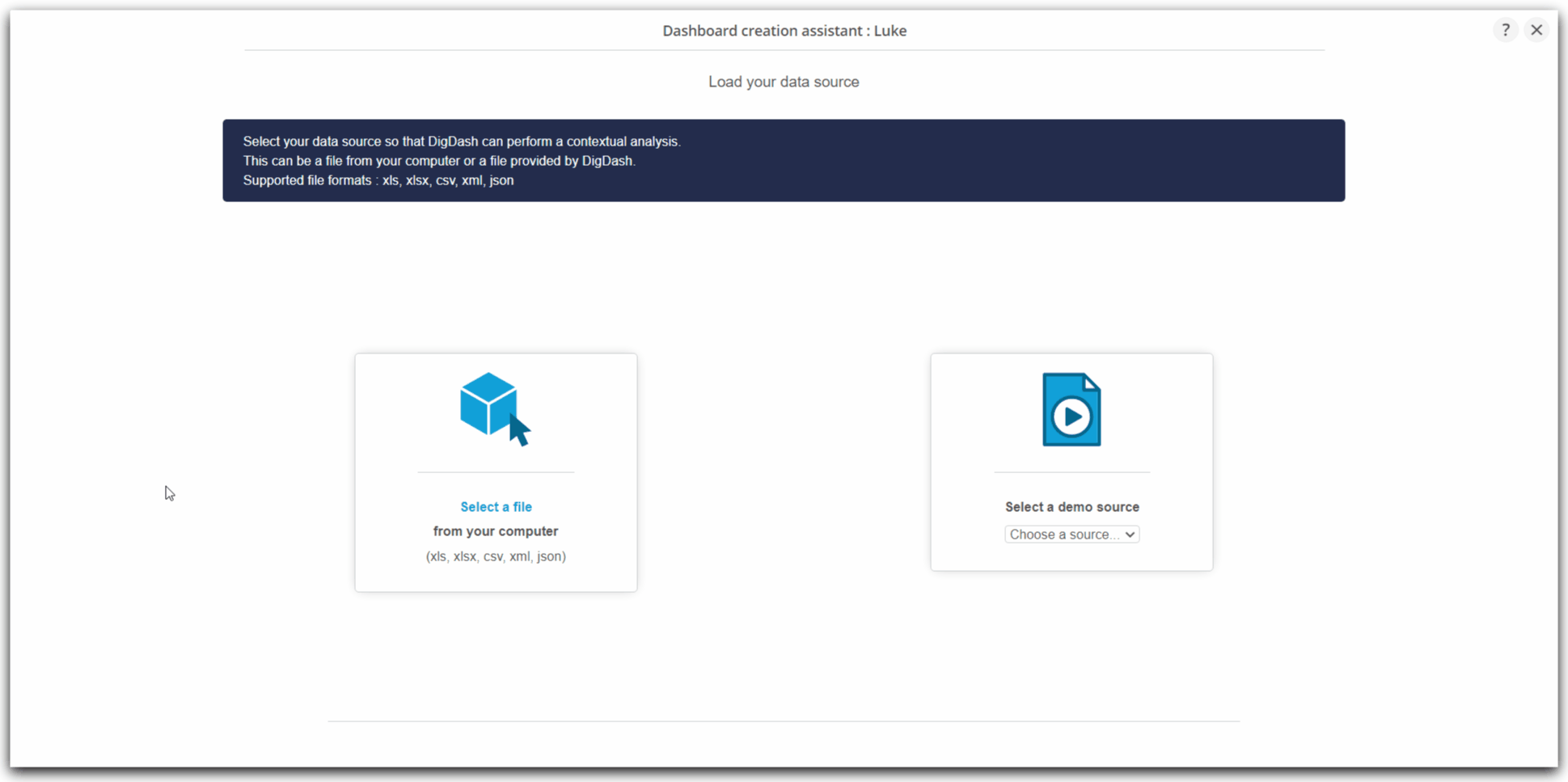
File selection
- To move through the Wizard and create our charts, we have two choices:
- use a demonstration source;
- or use a local file;
- These two choices are offered to us when the wizard opens;
- Click on Select a file from your computer;
- A window from your operating system will then open;
- Browse your folders to the folder where you saved the RH_dataset_tutorial_EN.xlsx file;
- Select this file and click Open ;
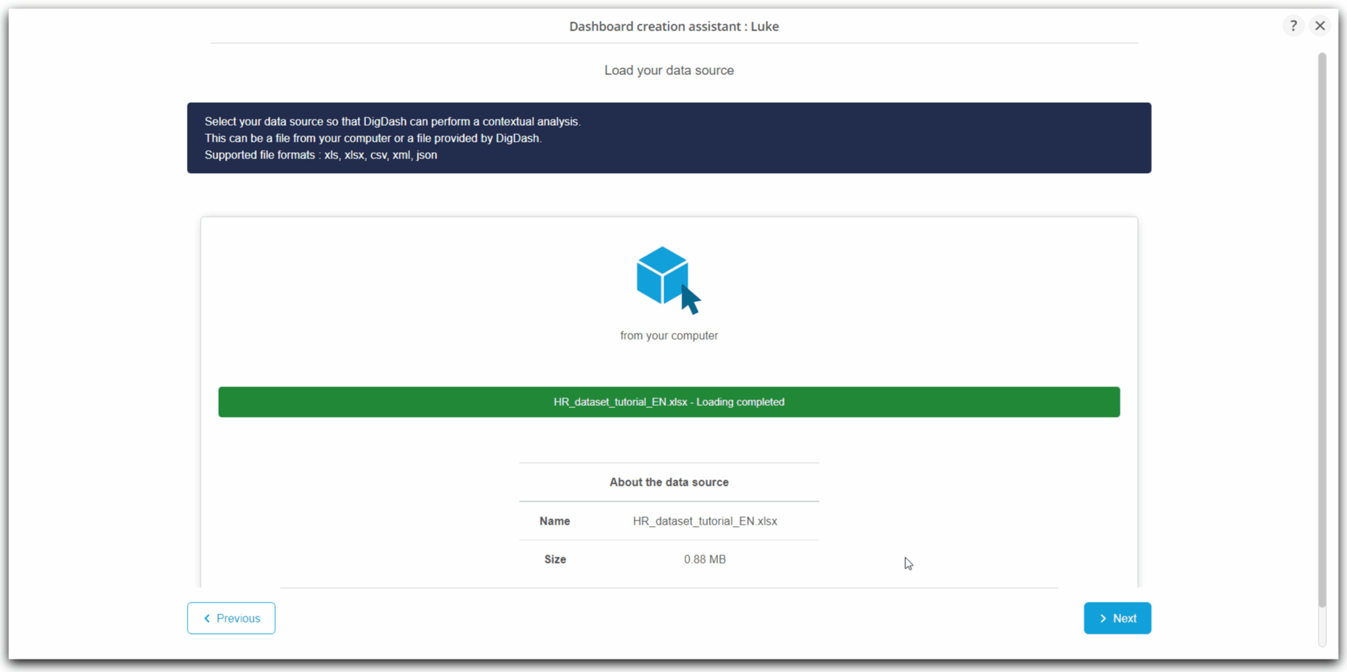
Loading file
- The progress bar, in green, is completed to indicate the correct and complete loading of the uploaded file;
- A Loading completed message confirms the successful loading;
- Then click on the blue button at the bottom: Next
Editing the data model
- After loading the file, a new screen appears;
- Click Edit data source;
This step will allow us to put our data model in order to better build our first charts.
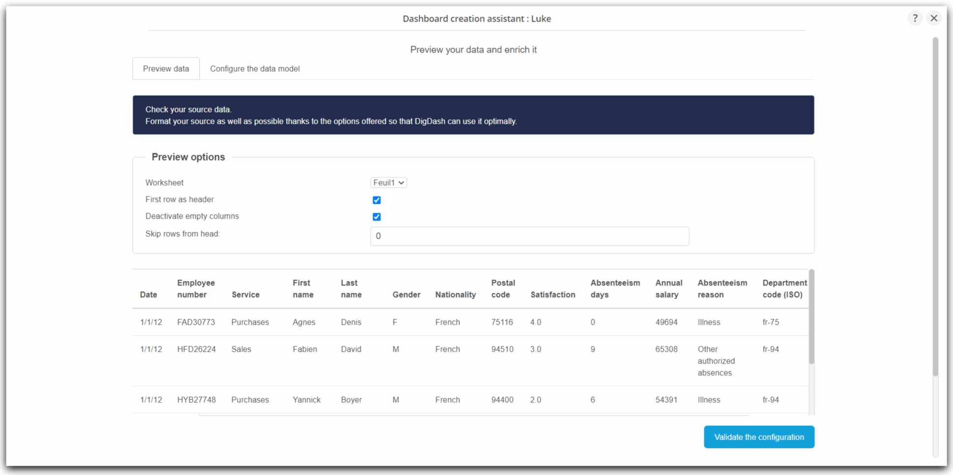
Data preview
- The screen that appears is divided into two tabs: the first allows you to preview the data
- In this tab, you can modify the sheet to be used in the Excel workbook.
- Options also allow:
- to choose the first line as the header;
- disable empty columns;
- and ignore a number of header lines.
- Here, with our file, everything is already preconfigured due to the analysis carried out during the loading by DigDash Enterprise to offer you an optimal preconfiguration.
- Now click on the second tab Configure the data model
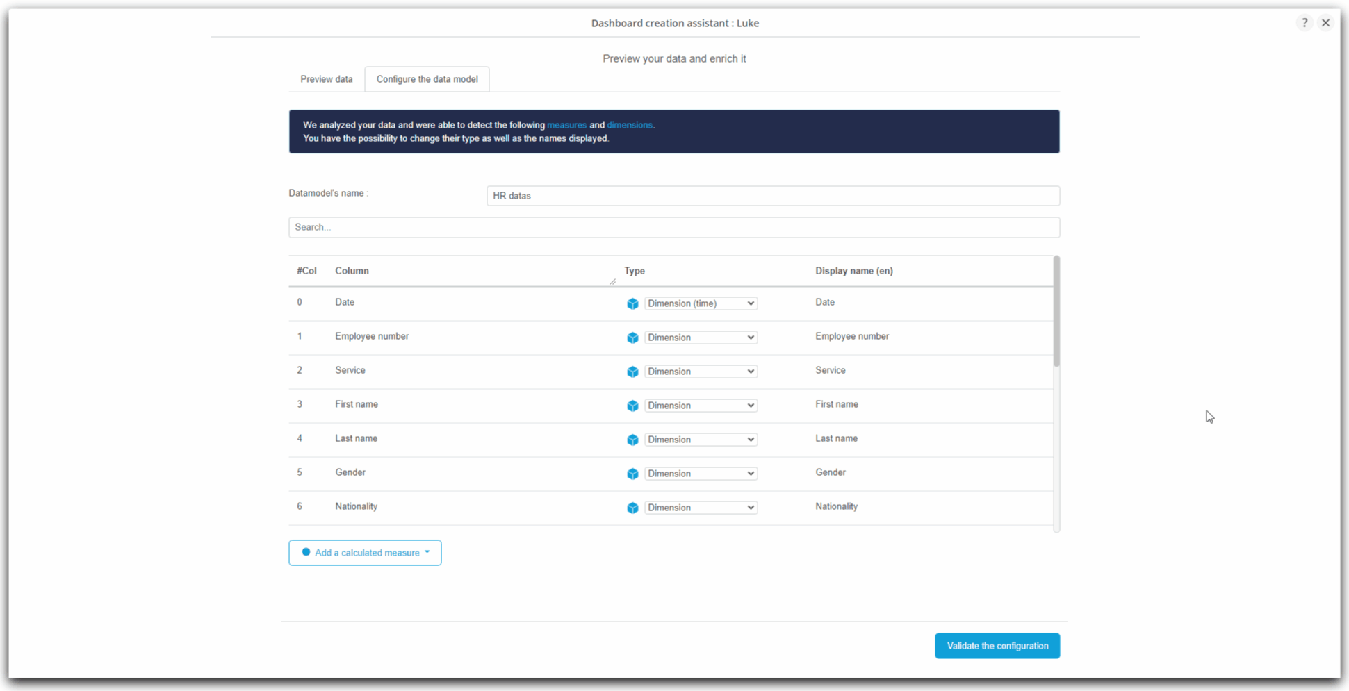
Configuration of data model
- In this second tab, we will configure the data model, that is to say:
- give it a name;
- check that the columns are well distributed between dimensions and measures;
- if necessary modify this pre-assignment;
- add calculated measures;
- change the display labels for certain measures or dimensions.
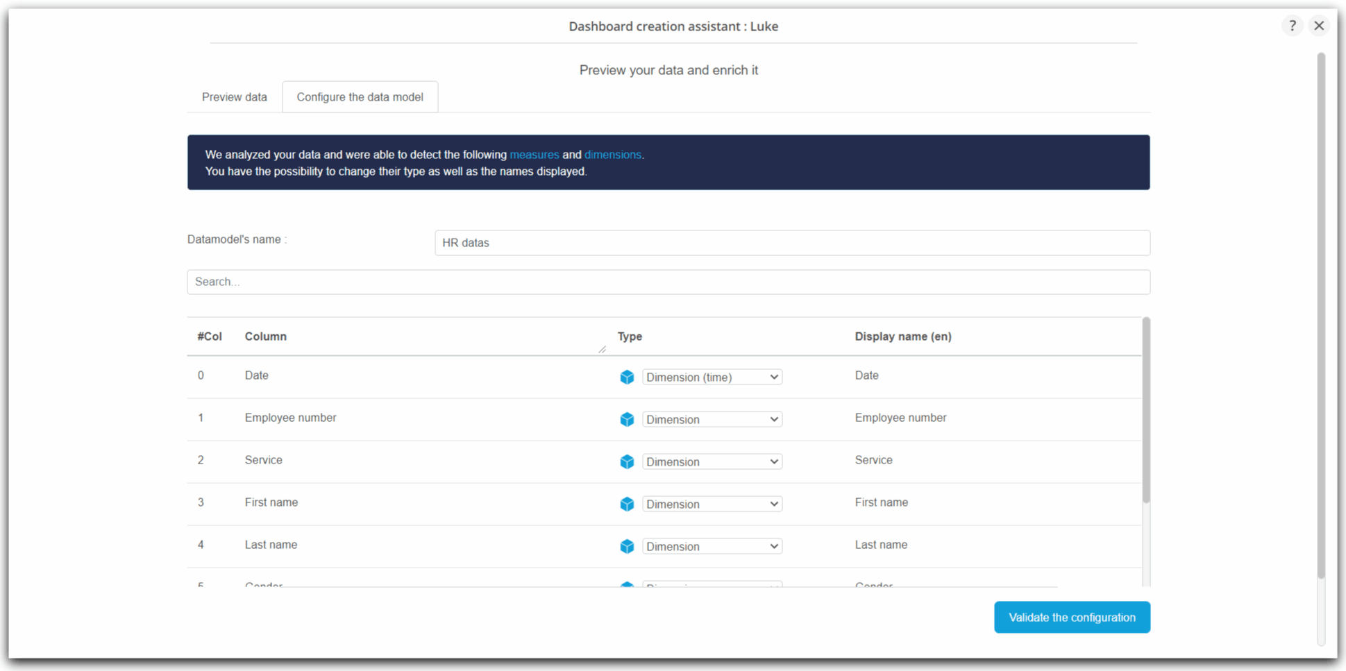
Naming the data model
- In order to clearly identify the data model, which will promote its future reuse, we will name this data model "HR datas";
- By default, the data model takes the name of the Excel file
- To rename it, enter the desired text in the first field corresponding to Datamodel's name.
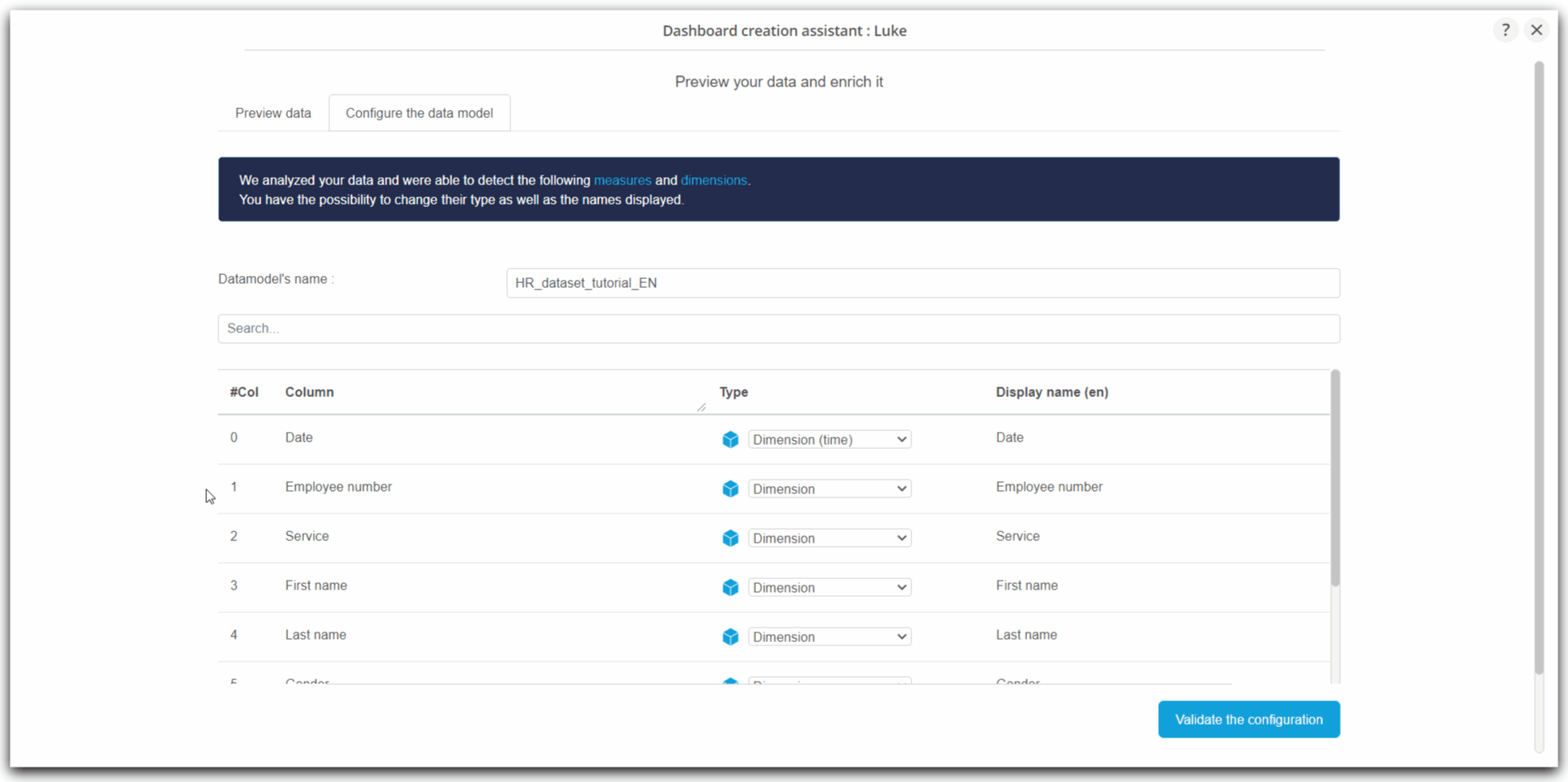
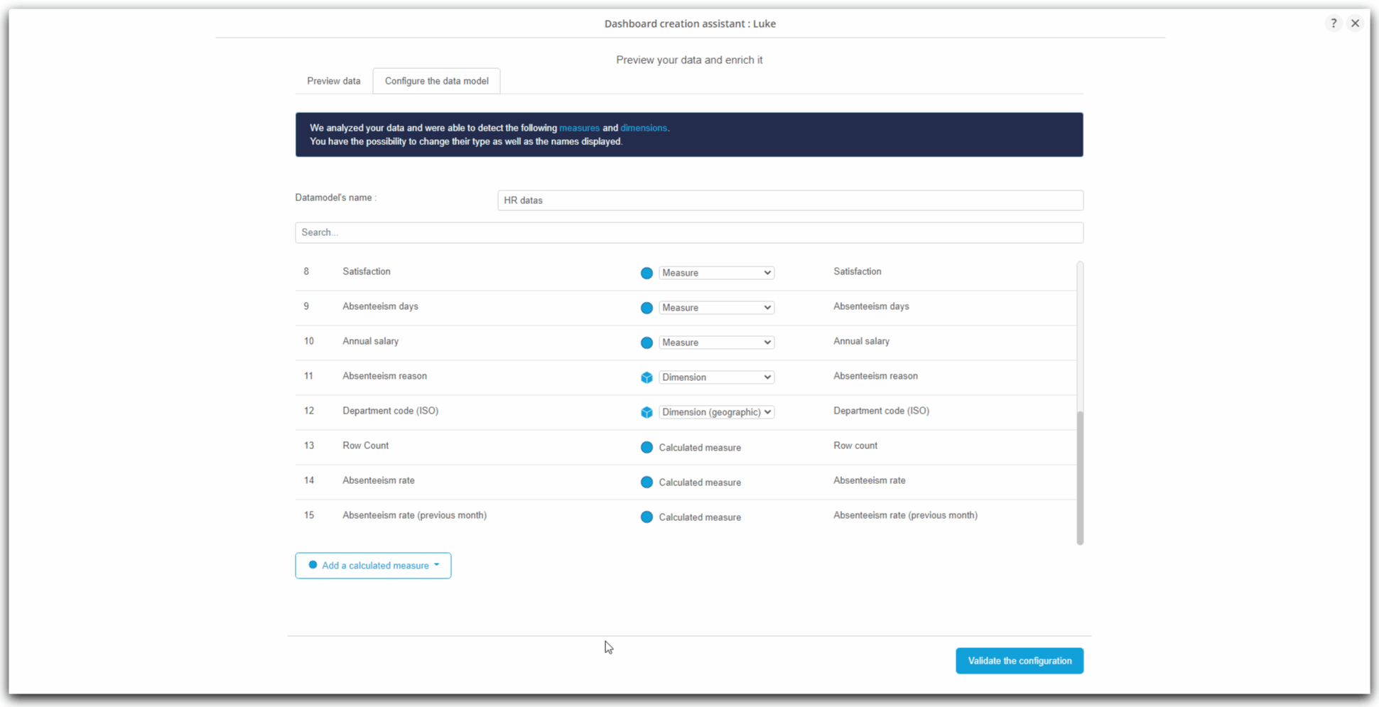
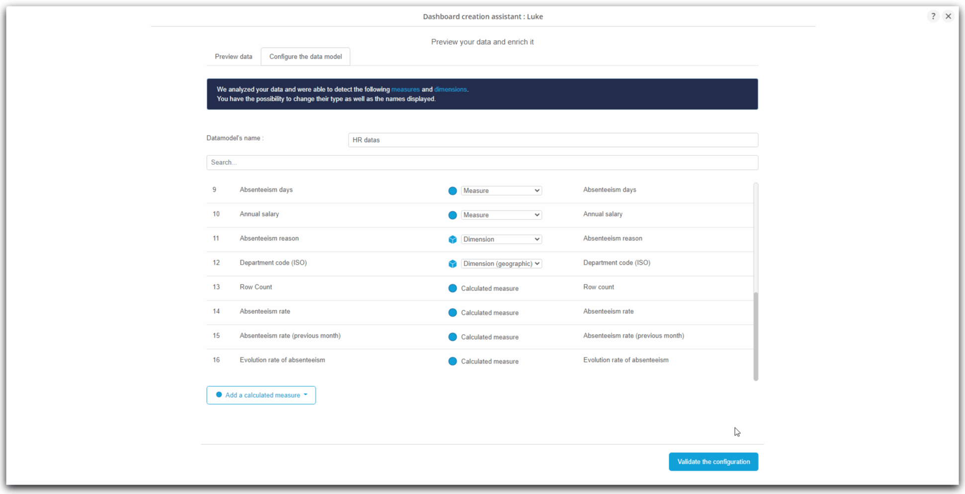
Verification of dimension and measure assignments
- Below the name of the data model, a list shows the columns of the file and indicates for each column:
- its index (starting at 0)
- the name (from the identified column header)
- the type :
- dimension
- geographic dimension
- time dimension
- measured
- and the display caption (or displayed value)
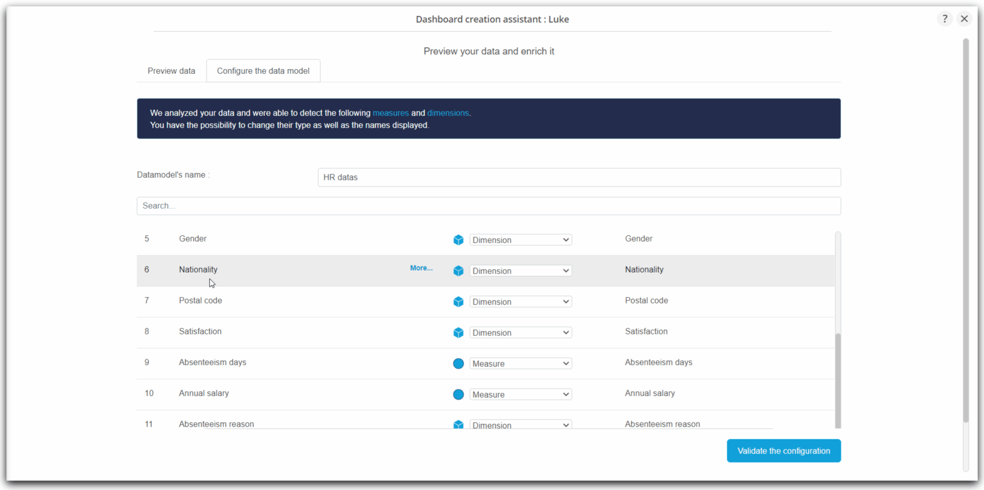
- Let's go through the list of columns:
- in column 7, we observe that the Postal Code is identified as a measure and not as a dimension
- this is explained by the fact that the Postal Code is a sequence of numbers, and is therefore identified as a number and therefore a measure by DigDash Enterprise
- to correct this oddity, we can select Dimension in the drop-down list associated with this colum
- in column 7, we observe that the Postal Code is identified as a measure and not as a dimension
- in column 8, we see that Satisfaction is identified as a dimension. However, this is a measure assessing employee satisfaction from 0 to 10
- this time we can select Measure in the drop-down list associated with the column to correct this
Adding calculated measures
- Calculated measures allow you to create the measures you want from the measures and the dimensions yet included in the file.
- In the wizard, three types of calculated measures are proposed:
- general functions: these are classic functions:
- calculating a percentage of progress
- calculating a percentage of the total
- calculating a percentage of a measure
- calculating a rank
- transformers: these functions are used to create a measure returning the value of the measure:
- of the day - 1
- of the week - 1
- of the month - 1
- of the year - 1
- formula: this calculated measure allows you to apply your own arithmetic formulas on the available measures.
- general functions: these are classic functions:
- We will see together how to create one or more measures of each of these three types
- These measures can then be integrated like all the other measures and dimensions in the graphs in the next step.
Absenteeism rate (formula)
Here we are going to create the measure calculating the absenteeism rate.
This calculated measure will use the following formula: Number of days of absence over a month for an employee divided by 30 (30 being considered here as the number of days over a month).
- At the bottom of the column list, click on the Add a calculated measure button;
- A context menu appears ;
- Click on Formula ...;
- The Formula Editor window is displayed;

- First, indicate the name of the new calculated measure being created in the first field: Absenteeism rate;
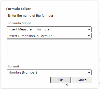
- To compose your formula, you must add the measures and dimensions involved and perform the desired arithmetic operation in the Formula Script part:
- You can add measures and dimensions by selecting them from the drop-down lists corresponding to each of the categories;
- In our case, click on Insert Measure In Formula
- Then choose the Absenteeism days measure
- The measurement is added in the text box below.
- Before adding the other measure, complete by writing: "/ (30 *"
- Then insert the measure Number of lines
- Finish by closing the parenthesis
- The final formula should be as follows:
- You can add measures and dimensions by selecting them from the drop-down lists corresponding to each of the categories;
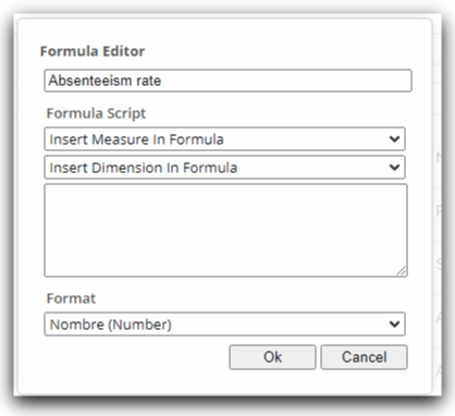
- Finally you can indicate the format in which this calculated formula will be displayed.
- Here, choose the format Pourcentage (Percentage).

- Complete the creation of this measurement by clicking on Ok
- The newly created calculated measure Absenteeism Rate is displayed at the end of the column list.

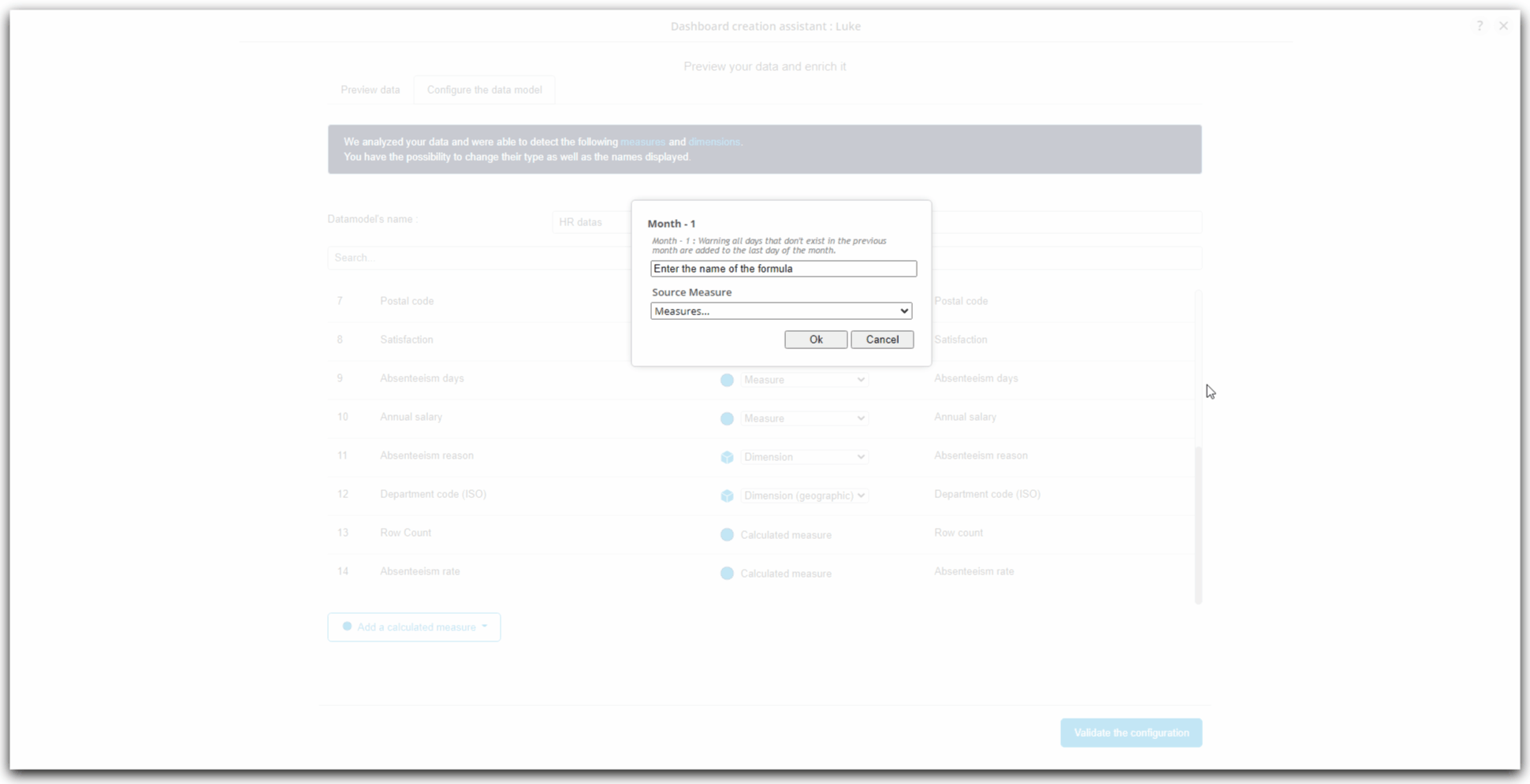
Absenteeism rate of previous month (transformer m-1)
Here we are going to create the calculated measure returning the absenteeism rate for the previous month, based on the calculated measure "Absenteeism rate" that we have just created.
- At the bottom of the columns' list, click on Add a calculated measure ;
- A context menu appears ;
- Click on Transformers then on Month- 1 ;
- The window Month - 1 appears then ;

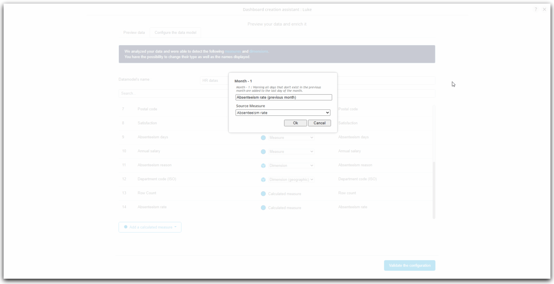
- First, enter the name of the new calculated measure being created in the first field: Absenteeism rate (previous month) ;
- Int he drop-down list Source Measure, choose the measure to which you want to apply the transformer to obtain the value of the previous month of this source measure.
- Here, choose the recently created calculated measure : Absenteeism rate
- Complete the creation of this measure by clicking on Ok ;
- The newly created calculated measure Taux d'absentéisme du mois précédent is displayed at the end of the list of columns.
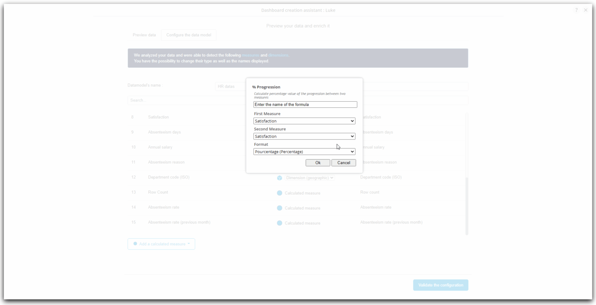
Evolution rate of absenteeism (general function : progression)
Here we are going to create the calculated measure returning the evolution between the previous absenteeism rate and the current rate by relying on the first two calculated measures that we have just created.
- In the bottom of the columns' list, click on Add a calculated measure ;
- A context menu appears ;
- Click on General functions then on % Progression ;
- The window % Progression appears ;
- First, enter the name of the new calculated measure being created in the first field: Evolution rate of absenteeism ;
- To calculate a progression type measurement, we must indicate the first measure from which we will measure the evolution with the second measure. We will therefore insert the temporally "oldest" measure in the first measure and the most recent in the second.
- Here, on the drop-down list First measure, choose Absenteeism rate (previous month) ;
- Then, on the drop-down list Second measure, choose Absenteeism rate ;
- Complete the creation of this calculated measure by clicking on Ok ;
- The newly created calculated measure Evolution rate of absenteeism is displayed at the end of the columns' list.
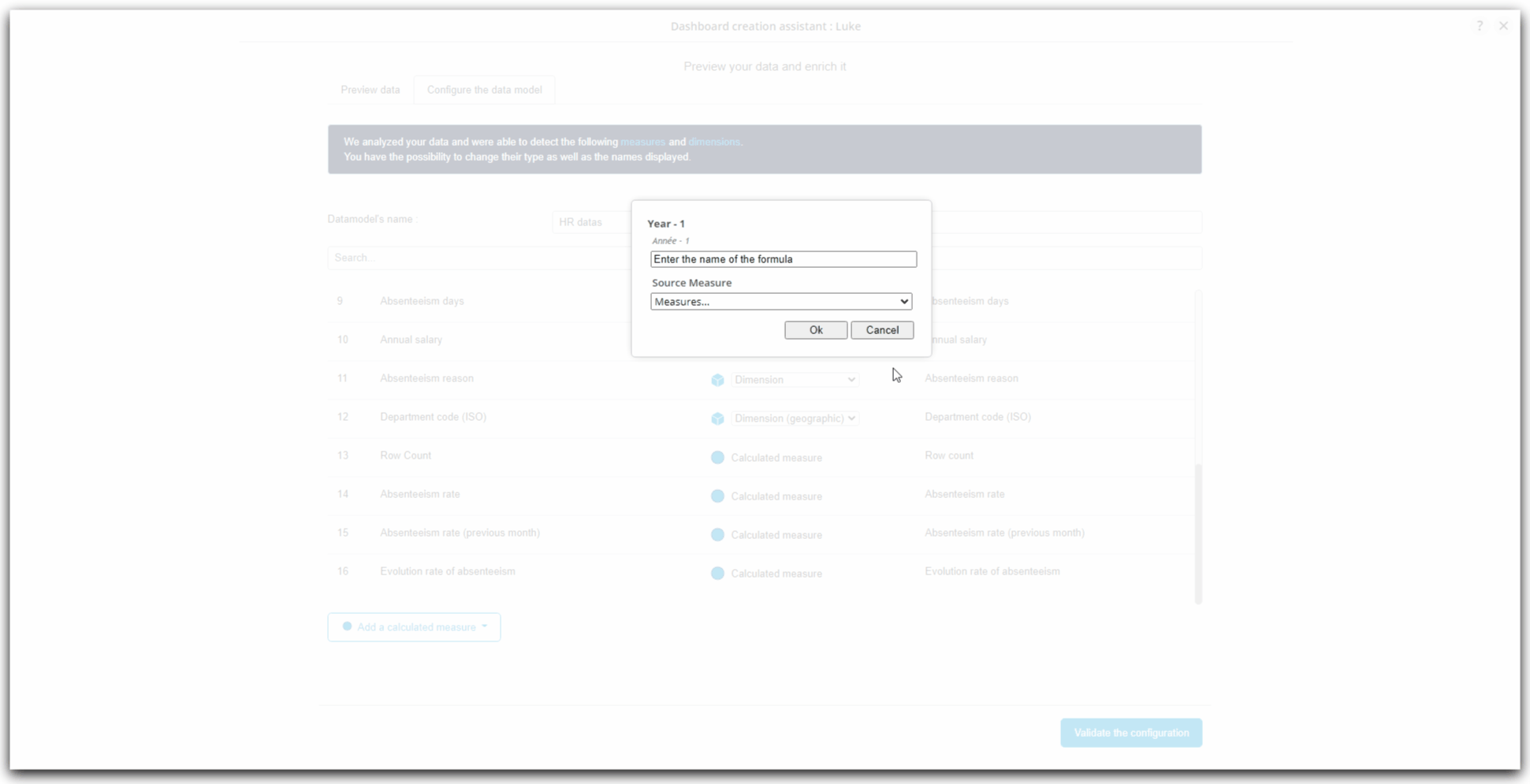
Payroll of previous year (transformer y-1)
Now, we are going to create a calculated measure returning the payroll of the previous year, relying on a already existing measure : Annual salary.
- In the bottom of the columns' list, click on Add a calculated measure ;
- A context menu appears ;
- Click on Transformers then on Year - 1 ;
- The window Year - 1 appears ;
- First, enter the name of the new calculated measure being created in the first field: Payroll (previous year) ;
- On the drop-down list Source measure, choose the measure to which you want to apply the transformer to obtain the value of the previous year of this source measure.
- Here, choose the measure : Annual salary ;
- Complete the creation of this calculated measure by clicking on Ok ;
- The newly created calculated measure displays at the end of the columns' list.
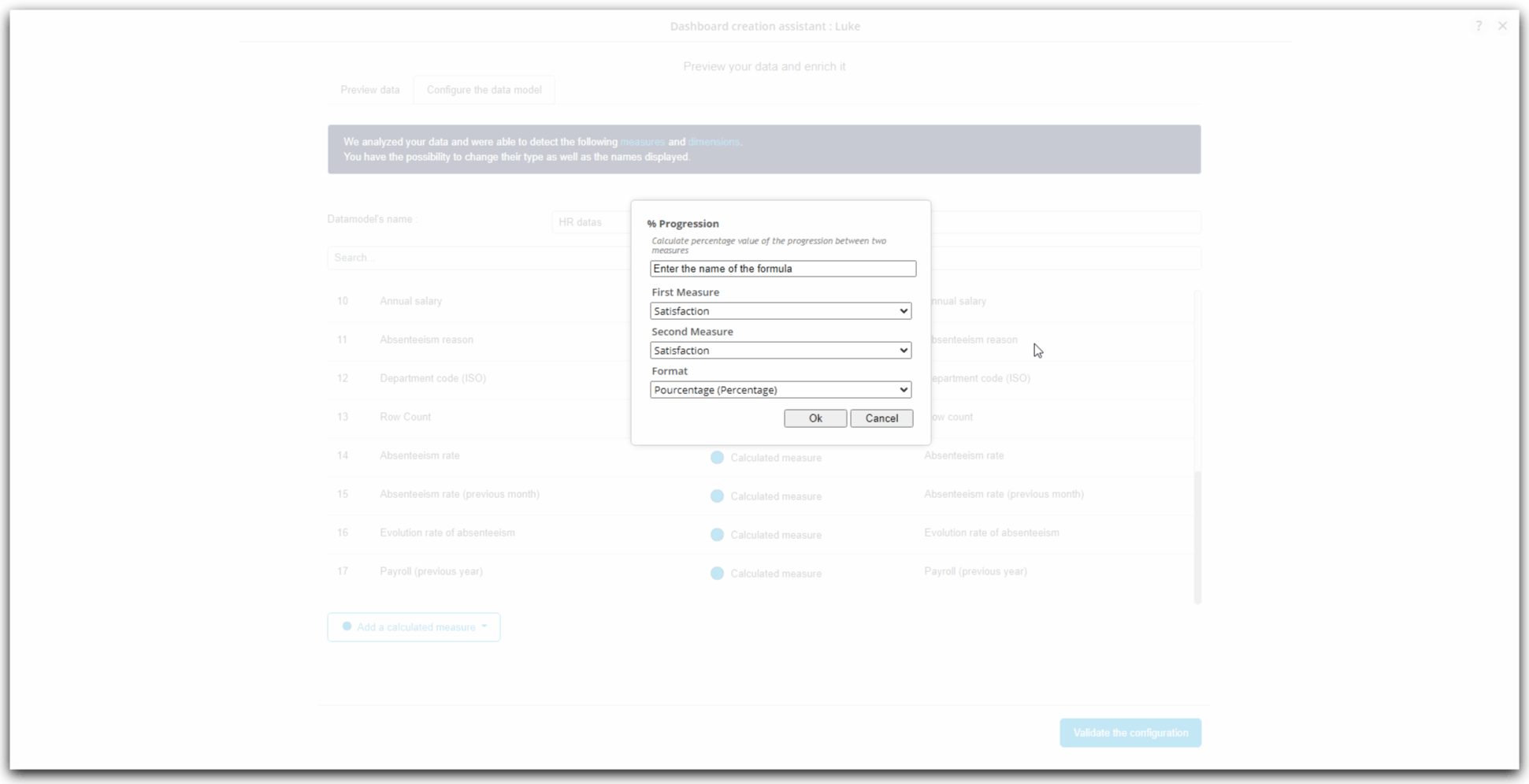
Evolution rate of payroll (general function : progression)
We are now going to create the measure that will return the rate evolution of payroll between a year and a previous year, relying on the already existing measure Annual salary and the the recently created calculated measure Payroll (previous year).
- In the bottom of the columns' list, click on Add a calculated measure ;
- A context menu appears ;
- Click on General functions then on % Progression ;
- The window % Progression appears ;

- First, enter the name of the new calculated measure being created in the first field : Taux d'évolution de la masse salariale ;
- To calculate a progression type measurement, we must indicate the first measure from which we will measure the evolution with the second measure. We will therefore insert the temporally "oldest" measure in the first measure and the most recent in the second.
- Here, on the drop-down list First Measure, choose Payroll (previous year) ;
- Then, on the drop-down list Second Measure, choose Annual salary ;
- Complete the creation of this measure by clicking on Ok ;
- The newly created calculated measure Evolution rate of payroll is displayed at the end of columns' list.
Changes to display labels
- Last step in the configuration of our data model, we will now see how to rename the column identifiers.
- Indeed, taken from the columns of the Excel file, these identifiers may not be very representative of your business area, or speak little, etc.
- It is therefore entirely possible to rename them to allow a clear display in the graphics.
- In the current example that we are following during this tutorial, we can observe that the measure of column #10 is named "Annual salary". That is not consistent with the other recently created measures that have been named with "Payroll" wording.
- We are going then to rename the name "Annual salary" of column #10 by "Payroll" :
- Place the cursor on the line of the column #10 "Annual salary"
- The line become grey and a link More... appears.
- Click on More...
- On the context menu that just appears, click on Edit display name
- The field containing the displayed value is now editable. Enter Payroll.
- Click anywhere outside the field to complete the entry.

- We can follow the same process to rename Department code (ISO) to Department code:

Validation
We have arrived at the end of these steps of loading the data then configuring the data model.
Yoy can now click on the blue button at the bottom of the columns' list : Validate the configuration

Personalized dashboard creation : first charts
After loading the data and editing the model of this data, we will now see the construction of the graphs to finally build our first dashboard on absenteeism in the company.
We will first choose how to create the dashboard, before configuring the charts.
We will then be able to insert them into the dashboard using a proposed smart layout.
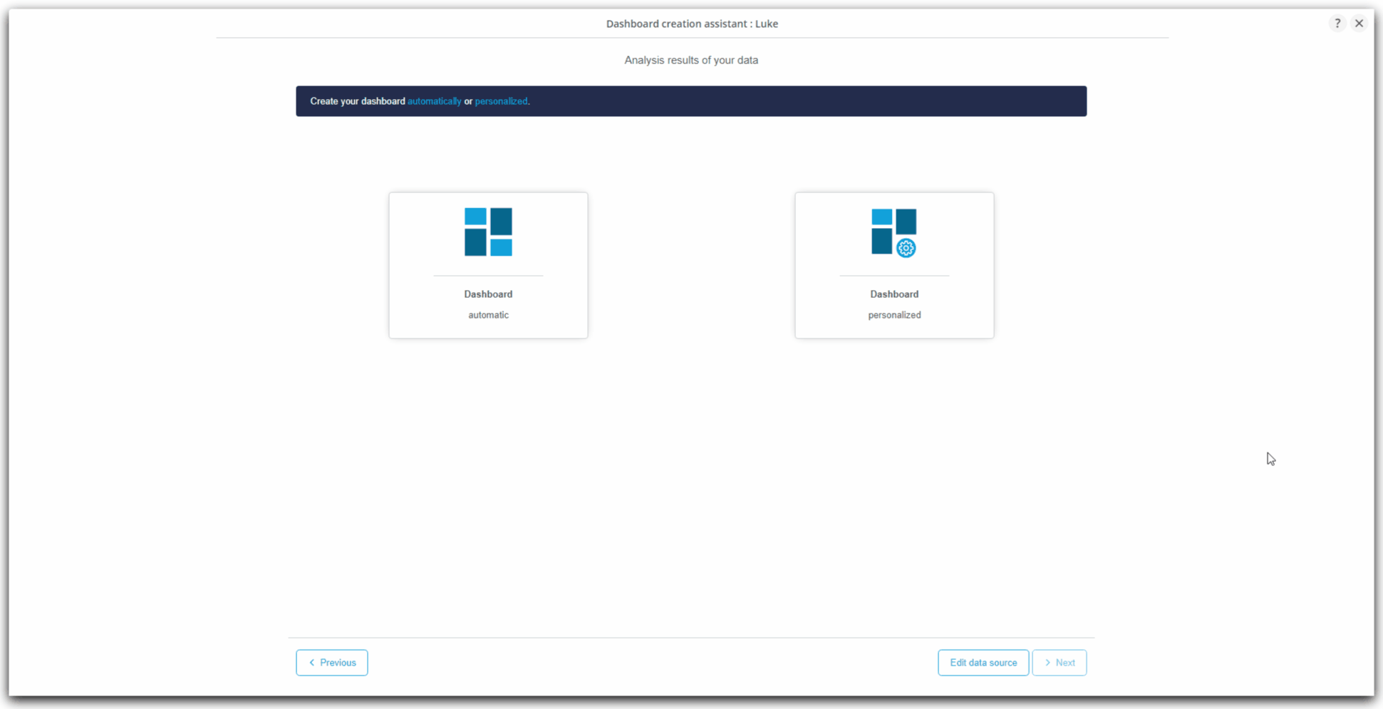
Personalized dashboard creation
Choice of personalized creation mode
In its Wizard, DigDash Enterprise offers you two ways to create a new dashboard page from the data model we have just loaded and configured:
- automatically : the graphics are automatically preselected and preconfigured for you;
- in a personalized way : you create your charts while being free to choose the different axes of analysis.
In the case of this tutorial, we are going to create this new dashboard page by following the personalized way :
- In the page currently displayed, click on Dashboard personalized ;
- Click then on Next ;
- The page Build your own dashboard is now displayed
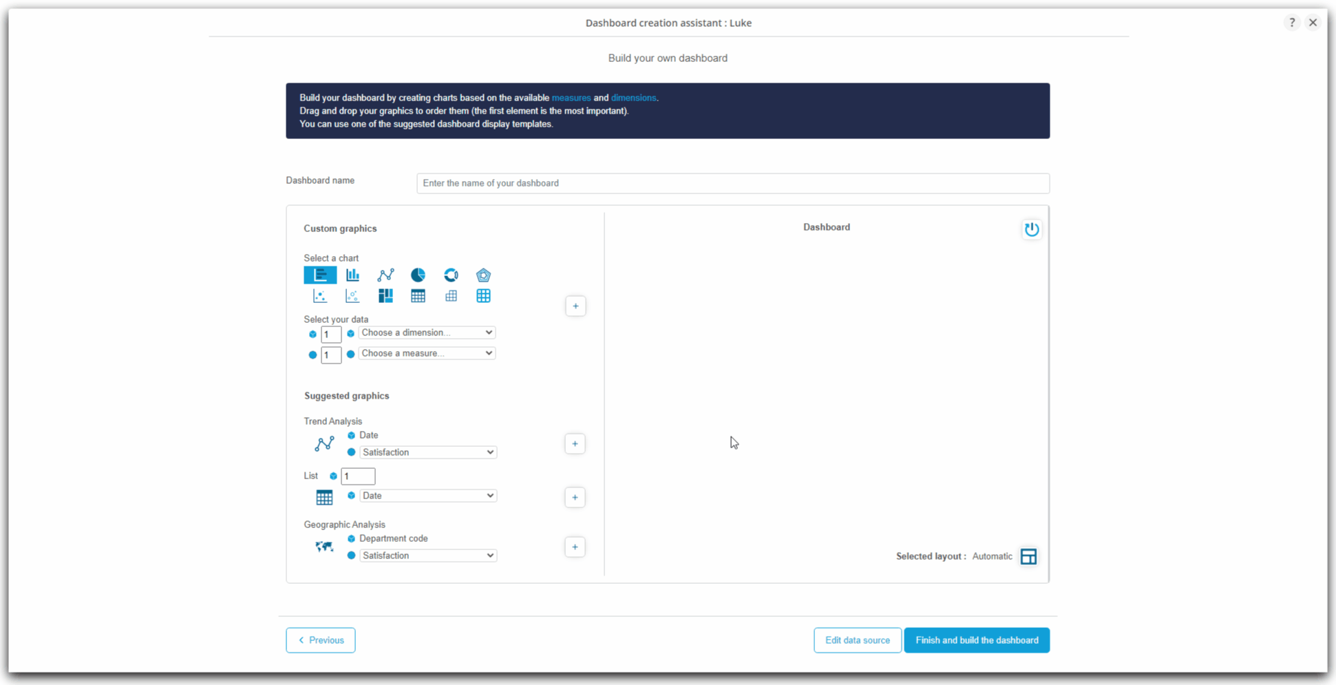
Charts construction
Presentation
- In this part, the Wizard is divided into two vertical parts :
- on the left, you will find the chart configuration part : this is where you can configure the wanted chart, before adding them to the list of charts to be inseted in the dashboard page being currently created ;
- on the right, you find the list of charts to insert in the dashboard page being created.
General process
The charts construction follows the following process :
- Choice of a chart among the custom charts or the charts offered by DigDash Enterprise; ;
- Configuration of dimensions and measures ;
- Addition to the list of charts of the dashboard page being created.
This operation is to be repeated as many times as you wish to add a chart to the dashboard.
Charts creation
First, we are going to create four graphs related to absenteeism in the company.
Evolution of absenteeism rate
In this first graph, we will build a line chart showing the evolution of the absenteeism rate over time. This graph is already almost ready, because the intelligence of DigDash Enterprise has detected that it could respond to an interesting use case. This is why it is proposed in the Suggested graphics, which will allow us to configure it even more quickly!
To create this chart :
- In the Suggested graphics, locate the Trend Analysis.
- The dimension is automatically fixed on the Date. Choose Absenteeism rate from the drop-down list of measures.
- Click on the button +.
- The Trend (Date) Absenteeism rate graph is now integrated into the page being created. You will be able to see it, rename it, and even configure it in more detail in the next step !
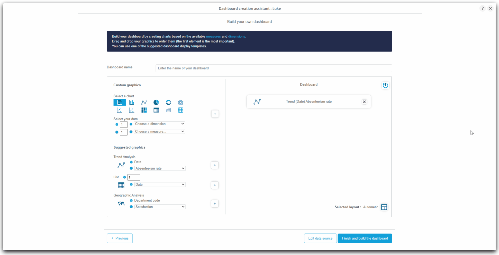
Absenteeism days by service
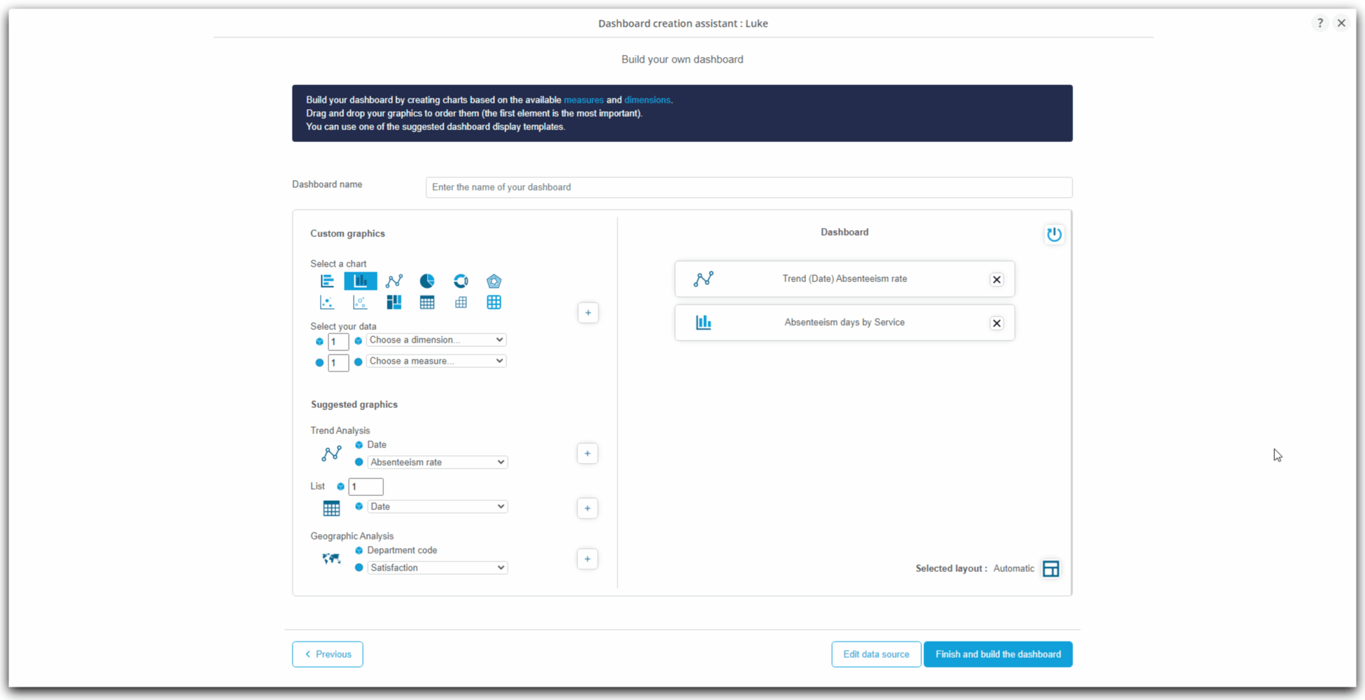
In this second chart, we are going to build a histogram presenting the number of days of absenteeism by service. This time, the chart will be created from the Custom graphics.
To create this chart :
- Locate the Custom graphics part in the left side;
- By default, the chart type for Custom graphics is a horizontal bar chart. Click on the button representing this graphic representation to select a column representation.
- By default, the number of dimension and measure is 1. This corresponds to the graph that we want to create. So, we do not have to modify these values.
- Into the drop-down list of dimensions, choose Service ;
- Into the drop-down list of measures, choose Absenteeism days ;
- Click on the button +.
- The chart Absenteeism days by service is now integrated into the page being created. You will be able to see it, rename it, and even configure it in more detail in the next step !

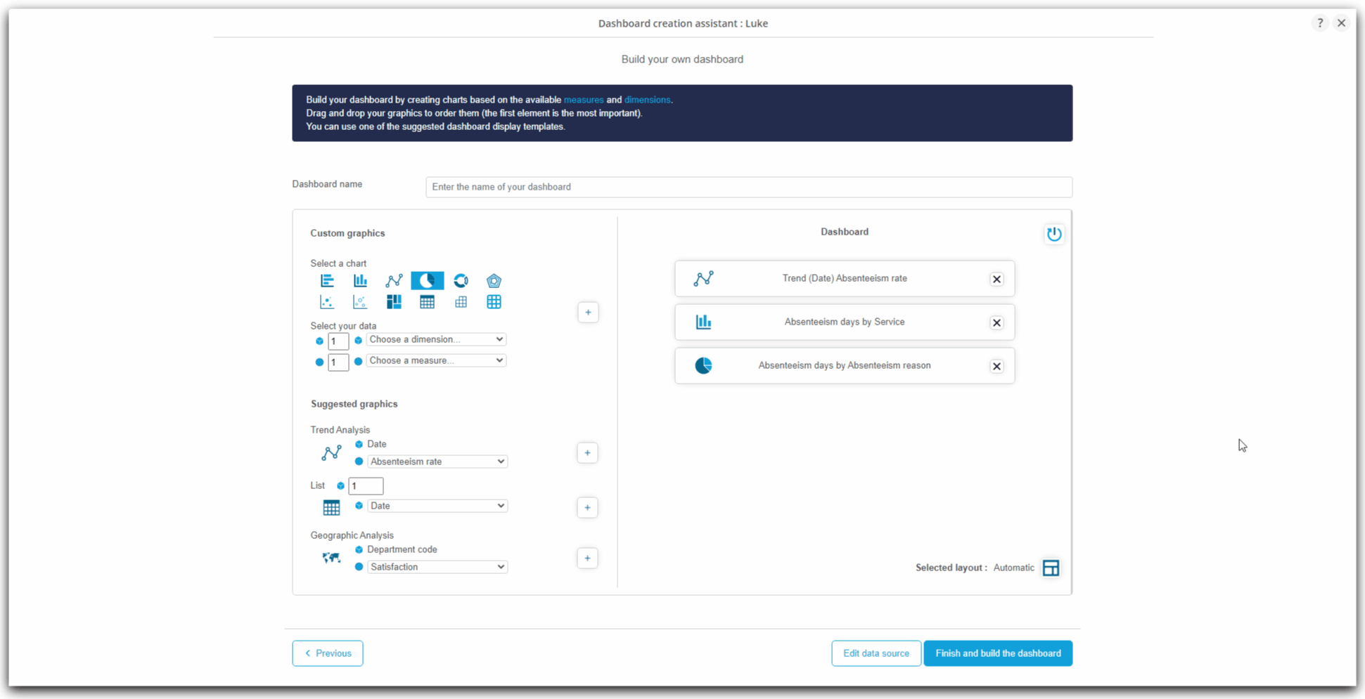
Absenteeism causes
In this third graph, we will construct a pie chart presenting the distribution of the causes of absenteeism.
To create this chart :
- Locate the Custom graphics part in the left side;
- By default, the chart type for Custom graphics is a horizontal bar chart. Click on the button representing this graphic representation to select a pie chart representation.
- By default, the number of dimension and measure is 1. This corresponds to the graph that we want to create. So, we do not have to modify these values.
- Into the drop-down list of dimensions, choose Absenteeism reasons
- Into the drop-down list of measures, choose Absenteeism days
- Click on the button +.
- The chart Absenteeism days by Absenteeism reasons is now integrated into the page being created. You will be able to see it, rename it, and even configure it in more detail in the next step !
Map: absenteeism rate by department
In this fourth graph, we will construct a map representing the absenteeism rate by department. This graph is already almost ready, because the intelligence of DigDash Enterprise has detected that it could respond to an interesting use case. This is why it is proposed in the Suggested graphics, which will allow us to configure it even more quickly!
To create this chart :
- In the Suggested graphics, locate the Geographic Analysis.
- The dimension is automatically fixed on the department code (as it is the only geographic dimension of the data model). Choose Absenteeism rate from the list of measures.
- Click on the button +.
- The chart Absenteeism rate by department code is now integrated into the page being created. You will be able to see it, rename it, and even configure it in more detail in the next step !
Naming the dashboard
- Before continuing, don't forget to name the dashboard.
- At the top of the page, the Dashboard Name field allows you to enter what will be the name of the new page being created.
- Here, enter "Absenteeism".

Choice of layout
We have just created 4 charts, which will be the charts of the "Absenteeism" dashboard.
To arrange these graphics within a page, several layouts are offered by DigDash Enterprise. These layouts automatically arrange the graphics on the page, to save you time.
- At the bottom of the list of the charts to be inserted in the page being created, locate the Selected layout : automatic
- By clicking on the button, several layout choices are available in a scroll list displayed at the right of the window.
- At the top, the first choice is Automatic : DigDash Enterprise will take care of all the layout logic.
- At the bottom of this first choice, you can choose several orientation of automated layout according to your preferences :
- notice the different symbols in the pre-layout areas : they correspond to the content that will be automatically added there :
- graphic
- dimensions for filtering
- filtered items
- notice the different symbols in the pre-layout areas : they correspond to the content that will be automatically added there :
- Choose the second choice : Charts + Filters on the left
- Close the drop-down list using the cross.
- Check the choice we just made: Selected layout: Graphics + Filters on the left

After this last step, we will exit the Wizard to find ourselves in the Dashboard Editor. From this editor, we will refine the dashboard just created.
- Click on Finish and build the dashboard

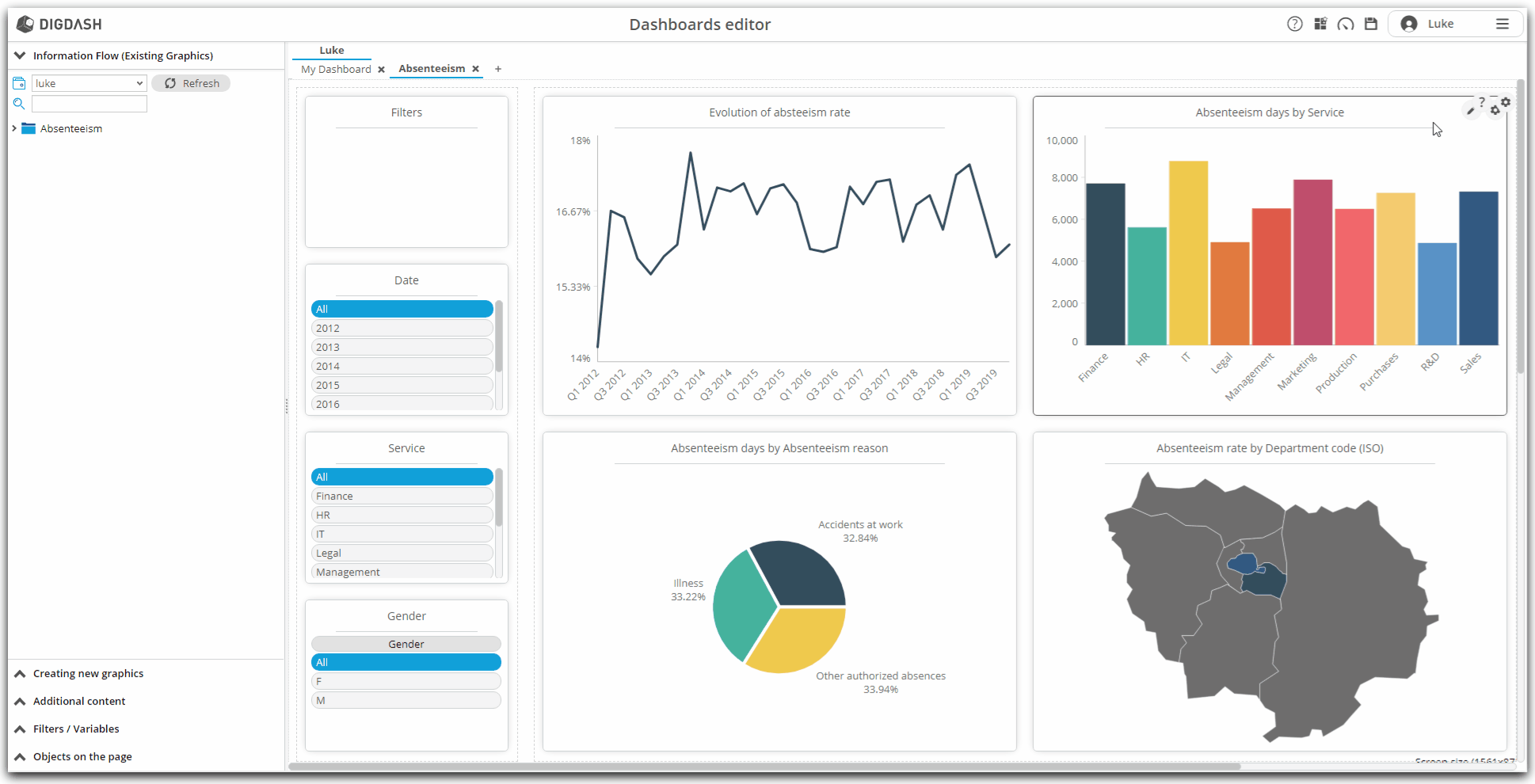
Finalization of the dashboard : absenteeism
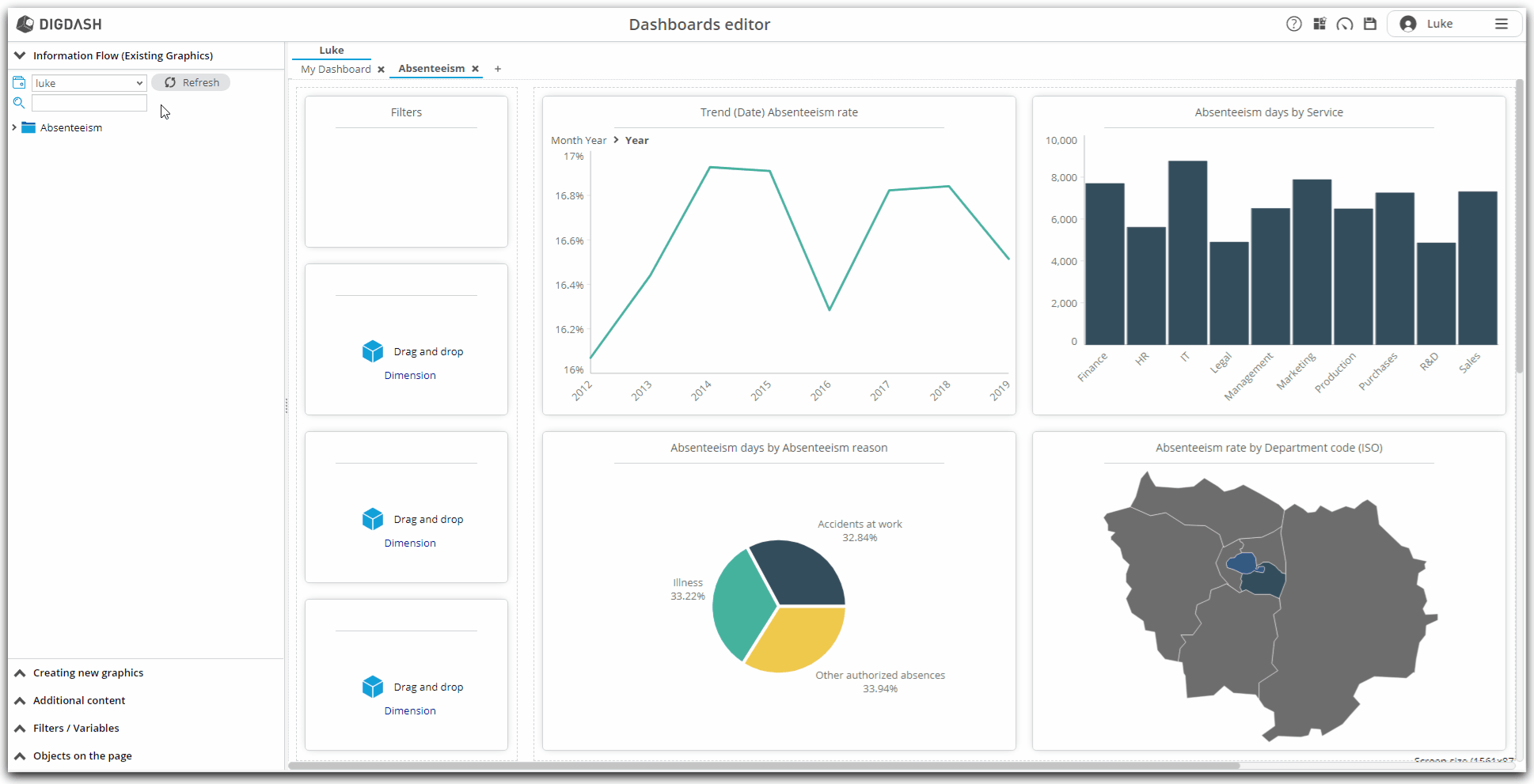
After loading the data, then editing the data model, and finally configuring the graphs that we want to see in our first dashboard dedicated to absenteeism in the company, we finally reach our goal! Indeed, we have just returned to the Dashboard Editor, and the 4 configured graphs are already arranged in our "Absenteeism" page.
Also, this part of the tutorial will show us how to polish the page we just created. Thus, we will see in particular:
- how to add dimensions as filters;
- how to modify the graphics already built;
- how to rename and access graph properties.
Finally, this part will also be an opportunity to familiarize ourselves more with the editor.
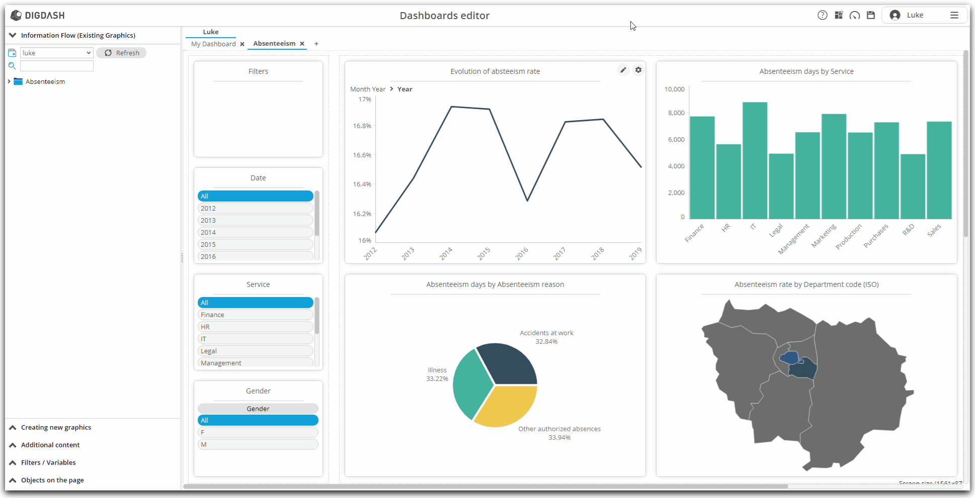
Back in the Dashboard Editor
In the previous part, we configured the first charts.
Having requested the construction of the dashboard, they are now arranged in your first dashboard page, which you now see in the editor.
Let's observe several things:
- the page created belongs to your personal role and bears the name chosen in the previous step;
- the section of filtered elements has been automatically added (top left): this space will list the filtered dimensions (and the members to which these filters relate)
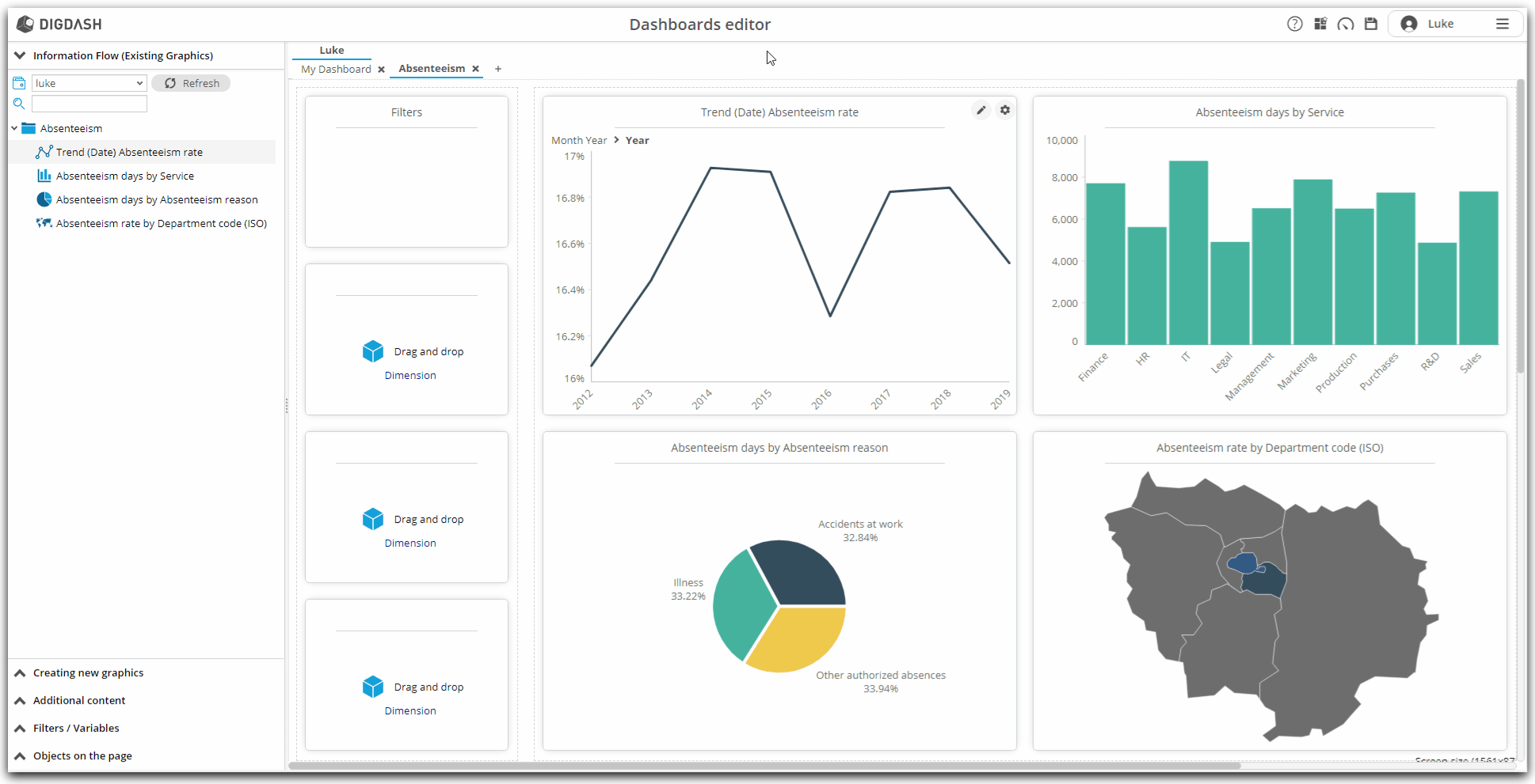
- on the left, the section "Information Flow (Existing Graphics)" is open:
- this section contains all the graphs we just created in the previous step;
- notice that the open role (or portfolio) is your personal role; later, you will be able to open another portfolio in your organization;
- in the event that you delete by mistake one of the graphics inserted in the page, you can rearrange it in the page from this space by simply dragging and dropping to the desired area on the page;
- also notice that the 4 dashboard charts present are all grouped together in a category with the same name as the page created.
- at any time, you can consult the dashboard in its final state by clicking on the consult button located in the upper banner of the editor.
- this switch to consultation also allows you to save the modifications made in the editor.
After these observations, let's move on to finalizing this first page dedicated to absenteeism.
Finalization of the page
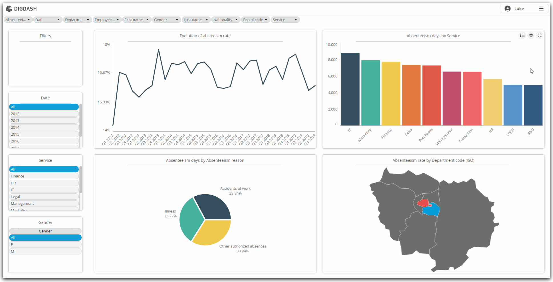
Adding dimensions as filters
Any dashboard must be able to offer its users to filter on its dimensions, and this is what we are going to put in place from now on. We will now add the dimensions "Date", "Department" and "Gender" as a filter.
To do this :
- Notice on the left column of the page being edited, the three rectangles inviting you to "Drag and drop Dimension"
- It is on these three areas that we will insert our three dimensions.
- Click on the "Dimension" link of the first rectangle
- Note that in the left banner, the "Filters / Variables" part opens
- Drag and drop successively in the three identified areas:
- the Date dimension
- the Service dimension
- and the Gender dimension
- Notice that the Date dimension presents its members in day / month / year format.
- To switch to year format:
- hover over this Date dimension with the mouse
- click on the toothed wheel that appears
- select Properties from the context menu, then Settings
- in the Hierarchy drop-down list, select Date
- then, in the Level drop-down list, select Year
- finally, choose, below, in the Type of visualization drop-down list: Horizontal list
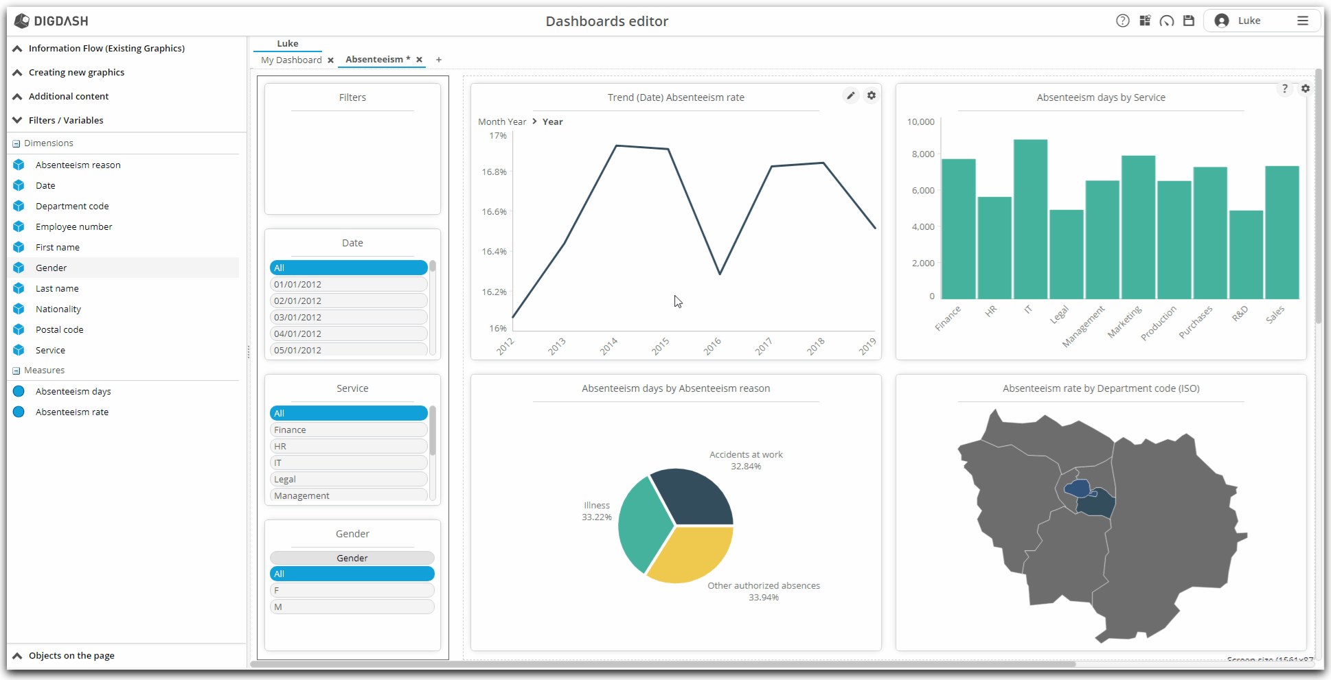
Renaming the charts
As you may have noticed, automatically constructed graphs feature automatically generated names, which can be complex to understand.
Also, in this part, we will rename the graphics so that they have a more meaningful name.
To do this,
- hover over the graph Trend (Date) Absenteeism rate
- click on the toothed wheel displayed at the top right
- click on Rename in the context menu
- enter the new name: Evolution of absenteeism rate.
- click OK to validate the renaming
Do the same to rename:
- Absenteeism days by Service in Number of days of absenteeism per service
- Absenteeism days by Absenteeism reason in Causes of absenteeism
- Absenteeism rate by Department code in Absenteeism rate by department

Modification of already constructed graphics
Now that your page is starting to take shape, that it contains filters and that its graphics have meaningful names, it is important that the graphics do not bear inconsistencies, and follow rules that may be unique to your business. or operation of your service.
This is why we have the possibility to modify in depth the graphics already built, always from the editor.
So, we will see here how:
- change the level of the Date dimension of the Absenteeism rate by date graph to display the dates at the quarter level;
- change the colors of the columns of the histogram Number of days of absenteeism per service so that each service has a different color;
- change the colors of the absenteeism rate map by department.
General process
First, let's discuss the general operation of modifying graphics already created in the editor:
- When the mouse hovers over a graph, a pencil icon appears at the top right of the graph area:

- Click on it to open the chart modification area
- On this modification space:
- the central space presents the preview of the modifications made;
- the left column presents multiple elements and options, including in particular the dimensions and measures that can be added or substituted for each graph;
- hovering over this left column, a configuration area appears over the central preview area:
- it is here that we can add measures and dimensions by dragging and dropping from the left column;
- it is here again that we can modify the configuration of the dimensions and measures already in place;
- Once the modifications are completed, it is possible to save the changes by clicking on the appropriate icon at the top right:
 .
.
Absenteeism rate by date: display dates in quarter format
In this first graph, we are going to enter edit mode to display the dates of the line graph in quarter format.
To do this :
- On the editor page, hover over the area of the Absenteeism rate by date graph
- Click on the pencil icon that appears
- The edit space for this graphic appears
- In the left column, in the Dimensions section, click Date ...
- Locate the hierarchy / level couple Month Year / Quarter
- Drag and drop this hierarchy / level couple to the configuration area X
- Save the modification using the appropriate icon at the top right
The dates in the chart are now displayed in quarter format!

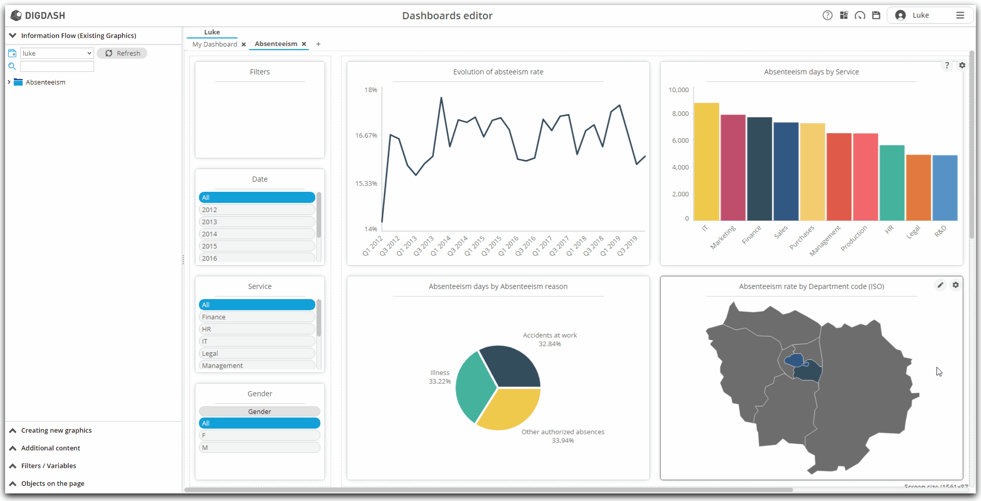
Number of days of absenteeism by service : color the histogram by service and sort according to the measure
In this second graph, we will enter the edit mode of the graph to color the columns according to the service. We will also take the opportunity to find out how to filter on the measure.
To do this :
- On the editor page, hover over the graph area Number of days of absenteeism by service
- Click on the pencil icon that appears
- The edit space for this graphic appears
- In the configuration area, right-click on Column
- In the context menu that appears, click on Activate the color cycle
- Notice that each column, for each department, is a different color.
- Again, right-click on Column
- In the contextual menu that appears, hover the mouse over Add sort on measure(desc.)
- Click on the Absenteeism Days measure in the submenu that appears
- The columns are now sorted from the most important to the least important number of days of absenteeism
- Save the modification using the appropriate icon at the top right
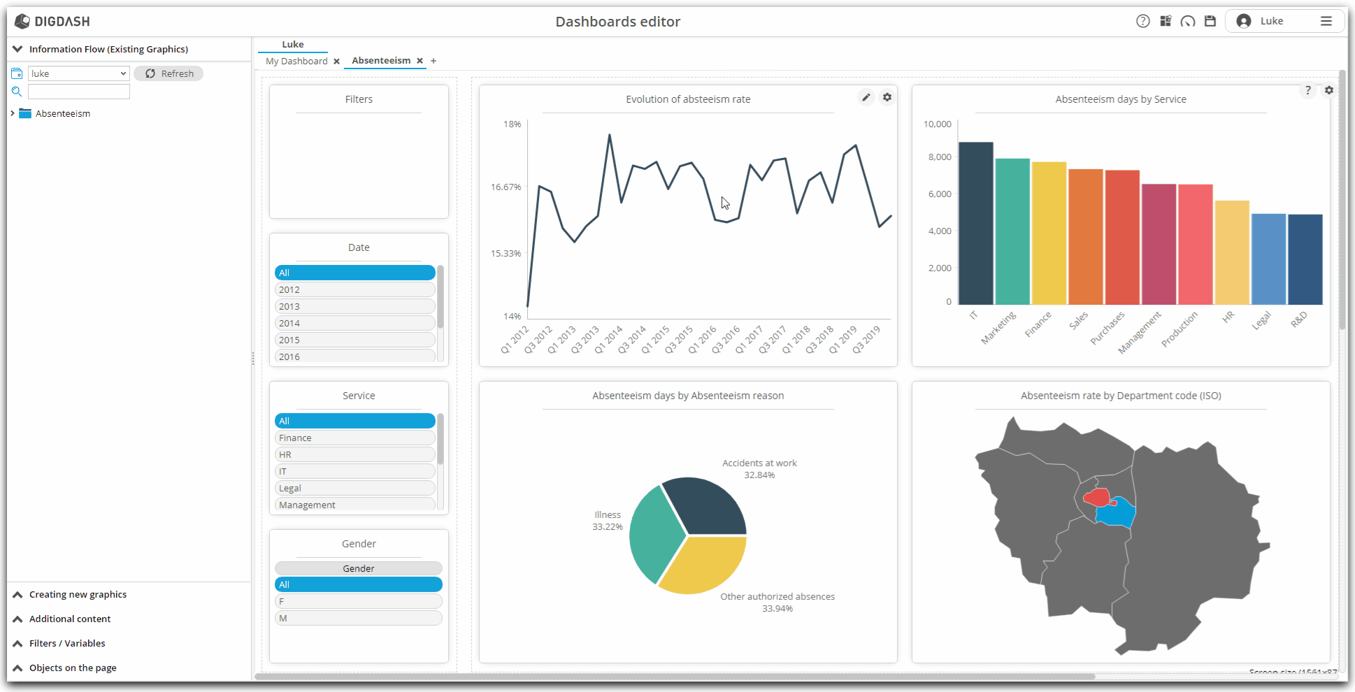
Absenteism rate by department : change the colors used by the map
In this third graph, we will enter the edit mode of the graph to change the colors used in the graph to color the departments. In fact, in the current state, the colors assigned by default do not make it possible to differentiate the rate shades at first glance.
- On the editor's page, hover over the area of the Absenteeism rate by department graph;
- Click on the pencil icon that appears;
- The edit space for this graphic appears;
- In the left area, click on Style ..., then on Colors ...;
- By default, the "Flat Design" color palette is selected;
- Click the drop-down list to choose Flat Design 04;
- Save the modification using the appropriate icon at the top right;
Creation of the second page: payroll
After having created a first page of our dashboard relating to absenteeism, we are now going to create a second page dedicated to the payroll.
We will see as follows:
- how to add a new page;
- how to create new graphs from the data source added and modeled in the previous parts;
- and how to insert and configure these new graphics in the new page;
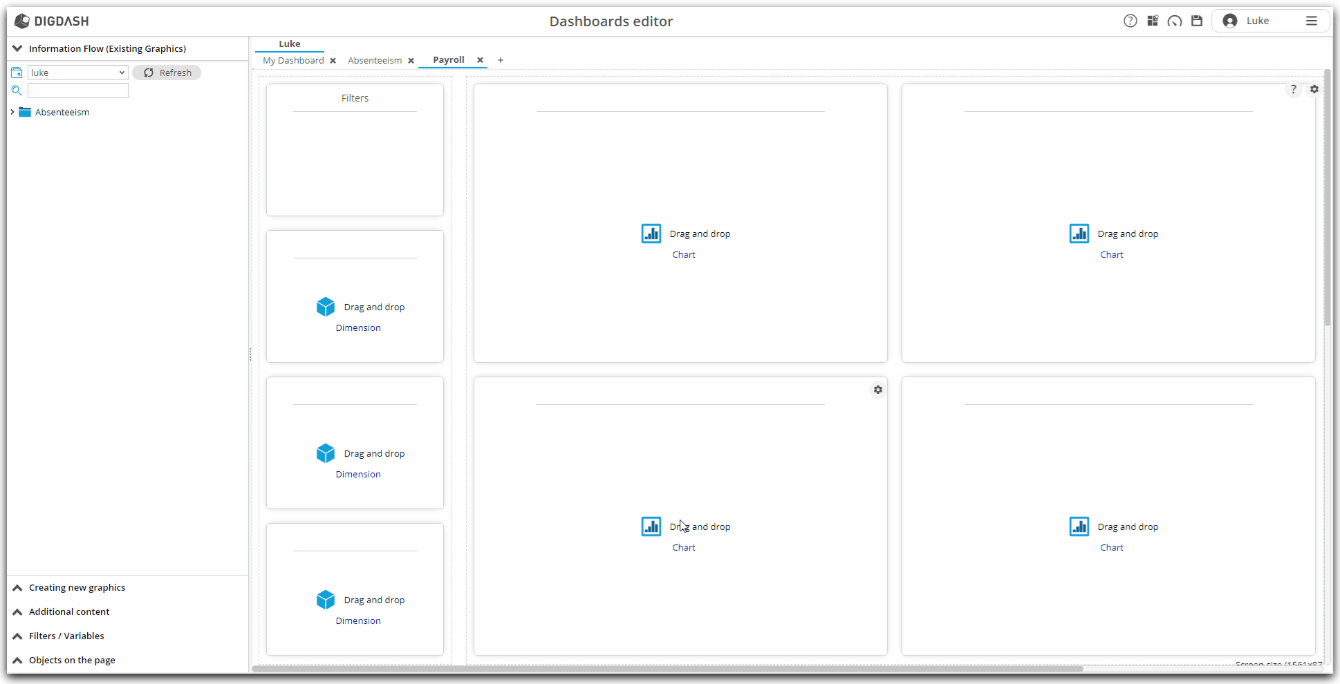
Adding a new page and choosing a layout
As we have observed previously, the Absenteeism page belongs to your personal role, with your username. We will add a second page, still in this personal role. During creation, we will choose layout for our new page.
- Click on the symbol
 to the right of the Absenteeism page;
 - The Add page window appears;
- Enter the name of the page: Payroll;
- We are now going to choose a design mode for the page: in the Display mode drop-down list, click Templates ...;
- The Templates window appears;
- For more consistency with the previous page, we will choose the same layout: click on Graphics + filters on the left;
- Validate this choice by clicking on OK;
- Then validate the creation of the new page by clicking on OK again;
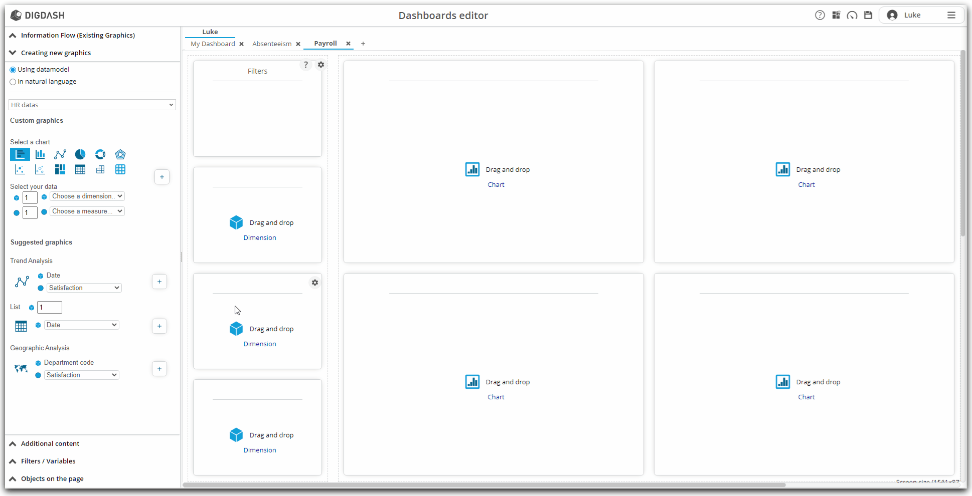
- Our new Payroll page is then displayed.
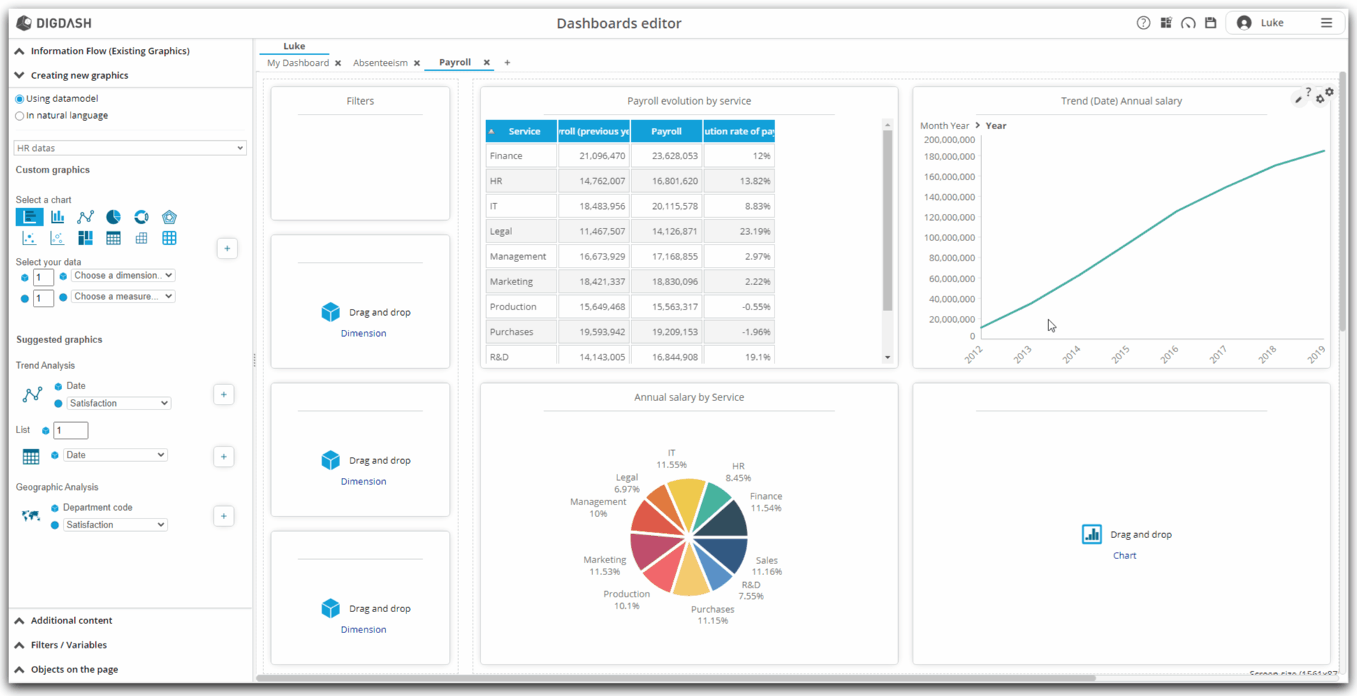
Creation of new graphics
Our new Payroll page has now been created! We will now configure new graphics.
Creation of new graphics from the Editor : general process
- Note that on the left of our pages, the Information Flow (Existing Graphics) section is open and presents the information flows that already exist;
- Let's open the panel below Creating new graphics by clicking on it;
- We find the similar graph configuration tool that we took in hand earlier in the wizard;
- Note that the "HR Datas" data model is automatically selected;
- It is from this data model that we will create our new graphs about payroll.
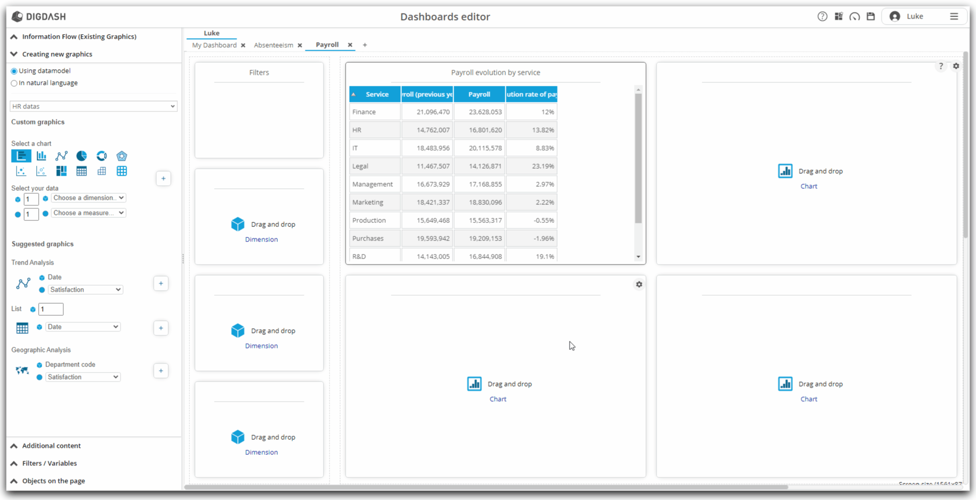
Evolution of the payroll by service over the last year
This first graph, in the form of a table, will represent the evolution of the payroll by service. We will then apply a filter to show the changes in each service only over the last year.
Configuration
- In the Creating new graphics section, locate the Custom graphics subsection;
- Click on the icon representing a table;
- In this table, we will represent, for each service, the payroll for the previous year, the payroll for the current year and the rate of change between these two years.
- We will therefore need one dimension and three measures to configure this table.
- Enter 3 in the number of measures;
- Then select the dimension from the drop-down list: Service;
- Then select the three measures:
- Payroll for the previous year;
- Payroll;
- Evolution rate of payroll;
- Finally click on the + symbol to add the graphic to the page.
Renaming
- Let us rename the graph by Evolution of the payroll by service:
- position your mouse cursor on the graph;
- at the top right of the graph, a toothed wheel appears: click on it;
- in the context menu that appears, click on Rename;
- enter the new name of the graph: Evolution of the payroll by service;
- validate by clicking on OK;

Filters
- We will then filter this chart to take into account the last year of our dataset.
- The filter we are going to create here will be exclusive to this chart and will not be propagated to other charts.
- position your mouse cursor on the graph;
- at the top right of the graph, a toothed wheel appears: click;
- in the context menu that appears, click Properties;
- in the window that appears, click the Filters tab (under the Parameters tab);
- in this tab, the filterable dimensions are displayed: there is currently no filter configured;
- click on the All filter corresponding to the Date dimension;
- a window allowing you to configure the filter for this dimension is displayed;
- in the Filter type drop-down list, select Predefined;
- in the second Context drop-down list, select Max data date;
- in the last Member drop-down list, select Year;
- validate by clicking on OK;
- validate again by clicking on OK;
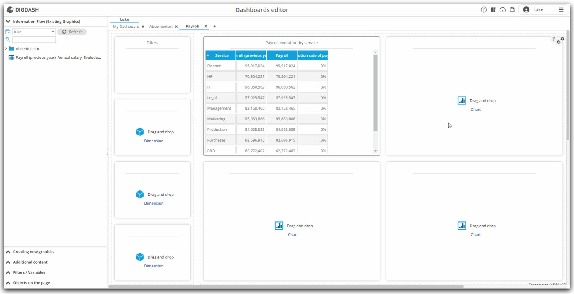
Payroll evolution
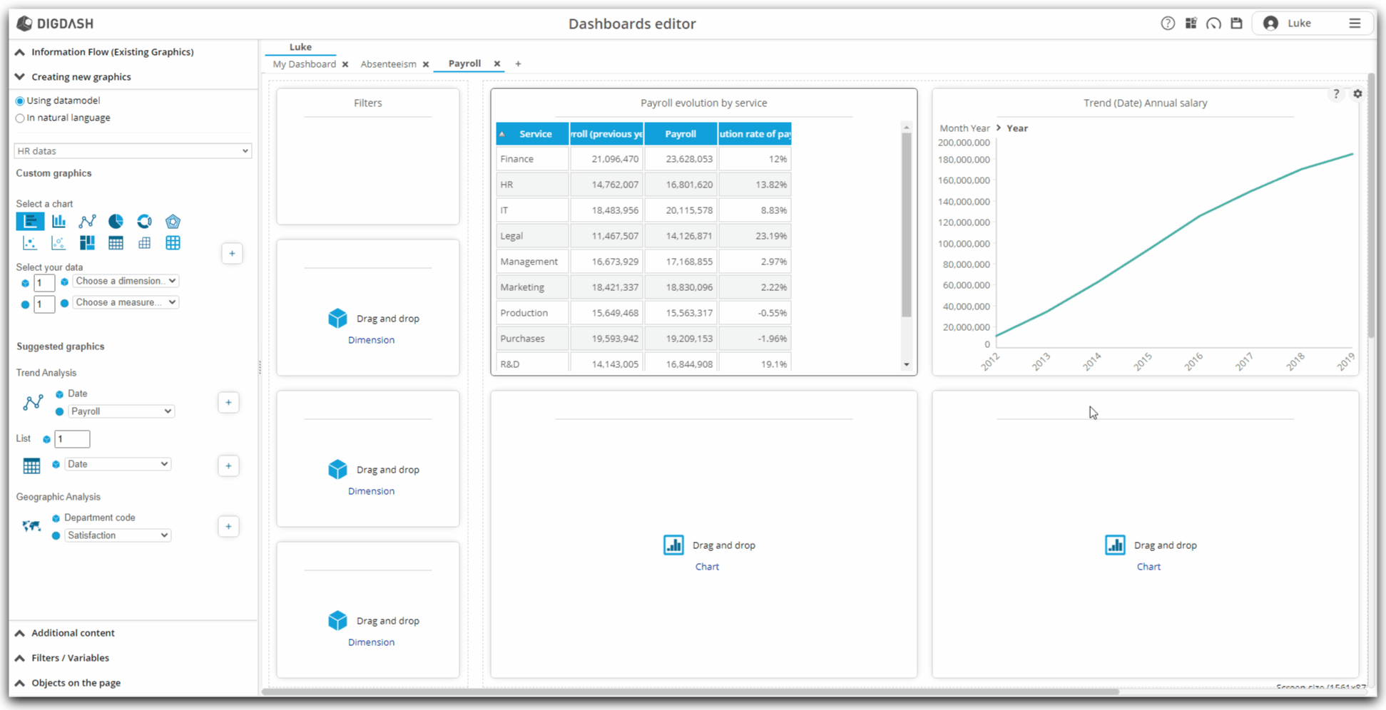
We are now going to create a second graph, in curve, which will represent the evolution of the wage bill over the years.
Configuration
- Into the Creating new graphics section, locate Trend Analysis (in Suggested graphics part);
- Choose the measure on the drop-down list : Payroll ;
- Finally, click on the plus symbol
 to add the graphic to the page.
Renaming
- As in the previous step, let's rename this graph by Payroll evolution :
- position your mouse cursor on the graph;
- at the top right of the graph, a toothed wheel appears: click on it;
- in the context menu that appears, click on Rename;
- enter the new name of the graph: Payroll evolution;
- validate by clicking on OK;
Payroll by service
We are now going to create a third chart : it will be a pie chart representing the repartition of payroll by service.
Configuration
- Into the Creating new graphics section, locate the Custom graphics part ;
- Click on the icon of the pie chart representation
- Choose then the dimension in the dropdown list : Service ;
- Then choose the measure : Payroll ;
- Finally, click on the plus symbol to add the graphic to the page.
Renaming
- As in the previous steps, let's rename this graph by Payroll by service :
- position your mouse cursor on the graph;
- at the top right of the graph, a toothed wheel appears: click on it;
- in the context menu that appears, click on Rename;
- enter the new name of the graph: Payroll by service;
- validate by clicking on OK;
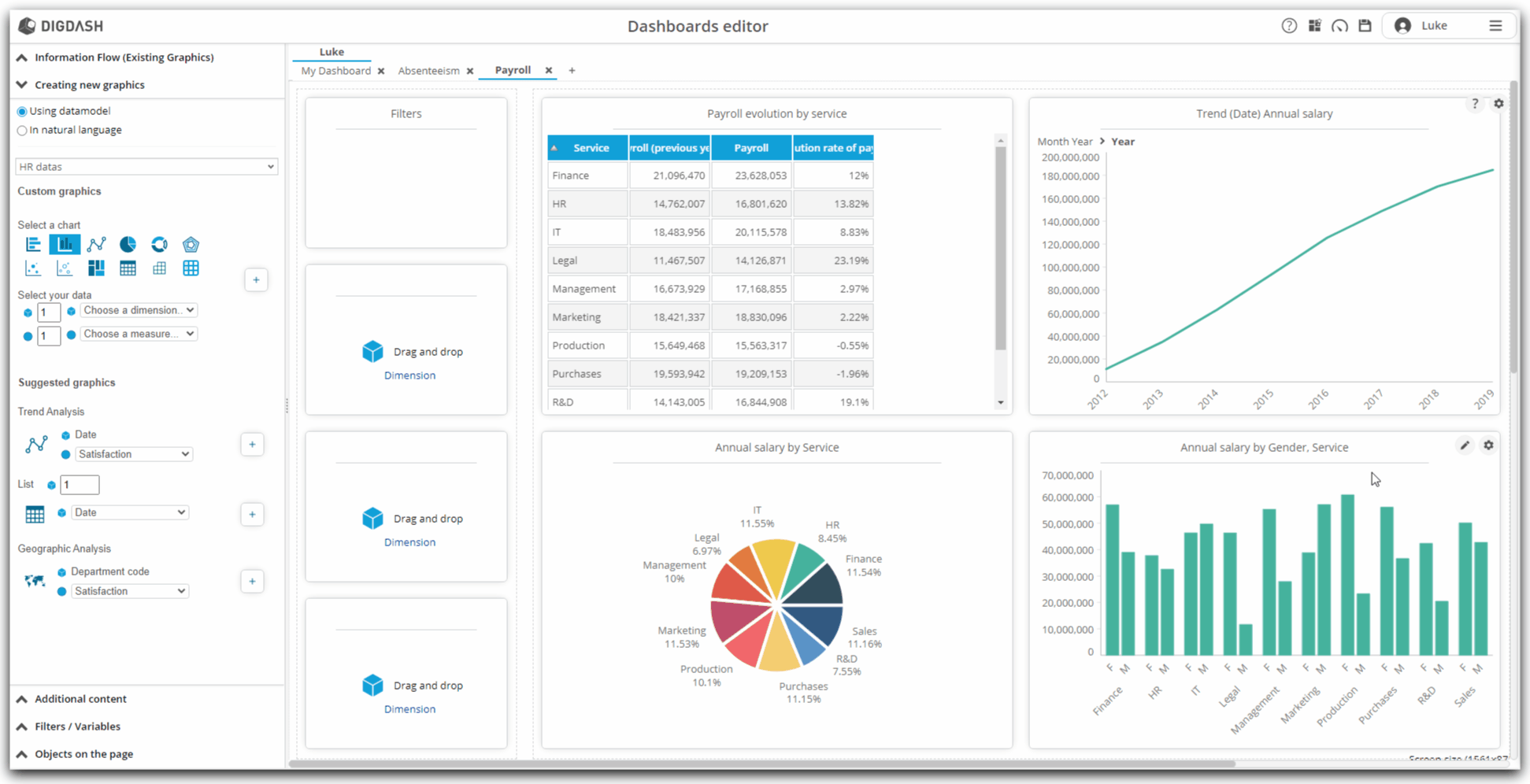
Payroll by service and gender
Finally, we will create a fourth chart : it will be a histogram presenting the repartition of payroll infunction of service and gender.
Configuration
- Into the Creating new graphics section, locate the Custom graphics part ;
- Click on the icon presenting the histogram representation ;
- In this diagram, we are going to represent, for each service, then for each gender, the payroll.
- So we will need two dimensions and a measure to configure this diagram.
- Enter 2 in the number of dimensions;
- Then select the two dimensions in the drop-down lists: Gender then Service;
- Then choose the measure : Payroll ;
- Finally, click on the plus symbol to add the graphic to the page.
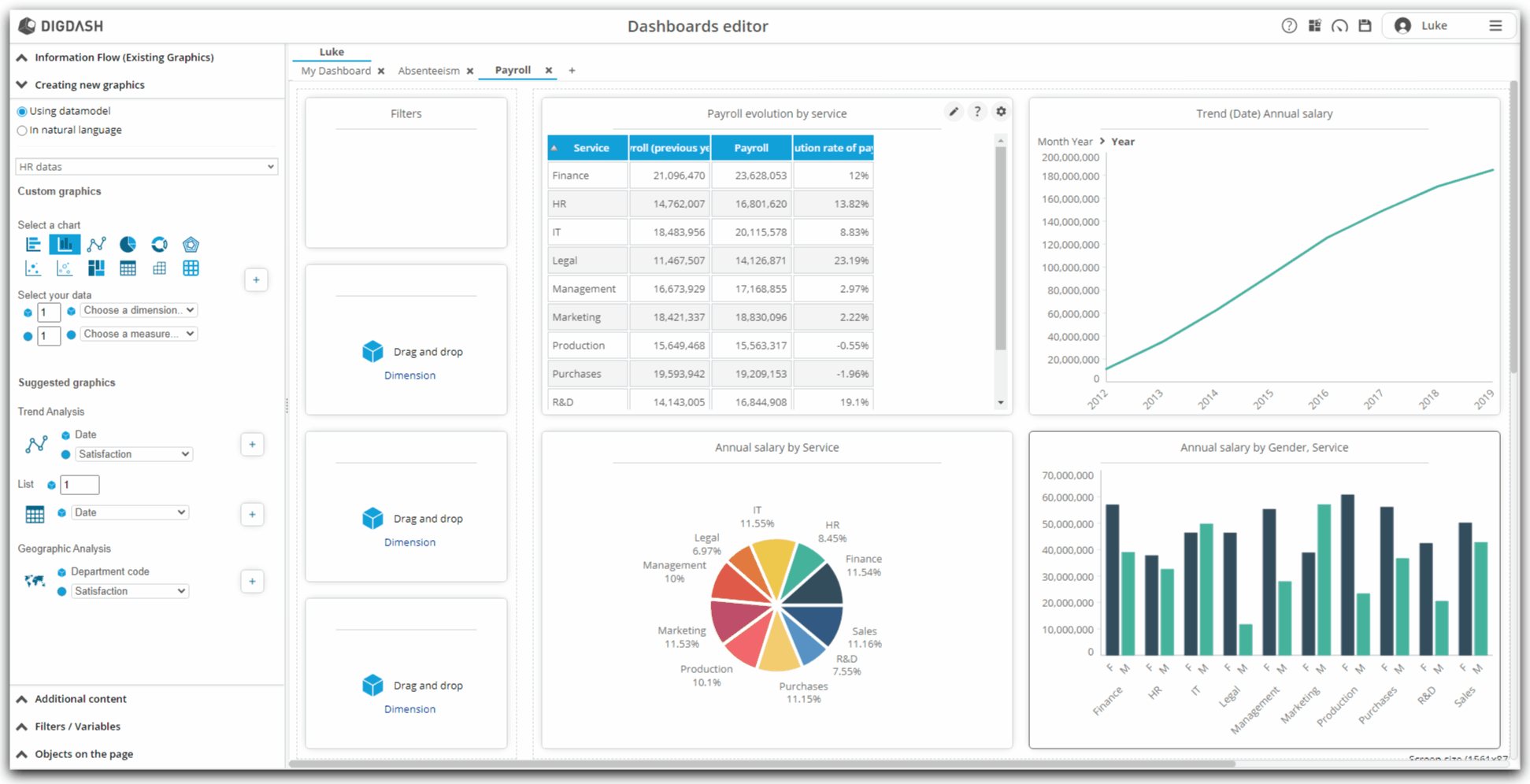
Applying an appropriate color palette
The histogram that we have just created presents a uniformity of color which does not make it possible to distinguish at first glance the two genders represented.
To correct this:
- with your mouse, position the cursor on the graph;
- at the top right, a pencil appears: click on it;
- the graph editing window appears;
- in the configuration area, right-click on Column;
- in the context menu that appears, click on Enable the color cycle;
- in the left area, click on Style ... then on Colors ...;
- a window allowing you to choose a color palette appears;
- select from the Color Gender drop-down list;
- automatically, the correct colors are applied;
- save by clicking on the "floppy disk" logo at the top right.
Renaming
- As in the previous step, let's rename this graph by Payroll by service and gender :
- position your mouse cursor on the graph;
- at the top right of the graph, a toothed wheel appears: click on it;
- in the context menu that appears, click on Rename;
- enter the new name of the graph: Payroll by service and gender;
- validate by clicking on OK;
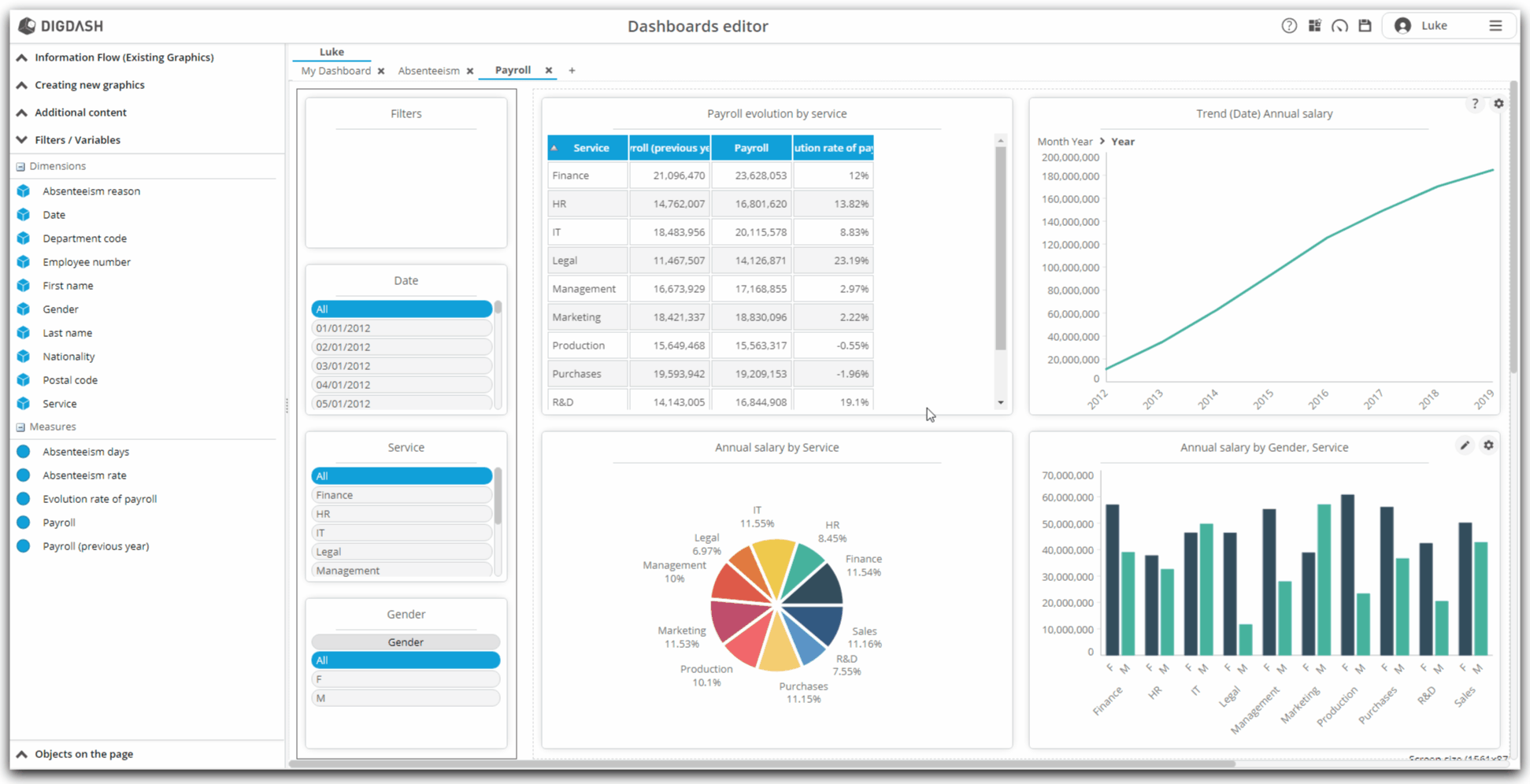
Adding dimensions as filters
Our page is almost ready. We still have, as we did before for the previous page, to add the dimensions in order to allow us to filter in consultation mode.
To do this :
- Notice on the left column of the page being edited, the three rectangles inviting you to "Drag and drop Dimension"
- It is on these three areas that we will insert our three dimensions.
- Click on the "Dimension" link of the first rectangle
- Note that in the left banner, the "Filters / Variables" part opens
- Drag and drop successively in the three identified areas:
- the Date dimension
- the Service dimension
- and the Gender dimension
- Notice that the Date dimension presents its members in day / month / year format.
- To switch to year format:
- hover over this Date dimension with the mouse
- click on the toothed wheel that appears
- select Properties from the context menu, then Settings
- in the Hierarchy drop-down list, select Date
- then, in the Level drop-down list, select Year
- finally, choose, below, in the Type of visualization drop-down list: Horizontal list
Conclusion
Congratulations !
From our Excel file, we were able to build a real dashboard thanks to the Dashboard Creation Wizard of DigDash Enterprise.
We saw :
- how to load a file;
- how to edit the data configuration and thus model a data model;
- how to configure charts from this data model;
- how to configure dashboard pages to add filters;
- how to modify the visualization generated by default, entering in more detail in the parameters;
To go further...
It is possible to go even further!
With the Studio, DigDash Enterprise allows you to go into more detail in the configuration of your data models, to connect to your databases or to be able to join or join several data sources.
Do not hesitate to get in touch with your DigDash Enterprise administrator or your DigDash referent contact to discuss this matter!