Predictive tutorial
Predictive in DigDash Enterprise is present through three features :
- Predictive measures
- What-if measures
- Smart grouping (clustering)
This document illustrates a possible use of these tools.
Predictive measures
Creation of a predictive measure
You can create predictive measures based on measures and derived measures. Predictive measures enable to predict the value of a given measure according to a temporal dimension.
To create a predictive measure, click on the arrow of the drop down menu located next to the button to add a derived measure. In the menu which just showed up, select Create a predictive measure … The dialog box Predictive measure shows up:
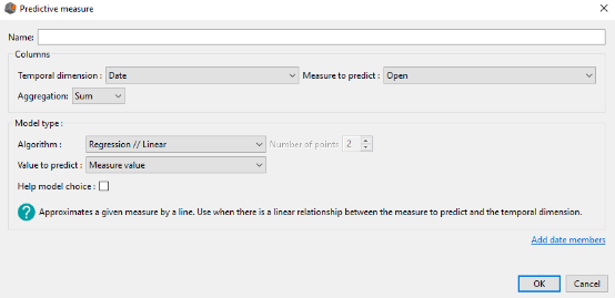
Enter the name of your predictive measure.
In the Columns group you need to complete:
- The measure you want to predict
- The temporal dimension you want to explore in order to make the prediction
- The aggregation of this measure
In the Model type group you need to complete:
- The algorithm to use in order to predict the selected measure in the Column group
- The value to predict (value of the measure, lower and higher bounds of confidence interval)
If the algorithm selected is the moving average, then you also need to indicate the number of points on which we calculate the moving average (order, equals to 2 by default).
For each algorithm, we display a brief description next to the help icon located at the bottom left. Moreover, you can check the Help model choice button in order to be helped in the choice of your algorithm. This triggers the opening of the Help model choice window:
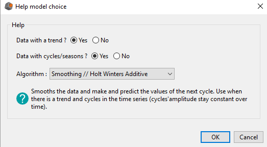
By answering to these two questions, we reduce the number of available algorithms in order to make the choice easier.
Moreover, above the OK button in the Predictive measure window, you have the possibility to extend the temporal dimension selected in the Column group.
Available models and model choice
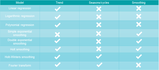
DigDash Enterprise offers 9 prediction models that we present in the table below:
DigDash Enterprise also offers a moving average algorithm, but this one can not be considered as a prediction algorithm since it can not predict future values. It enables only to study data from the past.
The model choice depends on the measure you want to predict and the kind of modelling that you want to do. It is important to ask yourself the following questions :
- Does my data have a trend ?
- Does my data have cycles ? If yes, are they complex ?
- Do I want to smooth my data ?
- Do I want a simple modelling, easy to visualize, or do I prefer an accurate one, more difficult to understand ?
Thanks to its help interface (image below), DigDash Enterprise reduces the number of available models by asking the two first questions to the user.
In the next part we present the different models more in details so that the user can understand them more easily.
Presentation of the models
The following definitions of the algorithms have to be considered in the context of the predictive measures in DigDash Enterprise.
Linear regression :
Linear regression is a basic tool of modelling. It research a linear relationship between the measure to predict and the time axis.
The ideal application situation of this model is when the measure to predict is proportional to the time axis. However, it may be interesting to choose this model for its simplicity of visualization (a line), which makes it easily understandable by a large audience.
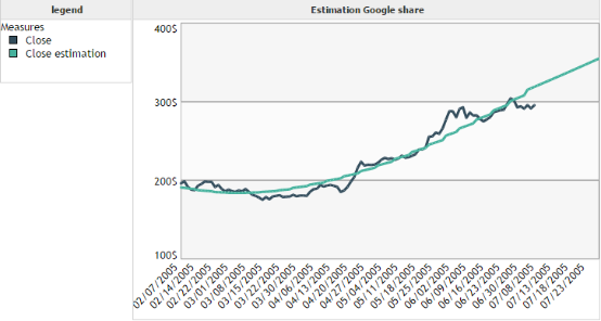
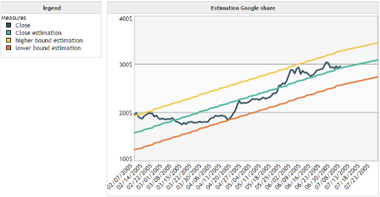
Example 1 :
We want to model the closing price of the Google share over time.
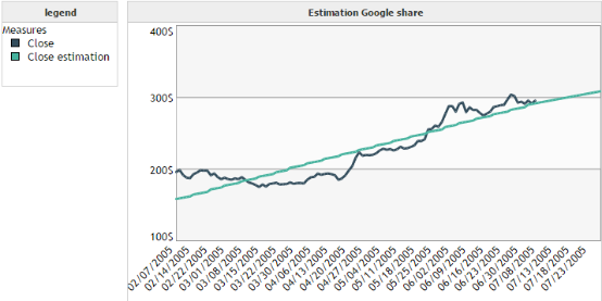
We can see that the forecast is not really accurate in this case. However, it enables to visualize easily the evolution of the trend of the curve.
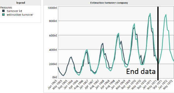
Example 2 :
We want to model the evolution of the turnover of a company over time.
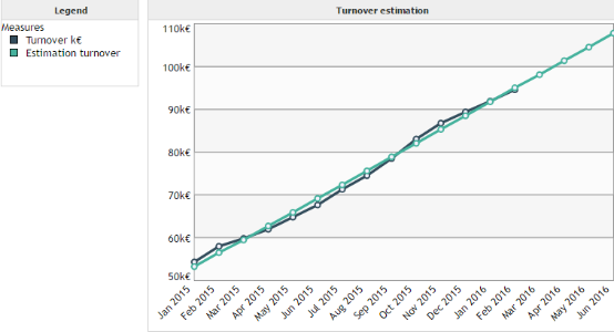
In this example we are in the best case of application for the linear regression. Indeed, there is a strong linear relationship between the turnover and the time axis.
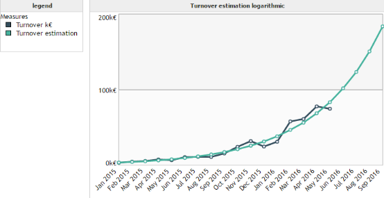
Logarithmic regression:
The logarithmic regression has the same properties as the linear regression. The difference stands in the fact that it enables to find a logarithmic relationship between the measure to predict and the time axis.
Example :
Polynomial regression :
The polynomial regression is a more complex form of the linear regression. It enables to approximate a measure not by a line, but by a polynomial of order 2 or 3.
Example :
Moving average:
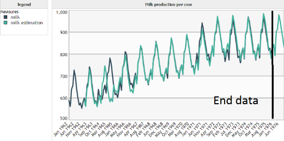
The goal of the moving average is not to predict but to smooth the data in order to eliminate the least significant fluctuations. A moving average of order 3 for example is a sliding average which for each point p, compute the average of points p-1, p and p+1. In this case, the computation of the moving average is possible only from the second point up to the penultimate one.
Example :
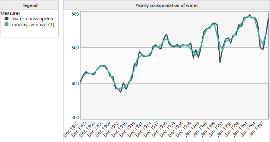
We can see that the moving average of order 3 enabled to smooth the curve of water consumption. It deleted the brutal variations such as in 1953 so that the user can focus on the overall shape of the curve.
Simple exponential smoothing :
In contrary to classical regression techniques which are not specific to time series, smoothing takes into account the specificity of the temporal variable. Indeed, the importance to give to a value decreases over time. For example, in order to predict the turnover for year 2017, it is more likely that we give more importance to the value of the turnover in 2016 than the one of 2008. The various techniques of smoothing enable to take into account the depreciation of the information over time.
The simple exponential smoothing enables to smooth the data but also to predict the next value. It applies to data showing no trend or cycle.
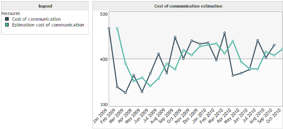
Example :
We want to predict the communication cost over time. We remark that the data are quite chaotic : they have no trend or cycle. This is a situation where the prediction is difficult. That is the reason why the exponential smoothing predicts only the next value.
Double exponential smoothing :
The double exponential smoothing is an improved version of the simple exponential smoothing because this one is able to take into account a trend in the data. However, it does not enable to predict cyclic data.
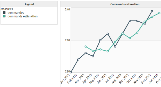
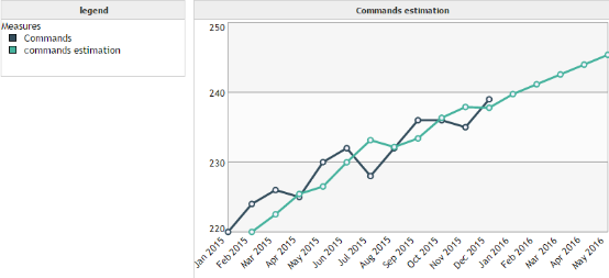
Example:
We want to predict the number of commands of a provider over time. By observing our data we remark that there is trend, but no seasonality. We meet the application conditions for the double exponential smoothing.
Holt smoothing:
Holt smoothing is an improved version of the double exponential smoothing. It uses 2 parameters instead of one.
Example :
Holt-Winters smoothing :
Holt-Winters smoothing enables to take into account data with a trend and a seasonality. DigDash Enterprise offers two versions of the Holt-Winters smoothing :
- Additive version
- Multiplicative version
The additive case corresponds to seasons whose amplitude remains constant over time (see image below) :
The multiplicative case corresponds to situations where the amplitude of seasons varies over time (see image below) :
Contrary to the first example (additive case), we can see that the amplitude of the cycles increases over time. Hence the need to use a multiplicative model instead of an additive one.
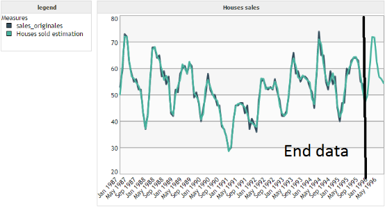
Fourier transform :
The algorithm use to predict is not the Fourier transform. It is an algorithm based on it. Technically, the goal is to split our measure to predict into a sum of sine and cosine functions of different periods. Thus, our algorithm is able to take into account more complex cycles/seasons than the ones presented in the Holt-Winters part.
Example :
For this example we want to predict the number of houses sold by a real estate agency. By observing the data we can see a complex shape of cyclicity. Hence the need to use our algorithm based on Fourier transform instead of a model based on the Holt-Winters algorithm.
Values to predict
We can predict 3 kinds of values through the predictive measures :
- The value of the measure
- The lower bound of the 95 % confidence interval
- The higher bound of the 95 % confidence interval
The confidence interval is defined so that the predicted value has a 95 % probability to be between its two bounds.
Be careful, this result is valid only when data are normal (Gaussian meaning). However, it can still be interesting to plot these intervals even when this hypothesis is not respected.
Example:
We apply the confidence interval on our first example of linear regression.
Mathematical considerations
In the case of algorithms which don't have exact mathematical solutions, the parameters are estimated by minimizing the sum of squared errors.
The number of iterations to estimate these parameters can't be yet modified by the user.
Moreover, it is important to understand that the algorithms presented previously use data from the past in order to predict future values. It implies several points :
- The more there will be data, the better the prediction
- Algorithms are based on the past, they consider that the future will be similar. Therefore, it won't be possible to predict structural shocks
- The accuracy of the prediction can't be guaranteed and must not be considered as deterministic
WHAT-IF MEASUREs
A what-if measure has for goal to study the influence of several measures on a given measure.
Creation of a what-if measure
You can create What-if measures based on measures and derived measures.
Warning: What-if measures work only when the cube is processed server side
To create a What-if measure click on the arrow of the drop down menu located next to the button to add a derived measure. In the menu which just showed up, select Create a What-if measure … The dialog box What-if Analyzis shows up.
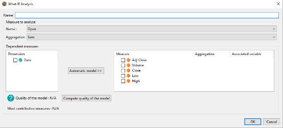
Enter the name of your What-if measure.
In the Measure to analyze group you need to select:
- The measure you want to analyze
- The aggregation of this measure
In the Dependent measures group you need to select the measures you want to integrate to your model in order to model the measure to analyze. For each measure you need to select:
- The aggregation of the measure
- The variable associated to this measure. If you don't want to change the value of the measure, select None
The other fields of the Dependent measures group are not required. However, we are going to explain their usefulness.
The Automatic model button enables to automatically select the measures in order to model the measure to analyze. To use it, you need to select the dimension(s) according to which you want to explore the measures to determine the model.
The Compute quality of the model button enables to compute the adjusted R² coefficient. It computes the accuracy of the model but also takes into account the complexity of this one. To compute it, you need to select the measures of your model and their aggregation.
Example
Our example will be on a supermarket chain. We have data on each store :
- Annual net sales
- Surface
- Stocks
- Advertising budget
- Number of families in the area
- Number of competitors in the area
We want to study the effect of the advertising budget on the annual net sales. To do it we are going to create a what-if measure by completing the fields like on the picture below :
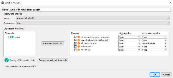
We have selected all the measures because we want to use them all to model the annual nets sales of our stores. However, since we only want to test the influence of the advertising budget, we let the value Associated variable equals to None for all of the measures except for k$ spend on ads.
The associated variable to the advertising budget is the variable var ad budget. This variable is a classical variable such as the one we can use in a derived measure.
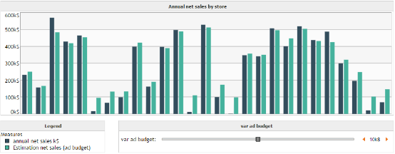
Once the what-if measure has been created, we can realize a bar plot on which we set the measures annual net sales (k$) and our new what-if measure, grouped by stores. In the dashboard we add our variable var ad budget so that we can change its value and thus, observe its influence on Estimation net sales (ad budget).
Mathematical model
What-if measures use the multiple linear regression to model the relationship between the measure to analyze and the dependent measures. It means that DigDash Enterprise is not able to automatically model measures whose relationship is not linear. However, the user can still manually applies transformations on the data by using a data transformer or by creating a derived measure.
Moreover, such as for the predictive measures, it is important to understand that the algorithms presented previously use data from the past in order to predict future values. It implies several points :
- The more there will be data, the better the prediction
- Algorithms are based on the past, they consider that the future will be similar. Therefore, it won't be possible to predict structural shocks
- The accuracy of the prediction can't be guaranteed and must not be considered as deterministic
Smart grouping (clustering)
Creation of a smart grouping
Smart grouping (clustering) enables to group members of a dimension according to several measures. The goal here is to group “similar” members together. The similarity notion has to be interpreted in the mathematical way. It means members whose values are close for given measures.
In the Hierarchies section, click Add then Smart grouping. The Smart grouping editor dialog box shows up:
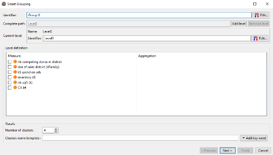
The upper part of the window is similar to the one to create a manual hierarchy. We can define the identifier of the hierarchy (by default Group 0), add levels, and changer their identifiers.
The differences are in the Level definition and Details groups.
In the Level definition group we define the measures according to which we want to group the members of the current level. You need to select the measures and for each of these measures, select their aggregation.
The Details group enables to precise:
- The number of clusters (groups) of the current level
- The name of these clusters
The name of these clusters can be composed of several keywords that we add thanks to the Add keyword button located above the Cancel button.
The keywords available to name the clusters are the following:
- ${bestMeasures} which enables to name the clusters according to the name of the 3 most discriminative measures. Each cluster name has the form Measure1Position,Measure2Position,Measure3Position where the position is between 0 and the number of clusters of the level, and indicates how the mean of the measure is ranked compare to the other clusters (for more details please see the example at the end of this part).
- ${Measure(MeasureName)} which enables to choose yourself the measures you want to show in the clusters names.
By default the name of the clusters is equal to ${bestMeasures}.
The user also has the possibility to add personal text in the clusters names.
To finalize the first step, the user has to click on the Next button. This triggers the computation of the groups and brings him to a second window, identical to the one to create a manual hierarchy but where the groups are already built.
Thus, this second step is totally identical to the creation of a manual hierarchy. You strictly have the same possibilities. For further details, please refer to the part on the creation of a manual hierarchy.
Examples
Example 1 :
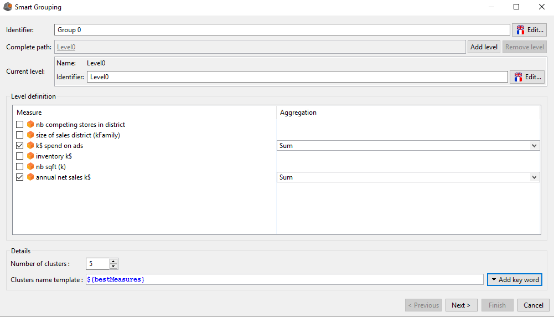
We have data about stores of a supermarket chain. We want to create 5 groups of stores, similar in term of advertising budget and annual net sales. We select ${bestMeasures} to name our groups of stores.
By clicking on the next button we get the following result:
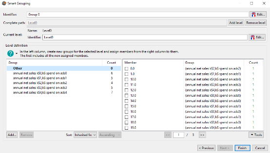
We get 5 groups of stores as we asked in the previous step. The group names follows the schema annual net sales k$Position,k$ spend on adsPosition.
For the group annual net sales k$0,k$ spend on ads0 it means that this group contains stores whose annual net sales and advertising budget is the lowest (rank 0). On the opposite, the group annual net sales k$4,k$ spend on ads4 contains stores whose annual net sales and advertising budget is the highest.
Example 2 :
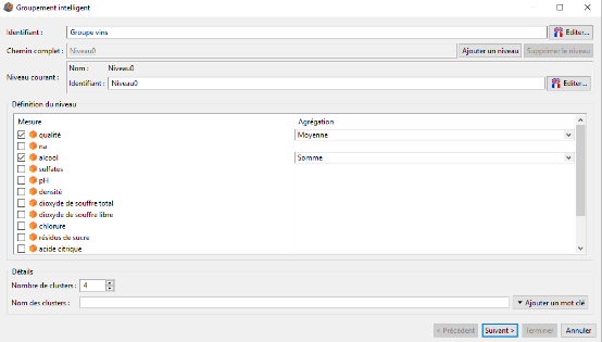
We have data about wines :
- Quality of the wine (average user rating)
- Chemical indicators (pH, alcoholic degree, density, etc)
We want to group our wines in four groups depending on their quality and their alcoholic degree.
To do it we complete the Smart grouping interface such as indicated on the picture below and then we click on the Next button :
In the second window we validate the creation of our hierarchy.
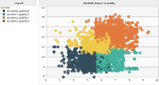
Then, we create a scatter plot. On the Y axis we set the alcoholic degree. On the X axis the quality of the wines. In the Bubbles field we set our dimension id wine at the root level. In the Cycle color field we set again id wine but this time at level 0 so that each group will have a different color.
We get the following graph :
Mathematical considerations
Groups (clusters) are determined using the Kmeans++ algorithm whose result depends on the initialization parameters. Thus, if you try to create smart grouping multiple times (even with the same parameters), you may not always have the same results.